How do you draw angel wings?
Short answer
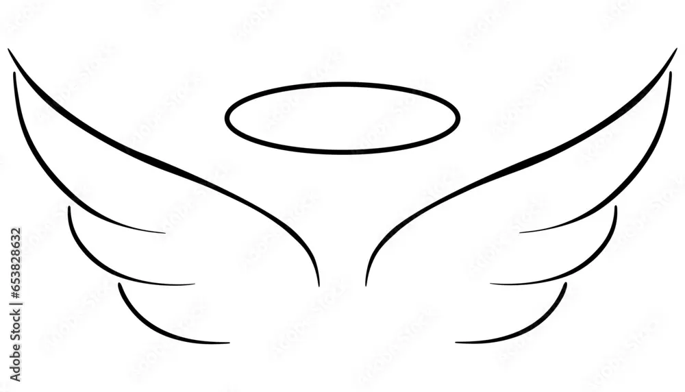
Drawing angel wings requires understanding avian anatomy to create a sense of weight and movement. Start by sketching a simple skeletal arc, then layer feathers in rows from the top down. By focusing on the primary, secondary, and covert feather groups, you can construct wings that appear both realistic and functional.
On this page
How to structure angel wings
The foundation of a convincing wing lies in its skeletal structure, which mimics the anatomy of a bird’s arm. Before drawing individual feathers, you must establish the "arm" of the wing, which consists of three main segments: the humerus, the radius-ulna, and the manus or "hand" section. By sketching these as connected lines, you create a frame that dictates the wing’s span and posture.
A common mistake is drawing wings as flat, leaf-shaped appendages attached to the back. Instead, visualize the wing as a multi-jointed limb that folds and extends. When the wing is closed, these segments collapse against each other, creating a compact shape. When open, the wing stretches outward, with the longest feathers extending from the manus section. Always begin with these structural lines to ensure your drawing remains anatomically grounded.
How to layer feathers correctly
Feathers are organized in distinct, overlapping rows that provide the wing with its aerodynamic profile. You should always work from the bottom of the wing toward the top. This layering technique ensures that the upper feathers naturally overlap the lower ones, mimicking the way birds maintain their plumage. If you start from the top, the feathers will appear disjointed and lack the necessary depth.
Follow these steps to layer your feathers effectively:
- Define the primary feathers, which are the longest and most rigid, extending from the wingtip.
- Add the secondary feathers, which are shorter and fill the middle section of the wing.
- Layer the covert feathers, which are smaller and softer, to cover the gaps near the shoulder.
- Refine the edges of each feather to ensure they taper to a point, creating a sleek, organized look.
Best drawing tools for beginners
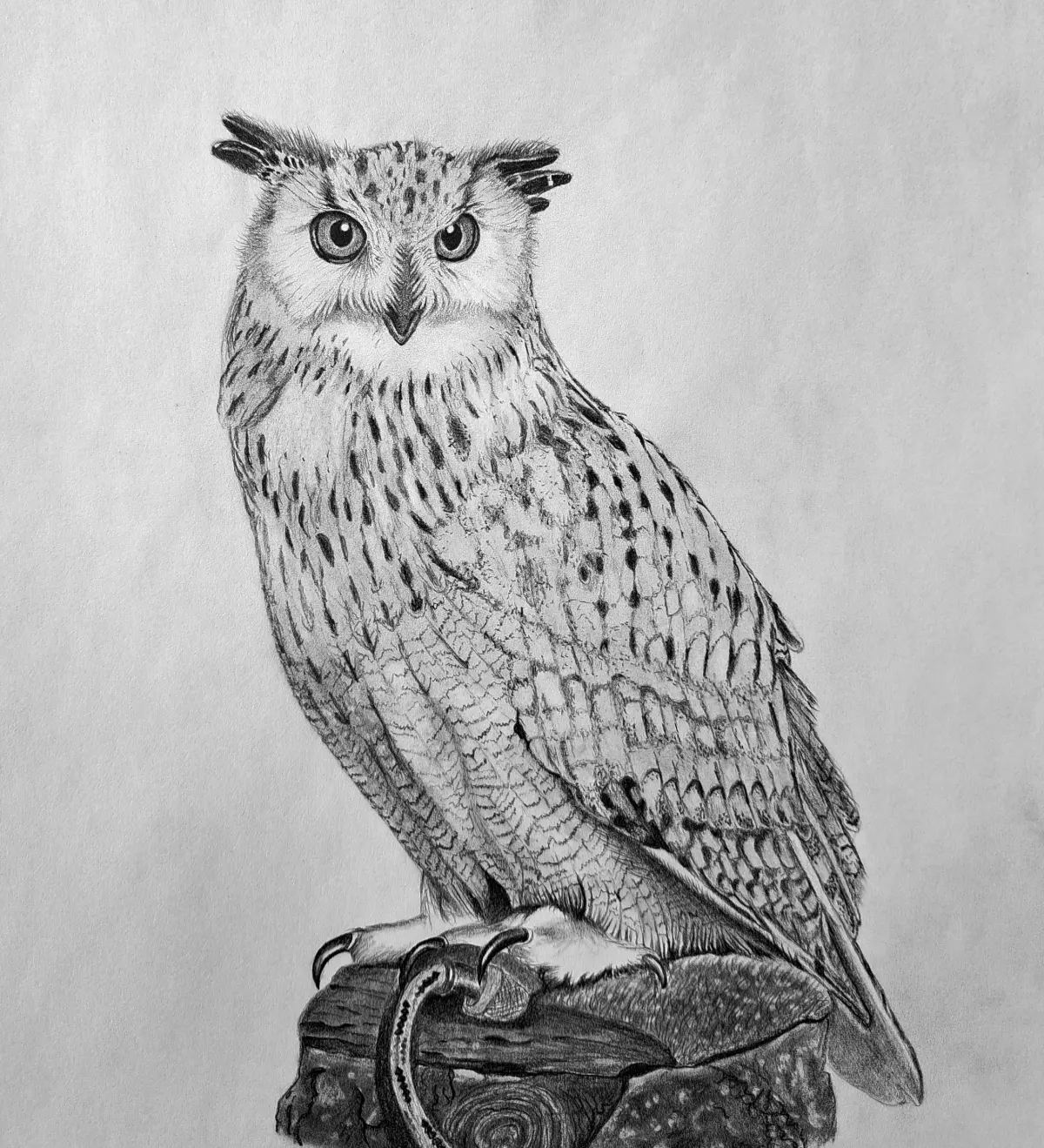
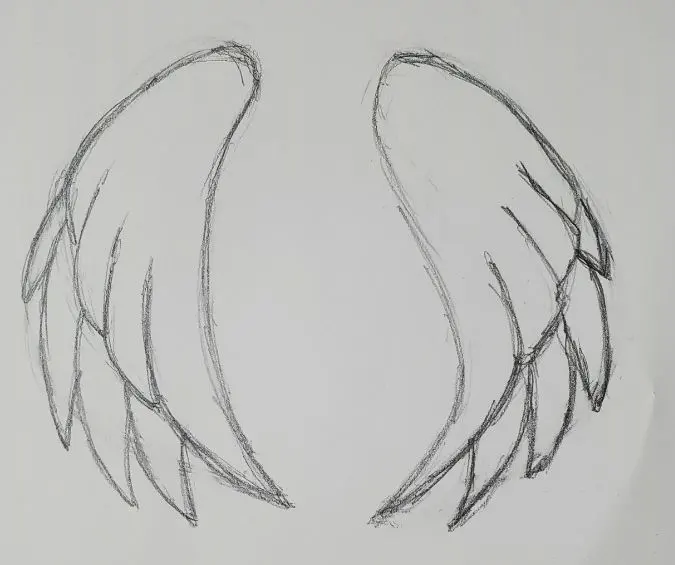
For those new to drawing wings, using a graphite pencil with varying hardness levels is highly recommended. An HB pencil is ideal for sketching the initial structural frame, as it is light and easy to erase. Once the frame is set, switch to a 2B or 4B pencil to add darker, more defined strokes for the feathers. This contrast helps separate the wing from the background and adds a sense of volume.
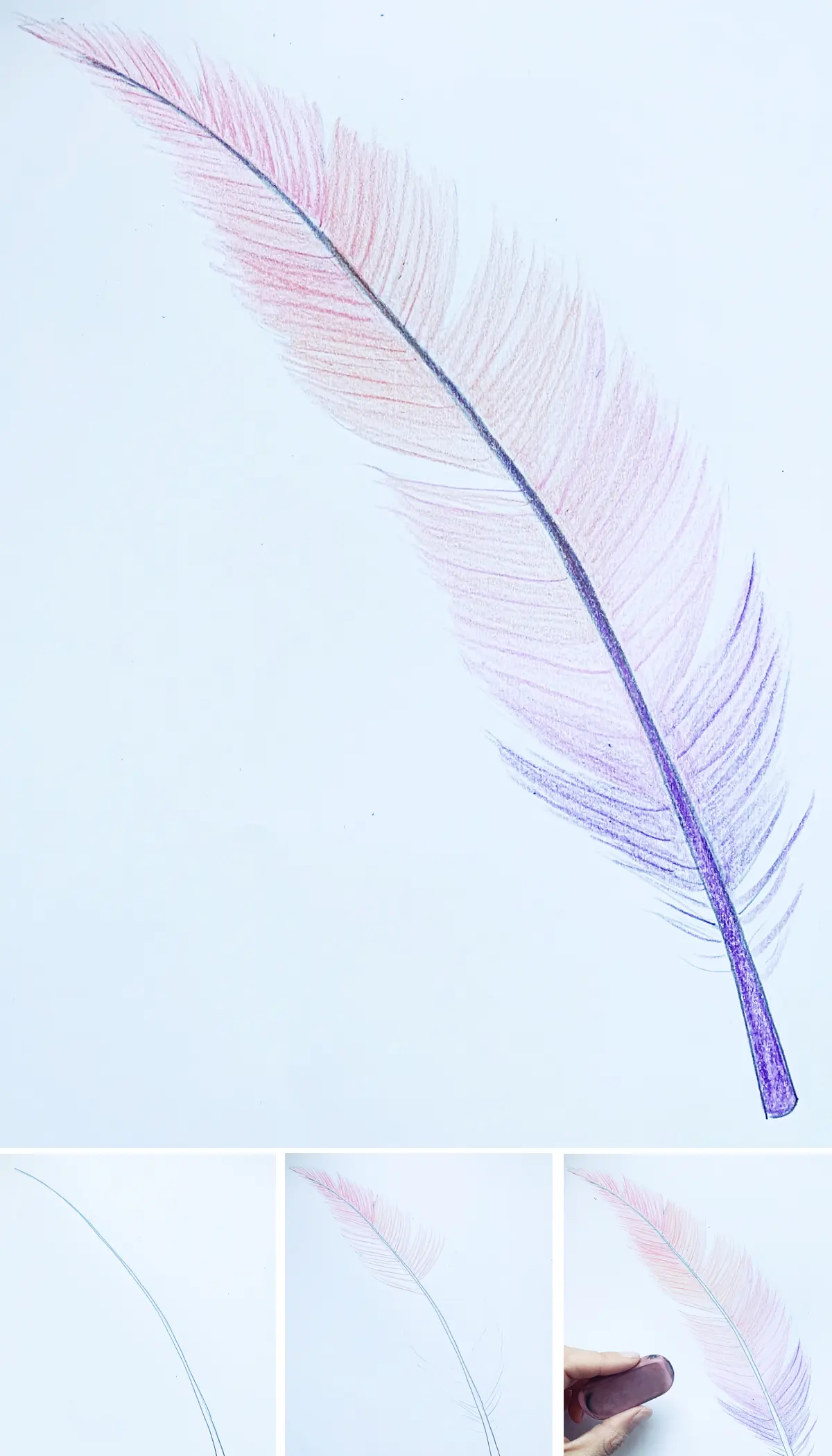
In addition to pencils, consider using a kneaded eraser to lift graphite and create highlights on individual feathers. This technique adds a three-dimensional quality to the drawing, making the feathers look shiny or light-catching. Avoid using pens or markers until you are confident in your feather placement, as these mediums are permanent and do not allow for the subtle shading required for realistic textures. Keep your strokes fluid and consistent to maintain a natural flow across the entire wing surface.
Why wings look stiff or unnatural
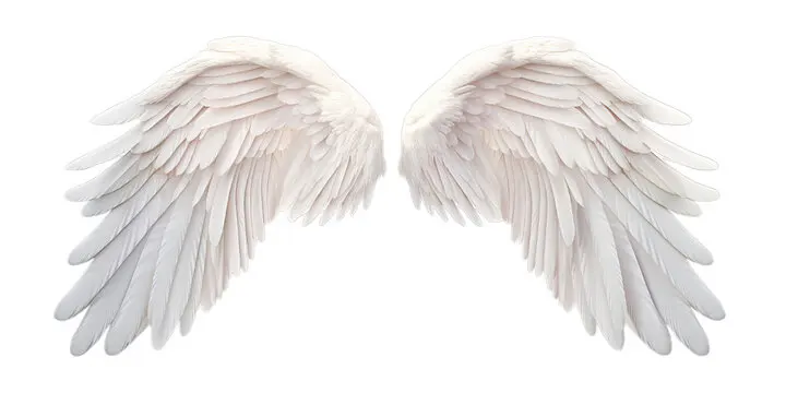
Wings often look stiff when the artist fails to account for the curve of the wing’s surface. A wing is not a flat plane; it is a curved, organic structure that catches the light differently at every angle. If your drawing looks like a static board, it is likely because the feathers are too uniform in size and direction. Varying the length and curvature of the feathers will immediately introduce a sense of movement and grace.
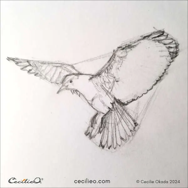
To avoid stiffness, observe how gravity affects the wing. When a wing is at rest, the feathers should hang slightly downward, following the natural pull of gravity. When the wing is in flight, the feathers should spread out, creating a fan-like effect that suggests tension and power. By studying photographs of eagles or hawks, you can see how the feathers flex and bend under pressure. Applying these observations will help you transition from drawing rigid shapes to creating dynamic, lifelike wings.
Common mistakes when drawing wings
One of the most frequent errors is neglecting the "shoulder" area where the wing connects to the body. Many artists draw wings that seem to float behind the back, rather than emerging from the scapula. To fix this, ensure the wing root is thick and muscular, blending seamlessly into the back muscles. Adding a small cluster of soft, downy feathers at the base of the wing helps bridge the gap between the body and the larger flight feathers.
Another common mistake is ignoring the perspective of the wing. If the wing is angled toward the viewer, the feathers on the far side should appear shorter and more compressed due to foreshortening. Always check your proportions to ensure that the wing size is appropriate for the scale of the character or subject. If the wings are too small, they will look incapable of flight; if they are too large, they may appear cumbersome. Consistent practice with these anatomical proportions will allow you to draw wings that feel like a natural extension of the form.
Key facts
- Angel wings are structurally modeled after avian wings, consisting of three main sections: the primary feathers, secondary feathers, and coverts.
- The "arm" of the wing connects to the shoulder blade, meaning the base of the wing should be placed high on the back near the scapula.
- Feathers are not uniform; they become longer and thinner toward the tips of the wings and shorter and rounder near the body.
- Use a "shingle" pattern when drawing feathers, where each layer overlaps the one below it to create a sense of depth and volume.
- A common mistake is drawing wings that are too small; to look functional, a wing's span should usually be at least twice the width of the torso.
- Always sketch the skeletal structure—the humerus, radius, and ulna—before adding feathers to ensure the wing has a logical range of motion.
The bottom line
Drawing convincing angel wings requires understanding avian anatomy and the layering of feathers. By focusing on the underlying skeletal structure and using a shingle-like overlapping pattern, you can create wings that appear both functional and graceful. Remember to scale the wings appropriately to the body size and use shading to define depth. With these foundational principles, you can effectively illustrate wings in various poses and styles.
People also ask
How do you make wings look like they are in motion?
To show movement, curve the primary feathers upward or downward and add "speed lines" or blurred edges at the tips. Tilting the wing angle relative to the body also suggests the subject is mid-flight.
Should I draw every single feather individually?
Avoid drawing every feather, as this often makes the wing look cluttered or stiff. Instead, draw the outlines of feather groups and add detail only to the most prominent feathers.
What is the best way to shade wings?
Shade the underside of each feather layer to create a cast shadow on the layer beneath it. This technique provides the necessary contrast to make the wings appear three-dimensional.
How do I determine the correct wing span for a character?
A realistic wingspan should be wide enough to support the weight of the body. For an average human-sized figure, each wing should be at least as long as the entire height of the person.
Why do my drawings of wings look flat?
Flatness usually occurs when the feathers are drawn in a single plane without overlapping. Ensure the feathers follow the curvature of the wing's bone structure to give them volume.
Can I use different bird species for reference?
Yes, studying different birds is highly recommended. Use eagle wings for a powerful, sharp look, or swan wings for a softer, more elegant and rounded appearance.
This answer was created with the help of AI research tools and reference sources. Spotted an error? Let us know — we correct mistakes quickly. See our editorial policy.