Why do certain colors make us feel calm?
Short answer
Certain colors promote calmness by triggering physiological responses linked to our evolutionary history. Cool tones like blue and green lower heart rates and reduce cortisol levels, mimicking natural environments that signaled safety to our ancestors. This psychological association helps regulate the autonomic nervous system, effectively quieting the brain’s stress response.
On this page
Why do certain colors make us feel calm?
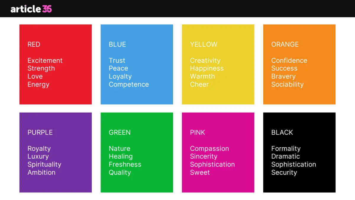
The human brain processes color through a complex interplay between the eyes and the amygdala, the area responsible for emotional regulation. Evolutionarily, humans associate specific hues with environmental safety. Blue, for instance, mirrors the appearance of clear skies and calm water, both of which historically indicated a lack of immediate danger or predators. When we view these shades, our nervous system shifts from a state of high alert to a more relaxed, parasympathetic state.
This reaction is not merely psychological; it is measurable. Research in environmental psychology has shown that exposure to soft, cool-toned environments can lead to a measurable decrease in blood pressure and respiratory rate. By minimizing visual stimulation, these colors prevent the brain from over-processing sensory input. When the environment feels predictable and serene, the body naturally releases fewer stress hormones, fostering a sense of internal stability and emotional equilibrium.
How to use calming colors in your home
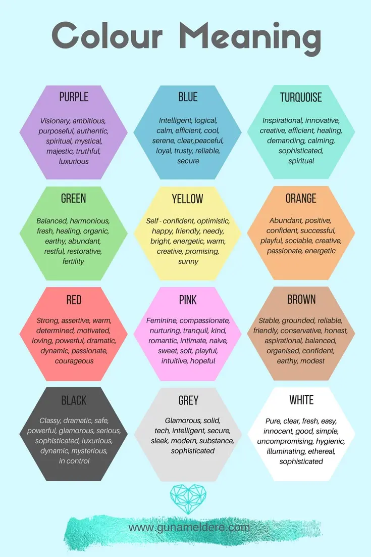
Transforming your living space into a sanctuary requires a strategic approach to color selection. To maximize the calming effect, focus on desaturated tones that avoid high-intensity pigments. Start by evaluating the natural light in your room, as bright sunlight can make even soft colors appear more vibrant and stimulating than intended.
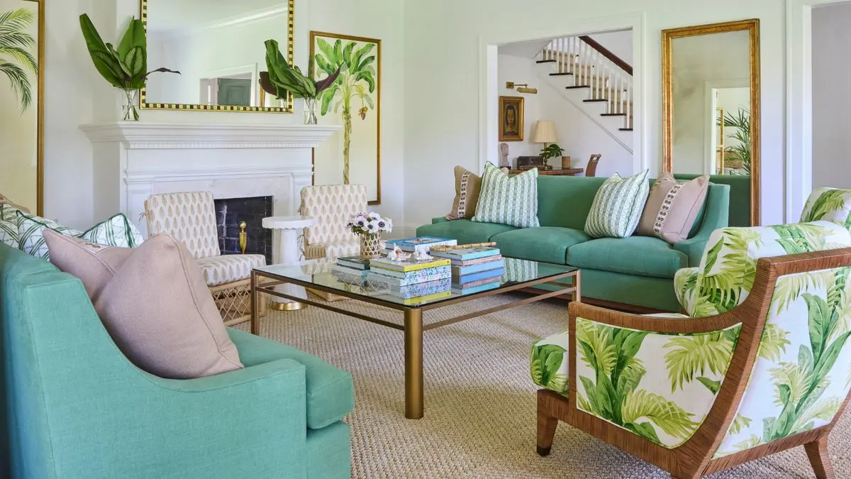
- Choose a primary wall color in a muted sage green or a dusty slate blue.
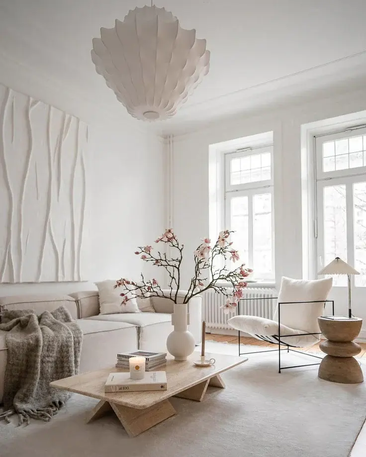
- Incorporate neutral textures like linen, wool, or light wood to soften the overall visual impact.
- Limit accent colors to a maximum of two complementary shades to prevent visual clutter.
- Use matte finishes instead of glossy ones, as matte surfaces absorb light rather than reflecting it, which reduces glare and intense visual contrast.
By following these steps, you create a cohesive environment that encourages rest. Avoid using neon or highly saturated primary colors in bedrooms or offices, as these hues increase physiological arousal and can disrupt your ability to focus or sleep peacefully.
Best calming colors for relaxation
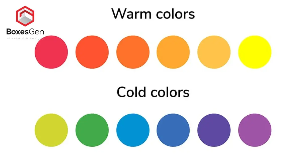
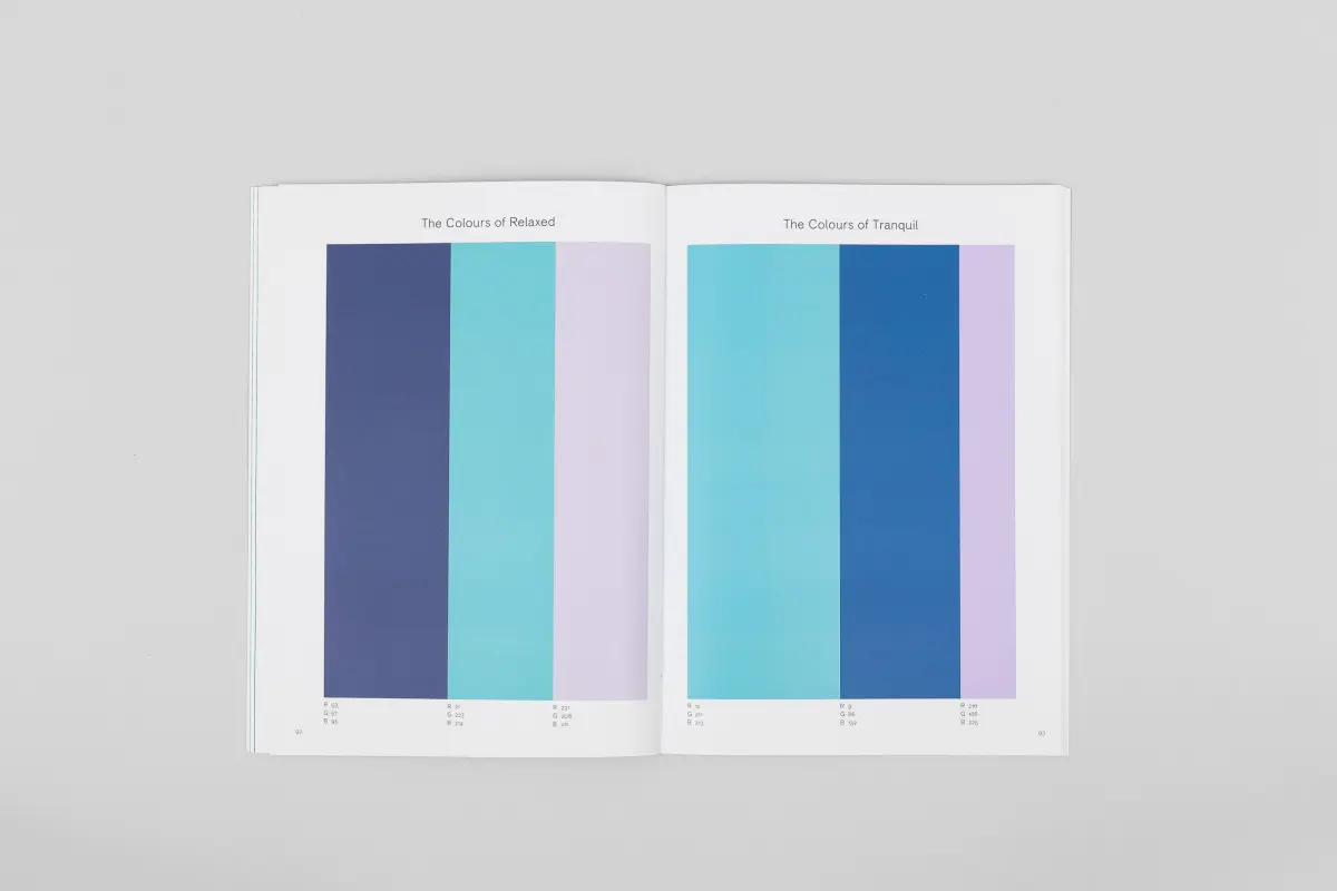
Not all colors are created equal when it comes to stress reduction. While individual preferences exist, certain shades consistently rank highest in studies regarding emotional tranquility. These colors typically fall into the "cool" category of the color wheel, characterized by longer wavelengths that are easier for the eye to process without strain.
- Soft Sage: Mimics nature, providing a grounding effect that feels organic and stable.
- Pale Lavender: Contains subtle warm undertones that soothe the mind without being overly stimulating.
- Sky Blue: Reduces cognitive load and promotes a feeling of openness and clarity.
- Warm Sand: A neutral option that provides a sense of comfort and protection.
- Muted Gray: Acts as a perfect backdrop, allowing the nervous system to remain neutral and unbothered by visual noise.
Integrating these colors allows for a balanced aesthetic. The key is to avoid "clashing" palettes, where multiple high-contrast colors compete for your attention, as this creates subconscious tension.
Common mistakes when choosing colors
Many people inadvertently sabotage their efforts to create a calm space by selecting colors that are too dark or too intense. A common error is choosing a color based solely on a small paint swatch without considering how it will look across an entire wall. Colors often intensify as they cover larger surfaces, turning a seemingly "soft" blue into an overwhelming, aggressive shade that keeps the brain in a state of high arousal.
Another mistake is neglecting the role of lighting. A color that appears soothing in a store’s fluorescent lighting may look jarring or cold under the warm light of an incandescent bulb. Always test paint samples on different walls and observe them at various times of the day. If the color makes you feel energetic rather than relaxed, it is likely too saturated. Avoid the temptation to follow trends, as trendy colors are often high-contrast and designed to grab attention rather than quiet the mind.
How long does it take to feel the effects?
The physiological benefits of color exposure can happen surprisingly quickly, often within minutes of entering a well-designed space. When you step into a room painted in a calming hue, the brain begins to process the visual information almost immediately. If the environment is consistent with your personal preferences and free from clutter, the transition from a stressed state to a relaxed one can occur in as little as five to ten minutes.
However, the long-term effectiveness of these colors depends on environmental maintenance. If the room becomes messy or cluttered, the psychological benefit of the color is quickly negated by the visual stress of the disorder. To maintain the calming effect, ensure that the space remains organized and that lighting remains soft. By treating your environment as a tool for emotional regulation, you can sustain a lower baseline of stress throughout your daily life, effectively using color as a permanent, non-invasive support for your mental well-being.
Key facts
- Cool colors like blue and green have shorter wavelengths, which the human eye processes with less strain than warmer, high-energy colors.
- Studies show that exposure to soft blue light can lower heart rates and reduce cortisol levels, the body’s primary stress hormone.
- Biophilia theory suggests humans find green calming because it mimics the visual cues of lush, life-sustaining natural environments.
- Muted or desaturated tones are generally more soothing than highly saturated, vibrant colors, which can overstimulate the nervous system.
- To create a calming workspace, paint walls in "cool neutrals" like light gray or sage green to minimize visual distraction.
- Avoid using pure white or bright neon colors in bedrooms, as these can increase alertness and interfere with sleep cycles.
The bottom line
The calming effect of color is rooted in a combination of biological evolution and psychological conditioning. By favoring cool, desaturated hues like sage, sky blue, or soft gray, you can effectively lower your physiological stress response. To maximize these benefits, ensure your lighting is consistent and avoid high-contrast patterns. Ultimately, your environment should reflect your personal comfort while adhering to these fundamental principles of visual harmony.
People also ask
Can painting a room a certain color actually change my mood?
While color does not change personality, it influences physiological responses through light reflection and psychological association. Soft, cool tones can lower blood pressure, while bright, warm tones like red can increase heart rate and appetite.
Are all shades of blue equally relaxing?
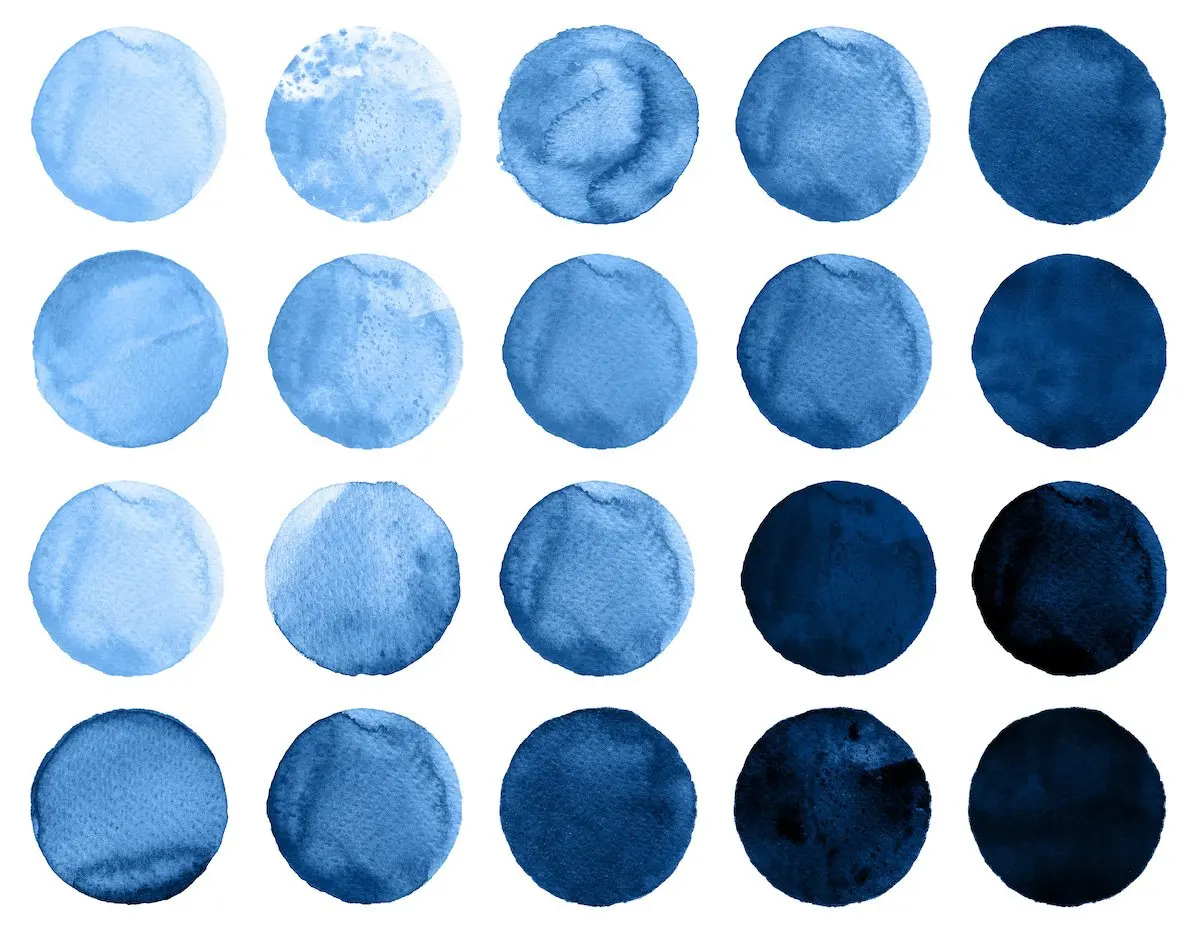
No, the intensity matters significantly. Deep, dark blues can feel somber or cold, while bright, electric blues are highly stimulating. Pale, sky-toned blues are the most effective for promoting relaxation.
Why do hospitals often use light green or blue?
These colors are chosen because they minimize eye fatigue for medical staff and provide a neutral, non-threatening environment for patients. This helps reduce anxiety in clinical settings where stress levels are naturally high.
Is it better to use one color or multiple colors for a calm space?
A monochromatic color scheme is usually more calming than a multi-colored one. Using different shades of the same hue creates visual harmony and prevents the brain from having to process complex color contrasts.
Does lighting affect how a color makes me feel?
Yes, lighting is critical because it dictates how much color is reflected back to the eye. Warm incandescent light can make a cool blue look muddy, while bright daylight might make a soft green feel overwhelming.
What is the biggest mistake people make when choosing "calm" colors?
The most common error is choosing a color based on a small paint chip without testing it in the room. Colors change drastically depending on the time of day and the specific quality of light in your home.
This answer was created with the help of AI research tools and reference sources. Spotted an error? Let us know — we correct mistakes quickly. See our editorial policy.