What is harmony in art?
Short answer
Harmony in art is the visual arrangement of elements that creates a sense of cohesion, balance, and completeness. By using consistent colors, shapes, lines, or textures, an artist links disparate parts of a composition into a unified whole. It provides a sense of order that allows the viewer to perceive the work effortlessly.
On this page
What is the definition of harmony in art?
Harmony is the principle of design that establishes a visual relationship between the different components of an artwork. It is often described as the "glue" that holds a composition together, ensuring that no single element feels out of place or disconnected from the rest. When a piece is harmonious, the viewer’s eye moves comfortably across the surface without encountering jarring interruptions.
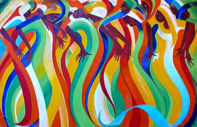
Artists achieve this effect through repetition, proximity, and continuity. By repeating specific motifs or maintaining a consistent color palette, the artist creates a rhythmic flow that signals to the brain that these elements belong to the same family. Harmony does not necessarily require symmetry; rather, it requires a logical connection between parts. It is the opposite of discord, where elements clash or compete for attention in a way that creates visual chaos.
How to create harmony in a composition
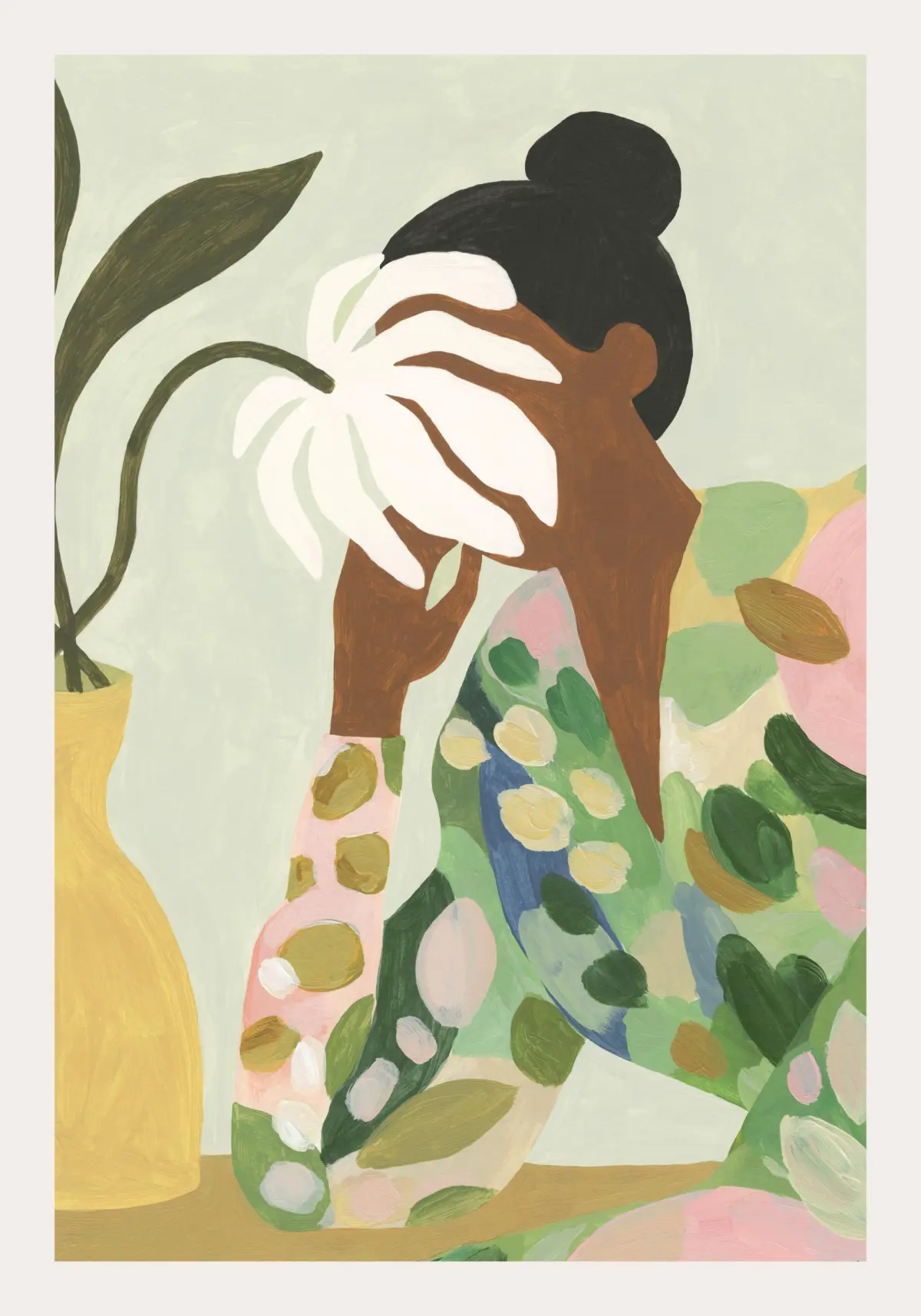
Creating harmony involves intentional planning regarding the placement and repetition of visual assets. A common method is to limit the color palette, using variations of a few hues rather than every color on the spectrum. This creates an immediate sense of belonging among the objects in the scene.
Follow these steps to build a harmonious layout:
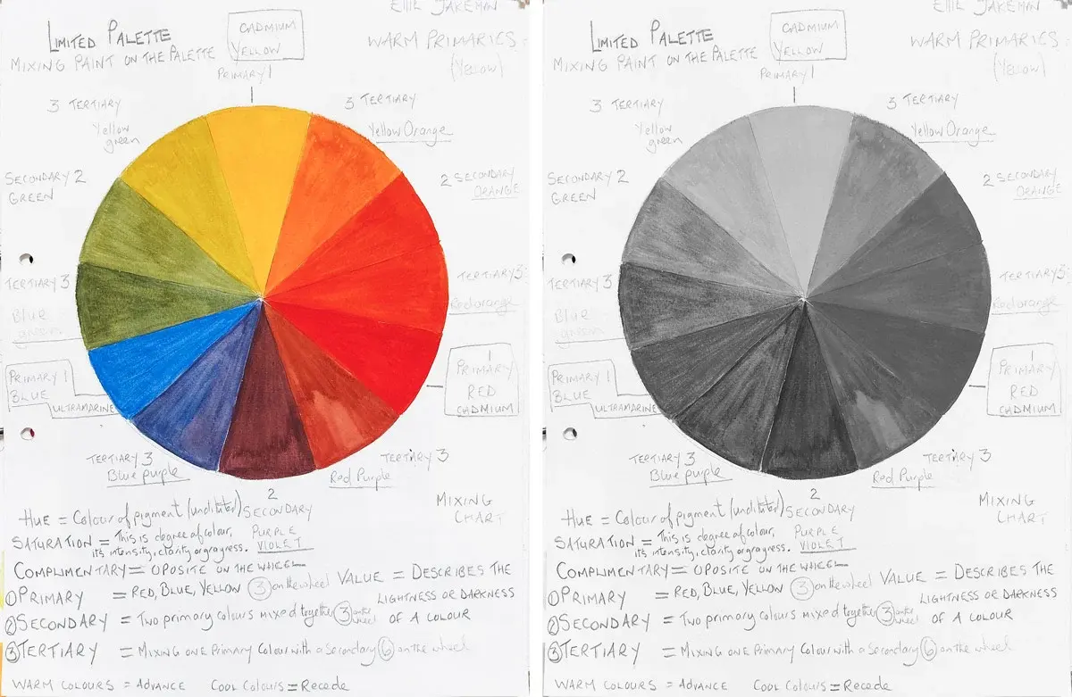
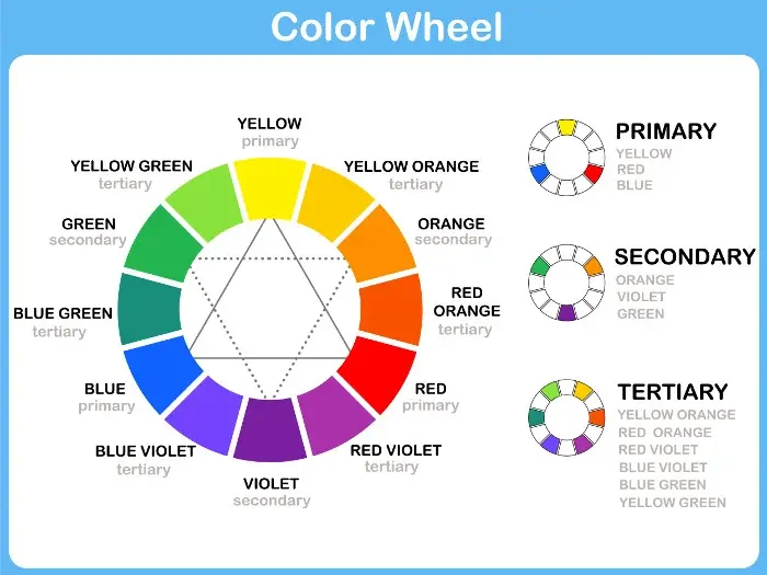
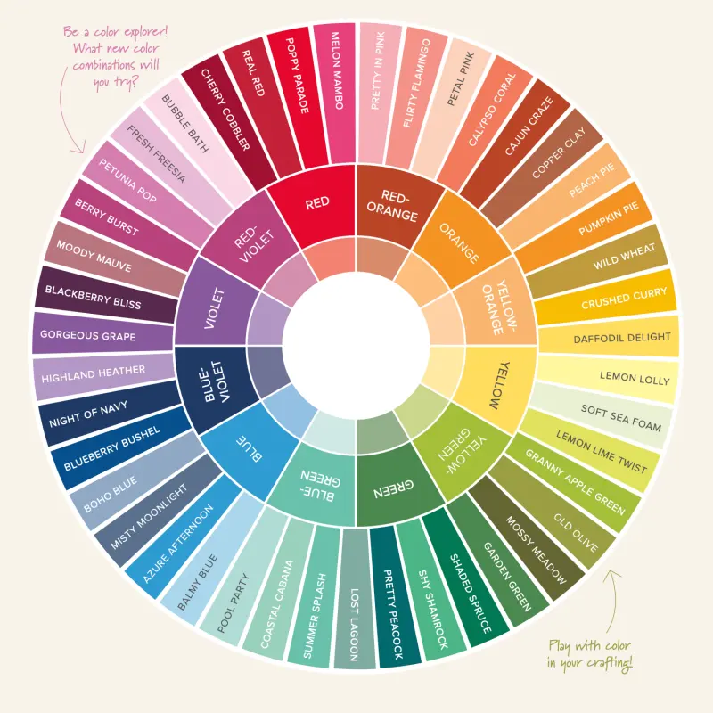
- Select a dominant color scheme, such as analogous colors found side-by-side on the color wheel.
- Repeat a specific shape or line weight throughout the piece to establish a visual rhythm.
- Group related objects together to create clear focal points that anchor the composition.
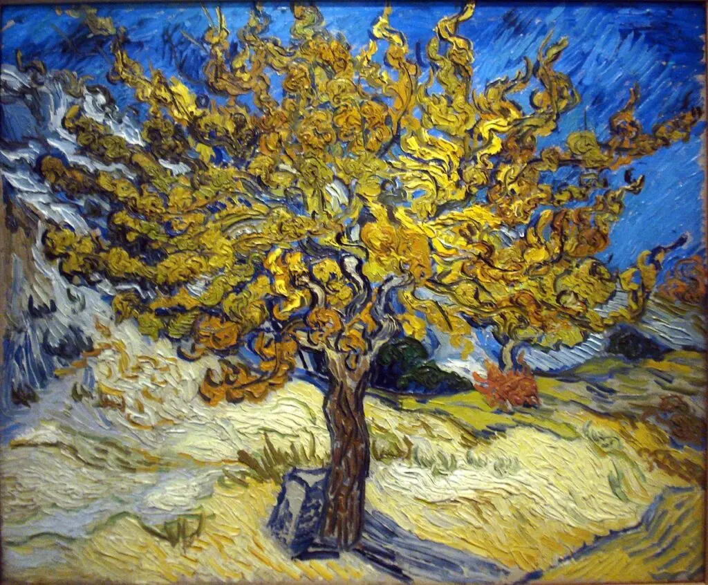
- Use consistent textures or brushwork styles to ensure the surface quality feels uniform across the entire canvas.
By applying these steps, you build a structural foundation that guides the viewer’s focus. Consistency in these technical choices acts as a unifying thread that prevents the viewer from feeling overwhelmed by conflicting visual information.
Why is harmony important for visual balance?
Harmony serves as the primary tool for achieving visual balance, which is the distribution of perceived weight in an artwork. Without harmony, a composition may feel lopsided or fragmented, causing the viewer to lose interest quickly. Harmony stabilizes the work, allowing the audience to process the artist's message without being distracted by visual noise.
When elements share similar characteristics, the brain spends less energy trying to categorize them individually. This efficiency creates a pleasant viewing experience, often associated with beauty or order. In classical art, such as the works of Raphael or Leonardo da Vinci, harmony was achieved through geometric arrangements and balanced color temperatures. These techniques ensured that the viewer’s eye was directed toward the subject while the background remained supportive rather than distracting. Harmony essentially dictates the hierarchy of the piece, ensuring that every element serves the greater purpose of the whole.
Common mistakes when trying to achieve harmony
Beginners often mistake harmony for monotony, leading to works that feel flat or uninspired. A common error is repeating an element too perfectly, which can make a composition feel sterile or mechanical. To avoid this, artists should introduce subtle variations in size, tone, or orientation while keeping the underlying theme consistent.
Consider these frequent pitfalls to improve your work:
- Using too many high-contrast elements that fight for dominance.
- Neglecting to connect the background to the foreground through shared colors.
- Introducing a "wildcard" element that lacks any relationship to the rest of the work.
- Overloading the composition with excessive detail, which breaks the visual flow.
If you find that your work feels disjointed, try simplifying your palette or reducing the number of competing shapes. Removing one or two distracting elements can often restore the sense of order needed for a harmonious result.
How to balance harmony and variety
While harmony provides order, variety provides interest. A composition that is entirely harmonious can become boring, while one with too much variety becomes chaotic. The goal is to find a middle ground where the elements are related enough to feel unified but distinct enough to hold the viewer's attention. This is often referred to as "unity in diversity."
To master this balance, use harmony for the majority of your composition and reserve variety for the focal point. For example, keep the background colors and textures consistent, but introduce a sharp contrast or a unique shape in the center of the piece. This technique draws the eye exactly where you want it to go while maintaining the overall integrity of the work. By treating harmony as the foundation and variety as the accent, you create dynamic art that is both stable and engaging. This sophisticated approach ensures that your work remains professional, visually stimulating, and easy for the audience to navigate.
Key facts
- Harmony is the principle of design that creates unity by stressing the similarities of separate but related parts.
- Artists achieve visual harmony by using consistent color palettes, such as analogous colors found side-by-side on the color wheel.
- Repetition of shapes, lines, or textures acts as a visual glue that connects disparate elements within a composition.
- Proximity is a key technique where grouping related objects together helps the viewer perceive them as a single, organized unit.
- A common mistake is "visual clutter," where too many competing focal points prevent the eye from finding a resting place.
- You can test for harmony by squinting at your work; if the overall composition feels unified rather than broken into jagged pieces, you have succeeded.
The bottom line
Harmony is the essential design principle that transforms a collection of individual elements into a unified, coherent whole. By thoughtfully applying repetition, proximity, and consistent color schemes, you create a visual language that guides the viewer’s eye comfortably across your work. While contrast is necessary to prevent boredom, maintaining a sense of underlying order ensures your composition feels intentional, professional, and aesthetically pleasing to the observer.
People also ask
How does harmony differ from balance?
Balance refers to the distribution of visual weight in a work, while harmony refers to the sense of cohesion and togetherness. An artwork can be perfectly balanced but feel chaotic if the elements lack a common thread.
Can an artwork be too harmonious?
Yes, excessive harmony can lead to monotony or boredom. Artists often introduce a small amount of contrast or a "focal point" to break the pattern and keep the viewer engaged.
What is the role of rhythm in creating harmony?
Rhythm uses the repetition of elements to guide the viewer’s eye across the canvas in a predictable flow. This movement creates a sense of predictability that the brain interprets as harmonious and pleasant.
How do I use color to create harmony?
You can limit your palette to a specific temperature, such as all cool blues and greens, or use a monochromatic scheme. Using a single dominant hue throughout a piece ties all other elements together visually.
Is harmony the same as symmetry?
No, symmetry is a specific type of formal balance where one side mirrors the other. Harmony is a broader concept that can be achieved through asymmetry, provided the elements share stylistic or tonal traits.
Why does a lack of harmony make an image feel "wrong"?
Humans have an innate psychological preference for order and pattern recognition. When an image contains conflicting styles, colors, or textures without a logical connection, the brain struggles to process the information, resulting in visual discomfort.
This answer was created with the help of AI research tools and reference sources. Spotted an error? Let us know — we correct mistakes quickly. See our editorial policy.