What is unity in art?
Short answer
Unity in art is the principle that creates a sense of wholeness and harmony within a composition. It occurs when individual elements—such as color, shape, and line—work together to form a cohesive visual statement. This integration ensures that the artwork feels complete rather than like a collection of disconnected, unrelated parts.

On this page
What is the definition of unity in art?
Unity is the conceptual glue that binds a work of art together. It is one of the foundational principles of design, alongside balance, contrast, and rhythm. When an artist achieves unity, the viewer perceives the work as a singular, organized entity rather than a chaotic assortment of competing visual elements. This sense of oneness is essential for effective communication, as it guides the eye through the piece without distraction.
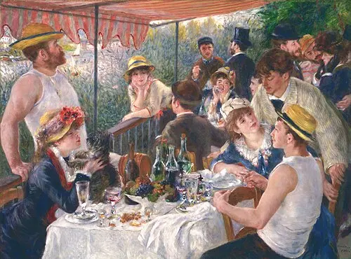
Artists often achieve this through proximity, repetition, and continuation. Proximity involves grouping related elements together, while repetition uses consistent patterns or colors to establish a theme. Continuation refers to the way lines or shapes lead the viewer’s gaze across the canvas. By strategically applying these techniques, a creator ensures that every part of the artwork serves the overall purpose, resulting in a professional and polished final product.
How to create unity in a painting?
Creating unity requires intentional planning and a disciplined approach to composition. You must consider how each element interacts with the others to support the central theme or focal point. Without this cohesion, a piece may feel fragmented or confusing, failing to deliver its intended message or emotional impact to the audience.
Follow these steps to build a more unified composition:
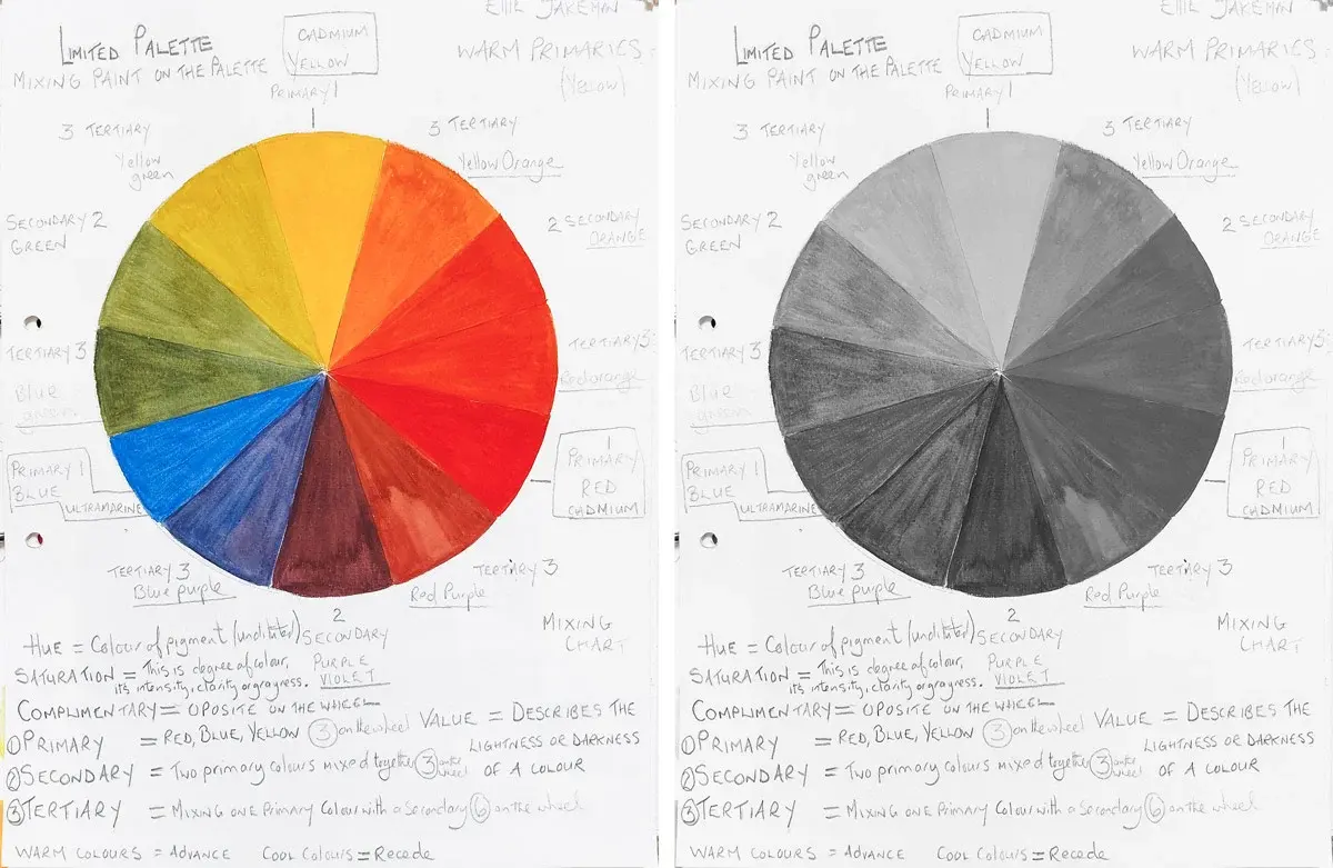
- Establish a limited color palette to create harmony across the entire work.
- Repeat specific shapes or textures in different areas to build visual rhythm.
- Use a consistent style or brushwork technique throughout the piece.
- Align elements along an invisible grid or path to guide the viewer’s eye.
- Ensure that the background and foreground share common tonal values.
By following these steps, you create a visual language that remains consistent from corner to corner. This consistency allows the viewer to focus on the content rather than being distracted by clashing elements.
Why is unity important for composition?
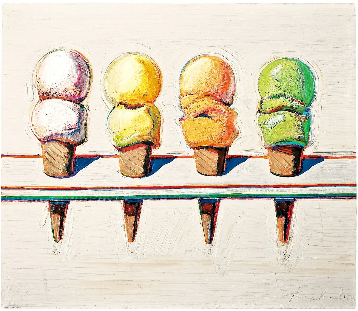
Unity acts as a stabilizer for complex visual information. In art history, works like Leonardo da Vinci’s The Last Supper (1495–1498) demonstrate how geometric perspective and the arrangement of figures create a powerful, unified narrative. Without unity, the viewer’s eye would dart aimlessly across the frame, unable to find a resting point or understand the relationship between the subjects involved in the scene.
A lack of unity often leads to visual fatigue. When a composition is too busy or contains conflicting styles, the viewer struggles to process the image. Conversely, a unified work provides a sense of order and clarity. This does not mean the art must be simple or boring; rather, it means that even complex, high-energy works must possess an underlying structure that holds the complexity together. Unity provides the necessary framework for artistic expression to be both impactful and legible.
Common mistakes when trying to achieve unity
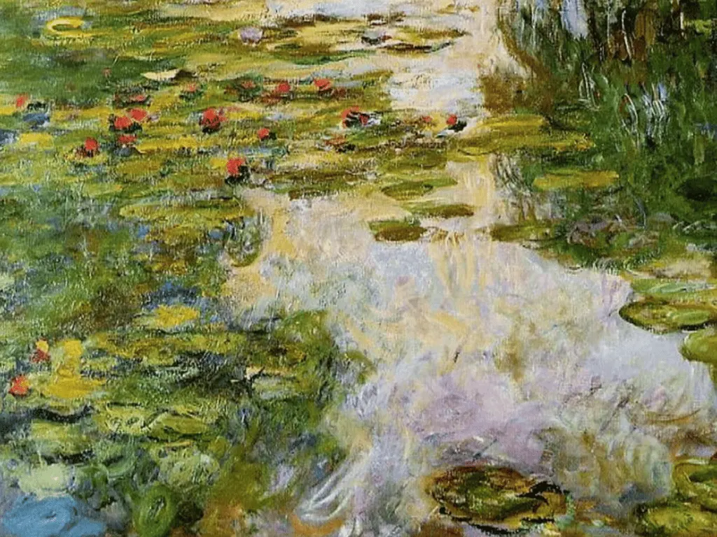
Many artists fall into the trap of over-complicating their work, believing that more detail equates to higher quality. This often leads to "visual clutter," where too many focal points compete for attention simultaneously. When everything in a painting is equally loud, nothing stands out, and the sense of unity is lost. Another common error is using too many clashing colors, which disrupts the visual harmony and makes the piece feel disjointed.
Avoid these frequent pitfalls to maintain a professional standard:
- Using too many high-contrast colors that fight for dominance.
- Placing focal points too close to the edges, which pulls the eye away from the center.
- Neglecting the negative space, which is crucial for balancing the positive elements.
- Adding unnecessary details that do not contribute to the main subject or theme.
- Failing to establish a clear hierarchy of visual information.
By simplifying your choices, you allow the core message of your work to emerge clearly. Remember that restraint is often the most powerful tool an artist has when building a cohesive image.
How to balance unity and variety in art?
While unity is vital, it must be balanced with variety to prevent the work from becoming monotonous. Unity provides the structure, but variety provides the interest. If a painting has too much unity, it may become static or dull; if it has too much variety, it becomes chaotic. The goal is to create a dynamic equilibrium where the viewer feels the work is organized yet engaging enough to hold their attention for a long period.
To achieve this balance, use unity for the underlying structure and variety for the details. For example, you might use a unified color scheme but vary the scale or texture of the objects within the scene. This approach keeps the viewer curious while ensuring the piece feels like a singular, well-thought-out creation. By mastering this interplay, you elevate your work from a simple collection of shapes to a sophisticated, professional composition that resonates with your audience on a deeper, more emotional level.
Key facts
- Unity is the principle of art that creates a sense of harmony and wholeness by ensuring all elements of a composition work together.
- Proximity is a primary method for achieving unity, as grouping related objects helps the viewer perceive them as a single, coherent unit.
- Repetition of colors, shapes, or textures acts as a visual bridge that connects disparate parts of a canvas.
- The rule of continuation encourages artists to lead the viewer's eye along a line or edge to link different focal points.
- Too much unity can lead to monotony, so artists often introduce variety to keep the composition engaging and dynamic.
- A simple test for unity is to squint at your work; if the composition feels disjointed or "busy," it likely lacks a unifying theme.
The bottom line
Unity is the essential glue that binds a work of art into a singular, meaningful experience. By carefully managing proximity, repetition, and visual flow, an artist ensures that the viewer perceives a cohesive whole rather than a collection of scattered parts. Mastering this principle requires balancing order with enough variety to keep the work vibrant, ultimately transforming individual components into a powerful and resolved artistic statement.
People also ask
How does unity differ from harmony in art?
While often used interchangeably, unity refers to the overall state of completeness, whereas harmony focuses on the pleasing arrangement of individual parts. Unity is the result, and harmony is the method used to achieve it.
Can a painting have too much unity?
Yes, excessive unity results in a composition that feels boring or static. Designers often introduce a "point of interest" or a contrasting element to break the uniformity and maintain viewer attention.
What is the relationship between unity and variety?
Unity and variety exist in a delicate balance. Unity provides the structure and order, while variety provides the visual interest and complexity necessary to prevent the work from feeling repetitive.
How do I fix a composition that feels disconnected?
Start by repeating a specific color or texture across different areas of the piece to create a visual link. You can also crop the image or adjust the spacing between objects to pull them into a tighter group.
Is unity more important than balance?
Both are essential foundations of design, but they serve different purposes. Balance provides physical stability and weight distribution, while unity ensures that the various elements communicate a singular, cohesive message.
Does minimalism require more unity than complex art?
Minimalism relies heavily on unity because there are fewer elements to distract the eye. In a sparse composition, every single shape and line must be perfectly integrated to prevent the piece from feeling empty or accidental.
This answer was created with the help of AI research tools and reference sources. Spotted an error? Let us know — we correct mistakes quickly. See our editorial policy.