What is variety in art?
Short answer
Variety is a fundamental principle of art that introduces diversity and change into a composition. By incorporating different visual elements—such as varied colors, textures, shapes, or lines—artists prevent monotony and maintain viewer engagement. It acts as a counterbalance to unity, ensuring that a work remains dynamic, stimulating, and visually complex throughout.
On this page
Why is variety important in art?
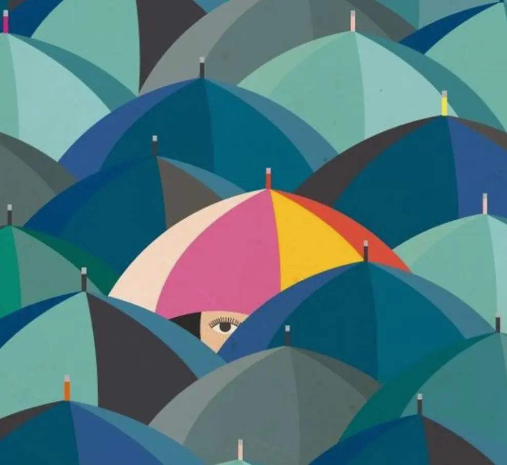
Variety is the engine of visual interest in any composition. Without it, a work of art risks becoming stagnant, predictable, or dull to the observer. By intentionally varying the size, color, or orientation of elements, an artist creates a sense of movement and energy that directs the eye across the canvas. This principle ensures that the viewer does not lose interest after a single glance, as there is always a new detail or relationship to discover within the frame.
When used effectively, variety works in tandem with unity to create a balanced masterpiece. Unity provides the structure, while variety provides the excitement. Think of it as a conversation where unity is the shared language and variety is the unique personality of the speakers. If a piece lacks variety, it often feels flat or repetitive. If it has too much, it becomes chaotic and difficult to interpret. Finding the sweet spot is essential for effective visual storytelling.
How to use variety in composition?
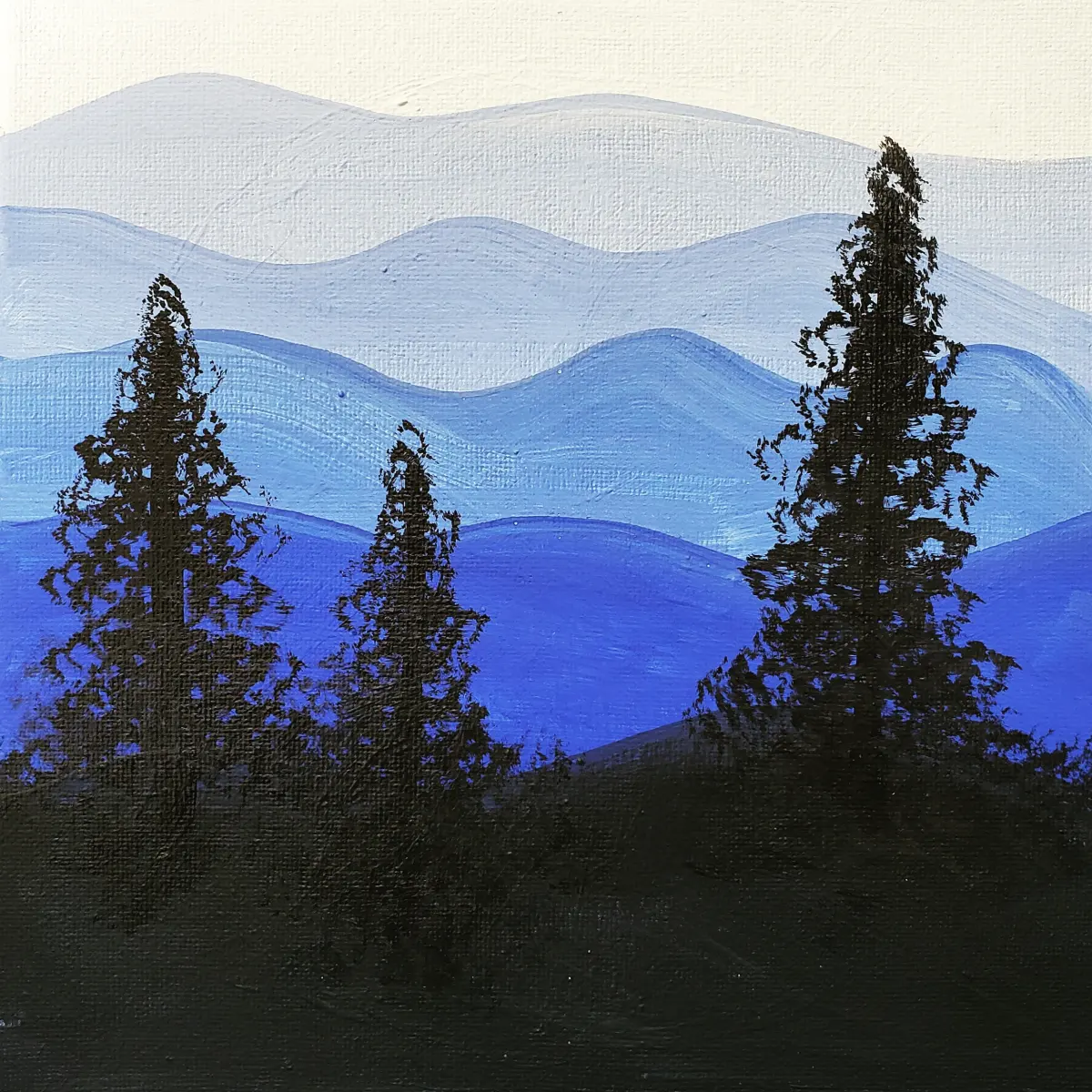
To introduce variety into your work, you must manipulate the fundamental elements of design. You can change the scale of objects, the intensity of colors, or the density of textures to create contrast. For example, a landscape painting might feature large, soft clouds contrasted against small, sharp, jagged rocks. This juxtaposition immediately creates a focal point and keeps the viewer’s attention moving across the entire scene.
Consider these methods to increase visual diversity in your next project:
- Vary the scale: Combine large, medium, and small shapes to create depth.
- Contrast color temperatures: Mix warm tones like oranges and reds with cool blues and greens.
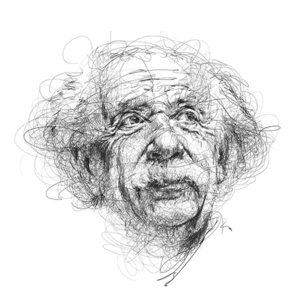
- Use line weight: Alternate between thin, delicate lines and thick, bold strokes to define forms.
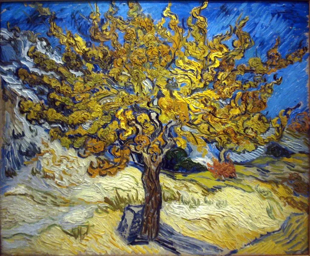
- Introduce texture: Pair smooth, flat surfaces with heavy, impasto brushwork or intricate patterns.
- Change orientation: Place some objects horizontally while others lean diagonally to create tension.
Best tools for creating variety
Artists use a range of physical and digital tools to achieve visual diversity. In painting, the choice of brush is paramount. A flat, wide brush creates broad, uniform strokes, while a small, round brush allows for fine, varied detail. By switching tools mid-process, you naturally introduce changes in mark-making that add complexity to the surface. Similarly, using a variety of mediums—such as mixing charcoal with graphite or watercolor with ink—creates inherent visual shifts that are difficult to replicate with a single tool.
In photography and graphic design, variety is often achieved through lighting and composition software. Adjusting the f-stop on a camera changes the depth of field, creating a sharp subject against a soft, varied background. In design software, altering layer opacity or blending modes allows for subtle shifts in color and texture. Regardless of the medium, the goal remains the same: to avoid uniform, repetitive patterns that lead to visual fatigue. Always experiment with different tools to see how they affect the final output.
Common mistakes when using variety
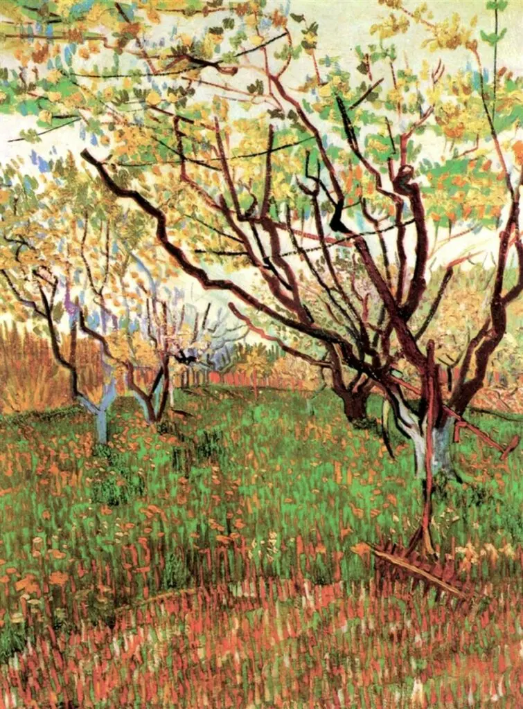
The most frequent error artists make is over-complicating a composition, which leads to visual chaos. This happens when an artist tries to include too many different shapes, colors, or textures without a unifying theme. When everything in a painting is shouting for attention, nothing is heard. This creates a cluttered, overwhelming experience that causes the viewer to look away rather than engage with the work. Always step back frequently to ensure that the variety you have added still serves the overall message.
Another common mistake is failing to balance variety with unity. If you introduce too many disparate elements, the work loses its cohesive structure. To avoid this, follow these steps to maintain control:
- Establish a primary focal point that anchors the composition.
- Use a limited color palette to tie different shapes together.
- Repeat one element, such as a specific shape or line style, throughout the piece.
- Evaluate the "flow" to ensure the eye moves naturally between the varied sections.
- Remove any element that distracts from the core subject or theme.
How to balance unity and variety
Balancing these two principles is the hallmark of a skilled artist. Think of unity as the "glue" and variety as the "spice." If you have too much glue, the work is stuck in a boring, singular state. If you have too much spice, the work becomes unpalatable. To achieve harmony, try to group similar elements together while allowing a few distinct, contrasting elements to stand out. This creates a hierarchy of information that guides the viewer's eye in a logical, pleasing sequence.
A helpful exercise is to create a thumbnail sketch before starting your final piece. In this small format, focus entirely on the placement of varied shapes. Ask yourself if there is enough contrast to keep the eye moving, but enough repetition to make the image feel like a single, unified idea. By planning these relationships early, you avoid the frustration of trying to fix a cluttered composition later. Remember that the goal is to create a rich, engaging experience that invites the viewer to linger and explore every corner of your work.
Key facts
- Variety is a principle of design that uses diverse elements to create visual interest and prevent monotony in a composition.
- Artists achieve variety by manipulating differences in scale, color, texture, shape, and line weight within a single work.
- Too much variety can lead to visual chaos, so it is often balanced with unity to keep the viewer’s eye engaged.
- A common technique is to use a dominant color or shape while introducing small, contrasting details to break up repetitive patterns.
- In photography, variety is often created by shifting camera angles or changing the depth of field to emphasize different subjects.
- To test for variety, squint at your artwork; if the composition looks like a flat, uniform gray blob, you likely need more contrast.
The bottom line
Variety is the essential engine of visual interest in any artistic composition. By intentionally introducing differences in scale, texture, color, and shape, artists prevent their work from becoming stagnant or predictable. The goal is not to create chaos, but to provide a dynamic experience for the viewer. When balanced correctly with unity, variety guides the eye across the canvas, making the artwork both memorable and engaging.
People also ask
How does variety differ from contrast?
Contrast refers specifically to the juxtaposition of opposing elements, such as light versus dark or rough versus smooth. Variety is a broader principle that encompasses all the different elements used to keep a viewer’s interest throughout a piece.
Can an artwork have too much variety?
Yes, excessive variety often leads to a lack of focal point and can make an artwork feel cluttered or overwhelming. This state is known as visual noise, which prevents the viewer from understanding the artist's intent.
What is the relationship between variety and unity?
Unity provides the sense of wholeness and order, while variety provides the excitement and complexity. Effective compositions rely on a strategic balance between these two to ensure the work is both cohesive and stimulating.
How can I add variety to a monochromatic painting?
You can introduce variety by varying the texture of the paint, such as using thick impasto alongside thin washes. Additionally, changing the scale of your shapes or the density of your line work will create visual depth without needing multiple colors.
Is variety necessary in minimalist art?
Even in minimalism, variety is essential to prevent the work from appearing sterile or unfinished. Minimalist artists often use subtle variations in material finish or tiny shifts in geometric proportions to maintain engagement.
What is a common mistake when trying to add variety?
A frequent error is adding too many competing focal points, which confuses the viewer's eye. Always ensure that your primary subject remains the most prominent element, using variety only to support or frame that central focus.
This answer was created with the help of AI research tools and reference sources. Spotted an error? Let us know — we correct mistakes quickly. See our editorial policy.