What is a drawing on toned paper?
Short answer
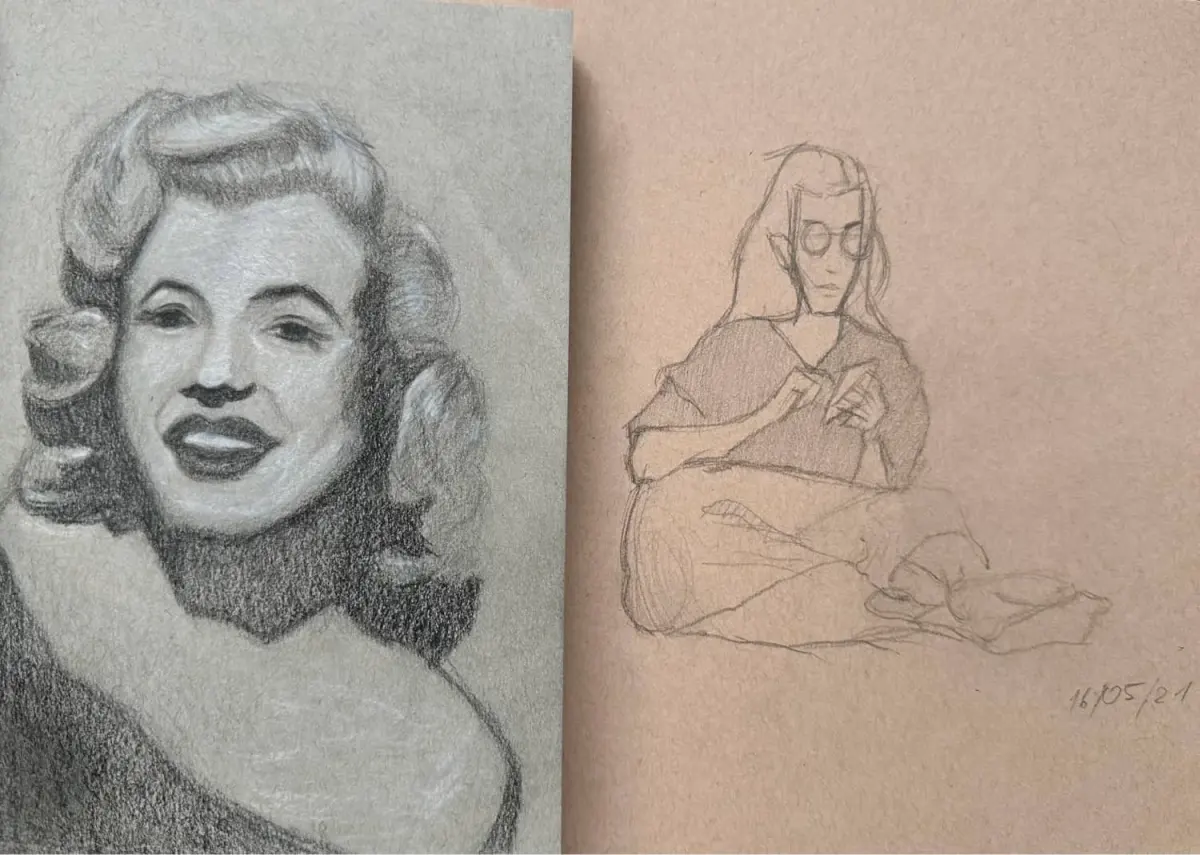
Drawing on toned paper involves using a mid-tone surface—typically gray, tan, or blue—rather than stark white. This technique allows artists to establish shadows and highlights simultaneously. By working with both dark media and white pigments, creators achieve greater depth, volume, and atmospheric effects more efficiently than on traditional bright white sheets.
On this page
What is toned paper used for?
Toned paper serves as a middle ground in the value scale of a drawing. On white paper, an artist must laboriously shade the entire background to create a sense of atmosphere or volume. On toned paper, the paper color acts as the mid-tone, meaning the artist only needs to add the darkest shadows and the brightest highlights to complete the image. This significantly reduces the time required to build form and creates a more cohesive, unified look across the page.
Historically, masters like Leonardo da Vinci and Albrecht Dürer utilized toned papers, often called "prepared papers," to enhance their sketches. By using a colored ground, they could focus on the interplay of light and shadow, which is the foundation of realistic rendering. Today, artists use toned paper for portraiture, figure studies, and urban sketching because it provides an immediate sense of mood and lighting that feels more sophisticated than drawings on plain white surfaces.
How to choose the best paper for drawing
Selecting the right paper depends on the medium you intend to use. Toned papers come in various weights, textures, and colors, each offering different benefits for specific drawing tools. For beginners, a smooth or medium-tooth paper is usually best because it allows for easy blending and precise mark-making. You should consider the following factors when purchasing your first pad:
- Weight: Aim for at least 80 lbs (120 gsm) to ensure the paper can handle multiple layers of media without buckling.
- Color: Tan or "kraft" tones provide a warm, classic look, while gray tones are neutral and excellent for studying cool light.
- Texture: A "vellum" or "cold press" surface provides enough tooth to grab charcoal or pastel particles effectively.
- Acid-free quality: Ensure the paper is archival to prevent it from yellowing or becoming brittle over time.
Avoid extremely thin papers, as they often tear when you apply heavy pressure with white charcoal or erasers. If you are using wet media like ink or markers, look for specialized toned papers labeled as "marker paper" or "mixed media" to prevent bleeding.

Why artists use white charcoal and black ink
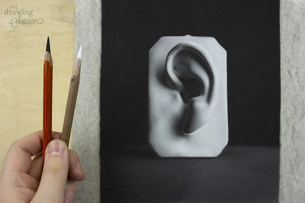
The core advantage of toned paper is the ability to use a "three-tone" system: darks, mid-tones, and lights. You use black charcoal or ink for the deepest shadows, while white chalk, white charcoal, or white gel pens are used to bring out the highlights. This technique mimics the way light actually behaves in the real world, where objects are rarely illuminated against a perfectly white background.
By utilizing the paper color as your mid-tone, you create a sense of three-dimensional volume much faster. The contrast between the darks and the lights against the colored background creates a dramatic, sculptural effect. This method is particularly popular for life drawing, as it allows artists to capture the complex curves of the human body with just a few strategic strokes. It forces you to think about light direction from the very first mark, which improves your overall observational skills and artistic decision-making.

Common mistakes when drawing on toned paper
Many beginners struggle because they treat toned paper exactly like white paper, often ignoring the mid-tone entirely. A frequent error is failing to use enough white pigment, resulting in a drawing that looks flat and muddy. You must be bold with your highlights to make the subject pop off the page. Conversely, some artists over-rely on white, creating "chalky" drawings that lack the necessary dark shadows to provide structural integrity.
- Neglecting the mid-tone: If you shade everything too dark or too light, you lose the benefit of the paper color.
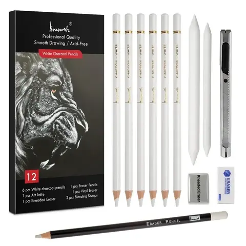
- Using the wrong white media: Standard white pencils are often too waxy; use white charcoal or pastel pencils for better opacity.
- Over-blending: Excessive rubbing can smear your darks into your lights, turning the entire drawing into a gray, featureless mess.
- Ignoring the edges: Ensure your shadows have sharp, clean edges where appropriate, rather than just soft, blurry transitions everywhere.
Always step back from your work frequently to check if the balance between your darkest darks and brightest lights is sufficient to create a convincing focal point.
How to finish a drawing on toned paper
Finishing a drawing on toned paper requires a final assessment of your value range. Once the shadows and highlights are placed, look for areas that need "reflected light." This is a subtle, secondary light source that bounces back into the shadows, which can be easily achieved on toned paper by applying a very light touch of white charcoal within the shaded areas. This simple step adds immense realism and depth to your work.
Finally, protect your drawing, especially if you have used charcoal or pastel. Because these materials sit on the surface of the paper, they are prone to smudging. Use a high-quality workable fixative spray in a well-ventilated area, applying light, even coats to avoid darkening the paper or changing the appearance of your highlights. Once dry, store your work in a portfolio or frame it behind glass to ensure the integrity of the drawing is preserved for years to come.
Key facts
- Toned paper is any paper that is not pure white, typically featuring shades of gray, tan, cream, or blue.
- The primary advantage of toned paper is that it allows artists to build up both highlights and shadows simultaneously.
- White charcoal or opaque white gouache is used to create light values, while black media provides the darkest shadows.
- Mid-tone paper acts as the base value, eliminating the need to shade in every single area of the drawing.
- Popular historical examples include the "chiaroscuro" drawings of the Italian Renaissance, often executed on blue paper.
- Avoid using heavy pressure with white pencils initially, as it can burnish the paper and prevent further layering.
The bottom line
Drawing on toned paper is a sophisticated technique that shifts the artist's focus from filling a blank void to defining light and shadow against a neutral base. By utilizing the paper’s inherent color as a mid-tone, you can achieve a three-dimensional effect with greater speed and efficiency. It is an essential skill for any artist looking to master value relationships and create more dynamic, professional-looking compositions.
People also ask
Why do artists prefer toned paper over white paper?
Toned paper provides an immediate mid-tone, which saves time by allowing the artist to focus only on the lightest and darkest values. This creates a balanced, atmospheric depth that is much more difficult to achieve on a stark white surface.
What is the best medium to use on toned paper?
Charcoal, graphite, and pastel are ideal because they adhere well to the tooth of the paper. Combining these with a white highlight tool, such as a white charcoal pencil or gel pen, yields the best results.
Does the color of the paper affect the mood of the artwork?
Yes, the paper color acts as an underlying filter for the entire drawing. A cool gray paper can make a scene feel somber or industrial, while a warm tan or "kraft" paper often evokes a classic, vintage aesthetic.
How do I prevent my highlights from looking muddy?
Always apply your darkest shadows first, then build up to your highlights. If you apply white too early, you may accidentally smudge dark pigments into the light areas, which ruins the brightness of the highlights.
Can I use watercolor on toned paper?
You can, provided the paper is heavy enough to handle moisture, such as toned sketchbook paper or mixed-media paper. Note that the paper color will shift the appearance of any transparent paint applied over it.
What is the most common mistake beginners make with toned paper?
The most frequent error is ignoring the mid-tones and treating the paper like white paper. Artists should leave the paper visible in areas that are neither the brightest highlights nor the deepest shadows to maintain the drawing's unity.
This answer was created with the help of AI research tools and reference sources. Spotted an error? Let us know — we correct mistakes quickly. See our editorial policy.