What techniques did Egon Schiele use?
Short answer
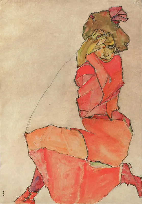
Egon Schiele utilized a distinctive technique defined by raw, agitated line work and expressive, distorted anatomy. He frequently combined charcoal or graphite outlines with thin, translucent washes of watercolor and gouache. His process emphasized emotional intensity over realism, often leaving large areas of the paper blank to heighten the subject’s psychological impact.
On this page
How to achieve Schiele’s signature line work
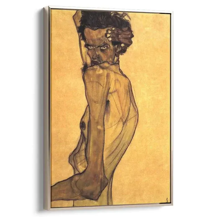
Schiele’s primary tool was the pencil or charcoal stick, which he used to create jagged, nervous, and highly rhythmic contours. Unlike traditional academic drawing, which seeks to smooth out forms, Schiele’s lines often break and overlap to suggest tension and movement. He frequently applied pressure inconsistently, allowing the line to thicken or taper abruptly, which gave his figures a sense of nervous energy. To replicate this, avoid the urge to create continuous, fluid outlines. Instead, focus on short, staccato strokes that follow the anatomical tension of the body rather than its literal shape.
When practicing this style, keep your hand loose and prioritize the "feeling" of the pose over anatomical perfection. Schiele often exaggerated the joints, fingers, and spinal curves to emphasize the vulnerability of his subjects. By emphasizing these bony protrusions, he transformed the human form into a landscape of psychological distress. Remember that the goal is not to copy the body exactly, but to interpret its physical strain through a series of sharp, deliberate marks that communicate a specific mood.
How to use watercolor and gouache like Schiele
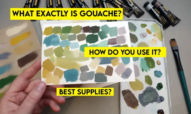
Schiele’s coloring technique was remarkably sparse, often leaving the majority of the paper white to create a stark, clinical atmosphere. He typically applied thin, watery washes of gouache or watercolor, which allowed the texture of the heavy-weight paper to remain visible. These colors were rarely blended into smooth gradients; instead, he applied them in flat, localized patches that sat within his complex charcoal outlines. This approach created a sense of fragmentation, as if the subject were being assembled from disparate, incomplete pieces.
To achieve this effect, follow these steps:
- Complete your charcoal or graphite drawing first, ensuring the lines are dark and expressive.
- Dilute your paint significantly with water to create a translucent, ink-like consistency.
- Apply the color in small, controlled patches, avoiding the urge to fill the entire figure.
- Use muted, earthy tones—ochres, burnt umbers, and bruised violets—to maintain his signature somber palette.
- Allow the paint to dry completely before adding any final, darker details to avoid muddying the colors.
Why Schiele’s anatomical distortion happens
Schiele’s work is characterized by a deliberate rejection of classical proportion in favor of psychological expression. He viewed the body as a vessel for inner turmoil, leading him to twist limbs into impossible angles and elongate torsos to emphasize the skeleton beneath the skin. This distortion was not a lack of skill, but a calculated choice to strip away the "mask" of social etiquette. By focusing on the awkwardness of the human frame, he forced the viewer to confront the raw, unvarnished reality of the individual.
Artists often struggle with this technique because it requires unlearning the rules of naturalism. To channel Schiele’s perspective, observe how the body shifts when under stress or in pain. Rather than drawing the arm as a cylinder, consider the way the shoulder blade protrudes or the way the neck tendons strain when the head is tilted. By focusing on these specific points of physical resistance, you can create a figure that feels alive and burdened by its own existence, effectively capturing the essence of the Viennese Expressionist style.
Common mistakes when drawing in Schiele’s style
A frequent mistake beginners make is overworking the drawing by adding too much shading or cross-hatching. Schiele’s power lies in his economy of mark-making; he knew exactly where to place a line and where to leave the paper empty. When you add unnecessary shadows, you lose the stark, graphic quality that defines his work. Another common error is attempting to make the figure look "pretty" or symmetrical. Schiele’s art thrives on asymmetry and the inherent "ugliness" of the human condition, so embracing the awkwardness is essential for authenticity.
To avoid these pitfalls, keep the following guidelines in mind:
- Limit your palette to three or four colors to prevent the work from looking decorative or overly polished.
- Do not attempt to shade the background; keep the figure isolated in a void to emphasize its loneliness.
- Avoid using soft, blended pencil strokes, as these undermine the aggressive, sharp nature of the original style.
- Practice drawing from life, but consciously choose to exaggerate one feature, such as the length of a finger or the sharpness of a chin, to break away from literal representation.
How to create a psychological portrait
The final element of Schiele’s technique involves the direct, often confrontational gaze of his subjects. His portraits are rarely passive; they engage the viewer, creating a sense of intimacy that is occasionally uncomfortable. He achieved this by placing his subjects in close-up, cropped frames that removed any context of the room or environment. This focus on the face and hands strips away all distractions, leaving only the raw personality of the sitter. To emulate this, position your subject so that they are looking directly at you, and tighten your composition until the figure dominates the page.
When working on these portraits, focus on the eyes and the hands, as these are the primary vehicles for emotion in Schiele’s work. Use your charcoal to emphasize the dark circles under the eyes or the tension in the knuckles. By concentrating on these specific areas, you can imbue your work with a sense of narrative depth that transcends simple technical skill. The result should be a portrait that feels less like a static image and more like a captured moment of intense, private reflection that invites the viewer into a deeper, more profound connection with the subject.
Key facts
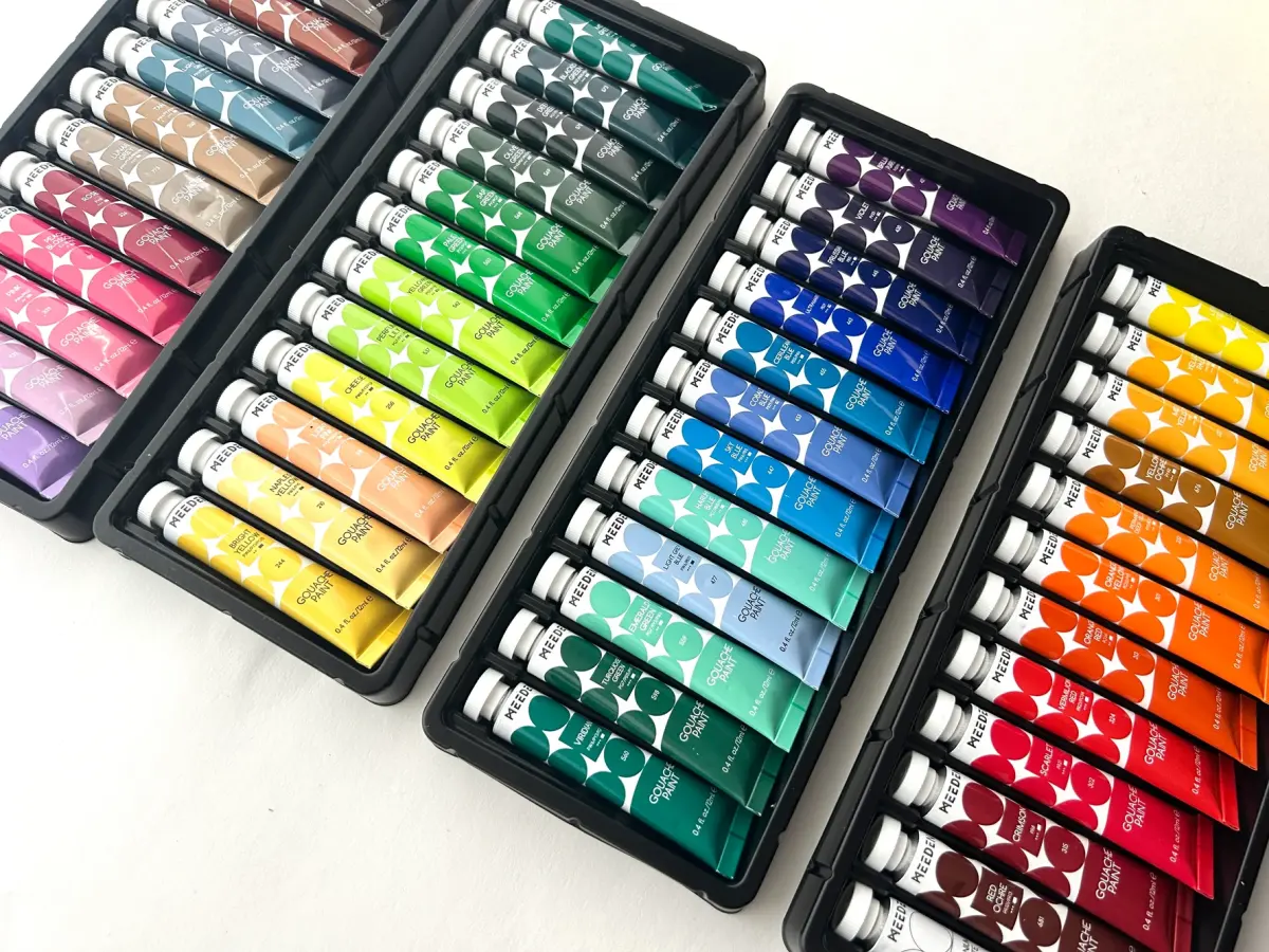
- Schiele primarily used gouache, watercolor, and black crayon, often layering these media on paper to create textured, raw surfaces.
- He frequently utilized a "contour-first" technique, drawing jagged, expressive lines before filling them with thin, translucent washes of color.
- Many of his works feature unpainted areas of the paper, allowing the negative space to interact with the distorted, elongated figures.
- He often applied paint directly from the tube or used dry-brush techniques to create scratchy, nervous textures that emphasized emotional intensity.
- His color palette was deliberately non-naturalistic, frequently employing sickly greens, bruised purples, and jarring oranges to convey psychological distress.
- A common mistake for students is over-blending; Schiele’s power lies in the sharp, unrefined edges and deliberate lack of smooth transitions.
The bottom line
Egon Schiele’s technique was defined by a rejection of academic polish in favor of raw, psychological honesty. By combining jagged, expressive linework with jarring, non-naturalistic color palettes, he captured the vulnerability of the human form. Aspiring artists should prioritize the emotional gesture of a pose over anatomical perfection, using bold outlines and negative space to create a striking, visceral impact that remains timelessly provocative today.
People also ask
Did Egon Schiele use oil paints?
Yes, Schiele used oil paints, though his approach was often sculptural and thick. He frequently applied paint with a palette knife to create heavy impasto, contrasting with his lighter watercolor works.
How did Schiele achieve his signature distorted proportions?
He practiced extreme foreshortening and elongated limbs to express inner turmoil rather than anatomical accuracy. He often posed his models in cramped, uncomfortable positions to capture a sense of vulnerability.
What was the significance of his line work?
His lines were intentionally nervous and broken, reflecting the influence of Art Nouveau but stripped of its decorative elegance. This "nervous line" became his trademark for conveying the frailty of the human condition.
Did Schiele use photographs to create his portraits?
Schiele relied heavily on live models, often spending hours observing them in his studio. He preferred the physical presence of the subject to capture the tension and specific gestures he wanted to depict.
Why did he leave so much of the paper blank?
Leaving the paper blank helped isolate the figure, forcing the viewer to focus entirely on the subject's posture and facial expression. It also prevented the background from distracting from the raw, psychological intensity of the work.
How can I mimic his style without losing the emotional impact?
Focus on the gesture of the subject rather than the details of the face or clothing. Use a dark, bold outline to define the shape and keep your color application minimal and expressive rather than realistic.
This answer was created with the help of AI research tools and reference sources. Spotted an error? Let us know — we correct mistakes quickly. See our editorial policy.