What colors make magenta?
Short answer
Magenta is created by mixing equal parts of primary red and blue light in the additive color model. In pigment-based subtractive systems, such as painting or printing, magenta is a primary color that cannot be created by mixing other hues. It sits between purple and red on the visible spectrum.
On this page
How light creates magenta
In the additive color system, which governs how screens like televisions and smartphones display images, magenta is produced by combining red and blue light. Unlike green, which is a primary color of light, magenta does not exist as a single wavelength on the visible spectrum. Instead, the human brain perceives magenta when the red and blue cones in our eyes are stimulated simultaneously without the activation of green cones. This phenomenon is known as non-spectral color, meaning it is a construct of our visual system rather than a specific frequency of light.
When you adjust the settings on a digital monitor, you are manipulating these light channels to produce a wide gamut of colors. Increasing the intensity of red and blue light to their maximum levels while keeping green at zero results in a vibrant, saturated magenta. This process demonstrates how digital displays simulate the full range of human-perceived color using only three primary light sources. Understanding this distinction is essential for anyone working in digital design, photography, or video production, as it explains why certain colors appear differently on screens compared to physical prints.
Why you cannot mix magenta with paint
Many artists mistakenly attempt to create magenta by mixing red and blue paints, but this usually results in a dull, muddy purple or violet. In the subtractive color model used for physical pigments, magenta is a primary color, meaning it is a fundamental building block that cannot be derived from other hues. If you mix standard red and blue pigments, you are essentially combining multiple wavelengths that absorb light, which leads to a loss of saturation. Because pigments are subtractive, they remove light rather than adding it, causing the final mixture to lean toward a dark, desaturated brown or gray.
If you are looking to work with magenta in a painting or printing context, you must purchase a tube of paint labeled as magenta or a process-magenta ink. Professional artists often use specific pigments to achieve the desired effect:
- Quinacridone Magenta: A highly transparent and vibrant pigment favored for its lightfastness.
- Permanent Rose: A slightly cooler variation that provides a clean, bright tone.
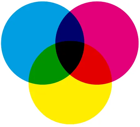
- Process Magenta: The standard ink used in CMYK printing to ensure accurate color reproduction.
How to use magenta in color mixing
While you cannot create magenta from other colors, you can use it as a base to expand your palette significantly. Magenta is an incredibly versatile color that acts as a bridge between the warm red side of the color wheel and the cool blue side. By adding small amounts of other colors to a magenta base, you can create a range of sophisticated hues that are impossible to achieve with standard red or blue primaries. This makes magenta an essential tool for painters who want to mix complex violets, deep burgundies, or soft, delicate pinks.
To experiment with magenta in your own work, follow these steps to see how it interacts with other pigments:
- Start with a small dab of pure magenta on your palette.
- Gradually add a tiny amount of white to observe the transition into various shades of pink.
- Mix in small increments of yellow to create warm, vibrant oranges and corals.
- Add touches of cyan or blue to explore the spectrum of deep purples and indigos.
Common mistakes when mixing magenta
The most frequent error beginners make is assuming that red and blue will yield a bright magenta. Because most red paints are actually warm, orange-leaning reds, they contain yellow undertones that neutralize the blue, resulting in a brownish violet. Similarly, if your blue paint has green undertones, the mixture will lean toward a muddy, slate-like color. To avoid these issues, always check the label of your paint or ink to identify the specific pigment composition before you begin your project.
Another common mistake is over-mixing your pigments, which can lead to a flat, lifeless appearance. When working with high-chroma colors like magenta, it is best to mix them gently and use them in thin layers or glazes. If you find your mixture becoming too dark, resist the urge to add black, as this will quickly kill the vibrancy of the magenta. Instead, use white to lighten the tone or a complementary green to subtly adjust the saturation. Keeping your mixing surface clean is also vital, as even a tiny residue of yellow or black can shift your magenta into an unwanted hue.
Where magenta fits in the color wheel
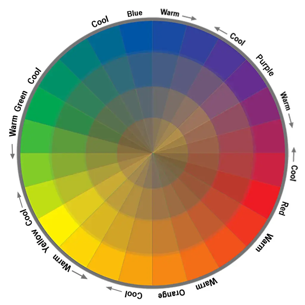
Magenta occupies a unique position in color theory because it connects the two ends of the visible spectrum. In a traditional color wheel, red and violet are usually placed at opposite ends, but magenta acts as the bridge that completes the circle. This placement is crucial for the CMYK printing process, which stands for Cyan, Magenta, Yellow, and Key (black). By using these three primary pigments, printers can reproduce a massive range of colors that would be impossible to achieve with a traditional RYB (Red, Yellow, Blue) model.
The importance of magenta extends beyond art and into the world of science and technology. It serves as a fundamental component in color calibration, ensuring that the images you see on your devices match the colors produced by high-end printers. Whether you are a graphic designer balancing digital assets or a painter looking to broaden your color range, recognizing magenta as a primary rather than a secondary color will change how you approach every project. By mastering this color, you gain the ability to create a more accurate and vibrant representation of the world around you.
Key facts
- Magenta is a non-spectral color, meaning it does not exist as a single wavelength of light in the visible spectrum.
- In the subtractive color model (CMYK), magenta is a primary pigment created by combining equal parts of blue and red light in digital displays, but it is a base ink in printing.
- To mix magenta paint, start with a primary red and add a tiny amount of blue or violet, adjusting gradually to avoid creating a muddy purple.
- The human brain perceives magenta because our eyes receive stimulation from both red and violet wavelengths simultaneously, forcing the brain to "invent" the color.
- When printing, magenta ink is one of the four standard process colors, alongside cyan, yellow, and black, used to reproduce a wide gamut of hues.
- Avoid mixing magenta with green or yellow, as these are complementary colors that will neutralize the brightness and turn the mixture into a dull brown or gray.
The bottom line
Magenta is a unique color because it does not exist as a single wavelength of light, but is instead a mental construct created when our eyes perceive red and blue light simultaneously. Whether you are mixing paints or designing for digital screens, understanding that magenta acts as a primary pigment in printing is essential for achieving accurate color reproduction and vibrant results in your creative projects.
People also ask
Is magenta the same as purple?
No, magenta and purple are distinct. Purple is a spectral color found on the edge of the rainbow, while magenta is an extra-spectral color created by the brain when red and blue light receptors are triggered together.
Why is magenta used in printers instead of red?
Printers use magenta because it is a primary subtractive color that allows for a wider range of pinks, purples, and reds when mixed with cyan and yellow. Red is a secondary color in this system and cannot be used to create magenta.
Can you create magenta using only primary colors?
In light-based systems, you create magenta by mixing red and blue light. In painting, you must use a cool-toned red, such as quinacridone or alizarin crimson, to successfully approximate the vibrant hue of magenta.
Why does magenta look different on a screen than on paper?
Screens use the RGB model, which produces magenta by emitting specific light frequencies. Paper uses the CMYK model, where the final color depends on light reflecting off ink pigments, which often results in a less saturated appearance.
What is the difference between magenta and fuchsia?
These terms are often used interchangeably, but fuchsia is technically a slightly more purple-leaning version of magenta. Both colors occupy the same space on the color wheel between red and violet.
How do I fix a muddy magenta mixture?
If your mixture looks brownish, you have likely added too much green or yellow. Add a small amount of pure cool-toned red or white to brighten the mixture and restore the pinkish vibrancy.
This answer was created with the help of AI research tools and reference sources. Spotted an error? Let us know — we correct mistakes quickly. See our editorial policy.