What is color temperature in art?
Short answer
Color temperature is a system for classifying colors as either "warm" or "cool" based on their psychological associations and visual properties. Warm colors like red, orange, and yellow suggest heat and sunlight, while cool colors like blue, green, and violet evoke shadows, water, and ice. Artists use this contrast to create depth and mood.
On this page
What is color temperature in art?
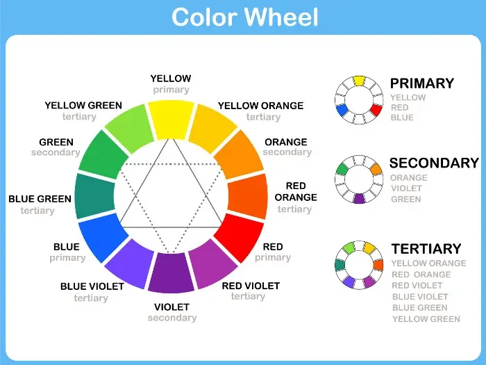
Color temperature is a relative concept used by painters to organize the color wheel into two distinct groups. Warm colors are generally those that lean toward the yellow, orange, and red side of the spectrum. These hues are often associated with fire, the sun, and intense emotions, appearing to advance toward the viewer in a composition.
Cool colors, conversely, occupy the blue, green, and violet side of the spectrum. These shades are associated with water, sky, and shade, and they typically appear to recede into the background. By understanding this division, an artist can manipulate the perceived distance and atmosphere of a scene. The temperature of a color is not fixed; it is often determined by its relationship to the colors surrounding it.
How to use color temperature in painting
To create a sense of depth, artists often place warm colors in the foreground and cool colors in the background. This technique mimics atmospheric perspective, where distant objects appear cooler and less saturated due to the scattering of light through the atmosphere. Mastering this balance is essential for creating realistic landscapes and complex interior scenes.
- Identify the dominant light source in your scene to determine the overall temperature.
- Mix a "warm" version and a "cool" version of every primary color on your palette.
- Apply warm highlights to areas directly hit by light and cool shadows to the shaded regions.
- Adjust the temperature of your midtones to bridge the gap between light and shadow areas.
Why does color temperature matter for artists?
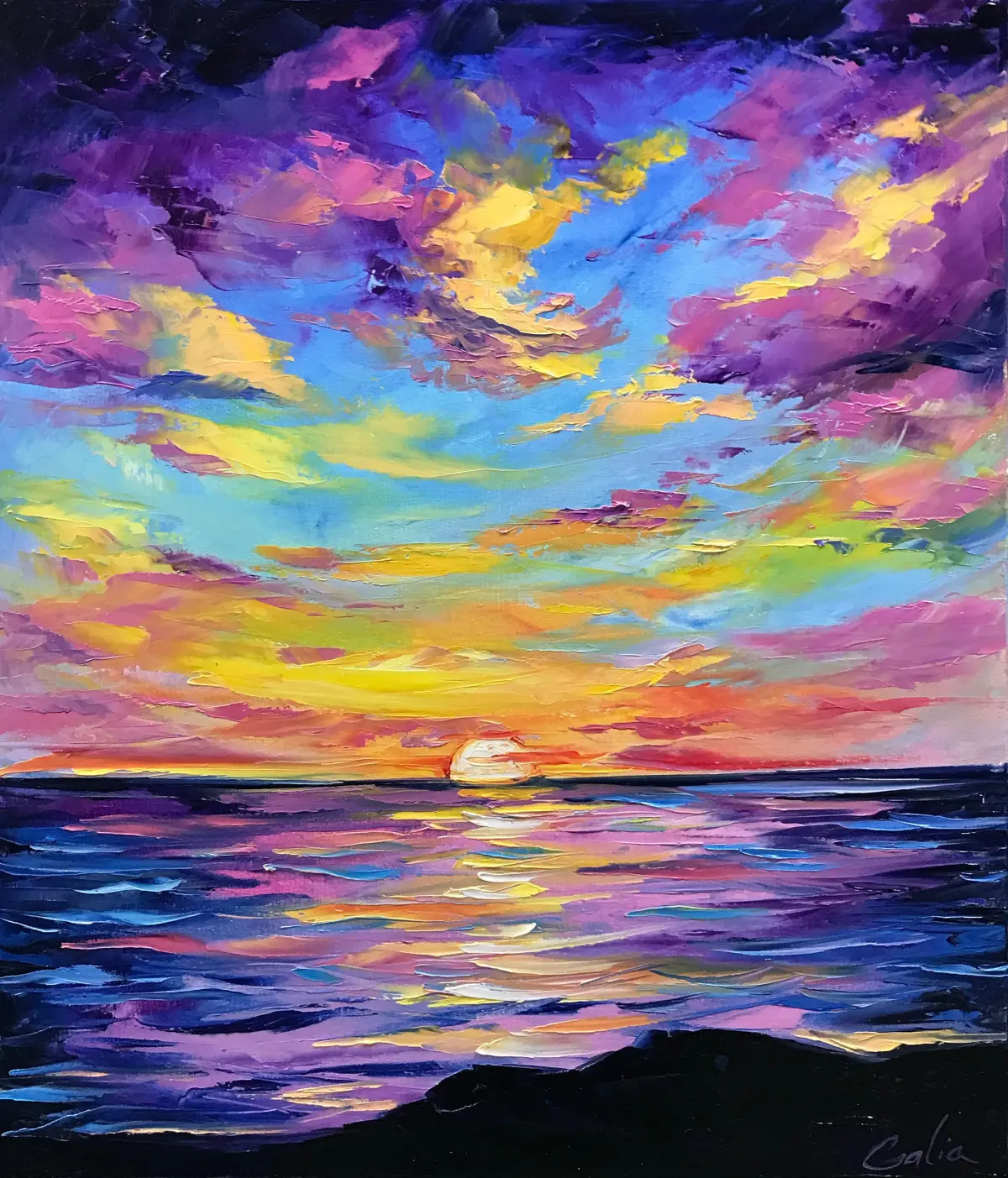
Color temperature is the primary tool for establishing the mood of a work. A painting dominated by warm tones will feel energetic, intimate, or aggressive, while a piece dominated by cool tones will feel calm, distant, or melancholic. By consciously choosing a temperature range, an artist can guide the viewer’s emotional response to the subject matter.
Furthermore, temperature is crucial for color mixing. If an artist wants to create a vibrant green, they must choose a blue and yellow that share a temperature bias. Mixing a warm yellow with a cool blue often results in a muddy or dull green because the colors are fighting against each other. Understanding the bias of each pigment allows for cleaner, more luminous color mixtures that maintain their integrity on the canvas.
Common mistakes when using color temperature
A frequent error is assuming that a color is inherently warm or cool without considering its context. For example, a "cool red" like Alizarin Crimson is still warmer than a "warm blue" like Ultramarine. Beginners often struggle because they view colors in isolation rather than as a set of relationships. Another mistake is using too many colors of the same temperature, which can make a painting feel flat and visually monotonous.
- Failing to account for the color of the light source, which dictates the temperature of shadows.
- Overusing high-intensity warm colors, which can overwhelm the viewer and create visual fatigue.
- Relying on black or white to adjust value without considering how they shift the temperature.
- Ignoring the "temperature bias" of individual pigments, leading to muddy, desaturated mixtures.
Best color temperature techniques for beginners
To practice, start by painting a simple object, such as an apple or a sphere, under two different lighting conditions. Use a warm light source like a candle or a sunset, then switch to a cool light source like a cloudy sky or a fluorescent bulb. This exercise forces you to observe how the local color of the object changes based on the temperature of the light hitting it.
- Limit your palette to one warm and one cool version of each primary color.
- Create a color chart that maps your pigments from the warmest to the coolest versions.
- Focus on "temperature contrast" rather than just "value contrast" to make your focal points pop.
- Study the works of Impressionist painters like Claude Monet, who famously used temperature shifts to capture the fleeting qualities of light.
By practicing these techniques, you will develop an intuitive sense of how color temperature functions. Eventually, you will be able to manipulate these relationships to create sophisticated, atmospheric works that feel balanced and intentional. Always remember that color is a conversation between adjacent hues, and the temperature is the language they use to communicate depth, light, and emotion to the viewer.
Key facts
- Color temperature is measured in Kelvins (K), with lower numbers appearing warmer (yellow/red) and higher numbers appearing cooler (blue).
- A standard candle flame is approximately 1,900 K, while a clear blue sky can reach 10,000 K or higher.
- In painting, artists use "warm" colors like cadmium red and "cool" colors like ultramarine blue to create the illusion of depth and atmospheric perspective.
- Mixing colors with different temperature biases can result in "muddy" or dull hues if the artist is not careful about color harmony.
- Light sources in a studio, such as daylight bulbs, are typically rated at 5,000 K to 6,500 K to provide neutral, accurate color rendering.
- A common mistake is using a "cool" red (leaning toward blue) to mix an orange, which will produce a muted, brownish color rather than a vibrant, clean orange.
The bottom line
Color temperature is a fundamental tool for artists to manipulate mood, depth, and light within a composition. By understanding that colors are relative and measured on the Kelvin scale, you can better control your color mixing and spatial relationships. Mastering the balance between warm and cool tones allows you to create more vibrant, realistic, and emotionally resonant works while avoiding common issues like muddy colors or flat perspectives.
People also ask
Does color temperature change the physical properties of paint?
No, color temperature is a perceptual quality rather than a chemical one. While pigments have different undertones, the physical binder and lightfastness of the paint remain unaffected by its perceived warmth or coolness.
Why do artists use a "split primary" palette?
A split primary palette includes two versions of each primary color: one warm and one cool. This allows artists to mix a wider range of clean, vibrant secondary colors by choosing the appropriate temperature bias for the desired result.
How does ambient light affect my artwork?
Ambient light acts as a color filter that shifts the appearance of your palette. If you paint under warm incandescent bulbs, your colors will look different than they would under cool, natural daylight, potentially leading to incorrect color choices.
What is the difference between hue and temperature?
Hue refers to the specific position of a color on the spectrum, such as red, blue, or yellow. Temperature is a relative quality that describes how a specific hue leans toward the warm or cool end of the spectrum.
Can a color be both warm and cool?
Yes, color temperature is relative to the colors surrounding it. A specific shade of green might look cool when placed next to a bright orange but look warm when placed next to a deep violet.
How do I fix a painting that looks too flat?
You can create depth by using warm colors for foreground elements, which tend to advance, and cool colors for background elements, which tend to recede. This technique mimics atmospheric perspective, where distant objects appear cooler and less saturated.
This answer was created with the help of AI research tools and reference sources. Spotted an error? Let us know — we correct mistakes quickly. See our editorial policy.