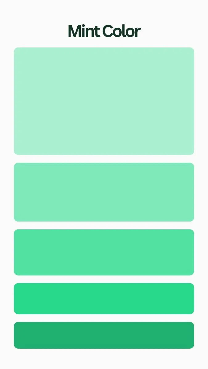
What colors go with mint green?
Short answer
Mint green pairs beautifully with crisp white, soft grays, warm wood tones, and metallic accents like gold or copper. For a bolder aesthetic, consider contrasting it with navy blue, coral, or blush pink. These combinations balance the cool, refreshing nature of mint with grounding neutrals or vibrant, complementary color pops.
On this page
Which neutral colors look best with mint green?
Neutral colors serve as the foundational backdrop for mint green, allowing its unique, cool-toned vibrancy to shine without overwhelming a space. Crisp, bright white is the most popular choice, as it enhances the freshness of mint and creates a clean, airy atmosphere reminiscent of a coastal cottage or a modern minimalist interior. Soft grays, particularly those with cool undertones, provide a sophisticated contrast that prevents the green from feeling too juvenile. Beige and cream can also work, though they introduce warmth that shifts the overall mood toward a more traditional or rustic aesthetic.
When selecting your primary neutral, consider the lighting in your room. In spaces with limited natural light, pairing mint with high-gloss white helps reflect available brightness, making the area feel significantly more expansive. If you prefer a moodier or more grounded look, charcoal gray creates a striking, high-contrast effect that elevates mint green into a more contemporary, design-forward palette. Stick to these neutral anchors to maintain visual harmony and avoid a cluttered appearance.
How to use bold colors with mint green?
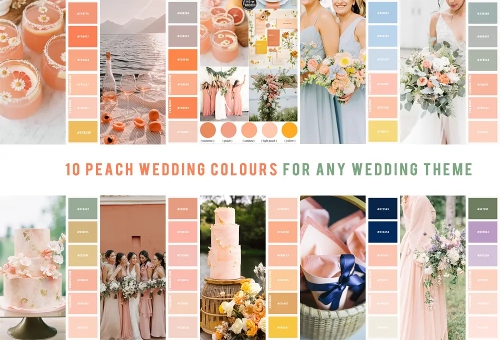
Integrating bold colors with mint green requires careful balance to ensure the space remains cohesive rather than chaotic. Because mint is a pastel, it pairs exceptionally well with saturated, jewel-toned colors that offer a sophisticated contrast. Navy blue is a classic choice, providing a deep, grounding anchor that tempers the lightness of the green. Alternatively, warm colors like coral, peach, or terracotta introduce a playful, energetic vibe that creates a balanced temperature in the room.
To successfully incorporate these bold accents, follow these professional design strategies:
- Use the 60-30-10 rule: 60% of the room should be a neutral, 30% should be mint green, and 10% should be your bold accent color.
- Focus on textiles: Introduce bold colors through throw pillows, rugs, or curtains rather than painting walls, which makes it easier to swap styles later.
- Limit the palette: Avoid using more than two bold accent colors alongside mint to prevent visual fatigue and maintain a curated, intentional look.
Best metallic accents for mint green decor
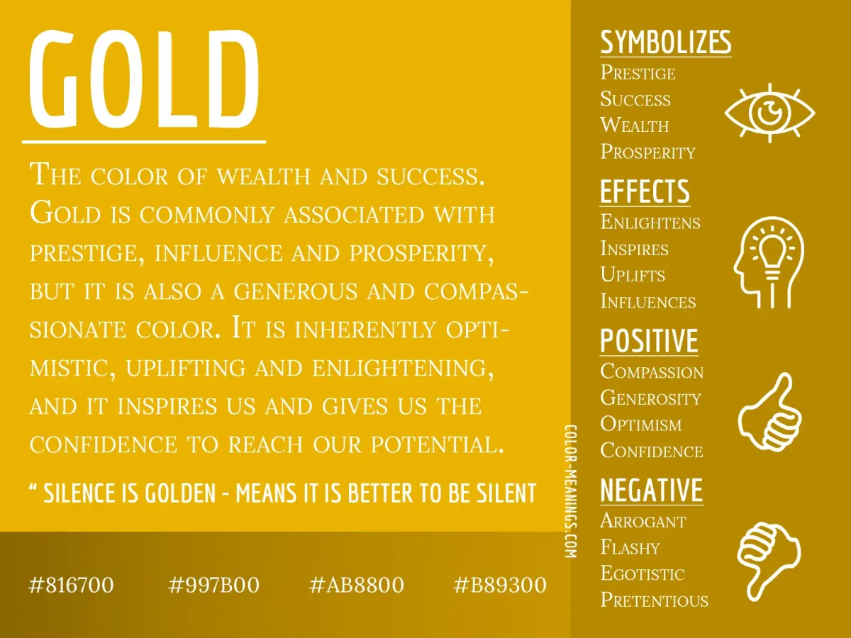
Metals act as the jewelry of a room, and the right finish can drastically alter how mint green is perceived. Gold and brass are arguably the best partners for this shade, as their warm, yellow-based undertones provide a beautiful contrast to the cool, blue-green base of mint. This combination creates an elegant, high-end look often found in boutique hotels and modern luxury homes. Copper is another excellent option, offering a slightly more rustic or industrial charm that feels warm and inviting.
If you prefer a sleek, contemporary aesthetic, silver and chrome are suitable alternatives. These cool-toned metals emphasize the refreshing, crisp quality of mint green, making it feel more clinical or high-tech. To achieve a professional finish, consider these steps:
- Identify your dominant metal finish: Choose one primary metal for hardware, such as cabinet pulls or light fixtures, to maintain consistency.
- Layer textures: Mix matte and polished finishes of the same metal to add depth without introducing clashing colors.
- Balance the scale: Use larger metallic pieces like floor lamps or mirrors to anchor the mint green elements.
Common mistakes when pairing colors with mint green
The most frequent mistake when decorating with mint green is treating it as a neutral rather than a color. Because it is a pastel, people often assume it will match everything, leading to palettes that feel disjointed or washed out. Another common error is pairing mint with colors that share too much similarity in saturation, such as light yellow or pale lavender. This can result in a "nursery" effect that feels overly soft and lacks the necessary contrast to define the space.
Avoid these pitfalls by focusing on depth and saturation:
- Avoid pairing mint with "muddy" colors like olive or mustard, which can make the mint look dirty or faded.
- Do not overload a room with too many pastels; always include at least one dark or high-contrast element to ground the design.
- Pay attention to undertones: Ensure that your chosen white or gray is not too yellow, as this will clash with the cool, icy nature of the mint.
Tips for styling mint green in different rooms
Mint green is a versatile color that adapts well to various functions, from the relaxing atmosphere of a bedroom to the high-energy environment of a kitchen. In a kitchen, mint cabinetry looks stunning when paired with white marble countertops and brass hardware. This combination creates a timeless, clean aesthetic that feels both vintage and modern. In a bedroom, use mint as an accent wall behind the bed, paired with navy blue bedding and soft gray curtains to create a tranquil, spa-like retreat.
For living areas, consider using mint green through upholstered furniture, such as a velvet armchair, paired with a charcoal sofa. This approach allows the mint to act as a focal point without dominating the entire color scheme. Regardless of the room, always test paint swatches or fabric samples in both daylight and evening light. Mint green changes significantly under artificial lighting, often appearing more blue or more yellow depending on the bulbs you use. By testing your colors in situ, you ensure the final result matches your vision perfectly.
Key facts
- Pair mint green with crisp white to create a clean, airy, and high-contrast aesthetic.
- Use soft gray as a neutral bridge to prevent the mint from appearing too juvenile or overly sweet.
- Combine mint with metallic gold or brass accents to add a layer of sophisticated warmth to the space.
- Incorporate navy blue or charcoal as a grounding element to balance the brightness of mint green.
- Avoid pairing mint with neon yellow or bright orange, as these can create a jarring, discordant visual effect.
- Apply the 60-30-10 rule: use mint for 30 percent of the room while keeping 60 percent neutral and 10 percent as an accent.
The bottom line
Mint green is a versatile, refreshing hue that thrives when balanced with intentional neutrals and metallic accents. To achieve a polished look, prioritize high-contrast pairings like navy or crisp white, and avoid overly saturated warm tones that clash with its cool base. By applying the color in measured doses rather than overwhelming a space, you can create a sophisticated, airy environment that feels both modern and timeless.
People also ask
Is mint green considered a warm or cool color?
Mint green is primarily a cool color because it contains significant blue undertones. It creates a refreshing and calming atmosphere, making it ideal for bedrooms and bathrooms.
Can mint green be used in a professional office setting?
Yes, mint green can work in an office when paired with darker, professional neutrals like slate gray or espresso brown. Avoid using too much mint, as it can feel too casual if not balanced with structured furniture.
Does mint green look good with wood tones?
Mint green pairs exceptionally well with light woods like oak or pine for a Scandinavian look. Darker woods like walnut provide a stronger contrast that makes the mint appear more vibrant and modern.
Should I paint an entire room mint green?
Painting an entire room mint green can be overwhelming and make the space feel smaller. It is usually more effective to use mint as an accent wall or through textiles like pillows, rugs, and curtains.
What color metal hardware looks best with mint green?
Gold, brass, and copper hardware provide a warm contrast that elevates the coolness of mint green. Chrome or brushed nickel can also work, but they tend to make the overall look feel colder and more clinical.
How do I choose the right shade of mint green?
Test paint samples in different lighting conditions throughout the day before committing. Mint can shift significantly from blue-leaning to yellow-leaning depending on whether the room receives natural northern or southern light.
This answer was created with the help of AI research tools and reference sources. Spotted an error? Let us know — we correct mistakes quickly. See our editorial policy.