How do you choose colors for a painting?
Short answer
Choosing colors for a painting involves balancing emotional intent with technical color theory. Start by selecting a limited palette to ensure harmony, then adjust values and temperatures to create depth. By understanding how colors interact on the wheel, you can guide the viewer’s eye and establish a clear, cohesive mood throughout your work.

On this page
How to use the color wheel for painting
The color wheel is the fundamental tool for understanding relationships between hues. It is organized into primary, secondary, and tertiary colors, providing a roadmap for creating balanced schemes. Primary colors—red, yellow, and blue—cannot be mixed from other pigments, while secondary colors emerge from mixing two primaries. Tertiary colors fill the gaps, created by mixing a primary with an adjacent secondary color. By utilizing these relationships, you can ensure your painting feels intentional rather than chaotic.
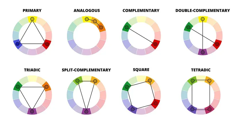
To build a professional color scheme, consider these standard arrangements:
- Complementary: Colors directly opposite each other, such as blue and orange, create high-contrast, vibrant energy.
- Analogous: Colors sitting side-by-side, such as yellow, yellow-orange, and orange, provide a harmonious, gentle aesthetic.
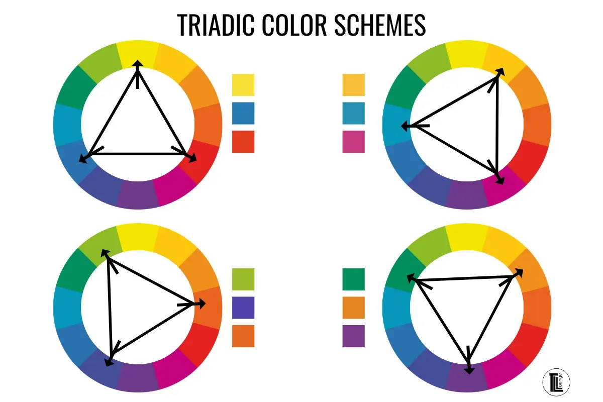
- Triadic: Three colors evenly spaced around the wheel offer a balanced, rich palette that remains visually interesting.
- Monochromatic: Using various tints, tones, and shades of a single hue creates a sophisticated and unified atmosphere.
Best color palettes for beginners
When starting, beginners often feel overwhelmed by the vast array of tubes available in art stores. Limiting your palette is the most effective way to learn color mixing and avoid "muddy" results. A "split-primary" palette is highly recommended, as it includes both a warm and cool version of each primary color. This setup allows you to mix a vast spectrum of clean, brilliant colors without needing dozens of pre-mixed tubes.
Follow these steps to establish your first limited palette:
- Purchase a warm and cool version of red, yellow, and blue, plus a tube of white.
- Practice mixing these six colors to see how many secondary and tertiary hues you can create.
- Limit your total palette to no more than five or six colors for your first few projects.
- Observe how changing the ratio of one color to another shifts the temperature of the resulting mixture.
Why color value is more important than hue
Value refers to the lightness or darkness of a color, regardless of its hue. Many artists make the mistake of focusing entirely on color choice while ignoring the underlying value structure of their composition. If the values are not distinct, the painting will look flat and lack depth, even if the colors themselves are beautiful. Squinting at your subject or your canvas is a classic technique to blur the details and see the value shapes more clearly.
To master value, try creating a grayscale study of your subject before introducing any color. If you can make the image readable using only black, white, and gray, your final painting will have a strong structural foundation. Remember that every color has an inherent value; for instance, yellow is naturally light, while violet is naturally dark. When you place a light color next to a dark one, you create contrast, which is the primary tool for directing the viewer's attention to your focal point.
How to create color harmony in art
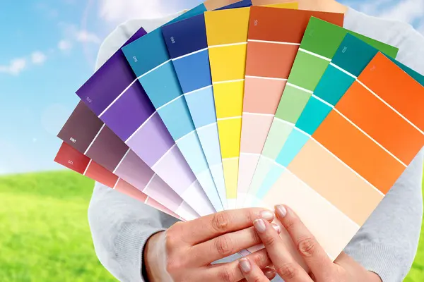
Harmony is the sense of visual unity that makes a painting feel complete and intentional. One of the easiest ways to achieve this is through "color temperature," which categorizes colors as either warm or cool. Warm colors, like reds and oranges, tend to advance toward the viewer, while cool colors, like blues and greens, appear to recede. By establishing a dominant temperature, you can create a specific mood, such as the warmth of a sunset or the chill of a winter morning.
Another effective technique is the use of a "mother color," which involves mixing a tiny amount of one dominant pigment into every other color on your palette. This simple act acts as a visual thread that ties all elements together. You can also create harmony by repeating colors across different areas of the canvas. By echoing a specific shade of green in both the foreground and the background, you guide the viewer's eye across the entire composition, ensuring no single area feels isolated or out of place.
Common mistakes when choosing colors
One of the most frequent errors is using colors straight from the tube without any modification. Pure, unmixed pigments often appear artificial or jarring when placed side-by-side. Always strive to adjust your colors by adding a touch of a complementary color to dull them down or by mixing in white, black, or gray to alter their intensity. Another mistake is failing to test your colors on a scrap piece of paper before applying them to the final canvas, which can lead to costly corrections later.
Avoid these common pitfalls to improve your painting quality:
- Over-mixing: Stirring paint too much on the palette often leads to a dull, gray-brown "mud" color.
- Ignoring edges: Sharp color transitions create high focus, while soft transitions create a sense of distance or atmosphere.
- Using too many colors: Adding too many different hues creates visual noise and makes it difficult to establish a focal point.
- Neglecting the background: Ensure the colors in your background support the subject rather than competing with it for the viewer's attention.
Key facts
- Use the color wheel to identify complementary colors, which sit directly opposite each other and create high contrast.
- Limit your palette to three or four main colors to ensure visual harmony and prevent the composition from looking chaotic.
- Adjust the value—the lightness or darkness of a color—to create depth and focal points within your painting.
- Apply the 60-30-10 rule: use a dominant color for 60% of the canvas, a secondary color for 30%, and an accent color for 10%.
- Mix colors on your palette rather than using them straight from the tube to achieve more natural, nuanced skin tones and shadows.
- Test your color choices on a small scrap of canvas or paper before applying them to your main work to ensure they interact as expected.
The bottom line
Choosing colors effectively requires a balance between technical knowledge and intuitive experimentation. By utilizing the color wheel to understand relationships, managing values to create depth, and limiting your palette to ensure harmony, you can elevate your work significantly. Remember that color is a tool for storytelling; focus on how your choices influence the viewer's emotional response rather than simply filling space with bright pigments.
People also ask
What are primary, secondary, and tertiary colors?
Primary colors are red, yellow, and blue, which cannot be created by mixing others. Secondary colors, such as green, orange, and purple, are made by mixing two primaries, while tertiary colors are created by mixing a primary and a secondary.
How do I make colors look more muted or natural?
You can desaturate a color by adding its complement or a small amount of grey. This technique prevents colors from appearing too "plastic" or artificial, helping them sit more realistically within a landscape or portrait.
Should I use black to darken my colors?
Avoid using pure black to darken colors, as it often creates a muddy or flat appearance. Instead, mix a dark complementary color or a deep brown to lower the value while maintaining color vibrancy.
How does lighting affect color choice?
Colors shift based on the light source; warm light makes colors appear more yellow, while cool light shifts them toward blue. Always consider the "time of day" in your painting to maintain consistent color temperature.
What is a monochromatic color scheme?
A monochromatic scheme uses only one hue, varying the shades, tints, and tones by adding black, white, or grey. This approach is excellent for creating a mood or emphasizing the composition's structure over its complexity.
Why do my colors look different when they dry?
Different paints, especially acrylics, often dry darker than they appear when wet. It is helpful to keep a reference chart of your dried paint samples to predict how colors will look once the work is finished.
This answer was created with the help of AI research tools and reference sources. Spotted an error? Let us know — we correct mistakes quickly. See our editorial policy.