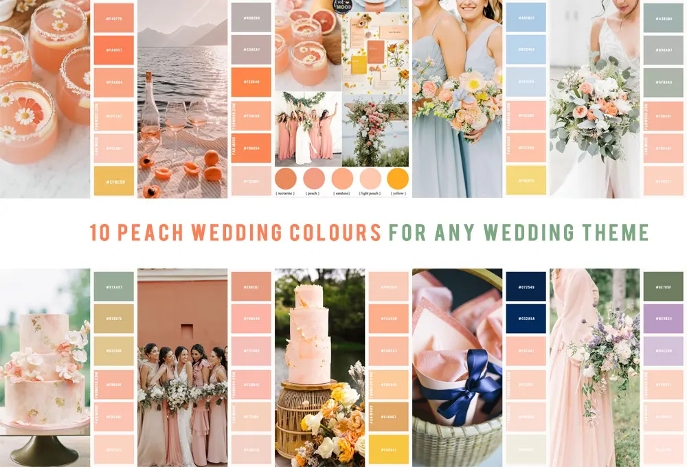
What colors go with coral?
Short answer
Coral is a vibrant, warm hybrid of pink and orange that pairs beautifully with neutrals, cool blues, and earthy tones. Because it is a high-energy color, it works best when balanced by grounding shades like navy, charcoal, or crisp white, or complemented by analogous colors like soft peach and warm gold.
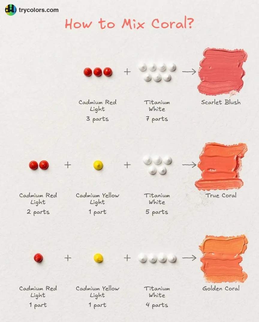
On this page
How to pair coral with neutral colors
Neutral colors provide the necessary visual "breathing room" for coral, which can easily overwhelm a space or an outfit if left to compete with other bold hues. Crisp white is perhaps the most effective partner, as it makes the coral appear brighter and cleaner. When using white, aim for a stark, cool-toned variety rather than a creamy or yellow-based white, which may clash with the orange undertones of the coral.
Gray and beige also serve as excellent anchors for coral. Light gray provides a sophisticated, modern backdrop, while charcoal gray offers a dramatic contrast that makes the coral pop. If you are decorating a room, consider using coral as an accent color against a neutral canvas to maintain balance.
- Use white for a fresh, summery aesthetic.
- Choose charcoal gray for a bold, contemporary look.
- Opt for light beige or sand to create a soft, coastal-inspired atmosphere.
- Avoid warm, yellow-toned creams, as they can make coral appear muddy or dated.
Which colors provide the best contrast for coral
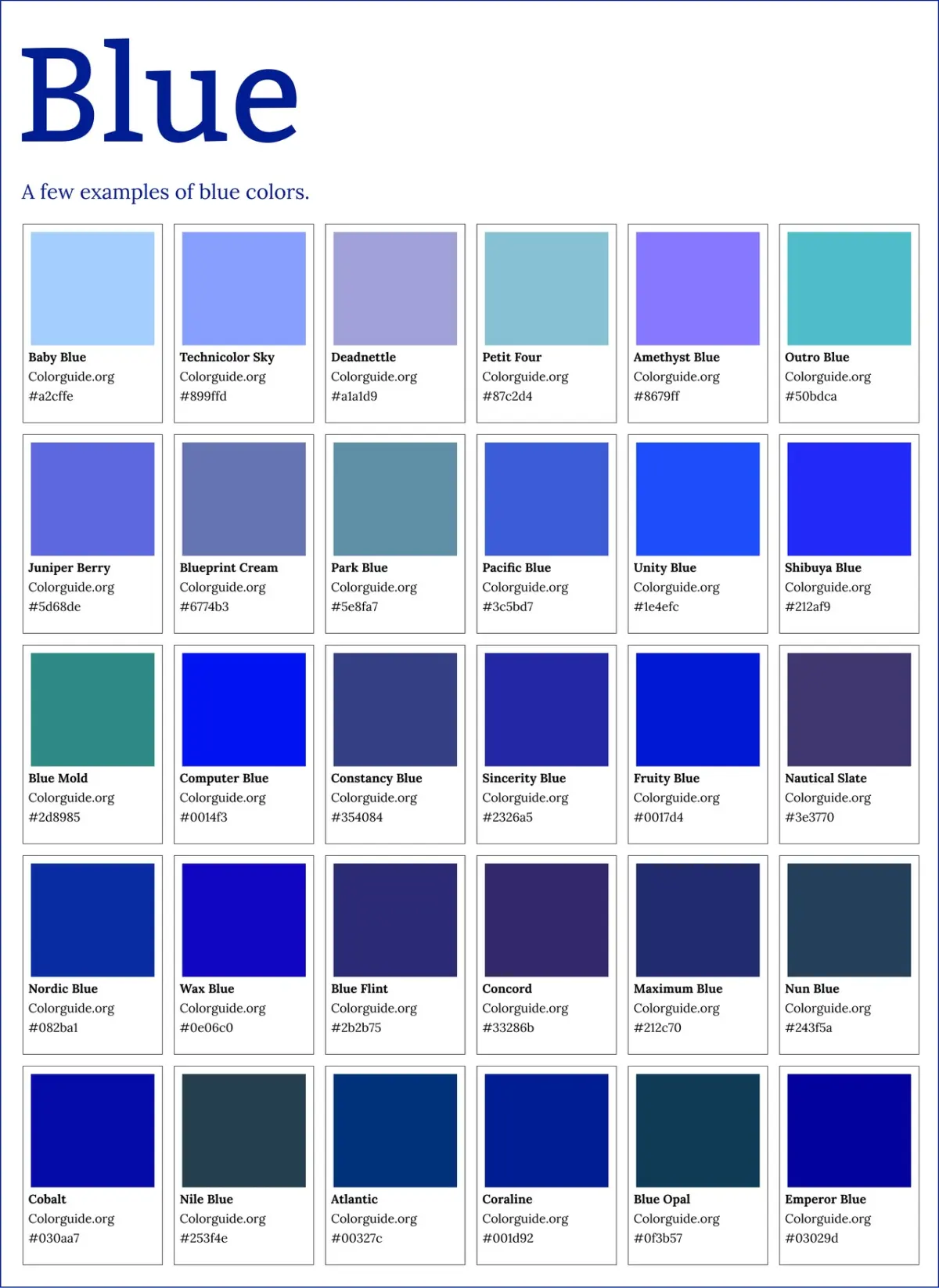
Complementary colors sit opposite each other on the color wheel, creating a dynamic tension that is visually stimulating. For coral, the ideal complementary partners are found in the blue and teal families. Because coral contains strong orange pigments, deep navy blue is the most popular choice for creating a balanced, high-contrast look. The coolness of the blue effectively tames the intensity of the coral, resulting in a professional and polished appearance.
Teal and turquoise also work exceptionally well, particularly in interior design and fashion, as they evoke the natural beauty of tropical environments. These pairings are energetic and lively, making them perfect for statement pieces or accent walls. When working with these combinations, ensure that the saturation levels are similar; a muted, dusty coral pairs better with a muted teal than with a neon turquoise.
- Select navy blue for a classic, nautical-inspired contrast.
- Use teal or turquoise to create a vibrant, tropical color scheme.
- Balance the intensity by ensuring the saturation of both colors is harmonious.
- Experiment with varying shades of blue to find the right depth for your specific coral tone.
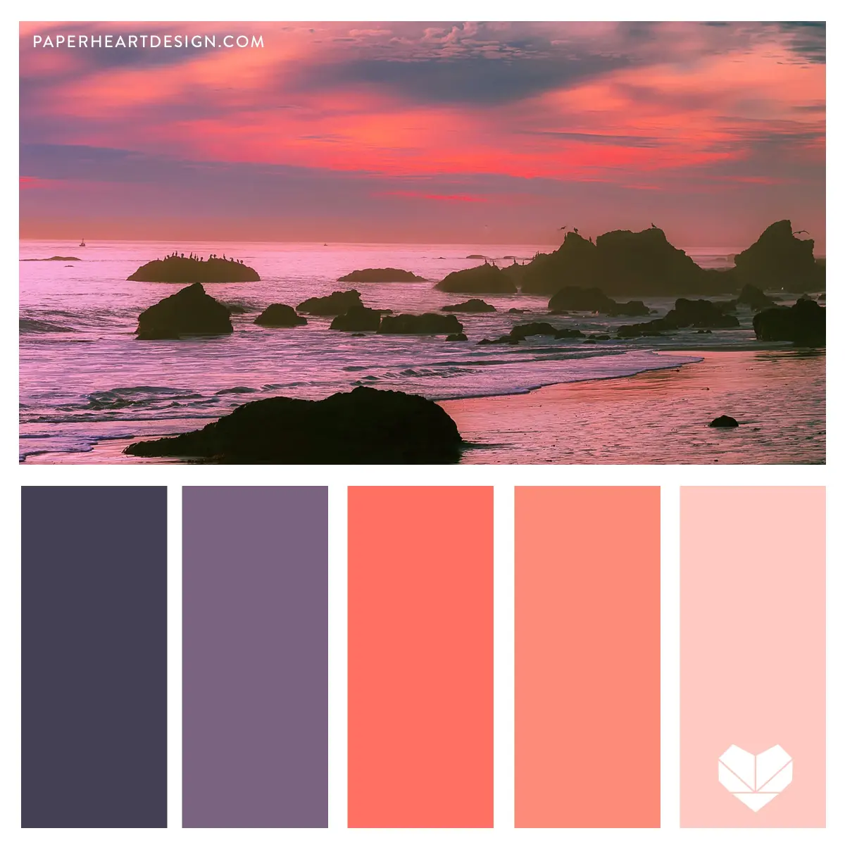
Why coral works well with metallic accents
Metallics act as neutral elements that add a touch of luxury and depth to coral-based palettes. Gold, brass, and copper are particularly effective because they share warm undertones with coral, creating a cohesive and glowing effect. These metals enhance the natural warmth of the coral, making it feel more opulent and intentional. Gold hardware, for instance, can elevate a coral dress or a coral-painted wall by adding a reflective, high-end finish.
Silver and chrome, by contrast, offer a cooler, more industrial aesthetic. While they do not share the same warmth as gold, they provide a sharp, clean contrast that prevents the coral from feeling too "sweet" or overly feminine. This combination is ideal for modern kitchens or minimalist fashion styles where you want to introduce color without sacrificing a sleek, polished look. When mixing metallics with coral, focus on one primary metal finish to maintain a sense of visual order.
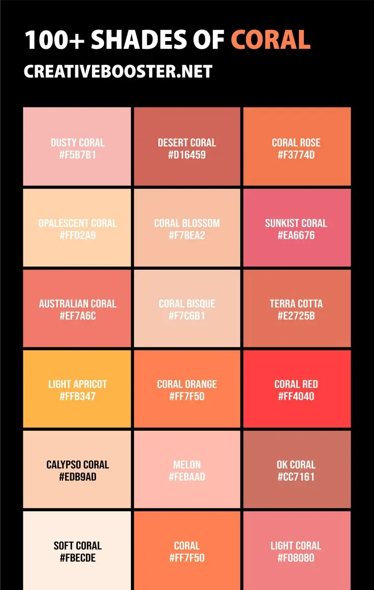
Common mistakes when styling coral
One of the most frequent errors when working with coral is pairing it with too many other bright, warm colors. Combining coral with bright yellow or hot pink often results in a chaotic, overwhelming aesthetic that lacks a focal point. Because coral is already a "loud" color, it requires quieter companions to succeed. If you want to use multiple colors, stick to the 60-30-10 rule: 60 percent neutral, 30 percent coral, and 10 percent for a third, contrasting accent color.
Another mistake is ignoring the undertones of the coral itself. Some coral shades lean heavily toward pink, while others are distinctly orange. If you are styling a coral that leans pink, avoid pairing it with earthy, muddy greens, as this can create an unappealing clash. Instead, test your fabric or paint swatches in natural light before committing to a combination, as artificial lighting can drastically alter how these colors interact with one another throughout the day.
Best color palettes for different seasons
Coral is a versatile color that can be adapted for any season by simply changing the supporting palette. During the spring and summer, pair coral with light, airy colors like mint green, soft lavender, or crisp white to emphasize its playful, energetic side. These combinations feel fresh and light, perfect for outdoor events or bright, sun-filled rooms. The lightness of these pairings keeps the coral feeling seasonal and appropriate for warmer weather.
In the autumn and winter, shift your palette toward deeper, more grounded tones to make coral feel cozy and sophisticated. Pair it with dark chocolate brown, forest green, or deep navy to add weight and warmth to the color. These darker pairings allow coral to transition seamlessly into cooler months, providing a vibrant pop of color against a more muted, seasonal backdrop. By adjusting your secondary colors, you can ensure that coral remains a functional and stylish choice year-round.
Key facts
- Coral is a vibrant hybrid of orange and pink, making it a warm, energetic focal point in any color scheme.
- Pair coral with crisp white or cream to create a clean, coastal aesthetic that prevents the color from feeling overwhelming.
- Navy blue serves as a sophisticated complementary color, providing a high-contrast anchor that balances coral's inherent warmth.
- Use soft sage or olive green to achieve an organic, nature-inspired palette that mimics the colors found in tropical reefs.
- Metallic accents, particularly gold or brushed brass, enhance the richness of coral and add a touch of luxury to interior spaces.
- Avoid pairing coral with neon yellows or harsh lime greens, as these combinations often clash and create visual fatigue.
The bottom line
To successfully incorporate coral into your design, prioritize balance by pairing its warmth with neutral tones or contrasting cool colors like navy. Whether you are choosing paint or textiles, start with small accents to gauge how the hue interacts with your existing lighting. By avoiding overly neon pairings and focusing on harmonious, nature-inspired combinations, you can create a sophisticated, inviting space that feels both modern and timeless.
People also ask
Is coral considered a warm or cool color?
Coral is primarily a warm color because it contains significant amounts of orange and red undertones. While some variations lean slightly toward pink, the overall temperature remains inviting and energetic.
Can coral be used in a professional office setting?
Yes, coral can be used professionally when paired with neutral tones like charcoal, slate gray, or beige. Use it as an accent color in artwork or desk accessories rather than on large wall surfaces to maintain a polished look.
What is the best way to test a coral paint color in a room?
Always paint a large swatch on a piece of poster board and move it around the room throughout the day. Coral changes drastically depending on whether it is hit by direct sunlight or artificial evening light.
Does coral work well with wood furniture?
Coral pairs beautifully with light-toned woods like oak or pine for a casual look. For a more dramatic or moody aesthetic, pair coral with dark walnut or mahogany to create a striking contrast.
How do I select the right shade of coral?
Consider the intensity of the light in your space; lighter, dustier corals work best in small or dim rooms. More saturated, punchy corals are ideal for large, well-lit areas where you want to make a bold statement.
Can I mix coral with other bright colors?
You can mix coral with other brights like turquoise or teal for a playful, Mediterranean-inspired palette. Limit the number of bright colors to two or three to ensure the room remains cohesive rather than chaotic.
This answer was created with the help of AI research tools and reference sources. Spotted an error? Let us know — we correct mistakes quickly. See our editorial policy.