What is a split primary palette?
Short answer
A split primary palette is a color mixing system using two versions of each primary color—one warm and one cool. By selecting a warm and cool red, yellow, and blue, artists gain greater control over color temperature and saturation, allowing for a broader, more vibrant range of secondary color mixtures than a standard triad.
On this page
Why use a split primary palette?
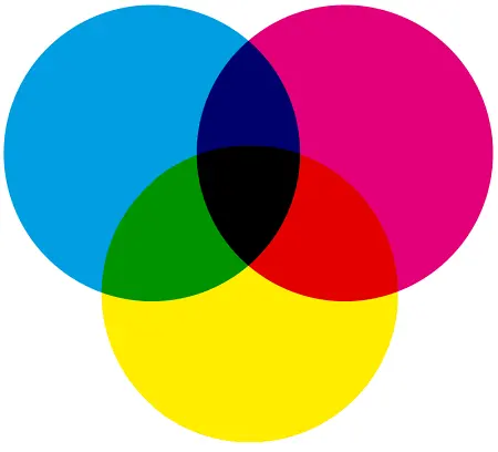
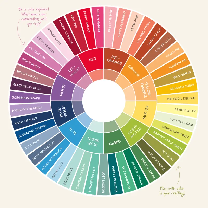
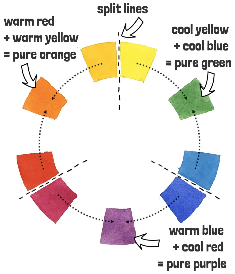
The primary goal of a split primary palette is to eliminate the muddy results often produced by mixing colors with conflicting temperatures. In traditional color theory, mixing a warm red with a cool blue often results in a dull, neutralized purple because the colors contain traces of their opposite hues. By choosing a "warm" version of a primary that leans toward one neighbor on the color wheel and a "cool" version that leans toward the other, you create a spectrum that spans the entire wheel with precision.
This system provides six distinct pigments instead of three, which significantly expands your mixing potential. It allows you to create bright, clean greens, oranges, and violets that are otherwise impossible to achieve with a limited three-color set. Mastering this approach helps artists understand the underlying bias of their pigments, leading to more intentional and professional color choices in painting and design.
How to choose your six colors
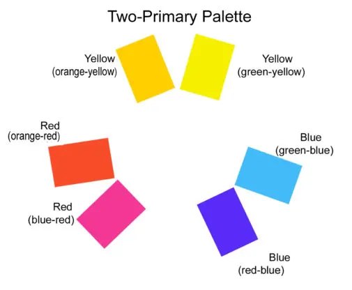
Selecting the right pigments requires identifying the subtle undertones within each hue. A warm red, such as Cadmium Red, leans toward orange, while a cool red, like Alizarin Crimson, leans toward blue. You apply this same logic to yellow and blue to complete the set.
- Warm Yellow: Look for a hue with an orange bias, such as Cadmium Yellow Medium.
- Cool Yellow: Choose a lemon-toned pigment with a green bias, like Hansa Yellow Light.
- Warm Red: Select a pigment leaning toward orange, such as Cadmium Red Light.
- Cool Red: Pick a pigment leaning toward violet, such as Quinacridone Rose or Alizarin Crimson.
- Warm Blue: Use a blue with a green bias, such as Phthalo Blue or Cerulean.
- Cool Blue: Select a blue with a violet bias, such as Ultramarine Blue.
Best practices for mixing colors
When mixing, the key is to pair colors that share a similar temperature bias to achieve the most vibrant results. If you want to mix a bright green, you must combine the cool yellow (which contains green) with the cool blue. Mixing the warm yellow with the warm blue will result in a muted, earthy green because the warm yellow contains red, which acts as a complementary color to green, effectively dulling the mixture.
- Always start with the lighter color and add the darker pigment gradually.
- Keep a scrap piece of paper nearby to test your mixtures before applying them to your final surface.
- Clean your brush thoroughly between mixes to prevent cross-contamination of pigments.
- Note the specific brand and pigment code for each color, as names like "Primary Red" can vary significantly between manufacturers.
Common mistakes when using split primaries
A frequent error is failing to recognize the "bias" of a pigment, which leads to frustration when colors do not turn out as expected. Beginners often assume that any blue mixed with any yellow will yield a vibrant green, ignoring the fact that many blues contain traces of red. When you mix a red-leaning blue with a yellow, you are essentially mixing all three primary colors, which naturally creates a gray or brown tone.
Another mistake is using too much pigment at once. Because high-quality professional paints are highly concentrated, a small amount of a dark pigment can easily overpower a large amount of a lighter one. It is always easier to add more color than to try and lighten a mixture that has become too dark or intense. Take your time to build your mixtures slowly, observing how the hue shifts as you introduce each new element into the blend.
How to organize your palette for success
Effective organization is essential for maintaining a clean and efficient workflow. Arrange your paints in a consistent order around your palette—typically grouping the warm and cool versions of each primary next to one another. This spatial arrangement helps you visualize the relationships between the colors and makes the selection process intuitive during the painting session.
- Place your warm and cool yellows on the top left.
- Position your warm and cool reds in the center.
- Set your warm and cool blues on the far right.
- Leave a large, clear space in the center of the palette for mixing your colors.
By keeping your mixing area clean and your pigments in fixed locations, you reduce the time spent searching for the right hue. This disciplined approach allows you to focus entirely on the creative process, knowing exactly which pigments will interact to produce the specific shades you need for your work. Consistent practice with this setup will eventually make color mixing feel like second nature.
Key facts
- A split primary palette uses six colors: two versions of red, two of yellow, and two of blue.
- Each primary color is represented by a "cool" version (leaning toward green or violet) and a "warm" version (leaning toward orange).
- This system allows artists to mix cleaner, more vibrant secondary colors by choosing the correct temperature bias.
- Warm colors contain a hint of yellow or red, while cool colors contain a hint of blue.
- A standard set includes warm red, cool red, warm yellow, cool yellow, warm blue, and cool blue.
- Using this palette prevents mud-colored mixes that occur when trying to mix across the color wheel with limited pigments.
The bottom line
The split primary palette is an essential tool for artists seeking control over color mixing. By organizing pigments into warm and cool pairs, you avoid the muddy results common with basic sets. Mastering these six colors allows for cleaner secondary hues and greater depth in your work. It is the most efficient way to expand your mixing capabilities while keeping your supply list simple and highly effective.
People also ask
Why do artists prefer a split primary palette over a basic three-color set?
A basic three-color set often produces dull, muddy secondary colors because the pigments contain unwanted undertones. A split palette provides specific warm and cool options that ensure cleaner, more accurate color mixing for any subject.
How do you identify if a color is warm or cool?
Warm colors lean toward the yellow or red side of the spectrum, appearing to advance visually. Cool colors lean toward the blue or green side, appearing to recede, which helps artists create depth and atmosphere.
What are the most common pigments used for a split primary palette?
Common choices include Cadmium Red (warm) and Alizarin Crimson (cool), Cadmium Yellow (warm) and Lemon Yellow (cool), and Ultramarine Blue (warm) and Phthalo Blue (cool). These provide a versatile range for most painting styles.
Can I mix every color with just these six pigments?
Yes, these six colors provide the necessary range to create almost any hue found in nature. By adjusting the ratios and temperature biases, you can achieve a vast spectrum of vibrant or muted tones.
What is the biggest mistake beginners make with this palette?
The most common error is mixing a warm primary with a cool primary that sits opposite it on the color wheel. This often results in a neutral, brownish gray instead of a bright secondary color.
Does this palette work for all painting mediums?
The principles of the split primary palette apply universally to oils, acrylics, watercolors, and gouache. While specific pigment properties may vary by medium, the underlying color theory remains consistent across all painting techniques.
This answer was created with the help of AI research tools and reference sources. Spotted an error? Let us know — we correct mistakes quickly. See our editorial policy.