What colors make ochre?
Short answer
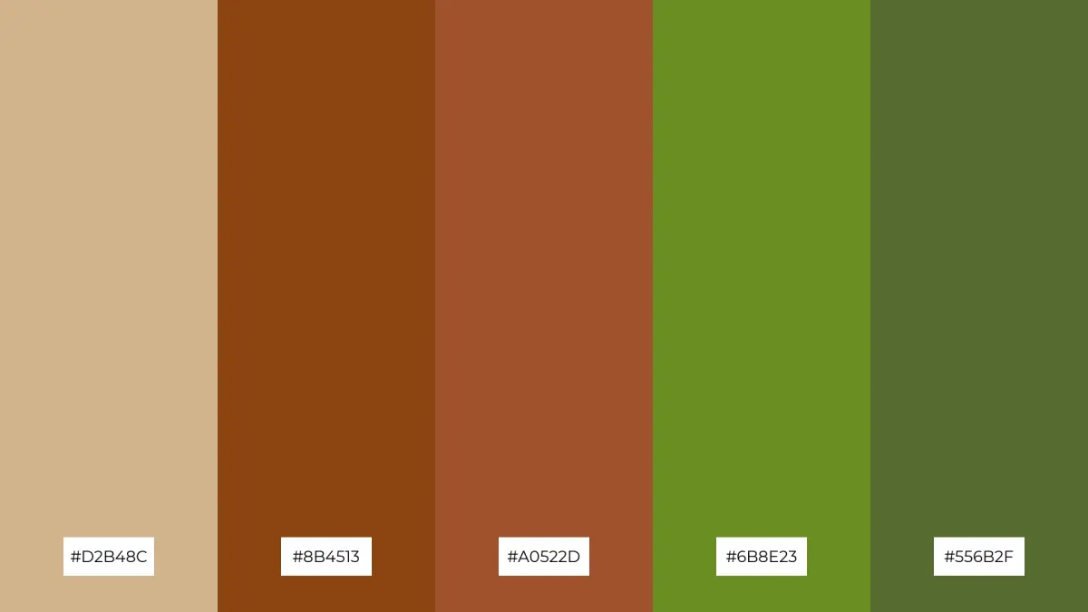
Ochre is a natural earth pigment primarily composed of iron oxide, clay, and sand. To recreate its signature warm, earthy hue, mix yellow ochre with small amounts of red and brown. By adjusting the ratios of cadmium yellow, burnt sienna, and a touch of ultramarine blue, you can achieve various authentic, muted tones.

On this page
What is ochre made of?
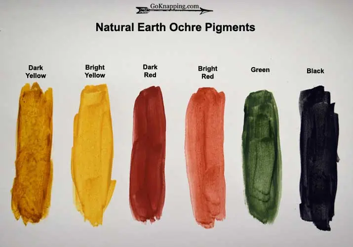
Ochre is one of the oldest pigments used by humanity, dating back to prehistoric cave paintings found in sites such as Lascaux, France. Geologically, it is a form of hydrated iron oxide, specifically limonite. When this mineral is found in nature, it appears in shades ranging from pale yellow to deep, rusty orange and dark brown. The specific color depends on the concentration of iron and the presence of other impurities like manganese or silica.
Because it is a natural earth pigment, true ochre is incredibly lightfast and stable, meaning it does not fade when exposed to sunlight over time. Artists prize it for its opacity and its ability to harmonize with other natural tones in a landscape or portrait. While modern synthetic versions are common today, they are chemically engineered to mimic the specific iron oxide composition found in the traditional mineral deposits mined from the earth.
How to mix ochre colors
Creating an ochre hue from standard artist paints requires a balance of warm primaries and earthy neutrals. You are essentially trying to replicate the muted, dusty quality of iron oxide by desaturating a bright yellow. Start with a base of yellow and systematically introduce complementary colors to dull the intensity.
- Begin with a generous amount of cadmium yellow or yellow medium as your base.
- Slowly add a small dab of burnt sienna to introduce the characteristic reddish warmth of natural ochre.
- Incorporate a tiny amount of ultramarine blue or raw umber to neutralize the brightness, turning the yellow into a more muted, natural earth tone.
- Adjust the consistency by adding white if you want a lighter, sandy ochre, or more brown for a deeper, golden-brown variant.
Best paint colors for beginners
If you are stocking a palette to achieve a wide range of ochre tones, you do not need an extensive collection of pigments. Focus on high-quality, opaque paints that provide a strong foundation for mixing. Beginners often find that starting with a "split primary" palette makes the process much more intuitive and predictable.
- Cadmium Yellow Medium: Provides a strong, warm yellow starting point.
- Burnt Sienna: Essential for adding the characteristic iron-rich reddish tint.
- Raw Umber: Useful for cooling down the mixture and adding depth.
- Titanium White: Necessary for creating tints and achieving the lighter, creamy shades of yellow ochre.
- Ultramarine Blue: Used sparingly to "gray down" or neutralize the yellow, preventing it from looking too neon or artificial.
By using these five tubes, you can mix almost any variation of ochre, from pale straw colors to deep, burnt-earth tones, without needing to purchase specialty pre-mixed tubes.
Why ochre looks different in paintings
The appearance of ochre on a canvas is heavily influenced by the medium you are using and the colors placed next to it. Because ochre is a muted, low-chroma color, it is highly susceptible to optical illusions. When placed next to a bright, saturated purple or blue, the ochre will appear significantly more golden and vibrant than it actually is.
Conversely, if you place ochre next to a stark white or a very light yellow, it may appear dull or muddy. This phenomenon, known as simultaneous contrast, is a critical tool for painters. If your ochre looks "dead" on the canvas, try adjusting the surrounding colors rather than immediately changing the mixture itself. Additionally, the texture of the surface—such as the tooth of the canvas or the absorbency of the paper—can alter how light reflects off the pigment, shifting the perceived warmth of the color.
Common mistakes when mixing ochre
The most frequent error when mixing ochre is adding too much blue or black, which quickly turns the mixture into a flat, lifeless gray or a muddy green. Because yellow is a light-valued color, it is easily overwhelmed by darker, more powerful pigments. Always add your darker colors in very small increments, testing the mixture on a scrap piece of paper before applying it to your main work.
- Avoid using black paint to darken your ochre, as it often creates a dirty, greenish tint that lacks the natural warmth of iron oxide.
- Do not over-mix your paint; leaving slight streaks of unblended yellow and red can actually create a more realistic, organic appearance that mimics the texture of natural earth.
- Be cautious with synthetic pigments that are highly transparent, as they may lack the covering power of traditional earth-based paints.
- Always clean your brush thoroughly between additions to ensure you do not contaminate your base yellow with leftover dark pigments from previous steps.
Key facts
- Ochre is a natural earth pigment composed of clay tinted by iron oxide, specifically hematite or limonite.
- You can replicate the color by mixing yellow ochre with small amounts of red and brown to achieve warmer, earthier tones.
- To create a basic ochre hue from scratch using primary colors, mix yellow with a touch of red and a tiny amount of blue or black to desaturate it.
- Avoid using pure, vibrant synthetic pigments, as they will lack the muted, organic quality characteristic of natural mineral ochre.
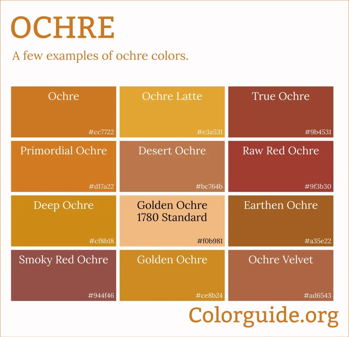
- The color range of ochre spans from pale yellow and golden tan to deep, rusty red and burnt orange.
- When mixing paints, always add darker colors to the yellow base in small increments to prevent the mixture from turning muddy or gray.
The bottom line
Ochre is a versatile earth pigment defined by its iron oxide content, offering a spectrum of warm, muted tones. While natural ochre is mined directly from the earth, you can replicate its appearance by blending yellow with subtle amounts of red and brown. By carefully controlling these ratios, you can create professional-grade, lightfast colors that capture the timeless, organic aesthetic used by artists throughout human history.
People also ask
Is ochre a single color or a range of shades?
Ochre is a family of earth tones that varies based on the mineral content and oxidation levels of the iron. It ranges from light yellow "yellow ochre" to deep, brownish-red "red ochre."
Can I use acrylic paints to mimic the look of natural ochre?
Yes, you can achieve an ochre effect by mixing a high-quality yellow medium with a small amount of burnt sienna or raw umber. This combination mimics the natural mineral impurities found in earth pigments.
What is the difference between yellow ochre and raw sienna?
Yellow ochre is typically more opaque and has a higher clay content, giving it a duller, more earthy appearance. Raw sienna is more transparent and possesses a slightly warmer, golden undertone.
Does the color of ochre change when it is heated?
Yes, heating natural yellow ochre transforms it into red ochre through a process called calcination. The heat alters the chemical structure of the iron oxide, shifting the pigment from yellow to red.
Why does my mixed ochre look like a dull brown instead of a golden yellow?
You likely added too much blue or black pigment to the mix. Ochre requires a delicate balance of warm tones, and adding even a tiny excess of a cool color will quickly neutralize the yellow.
Is ochre considered a permanent pigment in professional painting?
Ochre is one of the most lightfast and stable pigments available to artists. It has been used in cave paintings dating back tens of thousands of years and remains highly resistant to fading.
This answer was created with the help of AI research tools and reference sources. Spotted an error? Let us know — we correct mistakes quickly. See our editorial policy.