What is asymmetrical balance in art?
Short answer
Asymmetrical balance is a compositional technique where visual weight is distributed unevenly across an axis, yet the overall image maintains a sense of equilibrium. Unlike symmetrical balance, which mirrors elements, asymmetry uses different shapes, colors, or textures to create a dynamic, harmonious tension that feels stable without being identical on both sides.
On this page
What is asymmetrical balance in art?
Asymmetrical balance, often called informal balance, occurs when an artist arranges disparate elements to achieve a sense of visual stability. Rather than relying on a central axis to mirror identical forms, the artist balances the "weight" of objects based on their perceived importance. This weight is determined by factors like size, color intensity, texture, and placement.
The concept relies on the human eye’s tendency to seek order within a composition. By placing a large, muted object on one side and balancing it with a smaller, highly detailed, or brightly colored object on the other, an artist creates a sophisticated equilibrium. This approach prevents the composition from feeling static or predictable, allowing for a more engaging and energetic visual experience for the viewer.
How to create asymmetrical balance in design
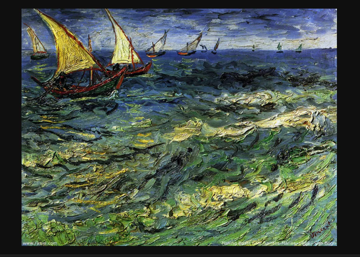
Creating balance without symmetry requires a deliberate consideration of visual mass. You must treat every element as having a specific weight that pulls the viewer's eye. A large, dark shape exerts more pull than a small, light-colored one, but a complex, intricate texture can hold as much visual interest as a larger, simpler form.
To master this technique, follow these steps to organize your workspace or canvas:
- Identify your focal point, usually the most complex or vibrant element in the piece.
- Place the focal point off-center to establish the primary weight of the composition.
- Introduce secondary elements on the opposite side to act as a counterweight.
- Adjust the proximity of these elements to the center to increase or decrease their perceived influence.
- Evaluate the overall "tilt" of the image by squinting to see if one side feels significantly heavier than the other.
Why asymmetrical balance feels more natural
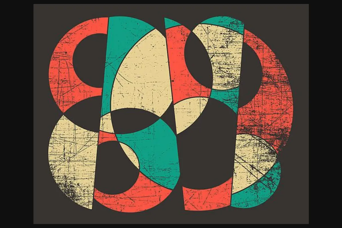
Human perception is rarely drawn to perfect symmetry in nature, which is why asymmetrical balance often feels more organic and lifelike. In the natural world, trees, landscapes, and even the human body exhibit subtle variations that prevent them from being exact mirror images. When art mimics this natural variation, it creates a sense of movement and spontaneity that rigid symmetry lacks.
This technique is essential in various art forms, including photography, interior design, and graphic layout. By avoiding the predictability of a mirrored image, artists can guide the viewer’s eye across the canvas in a specific sequence. This creates a narrative flow, encouraging the observer to linger on specific details rather than taking in the entire image at once. It transforms a static display into a dynamic story.
Common mistakes when using asymmetrical balance
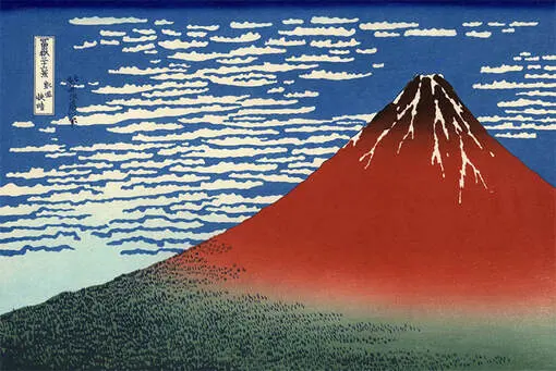
One of the most frequent errors is confusing "asymmetry" with "randomness." Beginners often scatter elements across a page hoping they will balance themselves, but true balance requires a calculated relationship between components. If the elements do not interact or relate to one another, the image will appear chaotic and disjointed rather than balanced.
Another common pitfall is failing to account for "negative space." Empty space is not merely an absence of content; it acts as a weight in itself. If one side of your composition is crowded while the other is completely empty, the balance will tilt heavily toward the crowded side. To avoid these issues, consider the following:
- Do not let one corner of the frame become overly busy while the rest remains vacant.
- Ensure that the "visual gravity" of your focal point is countered by enough negative space or smaller elements.
- Avoid placing all high-contrast elements in one localized area, which creates a visual "dead zone."
Best techniques for achieving visual equilibrium
To refine your ability to balance compositions, practice using "visual anchors." An anchor is an element that draws the eye and holds the composition together, preventing it from feeling like it might drift off the page. You can use lines, color gradients, or repeated shapes to lead the viewer from the heavy side of the composition to the lighter side, effectively bridging the gap.
Experimenting with different weights is a great way to build intuition. For instance, try placing a single large, dark circle on the left and balancing it with three smaller, lighter circles on the right. This teaches you how multiple smaller objects can collectively balance one large, dominant object. Over time, this practice becomes second nature, allowing you to create complex, balanced works that feel both intentional and effortless to the viewer.
Key facts
- Asymmetrical balance achieves visual equilibrium using different elements of equal visual weight rather than identical mirror images.
- Artists use this technique to create a sense of movement, tension, and modern sophistication in their compositions.
- Visual weight is determined by size, color intensity, texture, and the complexity of the shapes used.
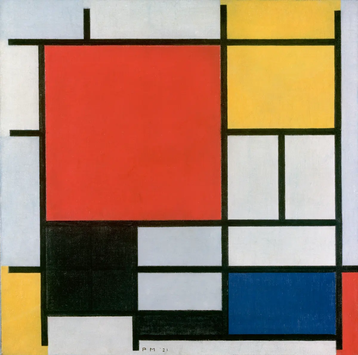
- A small, high-contrast object can balance a much larger, neutral-toned object on the opposite side of a canvas.
- Negative space acts as a critical component, providing the necessary breathing room to prevent a composition from feeling crowded.
- To practice, try placing a large, simple shape on one side and balancing it with a cluster of smaller, intricate shapes on the other.
The bottom line
Asymmetrical balance is a sophisticated design strategy that replaces rigid mirroring with a dynamic equilibrium of varied visual weights. By manipulating color, size, texture, and negative space, artists create compositions that feel active and engaging rather than static. Mastering this technique requires practice in balancing contrasting elements, ultimately allowing you to guide the viewer’s eye through your work with intentionality, rhythm, and a sense of natural harmony.
People also ask
How does asymmetrical balance differ from symmetrical balance?
Symmetrical balance creates a mirror image where both sides of an axis are identical, conveying stability and formality. Asymmetrical balance relies on varied elements that possess equal visual weight, resulting in a more dynamic and informal composition.
Why do artists prefer asymmetrical balance over symmetry?
Symmetry can sometimes feel static, predictable, or overly rigid in artistic contexts. Asymmetry introduces movement and interest, forcing the viewer's eye to travel across the entire work to resolve the visual tension.
What is the rule of thirds in relation to balance?
The rule of thirds is a grid-based guide that helps artists place focal points off-center to achieve natural asymmetry. By aligning subjects with the grid’s intersections, artists create a balanced composition that feels more engaging than a centered subject.
Can color affect the balance of an artwork?
Yes, bright, warm, or highly saturated colors carry more visual weight than muted, cool, or pale tones. A small splash of red can effectively balance a large area of soft gray or beige.
What is a common mistake when creating asymmetrical balance?
A frequent error is "over-balancing," where an artist adds too many competing focal points that clutter the frame. Another mistake is failing to consider the "pull" of the edges, which can make an off-center composition feel like it is falling off the canvas.
How can I test if my composition is balanced?
Try squinting at your work to blur the details, which highlights the distribution of light and dark areas. You can also view your image in a mirror or flip it horizontally to see if one side feels significantly heavier than the other.
This answer was created with the help of AI research tools and reference sources. Spotted an error? Let us know — we correct mistakes quickly. See our editorial policy.