How do you paint waves in watercolor?
Short answer
Painting waves in watercolor requires layering transparent washes and preserving white paper to represent sea foam. By using a combination of wet-on-wet techniques for soft backgrounds and dry-brush strokes for crisp crests, you capture the movement and translucency of water. Success relies on controlling paint consistency and timing your paper’s drying stages.
On this page
How to paint realistic waves in watercolor
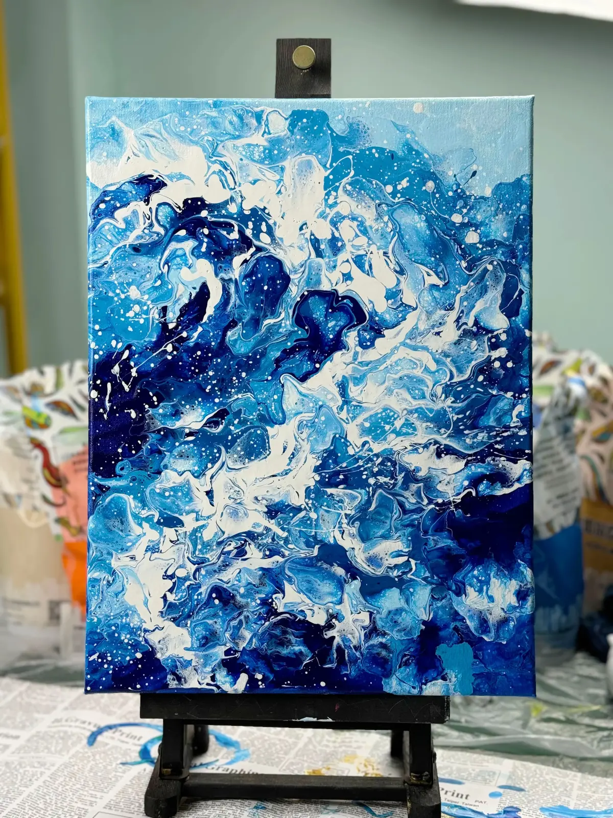
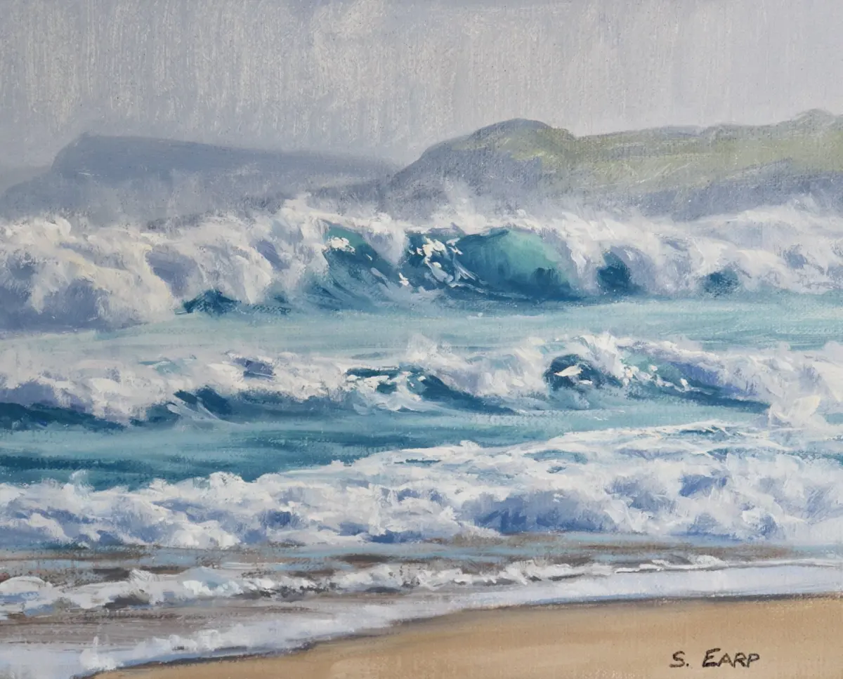
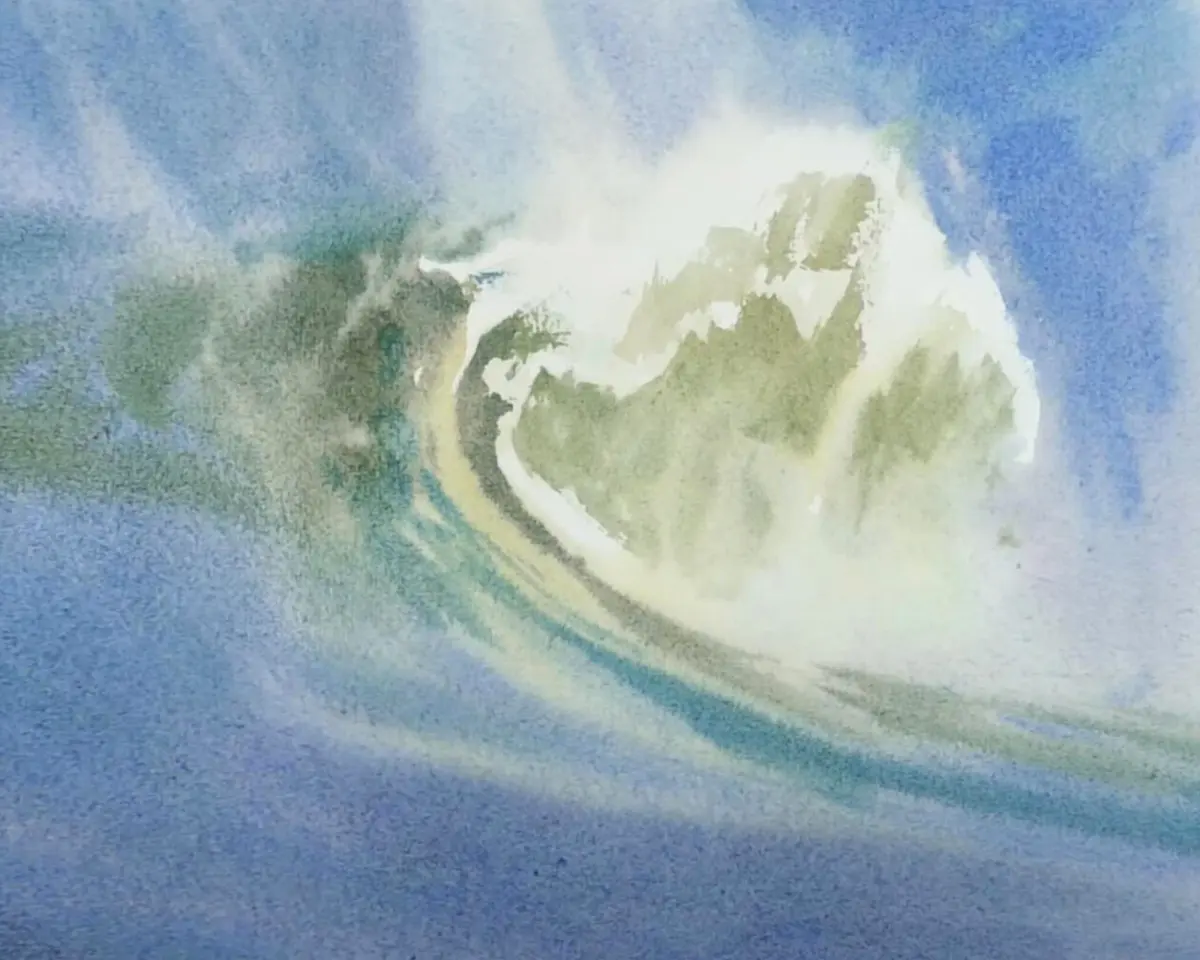
To create realistic waves, you must focus on the rhythm of the water rather than individual shapes. Start by sketching the horizon line and the main curves of the waves using a light graphite pencil. Apply a base wash of cerulean blue or cobalt blue, leaving areas of the white paper untouched to serve as the highlights of the crashing foam. This preservation of white space is the most critical step, as watercolor relies on the paper’s brightness to convey light.
Once the initial wash is dry, deepen the shadows under the crests using a mixture of ultramarine and a touch of burnt umber. By varying the intensity of your pigment, you create the illusion of depth and volume within the rolling water. Remember that waves are fluid; avoid rigid, symmetrical lines. Instead, use loose, sweeping motions to follow the natural energy of the ocean current.
Best watercolor techniques for beginners
Mastering two fundamental techniques will significantly improve your wave paintings. The wet-on-wet method involves wetting the paper with clean water before applying pigment, which allows colors to bleed softly into one another. This is ideal for painting the misty atmosphere of the horizon or the deep, dark troughs between waves.
The dry-brush technique is equally important for adding texture and detail. By using a brush with very little water and a thicker paint consistency, you can drag the bristles across the rough surface of the paper. This creates a broken, scratchy effect that perfectly mimics the appearance of sea spray and churning foam. Follow these steps to practice:
- Wet a section of paper and drop in blue pigment to create a soft, blurred background.
- Allow the area to dry completely before attempting to add detail.
- Load a stiff-bristled brush with concentrated paint and lightly graze the surface to create foam.
How to mix colors for ocean waves
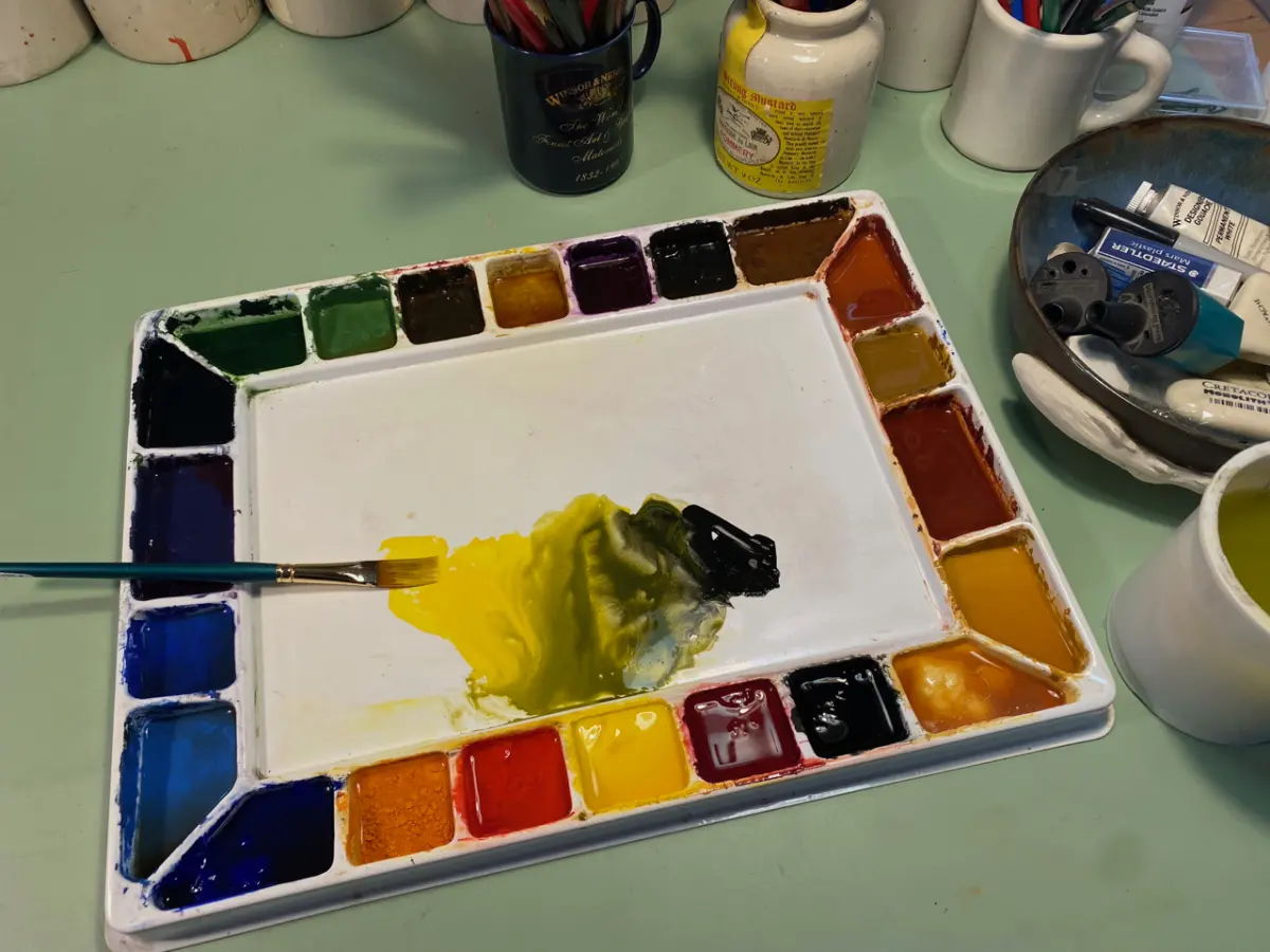
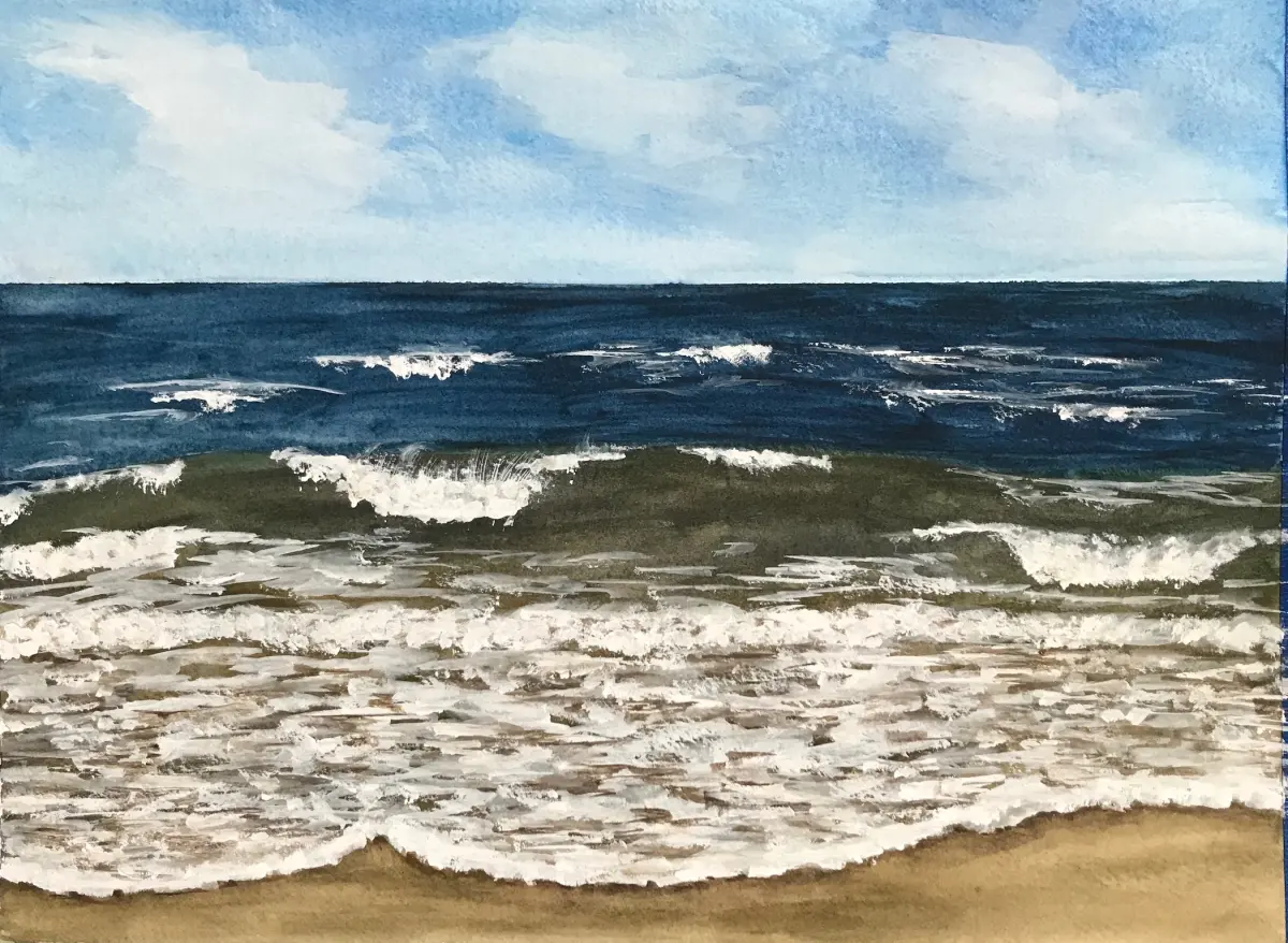
The color of the ocean changes based on the depth, the sky, and the presence of sediment. While beginners often reach for a single tube of blue, professional results come from mixing custom palettes. Use phthalo blue for vibrant, tropical waters, or mix Prussian blue with a hint of viridian green for a deep, stormy Atlantic appearance. Adding a small amount of neutral tint or Payne’s gray can help you achieve the muted, desaturated tones found in cooler climates.
Always test your mixtures on a scrap piece of watercolor paper before applying them to your main work. Watercolor dries significantly lighter than it appears when wet, so mix your pigments slightly darker than your target shade. If the water looks too artificial, try introducing subtle warm tones like yellow ochre or raw sienna into the deepest shadows to add complexity and natural realism to the scene.
Common mistakes when painting waves
One of the most frequent errors is overworking the painting, which leads to muddy colors and a loss of luminosity. Once you have applied a wash, avoid going back over it repeatedly while it is still damp, as this disturbs the paper fibers and creates unsightly streaks. If you make a mistake, it is often better to leave it and incorporate it into the movement of the water rather than trying to scrub it out.
Another common mistake is neglecting the direction of the light. If your highlights do not align with a consistent light source, the waves will appear flat and disconnected. Ensure that the crests of your waves are consistently brighter on the side facing the sun. Avoid using pure white gouache to "fix" mistakes unless necessary, as it often looks opaque and chalky compared to the natural transparency of the watercolor paper.
How to create movement in water
Conveying motion is the final step in bringing a seascape to life. Use directional brushstrokes that follow the curve of the wave to guide the viewer's eye across the page. Longer, horizontal strokes suggest calm, deep water, while short, choppy, and diagonal strokes imply turbulence and high energy. Varying the width of your lines helps to break up the monotony and adds a sense of dynamic flow to the composition.
Consider the following tips to enhance the feeling of movement:
- Use a fan brush to create the fine, scattered spray of a crashing wave.
- Incorporate "negative painting" by darkening the water around a light, foam-like shape to make it pop.
- Vary the pressure on your brush to create thick, bold lines that taper off into thin, delicate wisps.
By focusing on the rhythm of the water and the interplay between light and shadow, you can transform a simple landscape into a powerful, moving scene that captures the raw energy of the sea.
Key facts
- Use heavy-weight, cold-press watercolor paper (at least 300 gsm) to prevent buckling when applying multiple water-heavy washes.
- Reserve white highlights by using masking fluid or a wax resist crayon before painting the darker areas of the water.
- Employ a "wet-on-wet" technique for the background to create soft, diffused transitions between the sky and the distant ocean.
- Apply "dry brush" strokes with a flat or filbert brush to capture the jagged, white-capped texture of breaking waves.
- Mix blues, such as ultramarine and cobalt, with a touch of burnt sienna to create more natural, desaturated sea tones.
- Build depth by layering thin, transparent glazes, allowing each layer to dry completely before adding the next to maintain clarity.
The bottom line
Painting waves in watercolor requires a balance between controlled washes and expressive, dry-brush textures. By reserving white highlights early and layering transparent glazes, you can effectively mimic the depth and movement of the ocean. Focus on the direction of the water's flow and avoid over-blending your colors. With practice, these techniques will allow you to capture the dynamic, fluid energy of the sea on paper.
People also ask
What is the best brush for painting water?
A large round brush, such as a size 12 or 14, is ideal for broad washes, while a small synthetic rigger brush is perfect for fine, white foam details.
How do I create the look of transparent water?
Use highly diluted paint mixtures and apply them in thin, overlapping glazes to simulate the light passing through the crest of a wave.
Why does my watercolor painting look muddy?
Muddy colors often result from overworking the paper or mixing too many complementary colors together, so keep your brushstrokes decisive and limited.
How can I fix a mistake in my watercolor wave?
You can lift some wet paint with a clean, damp brush, but for dried mistakes, try a light scrub with a stiff brush or incorporate the error into the wave's shadow.
Should I use salt to create sea foam effects?
Sprinkling coarse sea salt onto damp paint draws the pigment away, creating crystalline, organic textures that resemble sea spray or bubbles.
How do I keep my edges sharp?
Paint on dry paper for crisp, defined edges, or use masking tape to block off sections of the paper that you want to remain pristine.
This answer was created with the help of AI research tools and reference sources. Spotted an error? Let us know — we correct mistakes quickly. See our editorial policy.