How do you paint the ocean with acrylic paint?
Short answer
Painting the ocean with acrylics requires building depth through layering, starting with dark base tones and moving toward lighter highlights. By utilizing varied brushstrokes, blending techniques, and a palette of blues, greens, and whites, you can create the illusion of movement, transparency, and light reflecting off the water’s surface.
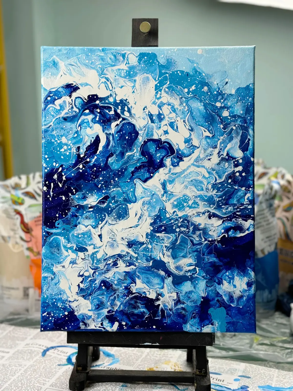
On this page
What supplies do I need for painting the ocean?
To capture the ocean effectively, you need a versatile set of acrylic paints, specifically focusing on a range of cool and warm tones. Essential colors include Phthalo Blue, Ultramarine Blue, Viridian Green, Titanium White, and Burnt Umber for deep shadows. High-flow acrylics or heavy body paints are both suitable, though heavy body paints allow for better texture when creating waves. You should also have a variety of synthetic brushes, including flat brushes for large areas, filberts for blending, and small rounds for fine detail.
Beyond paint and brushes, the choice of surface significantly impacts the final result. A primed canvas or heavy-weight acrylic paper provides a stable foundation that prevents warping. Consider using a palette knife to apply thick, textured white paint for foam and sea spray, as this adds a three-dimensional quality that brushes cannot replicate. Finally, keep a spray bottle filled with water nearby to keep your acrylics moist, as their fast-drying nature can make blending difficult during long painting sessions.
How do I mix realistic ocean colors?
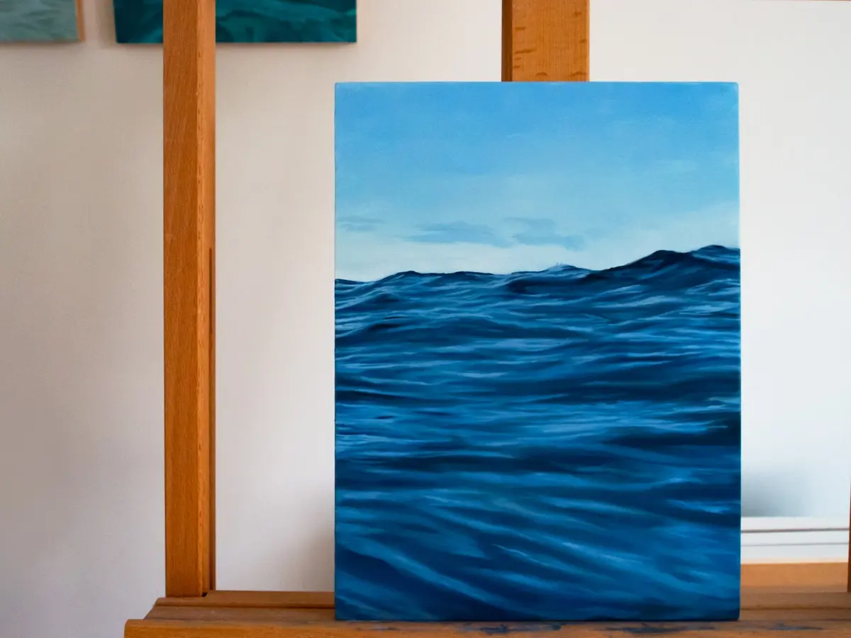
Mixing ocean colors is an exercise in understanding light and depth. The ocean is rarely just one shade of blue; it changes based on the depth of the water and the reflection of the sky. Start by mixing your base blues with small amounts of green to create emerald or teal tones for shallower water. Adding a touch of Burnt Umber or a complementary color like orange can neutralize overly bright blues, resulting in a more natural, muted sea color.
When creating the transition from deep water to the shoreline, use a gradient approach. Follow these steps to achieve a realistic color progression:
- Mix a dark, saturated blue for the deepest part of the horizon.
- Gradually add white and a hint of green as you move toward the foreground.
- Use lighter, more translucent mixtures for the crests of waves to suggest sunlight passing through the water.
- Keep your mixtures consistent by preparing enough paint on your palette before you begin painting the main body of the water.
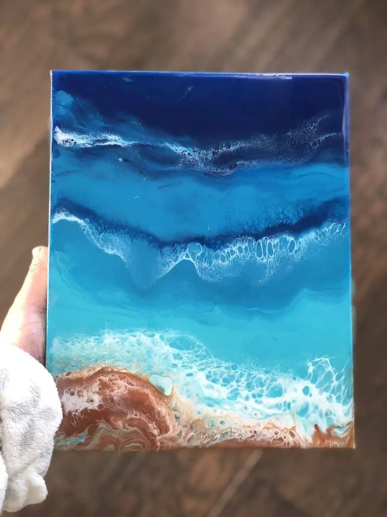
How do I paint waves and movement?
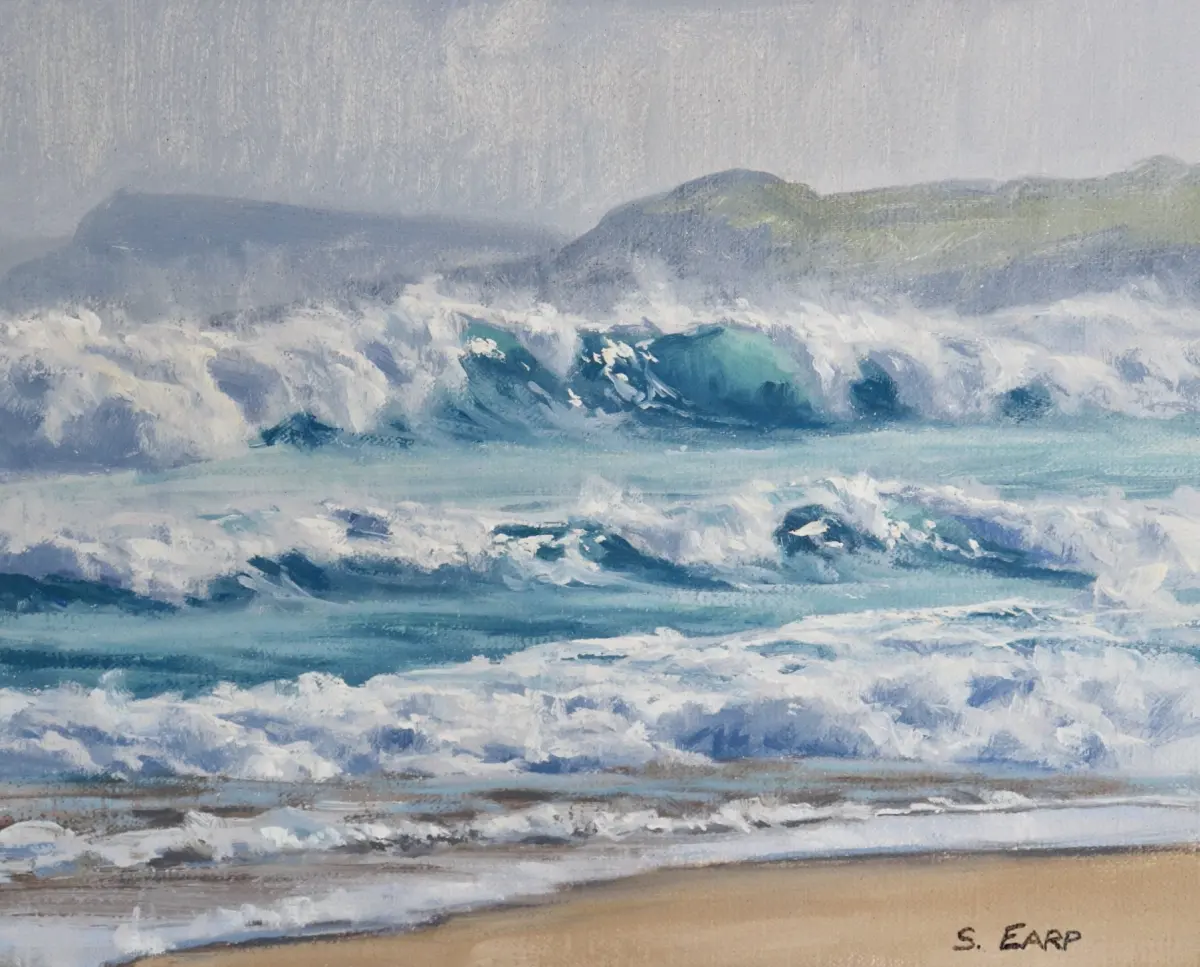
Capturing movement requires varied brushwork and an understanding of wave structure. Instead of painting uniform lines, use horizontal strokes that follow the curvature of the wave. Start by mapping out the darkest areas of the wave, known as the trough, and work toward the lighter highlights on the crest. By varying the pressure of your brush, you can create soft, blurred edges where the water meets the air and sharper, more defined edges where the wave breaks.
To add life to your waves, focus on the interaction between water and light. Use a dry-brush technique—where very little paint is on the brush—to drag white highlights across the texture of the canvas. This mimics the appearance of sea foam and bubbles. When painting the foam, avoid perfectly straight lines; instead, use irregular, stippled marks to suggest the chaotic nature of breaking water. Layering these highlights over darker, semi-transparent blues will provide the depth necessary to make the water appear deep and dynamic.
Common mistakes when painting the ocean
One of the most frequent errors beginners make is using too much white, which can make the water look chalky or flat. While white is necessary for highlights and foam, it should be used sparingly to maintain the saturation of your blues and greens. Another common issue is failing to account for the horizon line. If the horizon is not perfectly level, the entire painting will feel tilted, which is jarring to the viewer. Always use a straight edge or a level to ensure your horizon is accurate before detailing the waves.
Another mistake involves over-blending the paint. Because acrylics dry quickly, attempting to smooth out every transition can result in muddy, dull colors. Instead, embrace the visible brushstrokes, as they add energy and rhythm to the water. Avoid using pure black for shadows, as this often looks unnatural; instead, mix your own darks using deep blues and browns. Finally, ensure you are not painting the ocean in isolation; remember that the water reflects the sky, so incorporating subtle hints of your sky's color into the surface of the water will unify the composition.
How to add finishing touches to my painting?
Finalizing your ocean painting involves refining the details that draw the viewer’s eye into the scene. Once the base layers are dry, you can add "glazes"—thin, transparent layers of paint—to adjust the color temperature or deepen the shadows. This technique is particularly effective for creating the illusion of transparency in shallow water, where you might see the sandy bottom beneath the surface. Use a soft brush to apply these glazes gently, ensuring you do not disturb the underlying layers.
After the glazes are dry, you may choose to add a final varnish to protect the surface and enhance the colors. A gloss varnish will make the water appear wet and vibrant, while a matte finish can provide a more subdued, atmospheric look. Ensure the painting is completely cured before applying any varnish to prevent trapping moisture. By carefully layering your colors, respecting the horizon, and adding subtle, textured highlights, you will achieve a professional-looking ocean scene that captures the natural beauty and power of the sea.
Key facts
- Acrylic paint dries within 10 to 20 minutes, allowing for rapid layering of waves and foam.
- Use a "glazing medium" to extend the drying time and create transparent, fluid water effects.
- Titanium white is essential for painting the bright highlights of breaking waves and sea foam.
- Start with dark, muted colors at the horizon line and transition to lighter, vibrant blues near the shore.
- Employ a "dry brush" technique by using very little paint on a stiff brush to create the texture of sea spray.
- Always clean synthetic brushes immediately after use, as dried acrylic paint can permanently ruin the bristles.
The bottom line
Painting the ocean with acrylics requires a balance of speed and layering. By starting with dark, distant values and moving toward light, textured foregrounds, you can create a compelling sense of depth. Master the dry brush technique for foam and use mediums to control the fast drying time. With practice, these versatile paints allow you to capture the dynamic, ever-changing nature of the sea effectively.
People also ask
How do I create the illusion of depth in an ocean painting?
Use darker, cooler colors like ultramarine or phthalocyanine blue for the distant horizon. As the water approaches the foreground, shift to warmer, lighter tones like cerulean or turquoise to suggest proximity.
Should I use a gesso primer before painting the ocean?
Applying two coats of white gesso to your canvas creates a smooth, non-porous surface. This prevents the paint from soaking into the fabric and helps colors appear more vibrant.
How do I paint realistic whitecaps on waves?
Wait for the base layer of the wave to dry completely before adding white highlights. Use a small, firm-bristled brush to dab or flick paint onto the crests to mimic the chaotic nature of foam.
Can I blend acrylics like oil paints?
Acrylics dry too quickly for traditional wet-on-wet blending. Use a slow-drying medium or a fine mist of water from a spray bottle to keep the paint workable for longer periods.
What is the best way to paint the horizon line?
Use a piece of painter's tape to mask off a perfectly straight horizon line. Remove the tape only after the paint is dry to ensure a crisp, professional edge.
How do I fix a mistake in my acrylic painting?
Simply let the area dry for a few minutes and paint over the error with a new layer of color. Acrylics are opaque enough to cover most mistakes once the underlying layer has set.
This answer was created with the help of AI research tools and reference sources. Spotted an error? Let us know — we correct mistakes quickly. See our editorial policy.