How do you make digital art look traditional?
Short answer
To make digital art look traditional, you must introduce organic imperfections and physical texture. By utilizing textured brushes, limiting your color palette, and mimicking the layering process of physical media, you break the sterile precision of software. Focus on varying line weight and adding grain to bridge the gap between digital and canvas.
On this page
How to choose the right brushes for traditional textures
The most common indicator of "digital" art is the perfectly smooth, uniform stroke. To emulate traditional media, you must select brushes that replicate the physical interaction between pigment and surface. Look for brush sets categorized as "dry media," "impasto," or "natural charcoal." These brushes often include subtle variations in opacity and edge quality, mimicking the way a real pencil or brush skips across paper grain.
When setting up your workspace, prioritize brushes that utilize "dual-brush" settings or "texture stamps." These features ensure that every stroke carries the tactile quality of a specific material, such as cold-press watercolor paper or rough canvas. Avoid using standard hard-round brushes, as their mathematical precision is the antithesis of traditional art. Instead, build your library with these essential types:
- Dry charcoal or graphite pencils with jitter settings enabled.
- Oil paint brushes that feature bristle-texture patterns.
- Watercolor brushes that allow for color bleeding and pigment accumulation.
How to use color palettes for a natural look
Digital software offers millions of colors, which often leads to overly saturated, neon-like results that never occur in nature. Traditional artists typically work with a limited palette, mixing colors from a small set of pigments. To replicate this, start by restricting your color selection to a specific range, such as earthy tones or a complementary scheme. This creates a cohesive, grounded atmosphere that feels curated rather than computer-generated.
You should also avoid using pure black or pure white in your highlights and shadows. In nature, shadows are rarely black; they usually contain deep blues, purples, or browns. Similarly, highlights often pick up the ambient light of the environment. By sampling colors from real-world paintings or photographs of oil on canvas, you can train your eye to see the subtle shifts in hue that make a piece feel authentic. Consider these techniques:
- Limit your active color palette to five or six base colors.
- Use a "color mixing" layer to blend colors manually rather than using the digital eyedropper tool.
- Desaturate your shadows to prevent the "glow" effect common in digital work.
How to add texture and grain to digital layers
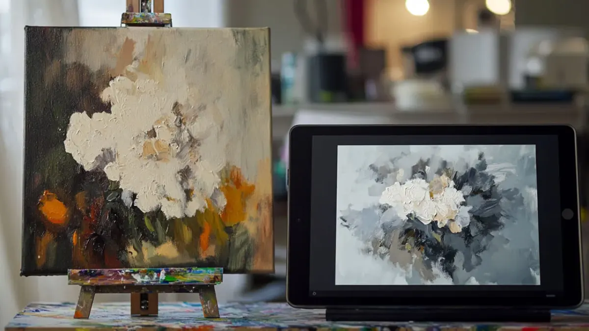
Digital images often suffer from a lack of "tooth," or the physical texture of the support surface. You can introduce this by overlaying a high-resolution scan of paper, canvas, or linen onto your project. Set this layer to "Multiply" or "Overlay" mode and adjust the opacity until the texture is visible but not distracting. This simple step provides the necessary grit that makes digital strokes appear as if they are sitting on top of a physical material.
Beyond surface textures, consider adding a subtle layer of digital noise or grain across your entire piece. This mimics the microscopic inconsistencies found in film photography or physical printmaking. If you are aiming for a painting style, use a "blender" brush to smudge your edges slightly. Traditional paint rarely has perfectly sharp, vector-like edges; softening your transitions helps the image feel like it was created by a human hand rather than a machine.
Common mistakes when mimicking traditional media
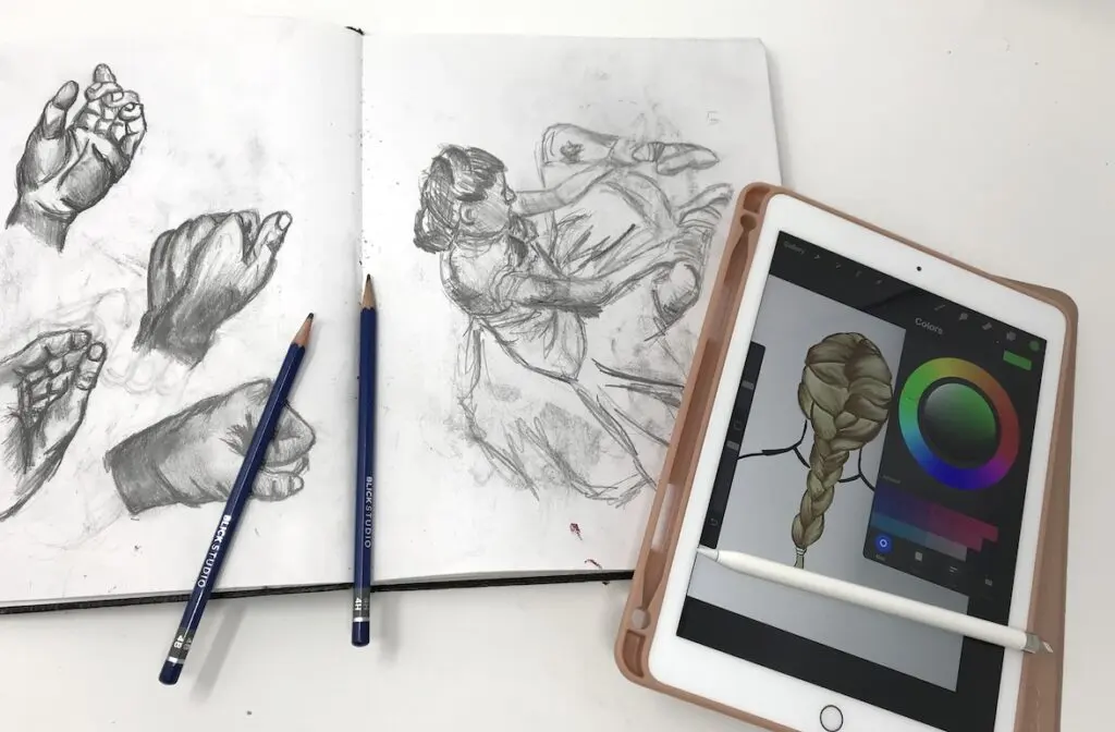
A frequent error is over-relying on the "Undo" function or using perfect symmetry tools. Traditional art is defined by its imperfections, such as shaky lines or accidental drips. If your digital work looks too clean, you have likely over-polished it. Try to embrace the "happy accidents" that occur during the process, and resist the urge to erase every stray mark or uneven line. These small flaws provide the character that viewers subconsciously associate with physical art.
Another mistake is failing to account for the way media layers interact. In oil painting, colors are often layered "fat over lean," meaning thicker, oilier paint is applied over thinner layers. Digital artists often paint everything on a single layer or use additive blending modes that don't exist in reality. To improve your workflow, follow these guidelines:
- Avoid "Screen" or "Add" blending modes, which create unrealistic light effects.
- Use "Multiply" for shadows to mimic the way transparent glazes darken a canvas.
- Vary your pressure sensitivity to ensure line weight changes naturally throughout a single stroke.
Why traditional art feels different than digital
The primary reason digital art feels different is the lack of physical resistance. When you draw on paper, the friction of the pencil creates a unique sound and tactile feedback that influences your muscle memory. To compensate for this in a digital environment, focus on the "gestural" quality of your work. Move your entire arm rather than just your wrist, which encourages more fluid, confident strokes that mirror the energy of a traditional sketch.
Ultimately, the goal is to stop thinking about the software as a calculator and start treating it as a studio. By focusing on the physical properties of light, pigment, and surface, you can transcend the limitations of the digital interface. Whether you are working in a program like Adobe Photoshop, Procreate, or Corel Painter, the principles of traditional art remain the same. Practice by observing how real paint behaves in the light, and apply those observations to your digital canvas to achieve a truly timeless aesthetic.
Key facts
- Use textured brushes that mimic physical media like charcoal, oil paint, or watercolor to break up digital smoothness.
- Add a subtle grain or paper texture overlay at low opacity to simulate the tooth of physical canvas or drawing paper.
- Limit your color palette to mimic the physical mixing of pigments rather than relying on the infinite digital spectrum.
- Vary your line weight and opacity to replicate the natural pressure sensitivity of graphite or ink on porous surfaces.
- Introduce intentional imperfections, such as slight bleeding, smudges, or uneven paint distribution, to avoid a sterile, "perfect" digital look.
- Use multiply or overlay blending modes for shadows and highlights to simulate the transparent layering found in traditional watercolors or glazes.
The bottom line
Achieving a traditional aesthetic in digital art requires a shift from technical perfection to intentional imperfection. By incorporating paper textures, limiting your color palette, and utilizing brushes that mimic physical resistance, you can bridge the gap between mediums. Focus on replicating the tactile nature of analog tools, such as the grain of paper or the viscosity of paint, to give your digital work authentic character.
People also ask
Do I need a special tablet to make digital art look traditional?
While a graphics tablet with pressure sensitivity is standard, the software settings are more important than the hardware. Focus on adjusting your brush stabilization and pressure curves to mimic the resistance of physical tools.
How can I make digital colors look more natural?
Avoid using pure black or neon colors, as these rarely occur in nature. Instead, mix your colors by eye and use desaturated tones to create a more organic, harmonious appearance.
What is the best way to add texture to a digital painting?
Import high-resolution scans of real paper or canvas and place them as a top layer set to "Overlay" or "Soft Light." Adjust the opacity between 5% and 15% to ensure the texture enhances rather than obscures your work.
Why does my digital art look too "plastic"?
This often happens when artists use too much airbrushing or perfectly smooth gradients. Replace soft brushes with textured ones and use hard-edged strokes to define forms more realistically.
Should I use layers to mimic traditional painting?
Traditional artists work on one surface, but digital artists should use layers to manage complexity. To keep a traditional feel, limit your layer count and avoid using too many complex blending modes that create artificial light effects.
How do I replicate the look of paint strokes?
Use custom brushes that have "jitter" settings for size, angle, and opacity. This ensures that every stroke you make varies slightly, preventing the repetitive, mechanical look of standard digital brushes.
This answer was created with the help of AI research tools and reference sources. Spotted an error? Let us know — we correct mistakes quickly. See our editorial policy.