How do you draw cherries?
Short answer
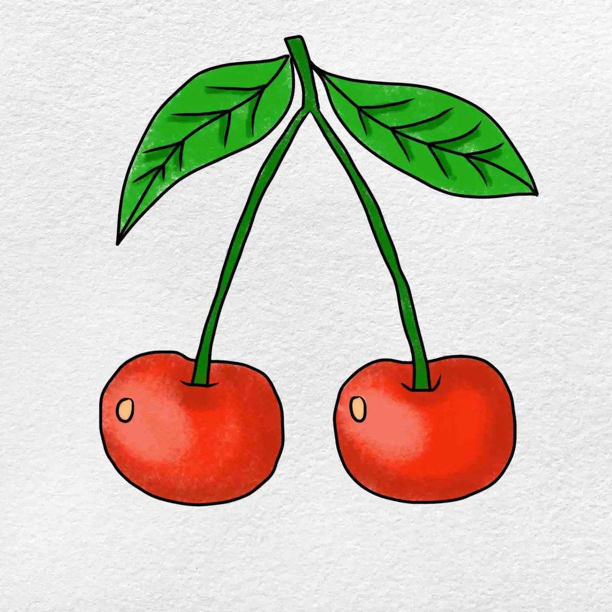
Drawing cherries involves sketching two overlapping circles, attaching thin, curved stems that meet at a single point, and adding highlights to suggest volume. By focusing on the spherical shape, the reflective surface texture, and the natural connection of the stems, you can create a realistic representation of this common fruit.
On this page
How to draw cherries step by step
To begin your drawing, start by sketching two circles of roughly equal size. Place them close together so that one slightly overlaps the other, which creates a sense of depth and interaction between the two fruits. Use light pencil strokes so you can easily erase the overlapping lines later. Once the circles are established, draw two thin, slightly curved lines extending upward from the top of each circle. These lines should converge at a single point, forming the stems. You can add a small, V-shaped notch at the top of each cherry where the stem attaches to the fruit to provide a more natural look.
- Draw two circles side by side with a slight overlap.
- Erase the inner line where the circles intersect to create a unified silhouette.
- Sketch two curved lines extending upward from the top centers of the circles.
- Join the two lines at a single point and add a small leaf or stem thickening.
- Define the dimple at the top of each cherry where the stem enters the fruit.
Best drawing tools for beginners
For those just starting, a standard HB graphite pencil is the most versatile tool for sketching the initial outlines. HB lead is firm enough to create light, erasable guidelines without damaging the paper surface. Once the structure is set, you may want to transition to a 2B or 4B pencil for adding darker shadows and defining the contours. Using a high-quality white vinyl eraser is essential for cleaning up overlapping lines and creating crisp highlights on the skin of the cherries. If you choose to add color, wax-based colored pencils allow for smooth blending, which is necessary to replicate the waxy, reflective skin of a cherry.
- HB pencil for initial light sketching and structural layout.
- 2B or 4B pencil for shading and adding depth to the shadows.
- Vinyl eraser for precision cleaning and creating bright highlights.
- Blending stump or soft tissue to smooth out graphite transitions.
- High-quality drawing paper with a slight tooth to hold graphite layers.
How to shade cherries for realism
Shading is the most important step in making your cherries look three-dimensional rather than flat circles. Cherries have a glossy, smooth skin that reflects light, creating a distinct "hot spot" or highlight. Identify where your light source is coming from and leave that area of the paper white. Use a circular shading motion to follow the curvature of the fruit, moving from the highlight toward the darker edges. The side opposite the light source should be the darkest, often featuring a "reflected light" area near the very bottom edge where light bounces back onto the fruit from the surface below.
When shading, keep your pencil strokes consistent with the round shape of the cherry. Avoid harsh, straight lines, as these will flatten the object. Instead, build up your tones gradually by layering light pressure. The transition from the highlight to the deepest shadow should be smooth and gradual. If you are using color, remember that the darkest parts of a red cherry are often deep purples or browns rather than pure black, which helps maintain the vibrancy of the fruit's natural color.
Common mistakes when drawing cherries
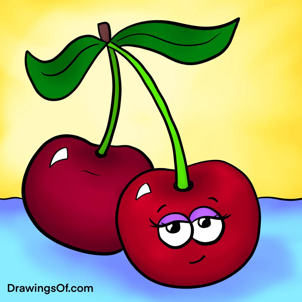
A frequent error for beginners is drawing the stems as perfectly straight, rigid lines. In nature, cherry stems are flexible and organic, often drooping slightly under the weight of the fruit. Avoid making the stems too thick, as they should appear delicate in proportion to the round cherries. Another common mistake is failing to account for the overlapping area. If you do not erase the line where one cherry sits behind the other, the drawing will look like two separate shapes rather than a unified cluster. Always ensure the perspective of the stems matches the angle of the cherries.
- Drawing the cherries as perfect, flat circles instead of slightly irregular spheres.
- Making the stems too thick or rigid, which detracts from the organic appearance.
- Forgetting to leave a highlight, which makes the fruit look dull or matte.
- Placing the stems at the wrong angle, making the connection point look unnatural.
- Using heavy, dark outlines that make the fruit look like a cartoon.
Why cherries look glossy in drawings
The glossy appearance of a cherry is caused by the way its smooth, waxy skin interacts with ambient light. To capture this in a drawing, you must master the contrast between the brightest highlight and the deepest shadow. The highlight is usually a sharp, bright white shape, often oval or crescent-shaped, depending on the light source. Because the skin is reflective, it also picks up colors from the surrounding environment. In a realistic drawing, you can suggest this glossiness by keeping the highlights very crisp and ensuring the darkest shadows are placed strategically to emphasize the roundness of the fruit.
By observing real cherries, you will notice that the highlight often shifts depending on the curvature of the fruit. It is rarely just a single dot; it often stretches along the top curve. By carefully placing these highlights and softening the transition into the mid-tones, you create the illusion of a wet, polished surface. Practicing this technique on simple spheres will eventually allow you to apply the same principles to more complex fruit arrangements, ensuring your drawings possess a professional, polished quality that captures the essence of the subject matter perfectly.
Key facts
- Cherries are defined by their spherical shape and the distinct, thin stems that connect them to a central point.
- Use a light graphite pencil to sketch two overlapping circles, which helps establish the natural weight and volume of the fruit.
- The highlight on a cherry is usually a small, crescent-shaped white area located near the top curve to indicate a glossy surface.
- Stems should be drawn with a slight "S" curve rather than a perfectly straight line to mimic organic growth patterns.
- A "dimple" or small indentation where the stem meets the fruit is essential for adding structural realism.
- Layering red tones from dark to light creates a three-dimensional effect, with the darkest shadows placed opposite the light source.
The bottom line
Drawing cherries is an excellent exercise in mastering highlights and rounded forms. By focusing on the structural dimple at the stem base and maintaining a high-contrast color palette, you can effectively capture the glossy, organic nature of the fruit. Remember that the key to realism lies in the reflection; keep your highlights sharp and your shadows deep to create a convincing, three-dimensional piece of art.
People also ask
What is the most common mistake when drawing cherries?
The most frequent error is making the surface look flat or matte. Cherries have a high-gloss skin that reflects light, so leaving a bright, sharp highlight is crucial for a realistic look.
Should I draw the stem first or the fruit?
It is better to draw the fruit first to establish the placement and size. Once the cherries are positioned, you can draw the stems extending from the top dimples to ensure they connect naturally.
How do I make the cherries look shiny?
You must maintain a high contrast between the dark shadows and the bright highlights. Use a white gel pen or an eraser to pull out crisp, clean highlights after you have finished coloring the body.
What colors are best for shading a cherry?
While the base is red, use deep purples or dark browns for the shadows. Avoid using black, as it can make the fruit look bruised or dull rather than vibrant.
How do I draw the stem connection point?
Draw a small, shallow "V" shape or a tiny crater at the top of the cherry. The stem should appear to emerge from this center point rather than sitting on top of the skin.
Is it necessary to use a reference photo?
Using a reference photo is highly recommended for beginners. It helps you understand how light behaves on curved, reflective surfaces and how the stems naturally drape over one another.
This answer was created with the help of AI research tools and reference sources. Spotted an error? Let us know — we correct mistakes quickly. See our editorial policy.