How do you draw a realistic sky?
Short answer
Drawing a realistic sky requires mastering atmospheric perspective, color gradients, and cloud volume. By applying lighter, cooler tones toward the horizon and deeper, warmer blues overhead, you create a sense of vast distance. Focus on light sources and soft, blurred edges to replicate the natural behavior of light in the atmosphere.
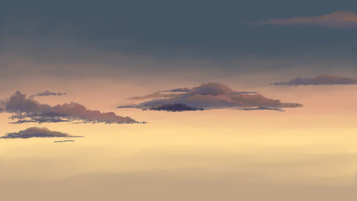
On this page
How to create depth in the sky
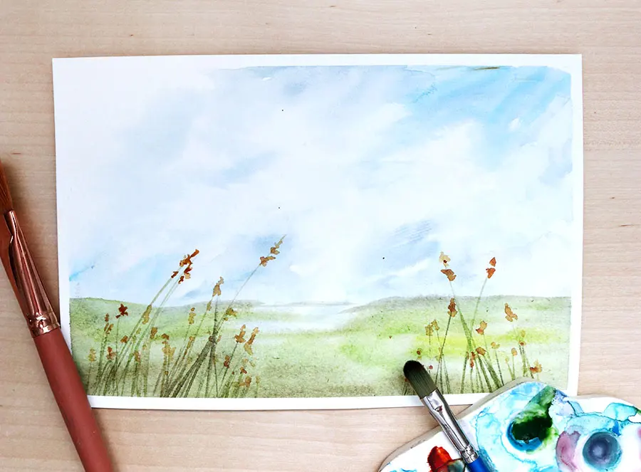
The most critical element in realistic sky drawing is atmospheric perspective. As objects or areas of the sky move closer to the horizon, they appear lighter, less saturated, and often shift toward a cooler, grayish-blue hue. This occurs because there is more atmosphere—and thus more light scattering—between your eye and the horizon than there is looking straight up.
To achieve this effect, use a gradient that transitions from a deep, intense cobalt or ultramarine at the top of your paper to a pale, misty cerulean or white near the bottom. Avoid using a solid, flat color, as this makes the sky look like a wall rather than an infinite expanse. Blend your pencil strokes or paint layers thoroughly to ensure there are no harsh lines, mimicking the soft diffusion of gases in the sky.
- Start with a light wash or base layer of your lightest blue.
- Gradually layer darker pigments or graphite toward the top of the page.
- Use a clean brush or blending stump to soften the transition between tones.
- Keep the horizon line crisp but the colors above it increasingly diluted.
How to draw realistic clouds
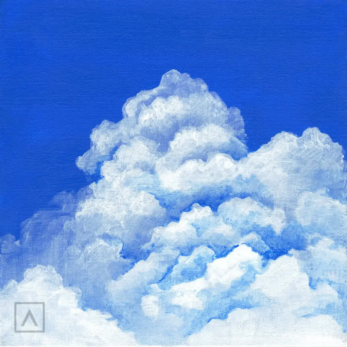
Clouds are three-dimensional objects that possess volume, shadow, and highlights. Beginners often make the mistake of drawing clouds as flat, white shapes outlined in dark pencil. Instead, treat clouds as solid masses that interact with the sun. Identify where your light source is located and apply shadows to the undersides of the clouds while keeping the tops bright.
Use a "subtractive" method if you are working with charcoal or graphite. Lay down a light gray tone across the sky area, then use a kneaded eraser to lift out the bright, fluffy highlights of the clouds. This technique creates soft, organic edges that are difficult to replicate with just a pencil point. Remember that clouds closer to the horizon appear flatter and smaller due to perspective, while those directly overhead appear rounder and more detailed.
- Observe the light source: The sun dictates where the shadows fall on the cloud's belly.
- Vary the edges: Use a mix of sharp, crisp edges for the sunlit side and soft, blurred edges for the shadowed side.
- Add depth: Use subtle grays and purples in the shadows to give the clouds weight and density.
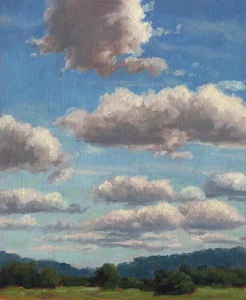
Best tools for drawing skies
The choice of medium significantly affects the realism of your sky. For graphite artists, a set of pencils ranging from 2H to 4B is essential. Harder leads (H) allow for light, smooth gradients, while softer leads (B) provide the depth needed for storm clouds or deep evening tones. A high-quality kneaded eraser is your most important tool, as it can be shaped to lift highlights or soften transitions.
If you are working with colored pencils or pastels, focus on layering. Colors in the sky are rarely a single shade; they are a complex mix of blues, purples, and even subtle pinks or yellows. Layering a light yellow over a pale blue can create a more natural, luminous green-blue that looks like real daylight. Always use high-quality, acid-free paper with a slight "tooth" or texture, as this helps hold the pigment and allows for better blending of the sky’s subtle color shifts.
- Kneaded eraser: Crucial for lifting highlights and correcting mistakes without damaging the paper.
- Blending stumps: Used to smooth out graphite and create seamless transitions between colors.
- Smooth-surface paper: Prevents unwanted texture from interfering with the smooth gradient of the sky.
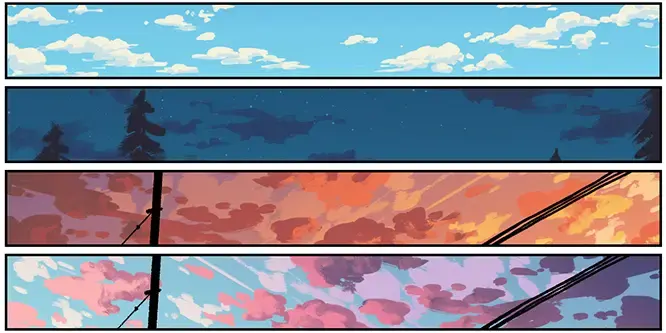
Why skies look different at various times
The color and mood of the sky change drastically depending on the time of day. During the "golden hour"—shortly after sunrise or before sunset—the sun's light travels through more of the atmosphere, scattering blue light away and leaving behind warmer reds, oranges, and yellows. During these times, the sky is not blue at all, but a gradient of warm tones that requires a different approach to layering and color mixing.
At high noon, the sun is overhead, creating high-contrast shadows and a bright, intense blue. In contrast, an overcast day creates a flat, desaturated sky where the clouds and the background merge into a uniform gray. When drawing, study reference photos taken at specific times to understand how the light temperature shifts. If you are drawing a sunset, avoid using pure black for shadows; instead, use deep violets or dark burnt umber to keep the colors harmonious and realistic.
Common mistakes when drawing skies
One of the most frequent errors is creating "static" skies that lack movement or energy. Skies are dynamic, and clouds often follow wind patterns or perspective lines. Avoid placing all your clouds at the same size or spacing them evenly across the paper. Nature is chaotic, so incorporate variety by grouping some clouds together while leaving large, open spaces of clear sky in between.
Another common mistake is neglecting the horizon line. If the horizon is not perfectly level or lacks the appropriate color shift, the entire sky will feel tilted or disconnected from the ground. Always ensure your horizon is straight and that the transition from the sky to the landscape is handled with care. Finally, do not overwork your drawing. If you spend too much time layering, the paper can become saturated, leading to a muddy appearance that loses the vibrant, airy quality of a natural atmosphere.
Key facts
- The sky is rarely a uniform blue; it is typically lighter near the horizon and deepens into a darker, more saturated blue toward the zenith.
- Atmospheric perspective dictates that objects further away lose contrast and shift toward the color of the sky, usually a cool blue or grey.
- Clouds are three-dimensional volumes; use highlights on the top and shadows on the bottom to create a sense of mass and depth.
- To mix a realistic sky blue, combine ultramarine or cobalt blue with a small amount of white and a touch of warm yellow to neutralize the intensity.
- When painting sunsets, the colors transition from deep purples and blues at the top to vibrant oranges, pinks, and yellows near the sun.
- Avoid using pure white for clouds; instead, use pale greys, creams, or light blues to represent reflected light and shadow within the vapor.
The bottom line
Drawing a realistic sky requires observing how light behaves as it travels through the atmosphere. By mastering the gradient from the horizon to the zenith and understanding how to render clouds as three-dimensional volumes, you can create depth and mood. Focus on subtle color transitions and avoid harsh outlines. With consistent practice in observing natural light, your sky paintings will gain a professional, atmospheric quality.
People also ask
Why does the sky look lighter near the horizon?
The sky appears lighter near the horizon due to atmospheric haze, which consists of dust, moisture, and particles that scatter light. This effect, known as aerial perspective, causes distant colors to wash out and lighten as they approach the ground level.
Should I use black to darken my sky colors?
Avoid using pure black to darken sky colors, as it often creates a muddy or unnatural appearance. Instead, mix your blue with its complementary color, such as a burnt orange or a deep violet, to achieve a rich, natural shadow tone.
How do I make clouds look soft and fluffy?
Use a clean, dry brush to gently blend the edges of your clouds into the surrounding sky while the paint is still wet. Keeping the center of the cloud opaque and the edges translucent will naturally create a soft, volumetric effect.
What is the best way to capture the transition of colors at sunset?
Use a technique called "wet-on-wet" blending, where you apply adjacent colors to the canvas simultaneously and soften the borders with a wide, flat brush. This allows the pigments to merge seamlessly without creating harsh lines between the hues.
How do I determine the light source in a sky painting?
The light source is almost always the sun or the moon, which dictates the placement of highlights on your clouds. Ensure that all highlights are on the same side of the cloud formations to maintain consistency and realism.
Why do my sky colors look flat?
Flatness often results from using a single, uniform shade of blue across the entire canvas. Introduce subtle variations in temperature and value by adding hints of violet, green, or warm white to create a sense of atmosphere and movement.
This answer was created with the help of AI research tools and reference sources. Spotted an error? Let us know — we correct mistakes quickly. See our editorial policy.