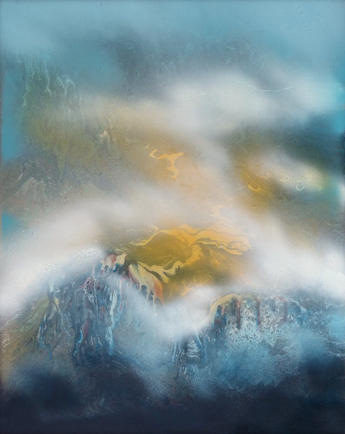
How do you paint skies in watercolor?
Short answer
Painting skies in watercolor requires mastering water control and timing. You must work quickly while the paper is damp to achieve smooth gradients. By using techniques like wet-on-wet application, gravity, and careful pigment management, you can create realistic atmospheric depth, soft clouds, and vibrant transitions from the horizon to the zenith.
On this page
How to prepare paper for watercolor skies
Proper preparation is the foundation of a successful sky. Watercolor paper should be heavy, ideally 300-pound cold-press or rough stock, to prevent buckling when saturated with water. If you use lighter paper, you must stretch it by soaking it in water and taping it down to a board with gummed paper tape. This ensures the surface remains flat while you apply large, wet washes.
Before applying any pigment, you should lightly dampen the entire area with clean water using a large flat brush or a hake brush. This creates an even surface tension that allows paint to flow predictably. If the paper is too dry, the paint will create hard edges; if it is too wet, the pigment will pool uncontrollably. Aim for a surface that has a subtle, uniform sheen without visible puddles.
Best watercolor techniques for painting skies
The most effective method for skies is the wet-on-wet technique. This involves applying diluted paint onto the pre-moistened paper, allowing the pigments to expand naturally. To create a realistic gradient, start with a more concentrated pigment at the top of the sky and gradually add clean water as you move toward the horizon. This mimics the natural atmospheric perspective where the sky appears darker overhead and lighter near the ground.
To add clouds, you can use the "lifting" technique while the wash is still damp. A clean, thirsty brush or a piece of crumpled paper towel can gently remove pigment to reveal the white of the paper underneath. Alternatively, you can drop in a slightly thicker consistency of paint to create darker cloud shadows. Follow these steps for a smooth application:
- Mix a large puddle of your chosen blue pigment, such as cerulean or cobalt, ensuring you have enough to cover the entire sky without stopping to mix more.
- Tilt your board at a slight angle to encourage the paint to flow downward evenly.
- Use a large mop brush to apply the wash in horizontal strokes, working from the top down.
- Soften any harsh edges immediately with a damp, clean brush before the paint begins to set.
How to manage paint and water ratios
Successful skies depend on understanding the consistency of your paint. A "tea" consistency is perfect for pale, distant horizons, while a "milk" or "cream" consistency provides the depth needed for a deep blue zenith. If your paint is too watery, it will dry into a pale, washed-out color that lacks impact. If it is too thick, it will look muddy and fail to blend smoothly across the paper.
Always test your colors on a scrap piece of paper before applying them to your main work. Remember that watercolor dries significantly lighter than it appears when wet. By keeping your water container clean and changing it frequently, you prevent unwanted gray tones from contaminating your sky. If you are painting a sunset, introduce warm colors like yellow or rose while the blue is still wet, but avoid over-mixing, which creates dull, brownish-purple hues.
Common mistakes when painting skies
One of the most frequent errors is "overworking" the sky. Once you have laid down your wash, resist the urge to go back and touch up areas that are already beginning to dry. This creates "cauliflowers" or backruns, where new water pushes the drying pigment into unsightly patterns. If you miss a spot, it is often better to leave it and address it once the entire painting is completely dry.
Another common mistake is failing to account for the drying time of the paper. If you work too slowly, the paper will dry in patches, leading to streaks and uneven transitions. You should also avoid using too many different colors, which can make the sky look chaotic. Stick to a limited palette of two or three pigments to maintain color harmony across the entire expanse.
- Applying paint to paper that is already partially dry, causing streaks.
- Using a brush that is too small, which prevents a continuous, fluid wash.
- Ignoring the horizon line, which should be the lightest part of the sky.
- Scrubbing the paper surface, which damages the fibers and ruins the transparency.
How to achieve depth in watercolor skies
To achieve a sense of distance, you must vary the intensity and temperature of your colors. The sky near the horizon is often warmer and paler due to the concentration of atmospheric particles. As you move upward toward the zenith, the sky becomes cooler and more saturated. By shifting your color temperature from a warm yellow-blue to a cool, deep ultramarine, you create a three-dimensional effect that draws the viewer’s eye into the distance.
You can also enhance depth by incorporating subtle color shifts within your clouds. Use a mix of cobalt blue and a touch of burnt sienna to create soft, neutral grays for the undersides of clouds. Keep these shadows soft by blending them into the surrounding sky wash while the paper remains damp. By carefully layering these subtle shifts in tone and temperature, you transform a flat, blue rectangle into a vast, breathable atmosphere that provides a convincing backdrop for your landscape.
Key facts
- Use the "wet-on-wet" technique by pre-wetting your paper with clean water to allow pigments to flow and blend naturally.
- Tilt your drawing board slightly to encourage the paint to move downward, creating a smooth, gravity-assisted gradient.
- Use a large, round or flat brush, such as a size 12 or larger, to hold enough water and pigment for broad coverage.
- Mix more paint than you think you need in a palette well to ensure you do not run out mid-wash.
- Apply colors from lightest to darkest, starting with a pale cerulean or cobalt blue before adding deeper tones.
- Avoid overworking the paper, as scrubbing with a brush will damage the surface texture and cause muddy, uneven colors.
The bottom line
Painting a successful watercolor sky relies on managing the moisture content of your paper and working with gravity. By utilizing the wet-on-wet technique and maintaining a steady, flowing wash, you can achieve smooth gradients and soft, ethereal clouds. Practice patience by allowing layers to dry completely before adding detail, and always mix ample pigment to maintain a consistent, vibrant color across the entire sky area.
People also ask
How do I prevent hard edges or "blooms" in my sky?
Keep the paper consistently damp and avoid adding new, watery paint into an area that has already begun to dry. If you see a hard edge forming, quickly soften it by gently brushing over the line with a clean, damp brush.
What is the best paper for painting skies?
Cold-press watercolor paper with a weight of at least 140 pounds (300 gsm) is ideal because it absorbs water slowly and resists buckling. Heavier paper allows you to apply multiple washes without the surface warping or tearing.
Should I paint around the clouds?
You can either paint around the white space of the clouds or "lift" them out later by wiping the wet paint away with a clean, damp paper towel or a stiff brush. Lifting is often preferred for a softer, more realistic cloud edge.
Why does my sky look streaky?
Streaks often occur when the brush is too dry or when you stop and start your strokes too frequently. Maintain a continuous "bead" of water at the bottom of your brush stroke to ensure the pigment flows evenly across the surface.
How do I achieve a sunset effect?
Start with a pale yellow wash at the horizon and transition into oranges, pinks, and purples as you move upward. Ensure each color blends into the next while the paper is still wet to avoid harsh transition lines.
What colors are essential for a basic blue sky?
Cerulean blue is perfect for bright, clear days, while cobalt or ultramarine blue provides more depth for darker, dramatic skies. Mixing a touch of alizarin crimson into your blue can create a more natural, atmospheric gray-blue.
This answer was created with the help of AI research tools and reference sources. Spotted an error? Let us know — we correct mistakes quickly. See our editorial policy.