How do you draw a person reading?
Short answer
To draw a person reading, focus on the triangular relationship between the eyes, the book, and the hands. Establish the figure's posture first, emphasizing the downward tilt of the head. Use simple geometric shapes to build the book’s perspective, then refine the details of the fingers and facial features to convey concentration.
On this page
How to structure the pose for a reading figure
The foundation of a convincing reading pose is the line of action. When a person reads, the spine typically curves forward, creating a C-shape that directs the viewer's attention toward the book. Start by sketching a light gesture line representing the spine, followed by a circle for the head and a larger oval for the torso. Ensure the head is tilted downward, as this is the most recognizable indicator of reading.
Positioning the arms is the next critical step in establishing the pose. The elbows usually rest near the ribs or on a surface like a table or lap, forming a stable base for the book. Avoid drawing the arms too far away from the body, as this makes the figure look detached from the object. Use these steps to build your initial sketch:
- Draw the spine’s curve to dictate the overall lean.
- Place the head tilted forward at a 30-to-45-degree angle.
- Sketch two simple cylinders for the upper arms.
- Position the hands at the bottom corners of the book.
Best techniques for drawing a book in perspective
A book is essentially a rectangular prism that changes shape based on the angle of the reader. To draw it accurately, use two-point perspective if the book is seen from the side, or one-point perspective if it is held flat. The pages should follow the curve of the book's binding, which creates a subtle arc rather than a perfectly straight line. If the book is open, the pages will fan out, creating a V-shape that leads the eye back toward the reader’s face.
Focus on the thickness of the book cover and the pages to add weight to the object. A common mistake is drawing the book as a flat, two-dimensional rectangle, which makes it look like a floating board. Instead, emphasize the depth by showing the thickness of the paper stack. Consider these tips for realistic book placement:
- Ensure the bottom edge of the book aligns with the reader's line of sight.
- Use overlapping lines where the fingers grip the edges to show physical contact.
- Add a slight shadow beneath the book to ground it in the scene.
Why the head and neck angle matters
The angle of the neck is the primary tool for communicating the reader's state of mind. A sharp downward tilt suggests intense study or deep immersion, while a more relaxed, upright posture indicates casual reading. When drawing the profile, the chin should be tucked toward the chest, which naturally hides part of the neck and creates a shadow under the jawline. This shadow is essential for adding volume and depth to the neck area.
Avoid the "floating head" syndrome by ensuring the neck connects naturally to the shoulders. The trapezius muscles will appear slightly bunched or elevated because the head is leaning forward. By observing your own reflection while reading, you will notice how the muscles shift and compress. Capturing this tension makes the drawing feel authentic rather than static. Focus on the transition from the base of the skull to the top of the spine to maintain anatomical accuracy.
Common mistakes when drawing hands holding a book
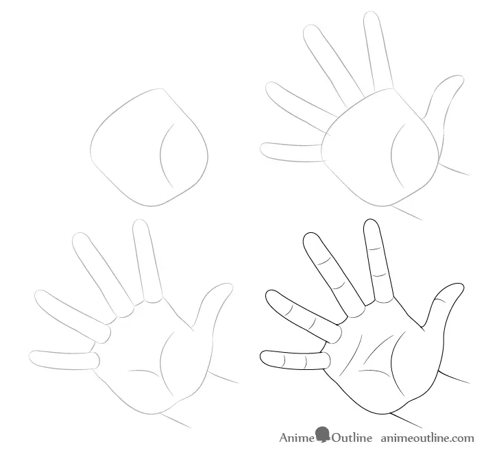
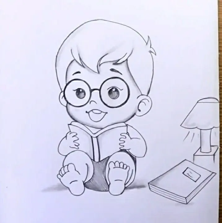
Hands are notoriously difficult to draw, especially when they are interacting with an object. A frequent error is drawing fingers that are too long or stiff, which makes the book look like it is being held by claws. Instead, focus on the "C" shape formed by the thumb and the index finger, which provides the primary support for the book's weight. The other fingers should curl naturally around the back or the edge of the cover.
Keep the hands proportional to the head; a general rule is that a hand is roughly the size of the face from chin to hairline. If the hands are too small, the figure will look like they are holding a tiny prop rather than a substantial book. Use these guidelines to refine your hand placement:
- Draw the thumb on the front cover to show grip.
- Keep the fingers slightly bent to show the tension of holding the pages.
- Use light shading to indicate the pressure points where skin meets paper.
- Ensure the wrists are bent slightly inward to match the natural resting position.
How to add shading for a sense of focus
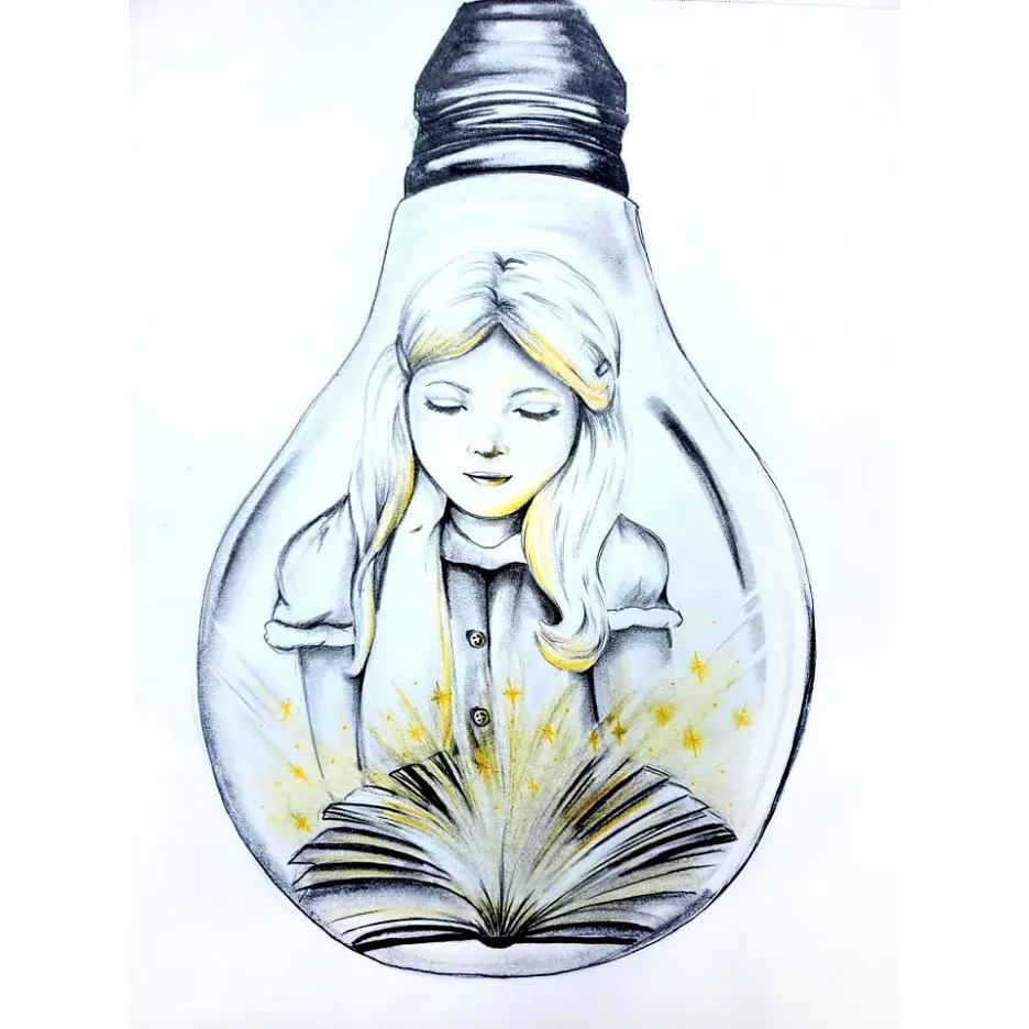
Shading is the final step that brings a drawing to life by creating a sense of environment. Since the reader is looking down, the light source—whether natural or artificial—will cast a shadow from the head onto the chest and the book itself. This shadow acts as a focal point, drawing the viewer's eye directly to the intersection of the reader and the text. Use soft, cross-hatched lines to build up these shadows gradually rather than using harsh, dark strokes.
Pay attention to the reflected light on the reader's face, which will be illuminated by the light bouncing off the pages of the book. This subtle glow adds a professional touch and reinforces the idea that the person is actively engaged with the text. By balancing the dark shadows of the neck and the light reflections on the face, you create a dynamic contrast. This interplay of light and shadow is what transforms a simple sketch into a compelling narrative piece.
Key facts
- Focus on the "C-curve" of the spine, as readers naturally hunch forward, bringing the head closer to the chest.
- Position the elbows close to the torso or resting on the lap to create a stable, realistic foundation for the arms.
- Draw the book as a trapezoid or a shallow "V" shape to account for perspective and the thickness of the pages.
- Ensure the eyes are angled downward toward the book, rather than looking straight ahead, to maintain anatomical accuracy.
- Keep the hands loose and relaxed; they should appear to be supporting the weight of the book rather than gripping it tightly.
- Use shadows under the chin and along the neck to emphasize the downward tilt of the head.
The bottom line
Drawing a person reading requires prioritizing the natural slouch of the spine and the downward orientation of the head. By anchoring the arms to the body and using simple geometric shapes for the book, you can create a believable scene. Focus on the interaction between the hands and the pages to convey a sense of weight, ultimately capturing the quiet intensity of a reader lost in thought.
People also ask
How do I make the book look like it has depth?
Draw the pages as thin, parallel lines curving slightly inward toward the center binding. Adding a small shadow where the pages meet the spine creates an immediate sense of volume.
What is the most common mistake when drawing someone sitting?
The most frequent error is making the legs too short or the torso too stiff. Always ensure the knees are higher than the hips if the person is sitting in a low chair or on the floor.
Should I draw the face in profile or from the front?
A profile view is often easier for beginners because it clearly shows the downward gaze and the neck posture. Frontal views are more challenging due to the need to foreshorten the nose and forehead.
How do I draw hands holding a book correctly?
Focus on the thumbs resting on the inner margins of the pages while the fingers curl around the outside edges. Avoid drawing fingers as rigid tubes; instead, use soft, overlapping shapes.
How can I show that the person is focused?
Subtle details like slightly parted lips or a furrowed brow suggest deep concentration. Keep the eyes mostly hidden or narrowed to emphasize that the character is looking at the text.
What clothes are easiest to draw for a reading pose?
Loose clothing like sweaters or hoodies works best because the fabric naturally bunches up at the elbows and shoulders. This adds realistic folds that help define the person's posture.
This answer was created with the help of AI research tools and reference sources. Spotted an error? Let us know — we correct mistakes quickly. See our editorial policy.