How do you color a drawing?
Short answer
Coloring a drawing involves selecting a medium, establishing a light source, and applying pigments in layers. Beginners should start with light base tones before building depth through shadows and highlights. By controlling pressure and blending techniques, you can transform a flat line drawing into a vibrant, three-dimensional image with professional visual appeal.
On this page
How to choose the right coloring medium
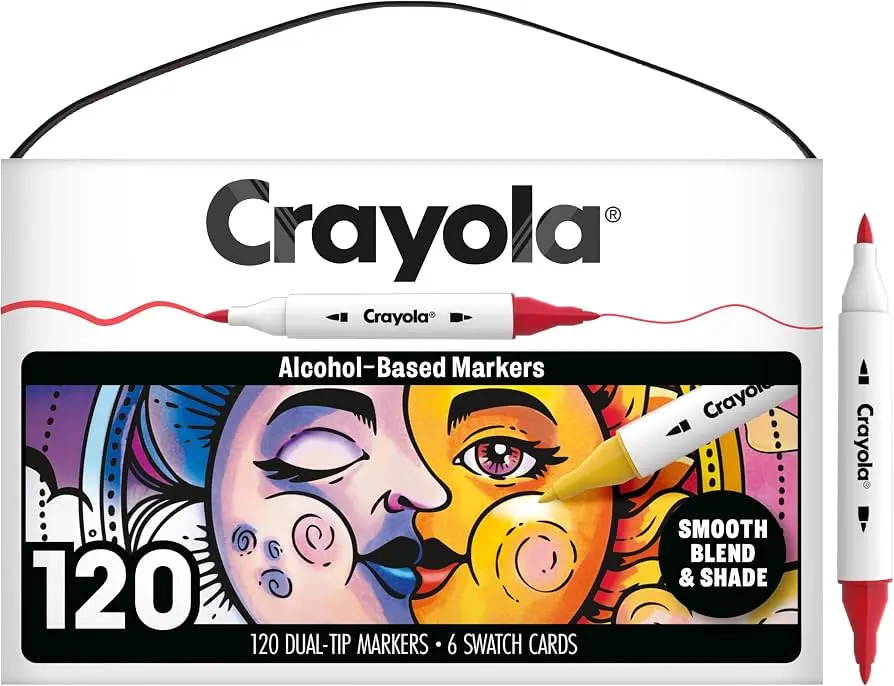
Selecting the appropriate medium is the first step in the coloring process. Colored pencils, alcohol-based markers, watercolors, and digital tools each offer unique textures and levels of control. Pencils are ideal for beginners because they allow for gradual layering and easy correction. Markers provide bold, saturated colors and smooth gradients but require high-quality paper to prevent bleeding. Watercolors offer a fluid, artistic aesthetic but demand a steeper learning curve regarding water-to-pigment ratios.
Consider the desired finish of your artwork before committing to a specific tool. If you prefer a soft, realistic look, wax-based pencils are excellent for blending colors seamlessly. For graphic designs or illustrations with sharp lines, alcohol markers are the industry standard. Evaluate your environment as well, as some media require significant ventilation or specialized surfaces to achieve the best results.
- Colored pencils: Best for detail, layering, and blending.
- Alcohol markers: Best for flat, vibrant, and streak-free coverage.
- Watercolors: Best for expressive, translucent, and atmospheric effects.
- Pastels: Best for soft textures and large, blended backgrounds.
How to use color theory basics
Understanding color theory is essential for creating harmonious drawings. The color wheel serves as a guide for selecting palettes that look natural to the human eye. Complementary colors, which sit opposite each other on the wheel, create high contrast and visual excitement. Analogous colors, located next to each other, produce a calm and unified appearance that is often used for backgrounds or subtle transitions.
Temperature also plays a vital role in how a viewer perceives your work. Warm colors like red, orange, and yellow tend to advance toward the viewer, while cool colors like blue, green, and purple recede into the background. By balancing these temperatures, you can create a sense of depth and focus. When in doubt, start with a limited palette of three or four colors to ensure your drawing remains cohesive and avoids looking cluttered.
How to layer and blend colors
Layering is the process of applying multiple thin coats of pigment to build intensity and complexity. Rather than pressing hard with a single color, use light, circular strokes to deposit pigment gradually. This technique prevents the paper from becoming saturated or damaged, allowing you to achieve smooth transitions between different hues. Blending tools, such as paper stumps or colorless blenders, can further soften edges and eliminate harsh lines.
When blending, always work from the lightest colors to the darkest. Darker shades are significantly harder to lighten once applied, so build up your shadows slowly. By overlapping colors, you create secondary and tertiary tones that add richness to the drawing. This method also allows you to simulate textures, such as the sheen on metal or the softness of fabric, by varying the density of your layers.
- Apply a light base layer across the entire area.
- Identify the light source and mark areas for highlights and shadows.
- Gradually add mid-tones to build volume.
- Use darker pigments to deepen shadows and define contours.
- Blend the edges with a colorless blender or a light-colored pencil.

How to create depth and shadows
Shadows provide the illusion of three-dimensional form on a two-dimensional surface. Before you begin coloring, determine where your light source is located. Everything on the opposite side of that light source should feature darker tones to indicate depth. Cast shadows, which appear on the surface beneath an object, are typically the darkest parts of a drawing and help ground the subject in space.
Avoid using pure black for all your shadows, as this can make an image look flat or muddy. Instead, mix a dark blue, purple, or brown into your shadow areas to create more vibrant, natural-looking depths. Observe how light interacts with objects in the real world to understand how highlights and core shadows behave. By consistently applying these rules of light and shadow, your drawings will gain a professional, sculptural quality that captures the viewer's attention.
Common mistakes when coloring drawings
One of the most frequent errors is applying too much pressure during the initial stages of coloring. Heavy pressure flattens the texture of the paper, making it impossible to add further layers or blend effectively. Another common mistake is neglecting the light source, which results in drawings that appear flat and lack a sense of physical presence. Take your time to map out the light before applying any pigment to the page.
Many beginners also struggle with patience, rushing to finish the drawing rather than building it up in stages. This often leads to messy edges and uneven color distribution. If you find yourself frustrated, step away from the work and return with fresh eyes. Maintaining a clean workspace and keeping your pencils sharp or your markers capped will also prevent accidental smudges and ensure your colors remain crisp and clean.
- Pressing too hard, which damages the paper fibers.
- Ignoring the light source, leading to inconsistent shadows.
- Using black for every shadow, which creates a dull appearance.
- Rushing the layering process, causing uneven or streaky results.
- Failing to test colors on scrap paper before applying them to the final drawing.
Key facts
- Use the color wheel to select complementary colors, which sit opposite each other to create high-contrast, vibrant visual effects.
- Apply light pressure with pencils or markers to build color intensity gradually rather than starting with heavy, dark strokes.
- Always test your colors on a scrap piece of paper before applying them to your final drawing to ensure they match your vision.
- Use a white gel pen or an eraser to add highlights back into your work, which creates a sense of depth and volume.
- Work from the background to the foreground to prevent smudging your hand across areas that are already finished.
- Keep your coloring tools sharp or consistent in flow to maintain clean edges and uniform texture across your drawing.
The bottom line
Coloring is a technical skill that relies on patience and the thoughtful application of pigment. By mastering basic techniques like layering, blending, and proper tool maintenance, you can transform simple sketches into vibrant compositions. Remember that the quality of your paper and the consistency of your stroke direction are just as important as the colors you choose. Practice regularly to develop your own unique artistic style.
People also ask
How do I prevent colors from bleeding through the paper?
Place a thick piece of cardstock or a dedicated plastic sheet underneath your drawing page. This barrier stops ink or heavy pigment from marking the subsequent pages in your sketchbook.
What is the best way to blend colored pencils?
Use a colorless blending pencil or a small amount of baby oil on a cotton swab to soften the transitions between hues. These tools help dissolve wax binders, creating a smooth, painterly finish.
Should I outline my drawing before or after coloring?
Most artists prefer to outline after coloring if using soft media like pastels, but outline before if using precise markers. Outlining first provides clear boundaries that help beginners stay within the lines.
How do I choose a color palette for my artwork?
Limit yourself to three or four primary colors to ensure visual harmony. You can expand this by using different shades and tints of those selected colors to maintain consistency.
Why does my coloring look streaky?
Streaks often occur when you change the direction of your strokes mid-section. Maintain a consistent, circular or parallel motion to ensure an even distribution of pigment across the paper.
How can I create shadows in a drawing?
Avoid using pure black for shadows, as it can make colors look muddy. Instead, use a darker shade of the object's base color or a cool-toned blue or purple to create depth.
This answer was created with the help of AI research tools and reference sources. Spotted an error? Let us know — we correct mistakes quickly. See our editorial policy.