What pens are best for calligraphy?
Short answer
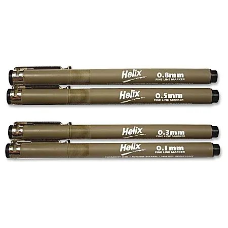
The best calligraphy pens depend on your chosen style. Beginners should start with felt-tip brush pens like the Tombow Fudenosuke for control. For traditional scripts like Gothic or Italic, dip pens with interchangeable metal nibs and a separate ink bottle provide the most precision, crisp line variation, and professional-grade results.
On this page
Best calligraphy pens for beginners
Starting your calligraphy journey requires tools that offer forgiveness and ease of use. Felt-tip brush pens are widely considered the gold standard for novices because they do not require messy ink wells or specific pressure techniques to master immediately. These pens feature flexible, synthetic tips that mimic the behavior of traditional brushes while remaining portable and clean. Brands like Tombow and Pentel offer various tip sizes, allowing you to experiment with different line thicknesses without needing to switch hardware constantly.
When choosing your first pen, consider the following options:
- Tombow Fudenosuke: Features a firm, small tip that is excellent for learning basic strokes and control.
- Pentel Fude Touch Sign Pen: Offers a slightly softer tip that creates beautiful, expressive flourishes.
- Zebra Funwari: Known for a very soft, bouncy tip that helps in creating dramatic contrast between thin and thick lines.
Focus on mastering the "upstroke" and "downstroke" with these pens before moving to more complex tools. The firm tips help you build muscle memory for the pressure required to create thick lines.
How to use dip pens for calligraphy
Dip pens consist of a handle, known as a holder, and a removable metal nib. This setup is essential for professional-grade calligraphy, such as Copperplate or Spencerian, because the metal nibs offer unparalleled flexibility and ink flow control. To begin, insert the nib into the holder at a slight angle. Dip the nib into your ink bottle only up to the breather hole, then tap the excess against the side of the bottle to prevent large, unwanted ink blobs on your paper.
Follow these steps to maintain proper technique:
- Hold the pen at a 45-degree angle to the paper for broad-edged scripts like Italic.
- Apply light pressure on the upstrokes and increase pressure on the downstrokes to create the characteristic "swell" of the letter.
- Clean your nib immediately after use with a damp cloth to prevent dried ink from clogging the delicate channels.
Consistent pressure is the key to success. If you press too hard, the nib tines will spread too far and cause the ink to splatter across your page.
Why ink flow matters in calligraphy
The relationship between your pen, your ink, and your paper is critical to achieving clean lines. If your ink is too thin, it will bleed into the fibers of the paper, creating fuzzy, feathered edges that ruin the look of your lettering. Conversely, ink that is too thick will not flow from the nib, causing the pen to skip or scratch the surface. Most beginners benefit from using high-quality, fountain-pen-friendly ink that is specifically formulated to dry quickly without feathering.
Paper choice is equally important when managing ink flow. Standard printer paper is often too porous, which causes ink to spread uncontrollably. Look for smooth, high-weight paper such as Rhodia or Clairefontaine. These surfaces are coated to prevent ink absorption, ensuring that your calligraphy remains sharp and crisp. Always test your pen and ink combination on a scrap piece of your chosen paper before starting a final project to ensure the flow is consistent and the lines remain defined.
Common mistakes when learning calligraphy
One of the most frequent errors beginners make is gripping the pen too tightly. A tense hand leads to shaky lines and rapid fatigue, which prevents you from achieving the smooth, fluid motions required for elegant lettering. You should hold the pen with a relaxed, loose grip, allowing the weight of your hand to guide the movement rather than forcing the pen into position. Additionally, many learners neglect the importance of posture; sitting upright with your feet flat on the floor provides the stability needed for steady, controlled strokes.
Another common pitfall is failing to maintain a consistent angle. In calligraphy, the slant of your letters defines the overall aesthetic of the script. If your pen angle shifts mid-word, the letters will appear disjointed and messy. Use a guide sheet underneath your paper to help you keep your letters aligned and tilted at the correct degree. Practicing basic shapes—such as ovals, loops, and straight lines—before attempting full words will help you correct these habits early and build a solid foundation.
How to maintain calligraphy pens
Proper maintenance is essential to extend the lifespan of your tools and ensure they perform reliably over time. For brush pens, always replace the cap immediately after use to prevent the felt tip from drying out. Store these pens horizontally or with the tip pointing downward to keep the ink flowing toward the nib. If you notice a brush tip fraying, it is often a sign that you are applying too much pressure or using paper that is too abrasive for the delicate synthetic fibers.
Metal nibs require more intensive care to prevent corrosion. Never leave a nib sitting in water, as this will lead to rust and ruin the metal's flexibility. After every session, rinse the nib under lukewarm water and dry it thoroughly with a lint-free cloth. For stubborn dried ink, use a specialized nib cleaner or a soft toothbrush. By treating your pens with care and storing them in a cool, dry place, you can ensure that your equipment remains in excellent condition for years of practice and creative exploration.
Key facts
- Broad-edged pens, such as Pilot Parallel pens, are best for classic styles like Gothic or Italic scripts.
- Pointed pens, which feature a flexible metal nib, are essential for modern calligraphy and Copperplate styles.
- Brush pens offer varying line widths based on pressure and are ideal for beginners learning hand lettering.
- High-quality, smooth paper is necessary to prevent ink bleeding and to keep nibs from snagging on fibers.
- Always clean your metal nibs with a mild soap or water after use to prevent corrosion and ink buildup.
- Hold your pen at a consistent 45-degree angle to the baseline to maintain uniform stroke thickness in traditional scripts.
The bottom line
Choosing the right pen depends on the specific style you wish to master. For traditional scripts, opt for broad-edged or pointed metal nibs, while brush pens are excellent for modern, expressive lettering. Regardless of the tool, success relies on using quality, bleed-resistant paper and maintaining a steady hand. Practice patience, keep your equipment clean, and focus on consistent pressure to develop your unique calligraphic style.
People also ask
Can I use regular printer paper for calligraphy?
Standard printer paper is generally too thin and porous, causing ink to "feather" or spread into the fibers. For the best results, use smooth, high-gsm paper or specific calligraphy pads designed to handle wet ink.
How do I choose the right nib size?
Nib sizes are typically measured in millimeters, with larger numbers indicating wider tips. Beginners should start with a medium-sized nib, such as 2.0mm, which provides enough feedback to learn control without being overly difficult to manage.
Why does my ink skip when I write?
Skipping often occurs due to residual manufacturing oils on a new metal nib or dried ink clogging the reservoir. You can prep a new nib by gently rubbing it with a soft cloth or briefly passing it through a flame.
Is it better to use bottled ink or cartridges?
Bottled ink offers a wider variety of colors and professional-grade pigments, but it requires a converter or dip pen. Cartridges are more convenient for travel and beginners who want to avoid the mess of refilling.
What is the difference between a dip pen and a fountain pen?
A dip pen requires you to manually load ink onto the nib frequently, allowing for the use of thicker, more varied inks. A fountain pen has an internal reservoir, making it more portable and consistent for long writing sessions.
How long does it take to learn calligraphy?
Mastery depends on consistent practice, but most beginners can learn basic letterforms within a few weeks of daily effort. Focusing on muscle memory and consistent pressure is more important than the total time spent writing.
This answer was created with the help of AI research tools and reference sources. Spotted an error? Let us know — we correct mistakes quickly. See our editorial policy.