What is visual weight in art?
Short answer
Visual weight is the perceived importance or "heaviness" of an element within a composition. It determines how strongly an object attracts the viewer’s eye. Artists manipulate factors like size, color, and texture to balance these elements, creating a sense of stability or intentional tension that guides the observer through the artwork.
On this page
What is visual weight in art?
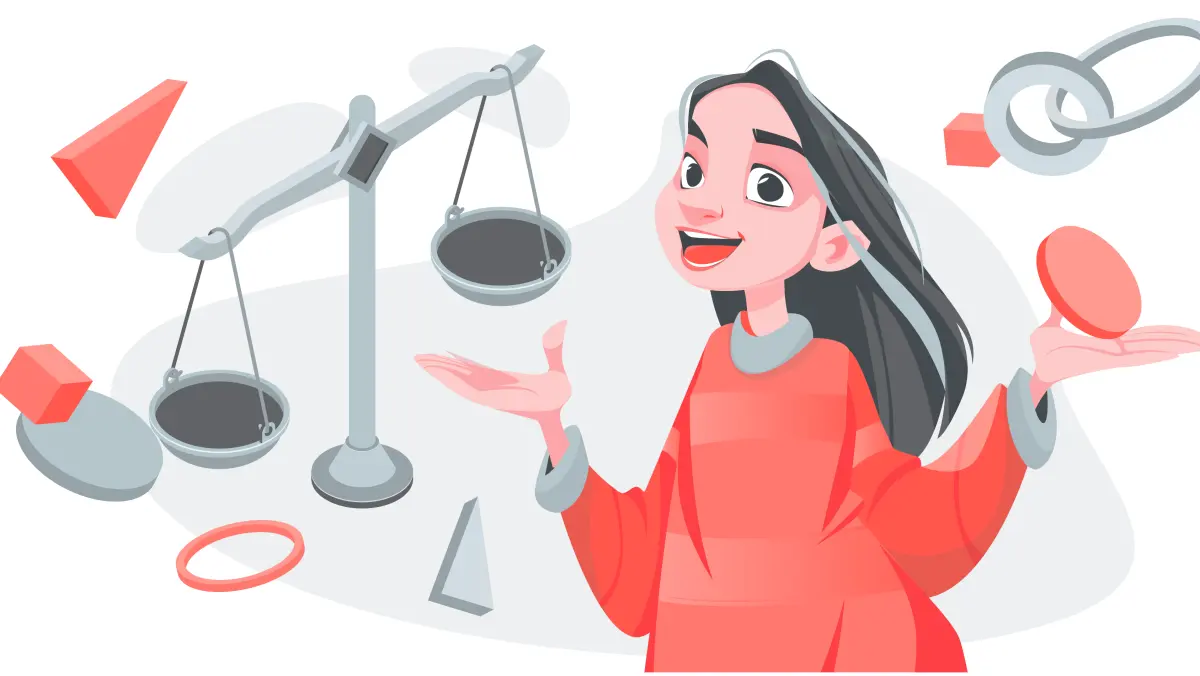
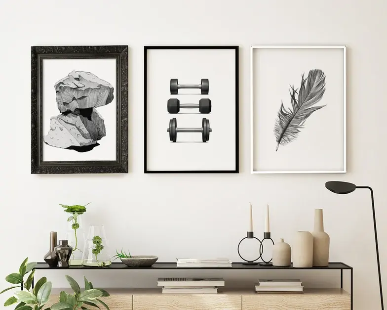
Visual weight refers to the psychological impact an element has on the viewer’s attention. While physical objects have mass measured in grams or pounds, visual elements possess an abstract weight based on their ability to command focus. High-weight elements feel dense and prominent, while low-weight elements feel airy or secondary. This concept is fundamental to the principle of balance, which ensures that no single part of an image overwhelms the rest unless the artist intends to create a specific focal point.
Artists use visual weight to establish a hierarchy of information. By placing heavier elements in specific locations, they can dictate the path the viewer's eye travels across the canvas. If a composition lacks a clear distribution of weight, it can feel chaotic or lopsided, leaving the viewer feeling unsettled. Understanding this phenomenon allows creators to move beyond simple placement and begin orchestrating the emotional response of their audience through deliberate spatial arrangement.
How to create balance with visual weight
Achieving balance involves distributing visual interest so that the composition feels stable. Symmetry is the most straightforward method, where identical elements are mirrored across a central axis. However, asymmetrical balance is often more dynamic, using different elements of equal weight to create equilibrium. For instance, a large, pale object might be balanced by a small, intensely dark object, as the intensity of the color compensates for the lack of surface area.
To effectively balance your work, consider these factors that increase visual weight:
- Size: Larger objects naturally command more attention than smaller ones.
- Color: High-contrast or saturated colors appear heavier than muted tones.
- Texture: Complex, intricate textures hold the eye longer than smooth, flat surfaces.
- Position: Elements placed near the edges or corners often carry more weight than those centered.
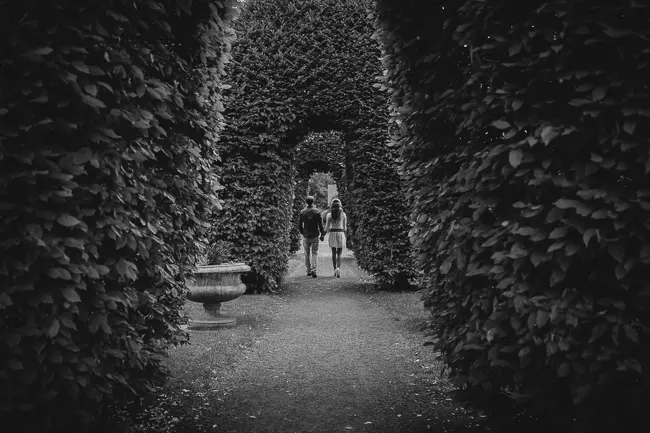
- Isolation: An object placed alone in a vast space feels heavier than one surrounded by many other items.
Why visual weight matters in design
Visual weight acts as the invisible scaffolding of an artwork. Without it, the viewer struggles to find a point of entry into the piece, leading to visual fatigue or disinterest. By managing weight, an artist can create a sense of movement or stillness. A composition where all the weight is clustered in one corner creates tension, whereas a spread-out distribution creates a sense of calm and order. This is essential in everything from Renaissance paintings to modern graphic design.
The concept also helps in establishing a focal point, which is the primary area of interest. By making the focal point the heaviest element in the frame, the artist ensures that the viewer notices the most critical part of the message first. Once the viewer has engaged with the focal point, the distribution of secondary weights guides them through the narrative or visual journey. This intentional manipulation is what separates professional compositions from amateur sketches that feel cluttered or aimless.
Common mistakes when balancing visual weight
One frequent error is overcrowding a composition with too many elements of high visual weight. When every part of an image is "loud," the eye has nowhere to rest, resulting in a chaotic and overwhelming experience. Another mistake is failing to account for negative space, which is the empty area around subjects. Negative space acts as a counterweight; without it, the composition feels suffocated and lacks the room for the eye to breathe and process the visual information.
- Avoid placing all heavy elements on one side of the frame, which creates an unintended sense of falling.
- Do not ignore the power of contrast; a lack of value variation often makes a composition feel flat and weightless.
- Stop adding details to every corner, as this prevents the viewer from establishing a clear hierarchy of importance.
- Ensure that the background does not compete with the foreground for visual weight, as this creates confusion.
Best practices for artists to improve
To master visual weight, start by practicing with grayscale studies. By removing color, you force yourself to focus entirely on value, which is the most powerful tool for creating weight. Squinting at your work is a professional technique to blur the details and see the composition as a map of light and dark shapes. This reveals where the weight is concentrated and helps you identify if the image is leaning too heavily in one direction.
Another exercise is to create thumbnail sketches before starting a final piece. These small, quick drawings allow you to test different arrangements of weight without committing to hours of work. If a thumbnail feels unbalanced, rearrange the elements until the composition feels "right" to your intuition. Over time, this practice develops your internal sense of scale and proportion, allowing you to intuitively place elements that create the exact emotional impact you desire for your final artistic output.
Key facts
- Visual weight is the perceived "heaviness" or "lightness" of an element within a composition, regardless of its actual physical size.
- Darker colors generally carry more visual weight than lighter colors, drawing the viewer's eye more quickly.
- Complex textures and intricate patterns appear heavier than smooth, flat surfaces because they demand more cognitive processing.
- Objects located near the edges of a frame often feel heavier than those placed in the center due to the tension created against the perimeter.
- Symmetrical compositions distribute visual weight equally, while asymmetrical balance relies on contrasting elements to achieve equilibrium.
- To balance a large, light-colored object, place a smaller, darker, or more highly textured object on the opposite side.
The bottom line
Visual weight is the fundamental principle of how elements command attention within a design or artwork. By manipulating color, size, texture, and placement, artists guide the viewer’s eye and create a sense of balance. Whether striving for formal symmetry or dynamic asymmetry, understanding these optical forces allows you to control the hierarchy of your composition and ensure that your intended focal point remains the primary visual anchor.
People also ask
How does color impact the visual weight of an object?
High-contrast colors, particularly warm tones like red or orange, appear heavier than cool, desaturated tones. A small, bright red circle will often balance a much larger, pale blue rectangle in a painting.
Does physical size always dictate visual weight?
No, size is only one factor. A small, dense, or brightly colored object can possess more visual weight than a large, transparent, or neutral-colored object.
What is the difference between visual weight and physical weight?
Physical weight refers to the actual mass of an object, while visual weight is a psychological perception. In a two-dimensional image, physical mass is irrelevant, as the viewer only responds to the optical pull of the elements.
How can I use white space to manage visual weight?
White space, or negative space, acts as a counterweight to dense areas. By increasing the amount of empty space around an object, you increase its isolation and perceived importance.
Why do isolated objects seem heavier than grouped ones?
An isolated object commands total attention, whereas objects in a group share the viewer's focus. The lack of competition for the eye makes the solitary element feel more significant and visually heavy.
What is the "Rule of Thirds" in relation to visual weight?
The Rule of Thirds suggests placing subjects at the intersections of a grid to create dynamic balance. This technique prevents the visual weight from becoming stagnant in the center, creating a more engaging composition.
This answer was created with the help of AI research tools and reference sources. Spotted an error? Let us know — we correct mistakes quickly. See our editorial policy.