What colors go with white?
Short answer
White is a versatile neutral that pairs effortlessly with every color in the spectrum. High-contrast combinations like black or navy create a crisp, modern aesthetic, while soft pastels or warm earth tones offer a serene, organic feel. Because white reflects light, it serves as a perfect canvas for any design palette.
On this page
How to choose colors for a white room
Designing with white requires understanding undertones, as white is rarely a pure, blank slate. Cool whites often contain blue or grey pigments, which pair exceptionally well with icy blues, silver, and crisp charcoals. Conversely, warm whites feature yellow, cream, or peach undertones, making them ideal companions for terracotta, gold, wood grains, and soft sage greens. Identifying the base temperature of your white paint or fabric is the first step toward a cohesive look.
To balance your space effectively, consider the "60-30-10" rule, which suggests using a primary color for 60% of the room, a secondary for 30%, and an accent for 10%. When white is the dominant 60%, you have immense freedom to experiment with the remaining percentages. If you prefer a minimalist aesthetic, stick to monochromatic textures. If you seek energy, use vibrant primary colors like red or yellow to create sharp, intentional focal points against the white background.
Best color combinations for white walls
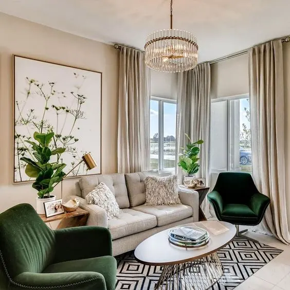
White walls act as a gallery backdrop, allowing other colors to dictate the mood of the room. High-contrast pairings are popular for their timeless appeal, while softer transitions create a sense of calm. The following combinations are widely regarded by interior designers for their balance and visual impact:
- Black and White: The ultimate high-contrast pairing that defines architectural lines.
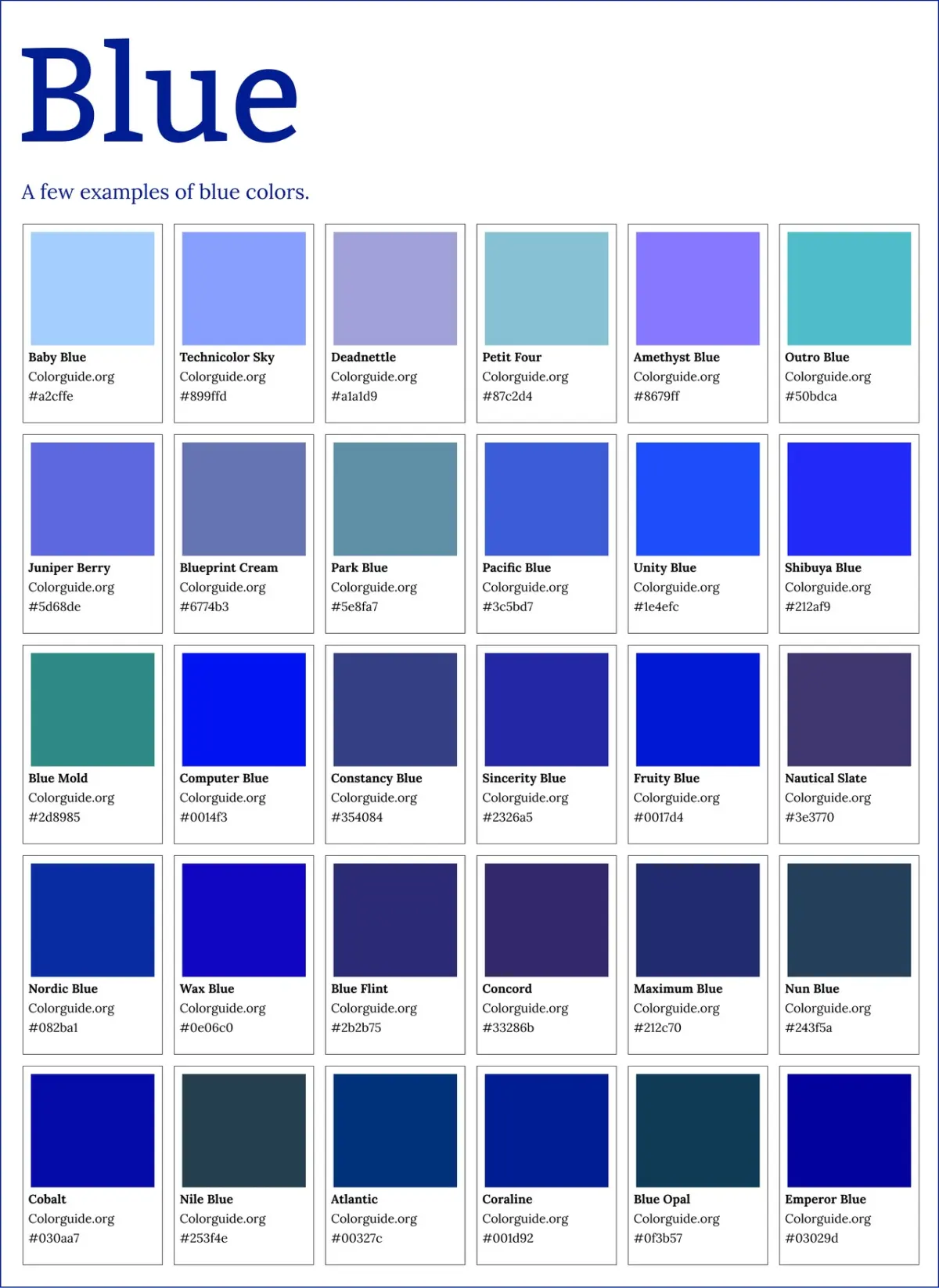
- Navy Blue and White: A classic nautical or "Hamptons" look that feels sophisticated and crisp.
- Sage Green and White: An organic, earthy combination that brings the outdoors inside.
- Terracotta and White: A warm, Mediterranean-inspired palette that feels cozy and inviting.
- Blush Pink and White: A soft, romantic pairing that adds warmth without overwhelming the senses.
When selecting these combinations, consider the natural light in your room. North-facing rooms often have cooler, bluish light, which can make stark white walls feel chilly. In these spaces, pairing white with warmer tones like terracotta or gold helps counteract the lack of sun, creating a more welcoming environment.
Why white works with every color
The science behind why white pairs with everything lies in its neutrality and light-reflectance properties. White is an achromatic color, meaning it lacks hue, which prevents it from clashing with the wavelengths of other colors. Because white reflects all visible light, it enhances the saturation of any color placed next to it. This makes it an essential tool for designers who want to highlight furniture, art, or architectural features without the background competing for attention.
Furthermore, white provides a psychological "reset" for the eyes. In complex spaces filled with patterns or varied textures, white surfaces provide visual breathing room. This is why white is the standard choice for galleries and museums; it ensures that the artwork remains the primary focus. By using white as a stabilizer, you can safely incorporate bold, experimental colors that might otherwise feel chaotic in a more saturated room.
Common mistakes when pairing colors with white
One of the most frequent errors is mixing whites with conflicting undertones. For instance, placing a stark, blue-tinted white trim against a creamy, yellow-tinted white wall often makes the wall look dirty or aged. Always test your white swatches side-by-side before committing to paint or textiles. Another mistake is failing to incorporate enough texture when using an all-white palette. Without varying materials like wool, linen, wood, or metal, a white room can feel sterile or hospital-like rather than clean and intentional.
- Test paint samples on all four walls to observe how light changes the color throughout the day.
- Introduce at least three different textures to prevent a flat, uninteresting aesthetic.
- Avoid using more than two different shades of white in a single space unless they are clearly distinct.
- Ensure your accent colors share the same temperature as your white base to maintain harmony.
How to use white as an accent color
If you prefer a darker, moodier interior, white can be used as a strategic accent to provide relief. In a room painted deep navy, forest green, or charcoal, white baseboards, window frames, or furniture pieces act as punctuation marks. They draw the eye toward specific structural elements and prevent the room from feeling like a dark cave. This "negative space" technique is highly effective for grounding dark, dramatic wall colors.
When using white as an accent, focus on high-quality finishes. Since white will stand out against a darker background, ensure that the white elements are clean and well-maintained. Glossy white finishes on trim or cabinetry can create a sharp, polished contrast against matte dark walls, adding a layer of luxury to the design. By flipping the traditional script and using white to highlight rather than dominate, you create a sophisticated, modern space that feels both grounded and airy.
Key facts
- White is a neutral shade that acts as a blank canvas, allowing any color in the visible spectrum to stand out.
- High-contrast pairings like black and white create a timeless, formal, and sophisticated aesthetic.
- Pairing white with warm neutrals, such as beige or cream, produces a soft, monochromatic, and calming environment.
- Cool tones like navy blue, forest green, or slate gray provide a crisp, professional, and modern visual balance.
- Pastels paired with white create a light, airy, and youthful atmosphere, often used in nursery or spring-themed designs.
- Metallic accents, including gold, silver, or copper, add a layer of luxury and depth to white-dominated spaces.
The bottom line
White is the ultimate versatile neutral, serving as a foundational element that adapts to any design style. Whether you prefer the dramatic contrast of black, the serene warmth of earth tones, or the modern crispness of cool blues, white provides the necessary balance. By carefully selecting your white’s undertone and incorporating varied textures, you can create a sophisticated, cohesive, and timeless aesthetic in any environment.
People also ask
Does white always look the same when paired with other colors?
No, white comes in many undertones, such as cool blue-whites or warm creamy whites. Matching the undertone of your white to the accompanying color ensures a cohesive and intentional look.
Should I use pure white or off-white for interior walls?
Pure white is best for modern, minimalist spaces with high natural light, while off-white is better for cozy rooms. Off-white prevents the space from feeling sterile or overly clinical.
Is it a mistake to use too many colors with white?
Using too many colors can lead to visual clutter and overwhelm the neutral base. Stick to a 60-30-10 rule, where white occupies 60 percent of the space, a primary accent takes 30, and a bold pop color takes 10.
Can I pair multiple shades of white together?
Yes, this is known as layering. To succeed, vary the textures—such as combining a linen white sofa with a wool white rug—to keep the room from looking flat.
What is the most common mistake when decorating with white?
The most frequent error is neglecting lighting, which causes white to look dingy or gray. Always test paint samples at different times of the day to see how the white reacts to your specific light source.
Does white make a small room look bigger?
White reflects light, which helps expand the perception of space in smaller rooms. When paired with light-colored furniture, it creates an open, airy feeling that minimizes visual boundaries.
This answer was created with the help of AI research tools and reference sources. Spotted an error? Let us know — we correct mistakes quickly. See our editorial policy.