What art style did Keith Haring use?
Short answer
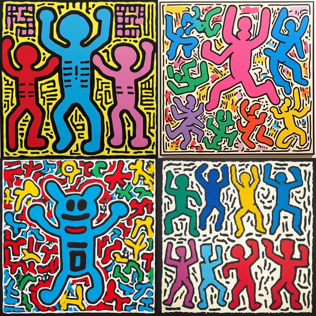
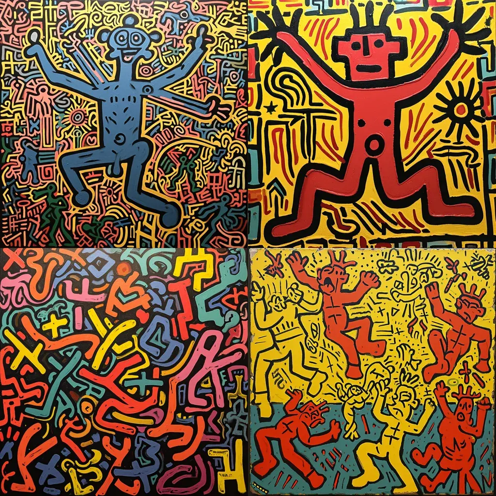
Keith Haring’s art style is best defined as Neo-Expressionism or Pop Art, characterized by bold, continuous black outlines, vibrant primary colors, and energetic, cartoon-like figures. Emerging from the 1980s New York City street art scene, his work utilized a unique visual language of simplified icons to communicate universal themes of life, death, and social activism.
On this page
What defines the Keith Haring style?
The core of Keith Haring’s aesthetic is his "linear" approach, which emphasizes the primacy of the line. He abandoned traditional shading and perspective in favor of flat, high-contrast silhouettes that seem to vibrate with kinetic energy. By using thick, uniform black outlines, he ensured his images remained legible from a distance, whether they were drawn on subway walls or displayed on large-scale canvases.
His visual vocabulary consists of recurring motifs that act as a modern hieroglyphic system. These symbols include barking dogs, crawling babies, radiant hearts, and flying saucers. These figures are rarely static; they are almost always captured in mid-motion, suggesting a sense of urgency and joy. By stripping away complex detail, Haring focused on the essential emotion of the subject, creating a democratic art form that was accessible to everyone regardless of their background in art history.
How to draw in the style of Keith Haring
To emulate Haring’s technique, you must prioritize fluid, confident lines over precision. His process was famously spontaneous; he often claimed he did not sketch his compositions beforehand, preferring to let the line dictate the form as it moved across the surface. This approach requires a steady hand and a willingness to embrace the accidental imperfections that occur during a quick, continuous movement.
To practice this style, follow these steps:
- Select a thick, felt-tip marker or a bold brush pen to ensure your lines have consistent weight.
- Choose a simple, singular action or emotion to represent, such as "running" or "love."
- Draw your figure in one continuous motion without lifting your pen from the paper.
- Add "action lines" or "radiant lines" around the figure to emphasize movement or energy.
- Fill the internal spaces with bold, unmixed primary colors like red, yellow, or blue.
Why did Haring use subway stations for art?
Haring’s decision to utilize New York City subway stations in the early 1980s was a deliberate rejection of the elitist gallery system. He viewed the subway as a subterranean laboratory where he could interact with a diverse, captive audience. By drawing on unused black advertising panels with white chalk, he transformed functional public spaces into temporary galleries, effectively democratizing art and removing the barrier of entry for the average commuter.
This choice was also a logistical necessity that shaped his style. Because he had to work quickly to avoid arrest by transit police, he developed a rapid, rhythmic drawing speed. The chalk medium forced him to simplify his compositions, leading to the iconic, minimalist aesthetic that became his trademark. This environment taught him that art could be ephemeral, powerful, and deeply influential without needing the institutional validation of a museum or a high-end auction house.
Common mistakes when imitating Haring’s art
A frequent error when attempting to replicate Haring’s work is over-complicating the anatomy of the figures. Haring’s characters are intentionally stylized and non-anatomical; they function as symbols rather than realistic representations of humans. When beginners try to add realistic musculature, shading, or facial features, they lose the essential "iconic" quality that makes his work immediately recognizable. Keep the proportions exaggerated and the features minimal to maintain the intended impact.
Another common mistake involves the use of color. Haring typically used flat, saturated colors that do not blend or overlap. If you attempt to use gradients, textures, or complex color mixing, you deviate from the Pop Art principles he championed. Stick to a limited palette of high-contrast colors to ensure your work retains the punchy, graphic quality of his original pieces. Remember that the white space between your lines is just as important as the lines themselves.
How to incorporate social themes into art
Haring’s work was rarely just decorative; it was deeply rooted in the social and political crises of his time. He used his art to raise awareness for the AIDS epidemic, the dangers of drug abuse, and the necessity of nuclear disarmament. To replicate this aspect of his style, you must identify a cause you are passionate about and distill it into a simple, universal symbol that can be understood at a glance.
- Identify a single, clear message you want to convey to the viewer.
- Simplify your message into a visual icon, such as a broken chain or a helping hand.
- Use the "Haring" style of bold lines to frame this message in a way that feels urgent.
- Place your finished work in a space where it can spark conversation or provide comfort.
- Avoid overly literal imagery, as the power of this style lies in its ability to be interpreted broadly by different audiences.
Key facts
- Keith Haring’s signature style is defined by bold, continuous black outlines and vibrant, flat colors.
- He emerged from the 1980s New York City street art scene, drawing inspiration from graffiti and underground subcultures.
- His iconography features recurring motifs such as the "Radiant Baby," barking dogs, and crawling figures.
- To emulate his style, use thick, black markers to create fluid, rhythmic lines without lifting the pen from the page.
- Focus on kinetic energy and simplified silhouettes rather than realistic shading or complex perspective.
- Avoid using gradients or blurred edges, as Haring’s aesthetic relies on the stark contrast of solid, unmodulated color blocks.
The bottom line
Keith Haring’s art style is a masterful blend of graffiti energy and pop art accessibility. By utilizing thick, rhythmic lines and a limited palette of high-contrast colors, he created a universal visual language that transcended cultural barriers. His work remains iconic for its ability to convey complex social messages through simple, kinetic silhouettes, proving that minimalist design can be both deeply emotional and globally impactful.
People also ask
What materials did Keith Haring use for his street art?
Haring famously used white chalk on unused black advertising panels in New York City subway stations. Later, he utilized acrylic paint, spray paint, and markers for his murals and canvas works.
Was Keith Haring considered a pop artist?
Yes, he is widely categorized as a pop artist because he blurred the lines between high art and commercial culture. His work often addressed social issues like the AIDS epidemic and apartheid through accessible, mass-produced imagery.
Where can I see Keith Haring's murals today?
You can find his public murals in cities like New York, Pisa, Paris, and Berlin. Many are preserved as historical landmarks, such as the "Crack is Wack" mural in Harlem.
Did Keith Haring have a formal art education?
He studied at the Ivy School of Professional Art in Pittsburgh and later at the School of Visual Arts in New York City. However, he often credited his spontaneous, intuitive process as more influential than his formal training.
What is the meaning behind Haring's "Radiant Baby" symbol?
The "Radiant Baby" represents purity, innocence, and the potential for new beginnings. It became his most recognizable emblem, symbolizing the energy of life amidst a chaotic urban environment.
Can I buy official Keith Haring merchandise?
Yes, the Keith Haring Foundation manages his estate and licenses his imagery for various products. These items help fund charitable organizations that support AIDS research and children's programs.
This answer was created with the help of AI research tools and reference sources. Spotted an error? Let us know — we correct mistakes quickly. See our editorial policy.