How do you make a value scale?
Short answer
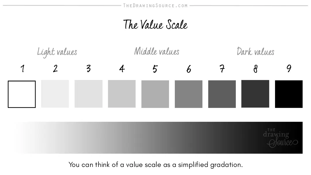
A value scale is a tool used by artists to map the range of light and dark within a composition. By creating a series of graduated boxes from pure white to solid black, you establish a reference for contrast, helping you achieve depth, volume, and realistic lighting effects in your drawings.
On this page
How to make a basic value scale
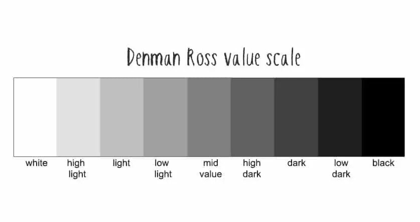
Creating a value scale requires a simple grid of rectangles, typically ranging from five to nine steps. Start by drawing a long horizontal strip on your paper and dividing it into an odd number of equal segments. An odd number is preferred because it allows for a distinct middle gray, which acts as the anchor for your transition. Label the far left box as white and the far right box as black.
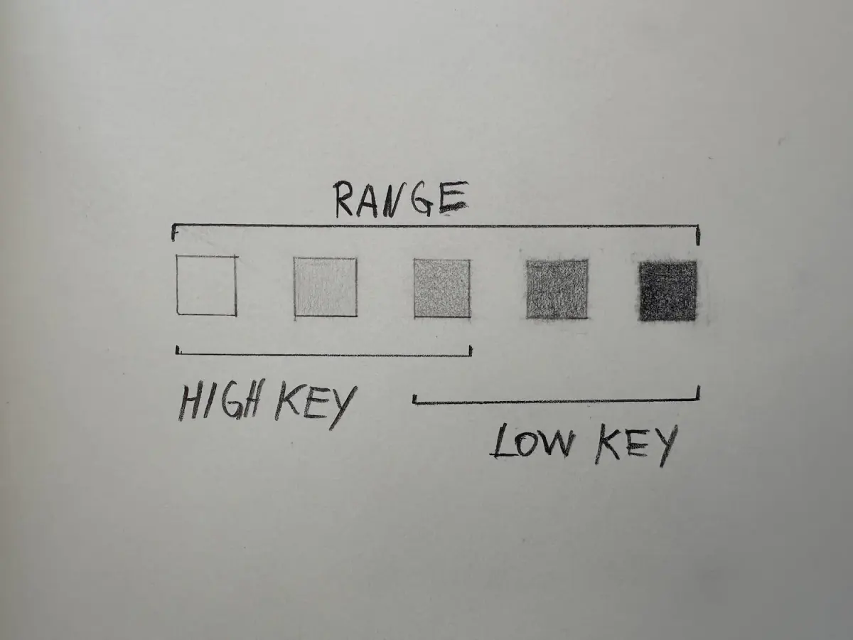
To fill the scale, start at the extremes. Leave the first box completely blank to represent the white of the paper. Fill the final box with the darkest possible graphite or charcoal pressure you can achieve. Once the anchors are set, work toward the center by creating incremental shifts in tone. The goal is to ensure that each step is clearly distinguishable from its neighbor, creating a smooth, logical progression of light to dark.
- Draw a rectangle approximately 8 inches long and 1 inch high.
- Divide the rectangle into seven equal sections using a ruler.
- Leave the first section blank.
- Fill the last section with the darkest pressure possible.
- Fill the middle section with a medium gray tone.
- Gradually fill the remaining sections to bridge the gap between the tones.
Why value scales are important for artists
Value is the fundamental element of art that defines form and space. Without a controlled range of tones, drawings appear flat and lack the illusion of three-dimensional volume. A value scale serves as a technical calibration tool, training your eyes to perceive the subtle differences between light and shadow. By practicing this exercise, you develop the muscle memory required to apply consistent pressure, which is essential for rendering complex subjects accurately.
When you understand how to manipulate value, you gain the ability to direct the viewer’s eye through a composition. High-contrast areas naturally draw more attention, while subtle gradations create soft transitions that suggest curvature. Artists like Leonardo da Vinci utilized these principles in their sfumato technique, where values are blended so seamlessly that lines disappear. Mastering the scale ensures you have the technical vocabulary to replicate these sophisticated lighting effects in your own work.
Best tools for making a value scale
The quality of your materials significantly impacts the range of values you can achieve. Graphite pencils are categorized by a hardness scale, ranging from 9H (hard and light) to 9B (soft and dark). For a standard value scale, a 2B or 4B pencil is often the most versatile, as these grades allow for a wide spectrum of pressure. If you are working with charcoal, you will find that it produces a much deeper, richer black than graphite, though it is more prone to smudging.
Paper choice also plays a role in how well your values transition. Smooth paper, such as Bristol board, allows for even, consistent shading, while textured paper, like cold-press watercolor paper, catches pigment in its "tooth" to create darker, more dramatic effects. Regardless of the medium, the key is to avoid using only one pencil. Experimenting with a range of tools helps you understand how different materials behave under varying degrees of pressure.
- Use a 2H pencil for light, delicate tones.
- Use a 4B or 6B pencil for deep, dark shadows.
- Use a blending stump or tortillon to smooth out transitions.
- Use a kneaded eraser to lift pigment and refine the lightest values.
How to avoid common mistakes when shading
One of the most frequent errors beginners make is failing to utilize the full range of the scale. Many artists tend to stay in the "middle gray" zone, resulting in drawings that look muddy or washed out. To avoid this, always check your work against the extreme ends of your scale. If your darkest shadow is not significantly darker than your mid-tones, your drawing will lack the necessary impact and depth to look realistic.
Another common mistake is applying uneven pressure, which creates streaks or patchy spots within the scale. This often happens when the artist tries to rush the process or uses a dull pencil. Keep your pencil sharp and work in small, circular motions to ensure the pigment is deposited evenly into the paper fibers. If you find your scale looks inconsistent, try turning the page upside down to see the values with fresh eyes, which often reveals areas that need more or less pigment.
How to use your scale in a drawing
Once your value scale is complete, keep it nearby as a reference while you work on a drawing. Before you begin shading an object, squint at your subject to simplify the scene into basic light and dark shapes. Compare these shapes to your scale to determine where they fall on the spectrum. This process, known as "value mapping," prevents you from guessing and ensures that your lighting remains consistent across the entire piece.
If you are drawing a sphere, for example, you will need to identify the highlight, the mid-tones, the core shadow, and the reflected light. By referencing your scale, you can ensure the core shadow is dark enough to provide contrast against the reflected light. This systematic approach transforms shading from an intuitive, often frustrating task into a logical, manageable process. Over time, you will internalize these values, eventually allowing you to shade complex subjects without needing to consult the physical scale at all.
Key facts
- A value scale is a visual tool used to organize shades from the lightest white to the deepest black.
- Most standard artistic scales consist of 5, 7, or 9 distinct steps of gray.
- To create a scale, start by filling in the two extreme ends: pure white and the darkest possible black.
- Use a graphite pencil, charcoal, or paint to fill in the middle steps, ensuring each transition is clearly distinguishable.
- The "middle gray" or "value 5" on a 9-step scale should be exactly halfway between white and black in terms of visual weight.
- Avoid "muddy" transitions by ensuring each box has a unique tone that does not blend into its neighbor.
The bottom line
Creating a value scale is a fundamental exercise that trains your eye to perceive light and shadow accurately. By establishing a consistent range from white to black, you gain the control necessary to render depth and volume in your artwork. Practice this technique regularly to improve your shading skills, ensuring that every step in your scale remains distinct and balanced across the entire composition.
People also ask
Why is a value scale important for drawing?
It helps artists understand the range of light and shadow in a scene. By mastering these steps, you can create the illusion of three-dimensional form on a flat surface.
How many steps should my value scale have?
While 5 steps is sufficient for beginners, 9 steps provides a more professional range for detailed shading. Choose a number that allows you to see clear differences between each adjacent box.
What is the most common mistake when making a value scale?
Many people make the steps too similar in tone, resulting in a scale that looks like one long gradient. Ensure there is a visible "jump" in darkness between every single box.
Can I use colored pencils for a value scale?
Yes, you can create a monochromatic value scale using any single color. Simply adjust the pressure of your hand to create lighter or darker versions of that specific hue.
How do I know if my values are accurate?
Squint your eyes when looking at your scale and the original subject. Squinting blurs the details and makes it easier to compare the relative darkness of different areas.
Is a value scale the same as a color wheel?
No, a value scale focuses strictly on lightness and darkness, regardless of color. A color wheel organizes hues based on their relationship to one another in the visible spectrum.
This answer was created with the help of AI research tools and reference sources. Spotted an error? Let us know — we correct mistakes quickly. See our editorial policy.