What is a value scale?
Short answer
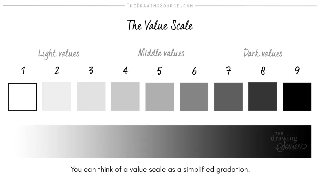
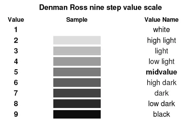
A value scale is a tool used in visual arts to represent the range of light and dark tones in an image. It typically consists of a series of squares or rectangles, ranging from pure white to solid black, helping artists achieve depth, volume, and contrast in their drawings and paintings.
On this page
What is a value scale used for?
A value scale serves as the foundational roadmap for creating the illusion of three-dimensional form on a two-dimensional surface. By organizing tones into a logical sequence, artists can accurately map how light interacts with objects. Without a clear understanding of value, a drawing often appears flat or cartoonish, lacking the physical weight required to mimic reality.
Beyond simple shading, the scale acts as a reference point for maintaining consistency throughout a project. If an artist identifies the darkest shadow and the brightest highlight in a scene, the value scale helps determine the appropriate mid-tones to bridge the gap. This prevents the common issue of "muddy" drawings where all shadows appear the same shade, effectively killing the visual interest of the work.
How to create a value scale
Creating a manual value scale is a fundamental exercise for beginners to train their eyes to distinguish subtle differences in tone. Most standard scales utilize five, seven, or nine steps, with nine being the most common for detailed academic drawing. The process requires patience and a steady hand to ensure each step is distinct from its neighbor.
- Draw a long rectangle and divide it into nine equal sections using a ruler.
- Leave the first square on the far left completely white to represent the paper’s highlight.
- Fill the far-right square with the darkest possible graphite or charcoal pressure to represent the deepest shadow.
- Fill the middle square with a neutral gray that sits exactly halfway between the two extremes.
- Gradually fill the remaining squares, ensuring each step is noticeably lighter or darker than the one beside it.
Why value contrast matters in art
Value contrast is the primary driver of visual hierarchy in any composition. High contrast—placing very dark values directly next to very light ones—creates a focal point that immediately draws the viewer's eye. Conversely, low contrast creates a softer, more atmospheric feeling, often used in landscape painting to suggest distance or fog.
Understanding these relationships allows artists to manipulate the viewer's perception. For instance, placing a light object against a dark background makes it appear to advance toward the viewer, while a dark object against a light background creates a silhouette effect. Mastering these shifts is essential for rendering textures, such as the smooth surface of a metal sphere or the rough, porous texture of a stone.
- Focal points: Use high contrast to highlight the most important subject.
- Depth: Use lighter values for distant objects and darker values for foreground elements.
- Form: Use a full range of values to describe the curvature of an object.
- Mood: Use a limited, dark value range for dramatic, somber scenes.
Common mistakes when using value scales
One of the most frequent errors beginners make is failing to utilize the full range of the scale. Many artists stay within the "middle gray" zone, resulting in drawings that look dull or washed out. To fix this, you must consciously push your darkest shadows to be as black as the medium allows and keep your brightest highlights clean and free of graphite smudges.
Another common mistake is "value jumping," where the transition between squares is too abrupt or inconsistent. This often happens when an artist presses too hard on the pencil too early in the process. It is always easier to darken a light tone than to lighten a dark one, so start with light, layering strokes. If the steps on your scale look identical, you have not achieved enough separation, and you should re-evaluate your pressure control.
Best tools for value practice
While a simple pencil and paper are sufficient for learning, different tools can significantly influence your ability to render values accurately. Graphite pencils are categorized by hardness, ranging from 9H (very hard and light) to 9B (very soft and dark). Using a variety of these pencils makes it much easier to achieve a full range of values without relying solely on heavy pressure.
- HB pencil: A standard, medium-hard pencil for initial sketching.
- 2B or 4B pencil: Ideal for mid-range tones and general shading.
- 6B or 8B pencil: Essential for achieving deep, rich blacks in shadows.
- Kneaded eraser: A vital tool for lifting graphite to create highlights or soften transitions.
- Blending stump: Used to smooth out transitions between values, though it should be used sparingly to avoid losing texture.
By selecting the right grade of pencil, you reduce the physical effort required to create dark tones. Experimenting with these tools allows you to develop the muscle memory needed to control value transitions instinctively, eventually leading to more professional and realistic artistic results.
Key facts
- A value scale is a tool used in art to measure the range of light and dark tones from pure white to absolute black.
- Most standard artistic scales consist of 5, 7, or 9 distinct steps to help artists organize their compositions.
- The lightest value is represented by the white of the paper, while the darkest is the deepest shadow.
- High-contrast images utilize a wide range of values, whereas low-contrast images rely on a narrow, subtle spectrum.
- Squinting at a subject helps simplify complex colors into basic light and dark values for easier mapping.
- A common mistake is failing to push darks dark enough, which results in drawings that appear washed out or flat.
The bottom line
Mastering the value scale is the most effective way to improve the realism and depth of your artwork. By learning to distinguish between subtle shifts in light and dark, you gain the ability to model complex forms and create compelling focal points. Practice creating consistent, even steps to train your eye, and always remember that contrast is the primary engine behind successful, professional-looking visual compositions.
People also ask
Why is a value scale important for drawing?
A value scale provides a roadmap for creating the illusion of three-dimensional depth on a two-dimensional surface. Without a full range of values, a drawing often lacks the necessary contrast to define forms and light sources.
How many steps should a beginner use in their first value scale?
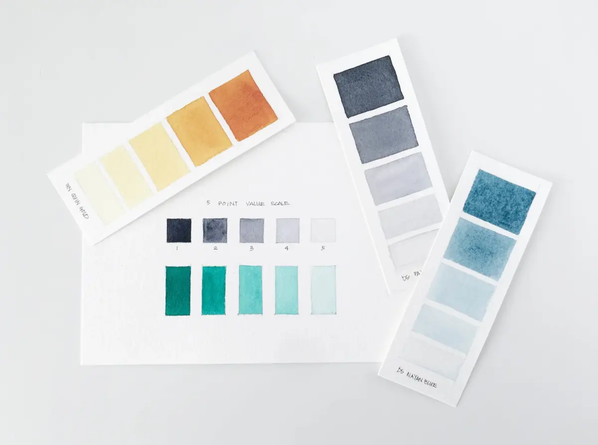
A five-step scale is the best starting point for beginners to learn control. It includes white, light gray, middle gray, dark gray, and black, which simplifies the process of balancing tones.
What is the difference between value and intensity?
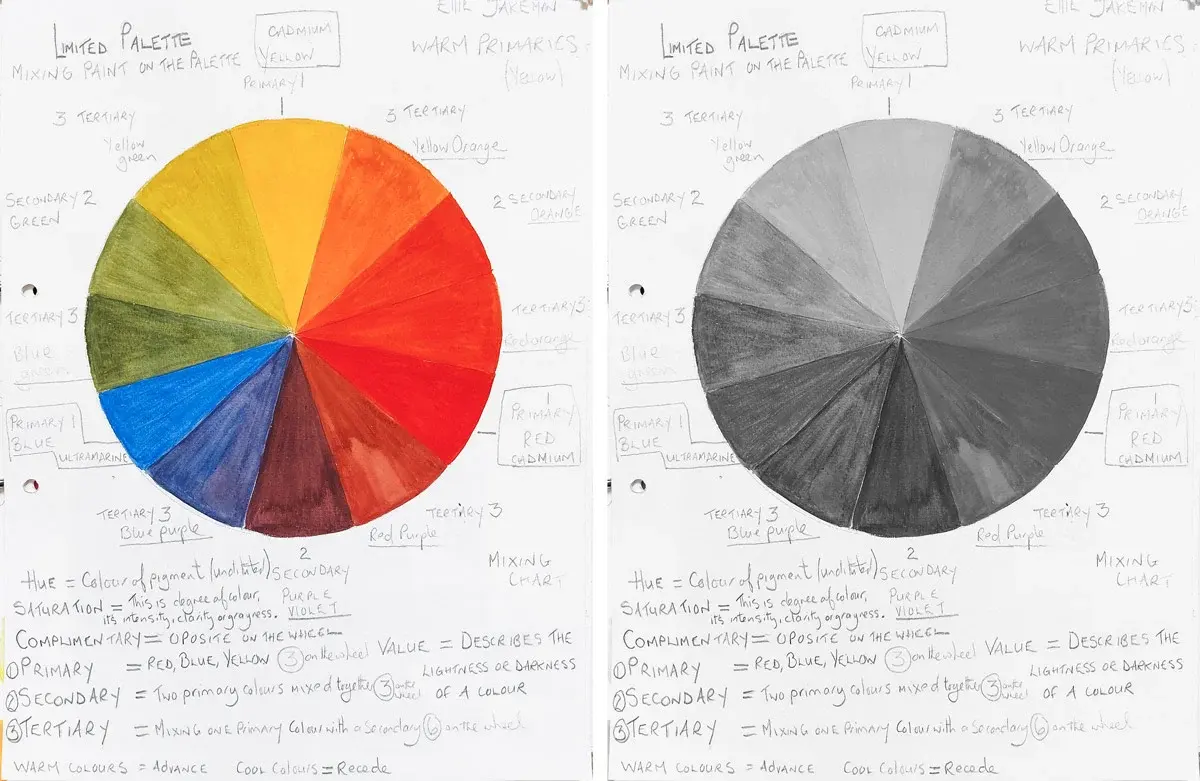
Value refers specifically to how light or dark a color is, regardless of its hue. Intensity, or saturation, refers to the brightness or dullness of a color, which is a separate property.
Can I use a value scale for painting as well as drawing?
Yes, painters use value scales to ensure their colors maintain the correct "tonal weight" across a canvas. If the values are correct, a painting will look realistic even if the colors themselves are slightly off.
What is the "middle gray" in a value scale?
Middle gray is the exact center of the scale, representing a tone that is neither light nor dark. It acts as an anchor point that helps artists judge whether their other values are too bright or too dim.
How do I fix a drawing that has poor value contrast?
You can improve contrast by darkening your shadows with a softer lead pencil or lifting highlights with a kneaded eraser. Adding these deeper blacks and brighter whites will immediately give your work more visual impact.
This answer was created with the help of AI research tools and reference sources. Spotted an error? Let us know — we correct mistakes quickly. See our editorial policy.