How do you draw realistic fire?
Short answer
Drawing realistic fire requires capturing its fluid, organic movement rather than static, jagged shapes. Focus on layering colors from dark to light, emphasizing the hottest, brightest core at the base. Use soft, blended edges for the flames and sharp, high-contrast highlights to define the heat, creating a sense of dynamic, glowing energy.
On this page
How to understand the anatomy of fire
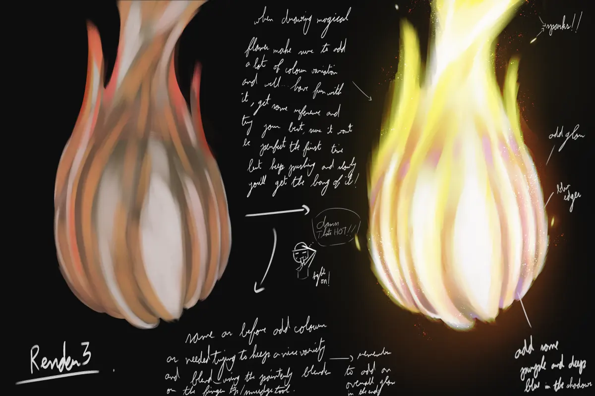
Fire is not a solid object; it is a chemical reaction that creates a plume of hot gas. To draw it realistically, you must visualize it as a fluid, rising structure that behaves like smoke or liquid rather than a rigid, spiked shape. The hottest part of the flame is usually at the base or the center, where the fuel is most concentrated. As the heat rises, it cools, causing the edges to flicker, curl, and dissipate into the air.
When observing a flame, notice that the colors follow a specific temperature gradient. The base is often a brilliant, near-white or pale blue, transitioning into intense yellow, then orange, and finally deep red at the cooler tips. If you draw fire with sharp, uniform triangles, it will look like a cartoon. Instead, focus on the following structural elements to build depth:
- The Core: The brightest, most opaque section near the fuel source.
- The Body: The mid-tones of yellow and orange that define the flame's curves.
- The Tips: The darker, wispy red and black edges where the fire fades into smoke.
Best techniques for layering colors
The key to luminosity in fire is layering your colors from darkest to lightest. Start by blocking in the darkest values, such as deep reds, browns, or even dark purples, to establish the shape of the flame. Because fire emits its own light, it should be the brightest element in your composition. If you start with light colors, you will struggle to add the necessary contrast later, resulting in a flat, muddy appearance.
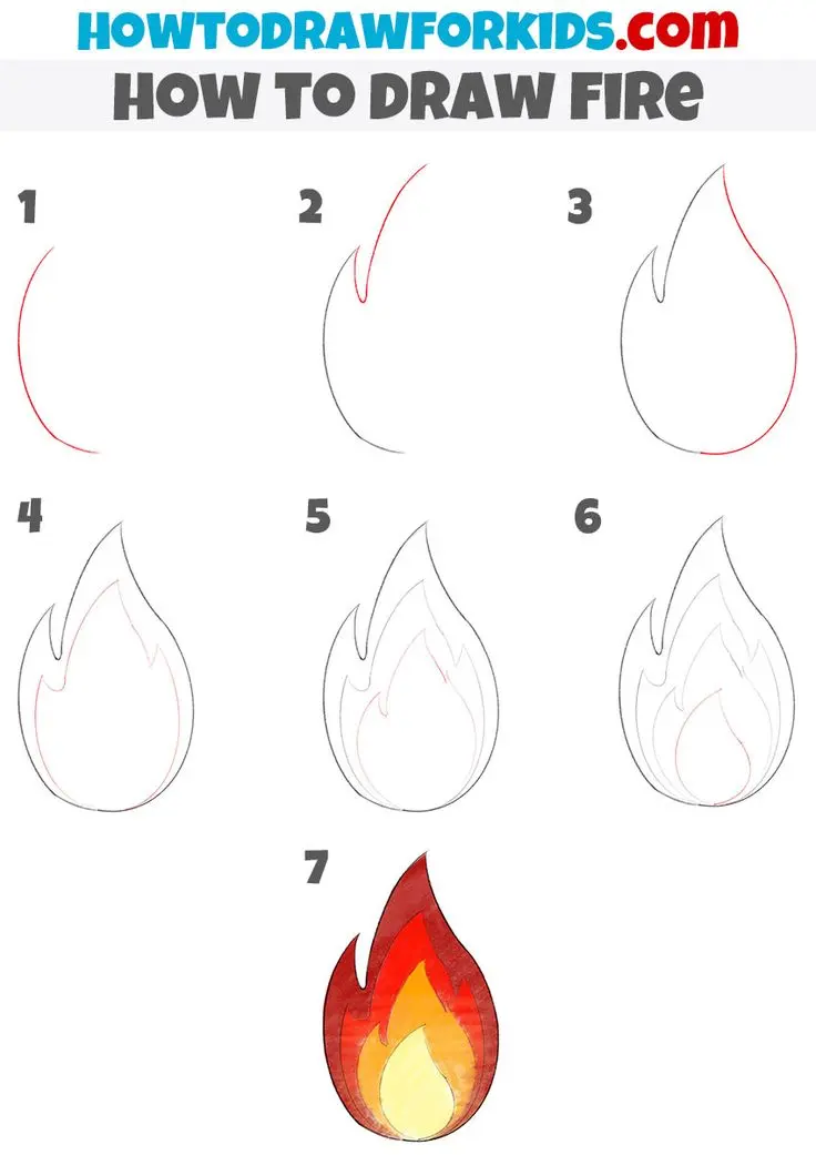
Once the base colors are established, gradually introduce brighter yellows and whites. Use a soft blending tool or a light touch with your pencil to ensure the transitions between colors are smooth. Fire rarely has hard, defined outlines, so blurring the edges is essential for realism. Follow these steps to build your layers:
- Map out the primary flame shapes using a light-colored base.
- Apply deep reds and oranges to the outer edges and the top of the flames.
- Use bright yellow to fill in the center, leaving the very bottom for pure white highlights.
- Soften the transitions between these colors to mimic the gaseous nature of the flame.
How to create a realistic glow effect
Fire influences everything around it, casting a warm, ambient light on nearby surfaces. If you draw a campfire without considering the environment, the fire will look like a sticker placed on top of the scene. To achieve a realistic look, the colors of the fire must bleed into the surrounding objects. This is known as light scattering, where the intense orange and yellow hues reflect off the ground, rocks, or nearby people.
To create this effect, use a light, transparent wash of yellow or orange over the surfaces closest to the flame. The intensity of this glow should decrease as the distance from the fire increases. Remember that the light source is the fire itself, so the shadows on nearby objects should be cast away from the flame. By integrating the fire into the environment through reflected light, you ground the flame in reality, making it feel like a physical, heat-producing entity within your drawing.
Common mistakes when drawing flames
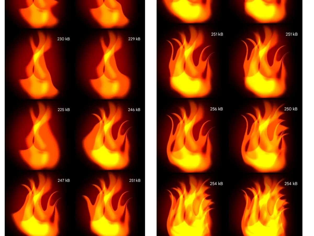
One of the most frequent errors is giving fire a static, symmetrical shape. Beginners often draw flames that look like identical, repeating spikes, which contradicts the chaotic and unpredictable nature of combustion. Fire is constantly shifting, and its form is determined by air currents and the type of fuel being consumed. Avoid creating uniform patterns; instead, vary the height, width, and curvature of each individual flame to capture a natural, organic feel.
Another common mistake is failing to incorporate smoke, which is an inevitable byproduct of fire. As the flames rise and cool, they transition into soot and carbon particles. Adding wisps of gray or black smoke near the top of the flames adds significant realism and provides a necessary contrast to the bright colors of the fire. Keep these points in mind to avoid common pitfalls:
- Avoid using black to outline your flames, as this deadens the light.
- Do not make all flames the same size; vary them to create a sense of movement.
- Ensure that the brightest parts of the flame are placed correctly, usually near the fuel source.
How to practice drawing fire from life
The best way to improve your ability to draw fire is to study it directly. If you cannot safely light a candle or a small fire, use high-resolution video footage to observe how flames move in slow motion. Pay attention to how the colors shift and how the flame reacts to small gusts of wind. Sketching from life allows you to see the subtle, flickering details that you might otherwise miss when working from your imagination or static photographs.
Start by doing quick, gestural sketches to capture the flow and energy of the fire. Do not worry about detail in these early stages; focus on the rhythm of the rising heat. Once you are comfortable with the movement, spend more time on a single study, focusing on the color transitions and the way the light interacts with the surrounding space. Regular practice will help you internalize the anatomy of fire, eventually allowing you to draw it with confidence and speed.
Key facts
- Fire is not a solid object; it is a chemical reaction that emits light, meaning the core is often the brightest part.
- Use a "bottom-up" approach, as flames naturally taper and sharpen as they rise due to heat convection.
- The color temperature of fire shifts from white-hot at the base to yellow, orange, and finally red at the cooler tips.
- Avoid outlining flames with black lines, as real fire is an additive light source that blends into its surroundings.
- Incorporate "flicker" by using jagged, asymmetrical edges rather than perfectly smooth, rounded shapes.
- Add a soft glow or "bloom" effect around the fire to represent the light reflecting onto nearby surfaces.
The bottom line
Drawing realistic fire requires shifting your focus from drawing shapes to capturing light. By layering colors from white to deep red and utilizing asymmetrical, tapering edges, you create the illusion of heat and motion. Remember that fire is a light source, not a solid object; avoid heavy outlines and prioritize the glowing core. With practice, these techniques will help you depict fire with convincing energy and depth.
People also ask
What colors should I use for a realistic flame?
Start with pure white for the center, transition to bright yellow, then deep orange, and finish with dark red or charcoal gray at the very top. Avoid using pure black, as fire is a source of illumination rather than a shadow.
Why do my flames look like cartoon shapes?
Cartoon flames often feature uniform, rounded lobes that lack internal detail. To fix this, introduce sharper, thinner wisps and vary the size of each flame tongue to create a more chaotic, organic appearance.
Should I use a brush or a pencil for fire?
Pencils are excellent for studying the structure and values of fire, but digital brushes or paint allow for better blending of light. Focus on layering transparent colors to mimic the way light intensity drops off from the core.
How do I show that fire is moving?
Use directional blur or "streaking" lines that follow the upward path of the heat. Keeping the edges slightly soft or blurred helps suggest the rapid, turbulent motion of rising gases.
What is the most common mistake when drawing fire?
The most frequent error is drawing the fire as a static, solid shape with a consistent color throughout. Fire is dynamic and translucent, so you must show varying levels of transparency and brightness within the flame body.
Do I need to draw the fuel source?
Yes, anchoring the fire to a fuel source like a log, candle, or torch provides essential context. Showing the contrast between the dark, unlit fuel and the bright flame makes the light appear much more intense.
This answer was created with the help of AI research tools and reference sources. Spotted an error? Let us know — we correct mistakes quickly. See our editorial policy.