How do you draw energy effects?
Short answer
Drawing energy effects requires layering light, motion, and core intensity. Start by establishing a bright, solid center, then build outward with translucent glows, jagged sparks, and flowing arcs. By varying line weight and using high-contrast color palettes, you create the illusion of raw power radiating from a central focal point.
On this page
How to draw basic energy flows
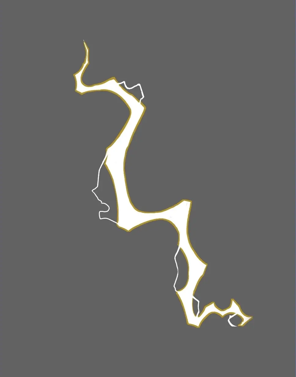
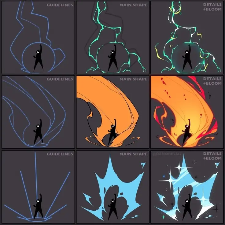
Energy is defined by movement and intensity. To begin, visualize the path the energy takes, whether it is a swirling orb, a crackling bolt, or a steady beam. Use a light pencil to map out the trajectory, ensuring the lines feel fluid rather than rigid. Energy rarely moves in perfectly straight lines; it curves, bends, and pulses with the rhythm of the source.
Once the path is set, focus on the "core." This is the brightest part of the effect, usually represented by pure white or a very pale tint of your chosen color. Draw a sharp, solid line or shape for this core. As you move outward, the energy should lose opacity, transitioning into softer, wider glows. This contrast between the sharp, white center and the diffuse, colored edges is what makes the effect appear to emit light rather than just reflecting it.
Best tools for energy effects
The choice of medium significantly impacts the final look of your energy. Digital tools offer the most control, as you can use "glow" or "add" blending modes to make colors appear luminous. Traditional artists, however, can achieve stunning results by layering media. Start with ink or markers for the core, then use soft pastels, colored pencils, or gouache to build the surrounding aura.
When selecting colors, consider the temperature of the energy. Cool colors like blues and cyans suggest electricity or ice, while warm colors like oranges and reds imply heat or fire. To add depth, incorporate secondary colors at the edges of the glow. For example, a blue lightning bolt might have a subtle purple fringe. Use these techniques to build your palette:
- Use high-saturation colors for the outer glow to create a vibrant halo.
- Apply white highlights at the sharpest points of the energy to emphasize intensity.
- Layer translucent washes over the background to simulate the way light spills onto surrounding surfaces.
How to add sparks and particles
Energy is rarely a contained stream; it often sheds material in the form of sparks, smoke, or debris. Adding these small, chaotic elements provides a sense of scale and danger. Place larger, brighter particles closer to the main energy source, and smaller, dimmer ones further away to create a sense of depth and perspective.
Follow these steps to create a dynamic particle field:
- Identify the focal point where the energy is most concentrated.
- Draw small, jagged shapes radiating outward from the core to act as sparks.
- Vary the size and spacing of these sparks to avoid a repetitive, mechanical look.
- Add soft, blurry dots behind the sharp sparks to suggest motion blur.
- Use a darker, muted color for particles that are trailing off, indicating they are cooling down.
Why energy looks unrealistic
The most common reason an energy effect looks flat is a lack of interaction with the environment. Energy is a light source, meaning it must cast light onto the characters or objects nearby. If your character is holding a glowing orb, the side of their hand and face closest to the orb should be illuminated. Failing to account for this "rim lighting" makes the effect look like a sticker placed on top of the drawing.
Another frequent issue is uniform brightness. Real energy has a pulse; it is not equally bright at every point along its path. By varying the thickness and intensity of your lines, you create a sense of flickering. If the line is the same width from start to finish, the energy will look static and lifeless. Always strive to break up the silhouette of your effect, making it look as though it is constantly shifting and struggling to maintain its shape.
Common mistakes when drawing energy
One major error is over-detailing the outer glow. Beginners often try to draw every individual ray of light, which leads to a cluttered and messy appearance. Instead, use smooth gradients or soft brush strokes to suggest the aura. The glow should be a secondary element that supports the core, not a distraction that hides the primary shape of the energy.
Avoid these common pitfalls to improve your results:
- Do not use black outlines around the energy; let the color transitions define the edges.
- Avoid perfectly symmetrical shapes, as natural energy is chaotic and unpredictable.
- Do not ignore the "fall-off" of light; the glow should fade out completely as it moves away from the source.
- Ensure that the intensity of the light is consistent with the surrounding environment's lighting conditions.
- Remember that energy is an additive effect, so it should always appear brighter than the background it sits upon.
By following these principles, you will be able to create energy effects that feel truly powerful and integrated into your artwork.
Key facts
- Energy effects rely on high-contrast lines to suggest speed, power, and intense light.
- Use a "tapered" stroke technique by applying heavy pressure at the start and lifting the pen quickly at the end.
- Incorporate "arcs" or "zig-zags" to create a sense of chaotic, crackling movement.
- Layering colors from dark to light creates a glowing core effect, simulating intense heat.
- Add small, floating particles or "debris" around the main energy source to ground the effect in space.
- Use motion blur or "speed lines" behind the energy to imply it is traveling across the frame.
The bottom line
Drawing compelling energy effects requires a balance of chaotic movement and purposeful lighting. By mastering tapered line work, layering vibrant colors, and adding environmental context, you can transform simple strokes into powerful visual phenomena. Focus on varying your line weight and incorporating soft glows to sell the illusion of heat and speed, ensuring your energy looks dynamic, dangerous, and integrated into the scene you are creating.
People also ask
What is the best color palette for magical energy?
Cool blues and whites are standard for electrical or cold energy, while oranges and reds signify fire or raw heat. Use a neon-bright version of your chosen hue for the center and a darker, desaturated version for the outer edges to create depth.
How do I make energy look like it is glowing?
Apply a soft, blurred outer glow or a "bloom" effect around the brightest parts of your drawing. This mimics how light scatters in the human eye when viewing a high-intensity source.
Should I use straight or curved lines for lightning?
Use jagged, angular lines for lightning to show sudden, sharp movement. Curved lines are better suited for mystical, flowing energy like magic or plasma.
How do I show the impact of energy on the environment?
Draw cracks on the ground or singe marks on nearby objects to show the energy's physical toll. This provides context and makes the effect feel dangerous and real.
What is the most common mistake when drawing energy?
The most common error is making the lines too uniform or static. Vary your line thickness and spacing to ensure the effect looks dynamic rather than like a rigid, inanimate object.
Can I use shading to enhance energy effects?
Yes, shading the areas surrounding the energy source helps define the light's reach. Darken the background to make the light appear more vibrant and intense by contrast.
This answer was created with the help of AI research tools and reference sources. Spotted an error? Let us know — we correct mistakes quickly. See our editorial policy.