How do maps show the round Earth?
Short answer
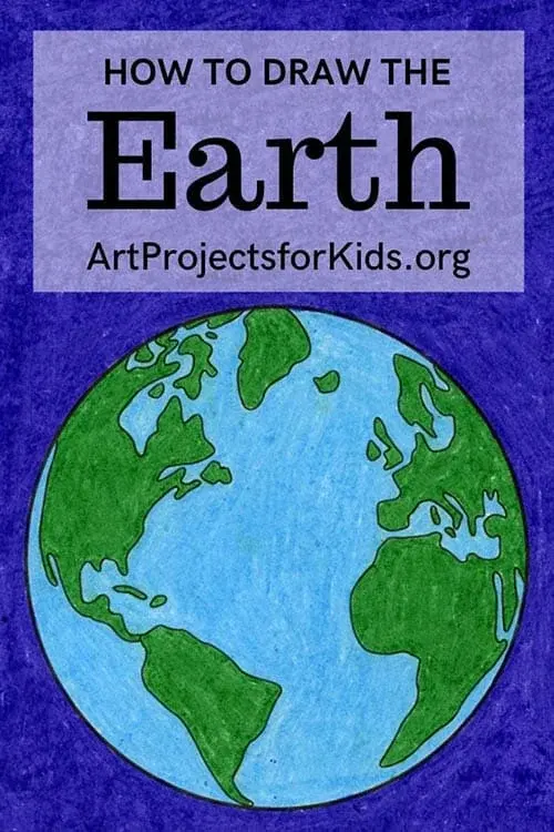
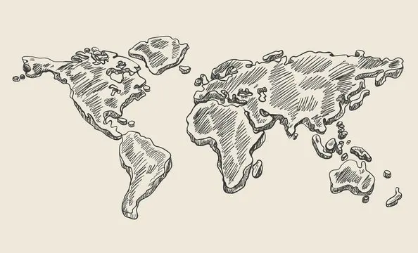
Maps represent the round Earth by using mathematical projections to flatten a three-dimensional sphere onto a two-dimensional surface. Because it is physically impossible to flatten a sphere without stretching or tearing, cartographers use specific geometric formulas to preserve certain properties, such as area, shape, or distance, at the expense of others.
On this page
Why maps cannot be perfectly accurate
The fundamental challenge of cartography is the "unpeeling" problem. Imagine trying to flatten an orange peel onto a table; you must either stretch the peel or cut it into pieces to make it lie flat. Because the Earth is a sphere, any flat map inevitably introduces distortion in size, shape, distance, or direction. No single map can represent all these features perfectly at the same time.
Cartographers use map projections—mathematical transformations—to translate coordinates from a globe to a flat sheet. These projections act like a light source inside a transparent globe, casting shadows onto a surface like a cylinder, a cone, or a plane. Depending on where you place the light and the shape of the surface, different parts of the world will appear distorted. For example, the Mercator projection keeps shapes accurate for navigation but makes landmasses near the poles appear significantly larger than they are.
How map projections work
Projections are categorized by the geometric surface used to capture the Earth's features. Each type serves a distinct purpose depending on whether the map is intended for aviation, land surveying, or global statistics. Choosing the right projection is a trade-off between visual utility and mathematical precision.
- Cylindrical: The map is wrapped around the Earth like a tube. This is excellent for navigation but distorts the size of polar regions.
- Conic: A cone is placed over the Earth, touching along a line of latitude. This is often used for maps of mid-latitude regions like the United States.
- Azimuthal: The map is projected onto a flat plane touching a single point, such as the North Pole. This is ideal for showing the shortest flight paths between two points.
These methods allow mapmakers to control which errors are acceptable for the intended use of the map. A map designed for a classroom wall might prioritize recognizable shapes, while a nautical chart prioritizes accurate compass bearings.
What is the Mercator projection
Created by Gerardus Mercator in 1569, this cylindrical projection remains one of the most recognizable maps in history. Its primary innovation was that it represented lines of constant compass bearing, known as rhumb lines, as straight segments. This made it an essential tool for sailors navigating the open seas during the Age of Discovery.
However, the Mercator projection is infamous for its size distortion. Because the projection stretches the map increasingly as it moves away from the Equator, Greenland appears roughly the same size as Africa. In reality, Africa is about 14 times larger than Greenland. This distortion happens because the projection maintains local angles and shapes at the cost of area. While it is perfect for plotting a course across an ocean, it is highly misleading for comparing the actual geographic size of countries or continents.
How to choose the right map
When selecting a map, you must first define your objective. If you are measuring the surface area of a continent, you need an "equal-area" projection, such as the Gall-Peters or Mollweide projections. If you are planning a long-distance flight, a "gnomonic" projection is superior because it shows the shortest distance between two points as a straight line.
Follow these steps to evaluate a map's utility:
- Identify the map's projection type in the legend or metadata.
- Check if the map claims to be "equal-area," "conformal" (shape-preserving), or "equidistant."
- Compare the size of a known landmass, like South America, to the rest of the map to gauge the level of distortion.
- If you are using a digital map, note that many platforms like Google Maps use a modified Mercator projection, which is great for local streets but inaccurate for global measurements.
Common mistakes when reading maps
A frequent error is assuming that the center of the map is the center of the world. Many maps are "Eurocentric" or "Americentric" simply because of the cartographer's perspective, but any point can be the center of a projection. Another mistake is ignoring the scale bar, which is the only reliable way to measure distance on a flat surface. Because scale changes across a map due to distortion, the scale bar is often only accurate at specific latitudes.
Avoid these pitfalls to ensure you are interpreting map data correctly:
- Never assume that a straight line on a map is the shortest distance between two points unless the map is specifically designed for that purpose.
- Do not compare the sizes of countries located at different latitudes without checking if the map uses an equal-area projection.
- Always check the date of the map, as political boundaries change frequently, rendering older maps obsolete for navigation or research.
- Remember that a map is a model of reality, not reality itself, and it will always reflect the specific intent of its creator.
Key facts
- Map projections are mathematical formulas used to flatten the Earth’s three-dimensional surface onto a two-dimensional plane.
- Every flat map inevitably introduces distortion in either shape, area, distance, or direction.
- The Mercator projection, created in 1569, preserves angles for navigation but drastically exaggerates the size of landmasses near the poles.
- The Gall-Peters projection maintains accurate relative sizes of continents but significantly distorts their shapes.
- Latitude and longitude lines are curved on a globe but often appear as straight lines on maps, creating visual discrepancies.
- To minimize error, choose a map projection based on your specific goal, such as measuring area versus navigating a ship.
The bottom line
Mapping a round Earth onto a flat surface is a complex geometric challenge that requires trade-offs. Because you cannot flatten a sphere without stretching it, every map distorts reality in some way. By understanding that projections prioritize specific features like navigation or area, you can better interpret geographical data and avoid common misconceptions about the true size and shape of our world’s landmasses and oceans.
People also ask
Why do Greenland and Africa look similar in size on some maps?
This is a classic distortion caused by the Mercator projection, which inflates the size of landmasses far from the equator. In reality, Africa is roughly 14 times larger than Greenland.
Can a map ever be perfectly accurate?
No, it is mathematically impossible to flatten a sphere onto a plane without stretching or tearing the surface. Cartographers must choose which property to sacrifice to maintain the accuracy of others.
What is the most accurate map projection?
There is no single "most accurate" projection; the best choice depends on the map's purpose. The Winkel Tripel projection is often favored for world maps because it offers a good balance of size and shape distortion.
How do I avoid misinterpreting map data?
Always check the map's projection type in the legend or metadata. Be cautious when comparing the sizes of countries located at different latitudes, as the projection may be misleading.
Why do maps look different depending on the country of origin?
Map orientation is subjective; while many Western maps place North at the top, this is a convention rather than a physical requirement. Some maps use South-up orientations to emphasize different geographical perspectives.
How do digital maps like Google Maps handle the Earth's curvature?
Digital platforms use a variation of the Mercator projection that allows for seamless zooming and panning. They compensate for distortion by dynamically adjusting the scale as the user changes the zoom level.
This answer was created with the help of AI research tools and reference sources. Spotted an error? Let us know — we correct mistakes quickly. See our editorial policy.