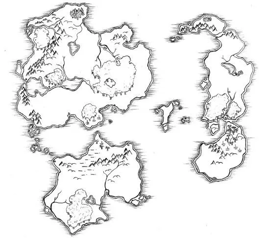
How do you draw a map?
Short answer
Drawing a map involves defining your purpose, selecting a geographic area, and choosing a projection to represent the curved Earth on a flat surface. You must establish a scale, select relevant features to include, and apply clear symbology. By layering data and adding a legend, you create a functional, accurate spatial guide.
On this page
How to start drawing a map
Before putting pen to paper or using software, you must define the map's purpose. A map designed for hikers requires different details than one meant for urban planners or historical researchers. Start by identifying your target audience and the specific geographic extent of the area you intend to cover. This initial planning phase prevents clutter and ensures that the final product communicates its intended message effectively.
Once the purpose is set, gather your base data. This can include physical maps, satellite imagery, or survey notes. If you are drawing by hand, use a grid system to maintain proportions. If you are using digital tools, import your reference layers first. Establishing a clear boundary at this stage is essential, as it dictates the framing and the level of detail you can realistically include without overwhelming the viewer.
- Define the geographic extent of your area.
- Choose a primary purpose (e.g., navigation, thematic data, or reference).
- Gather reliable source materials or base layers.
- Select a projection that minimizes distortion for your specific region.
How to choose a map scale and projection
Scale is the ratio of a distance on the map to the corresponding distance on the ground. A large-scale map, such as 1:10,000, covers a small area with high detail, while a small-scale map, like 1:1,000,000, covers a vast area with less detail. Choosing the wrong scale is a common error that leads to either excessive empty space or unreadable, cramped information. Always indicate the scale clearly using a bar scale or a representative fraction.
Projections are mathematical methods for flattening the Earth's sphere. Because no flat map can perfectly represent a sphere, every projection introduces distortion in shape, area, distance, or direction. For example, the Mercator projection preserves angles for navigation but distorts the size of landmasses near the poles. Select a projection based on your map’s goal; use an equal-area projection if you are comparing the sizes of countries, or a conformal projection if you are measuring bearings.
Best tools for map drawing
For beginners, hand-drawing remains an excellent way to understand spatial relationships. You will need high-quality drafting paper, fine-tip pens, a compass, and a ruler. Using tracing paper over a printed map is a practical technique for learning how to generalize features. This manual approach forces you to prioritize which landmarks are essential, helping you develop a keen eye for cartographic hierarchy and visual balance.
For more complex projects, Geographic Information Systems (GIS) software like QGIS or ArcGIS is the industry standard. These tools allow you to layer data, perform spatial analysis, and update information dynamically. If you prefer a middle ground, vector illustration software like Adobe Illustrator or Inkscape provides high creative control for aesthetic, non-analytical maps. Regardless of the tool, the fundamentals of design—such as contrast, alignment, and legibility—remain the most critical factors in creating a professional-looking map.
- Drafting paper and fine-tip pens for manual design.
- GIS software for data-driven, analytical mapping.
- Vector illustration software for artistic or thematic maps.
- Tracing paper for practicing feature generalization.
Common mistakes when drawing a map
One of the most frequent errors is failing to include a map legend, also known as a key. Without a legend, the symbols, colors, and patterns on your map are meaningless to the reader. Ensure that every symbol used on the map is clearly defined in the legend. Additionally, avoid "data overload" by including only the features that support your map's primary purpose. A map that tries to show everything often ends up showing nothing clearly.
Another common mistake is neglecting the map's orientation and source attribution. Always include a north arrow unless the map is clearly oriented to a specific grid. Furthermore, failing to cite your data sources undermines the credibility of your work. If you are mapping real-world locations, verify your data against multiple reputable sources to ensure accuracy. Small errors in placement or labeling can lead to significant confusion, especially in maps intended for navigation or emergency planning.
How to improve map readability
Readability relies on the effective use of visual hierarchy. Use different font sizes, weights, and colors to distinguish between major features like cities and minor features like streams. Ensure there is enough contrast between your text and the background to prevent eye strain. A well-designed map guides the viewer’s eye naturally from the most important information to the supporting details, creating a logical flow of information.
Color choice is equally vital in cartography. Use colors that are intuitive; for example, blue for water and green for vegetation. Avoid using too many colors, as this can create visual noise and make the map difficult to interpret. When using color to represent data, ensure it is accessible to colorblind users by using patterns or varying shades rather than relying solely on hue. By refining these design elements, you transform a basic sketch into a polished, professional, and highly functional cartographic document.
Key facts
- Cartography is the science and art of making maps, combining geography with graphic design.
- Every map requires a projection, which is a mathematical method for flattening the Earth's curved surface onto a 2D plane.
- A scale bar is essential to indicate the relationship between a distance on the map and the actual distance on the ground.
- Always include a legend, or key, to explain the symbols, colors, and line types used throughout the map.
- North should be clearly indicated with a compass rose, as most modern maps are oriented with North at the top.
- Choose a specific purpose for your map, such as navigation or data visualization, to avoid cluttering the visual space.
The bottom line
Drawing a map is a disciplined process that balances technical accuracy with visual clarity. By selecting an appropriate projection, defining a clear scale, and utilizing a consistent legend, you transform raw geographic data into a functional tool. Whether you are sketching a local trail or designing a complex infographic, prioritize the user's ability to interpret spatial relationships and navigate the information presented on your page.
People also ask
What is the difference between a globe and a map?
A globe is a three-dimensional scale model of the Earth that preserves accurate shapes and distances. A map is a two-dimensional representation that inevitably introduces distortion in area, shape, or scale.
Why do some maps look distorted?
Because the Earth is a sphere, it is impossible to flatten it without stretching or tearing the surface. Different map projections, such as Mercator or Robinson, prioritize either accurate shapes or accurate land areas depending on the intended use.
What tools do I need to start mapmaking?
For hand-drawn maps, you need high-quality drafting pens, a ruler, a compass, and tracing paper. For digital maps, software like QGIS or Adobe Illustrator provides professional tools for layering data and styling features.
How do I determine the correct scale for my map?
Determine the total area you want to cover and the size of your paper. If you want to show a city block, a scale of 1:1,000 is appropriate, while a continental map might use 1:50,000,000.
What is the most common mistake beginners make?
Beginners often forget to include a clear title or a legend. Without these, the viewer cannot understand the context or the meaning behind the symbols used on the map.
Can I use satellite imagery to draw my own map?
Yes, you can trace features from satellite imagery using geographic information systems or design software. This is a common practice for creating custom base maps for hiking or urban planning.
This answer was created with the help of AI research tools and reference sources. Spotted an error? Let us know — we correct mistakes quickly. See our editorial policy.