What is the most popular color in the world?
Short answer
Blue is widely considered the most popular color in the world. Numerous cross-cultural surveys and psychological studies consistently rank it as the favorite color across diverse demographics and geographic regions. Its universal appeal is often attributed to evolutionary associations with positive environmental elements like clear skies and clean, life-sustaining water sources.
On this page
Why is blue the most popular color?
The widespread preference for blue is rooted in evolutionary psychology. Researchers suggest that humans develop positive associations with colors based on the objects they represent. Because blue is consistently linked to the sky and water—two elements essential for survival and generally perceived as safe—it triggers a positive emotional response. This "ecological valence theory" explains why blue rarely carries negative connotations in most cultures.
In contrast, colors like yellow or brown are often associated with waste, decay, or sickness, which leads to lower preference ratings. Blue is also perceived as calming and stable, qualities that are highly valued in modern, fast-paced societies. These psychological benefits make blue a default choice for corporate branding, interior design, and personal fashion, further reinforcing its status as the world's most favored hue.
How do researchers measure color preference?
Scientists and market researchers typically use standardized surveys to determine color popularity. One of the most famous studies, conducted by researchers at the University of California, Berkeley, involved participants from various countries who were asked to rank colors based on their personal preferences. The results showed a strong, statistically significant bias toward blue across almost every tested population.
These studies often utilize the following methods to ensure accuracy:
- Controlled lighting environments to prevent color distortion.
- Diverse participant pools to account for age, gender, and cultural background.
- Standardized color palettes, such as the Munsell Color System, to ensure consistency.
By using these rigorous methods, researchers can isolate color preference from external factors like brand loyalty or current fashion trends. While individual preferences exist, the aggregate data consistently points to blue as the global leader in popularity.
How to use popular colors in design
When designing a space or a project, incorporating popular colors can make your work feel more accessible and trustworthy. Blue is an excellent choice for areas where you want to promote productivity and focus, such as offices or study rooms. Because it is a "cool" color, it can also make small rooms feel more spacious and open.
To effectively use blue in your design, consider these steps:
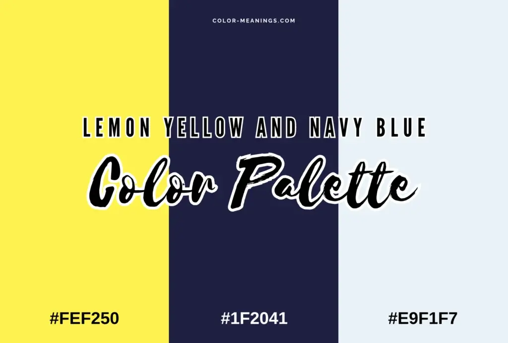
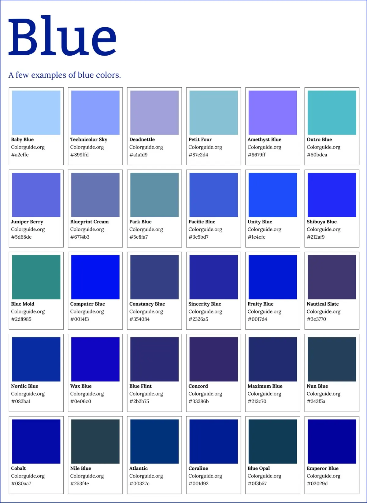
- Select a base shade of blue that aligns with the desired mood, such as navy for authority or light blue for tranquility.
- Balance the blue with neutral tones like white, gray, or beige to prevent the space from feeling too cold or overwhelming.
- Introduce accent colors, such as orange or yellow, to create a complementary contrast that adds visual interest.
Avoid using too many different shades of blue in one area, as this can create a cluttered, disorganized look. Stick to a cohesive palette of two or three related tones.
Common mistakes when choosing colors
A frequent mistake people make is ignoring the context of the environment. While blue is popular, it may not always be the right choice for every situation. For example, in a dining room, blue is sometimes avoided because it is rarely found in natural, appetizing foods, which can subconsciously suppress the appetite.
Another common error is failing to consider the impact of lighting on color perception. A shade of blue that looks vibrant in a store may appear dull or gray in a room with poor natural light. Always test color samples in the specific environment where they will be used before committing to a large project.
- Ignoring the undertones of a color, which can make it clash with existing furniture or wall colors.
- Overusing a popular color, which can lead to a generic or uninspired aesthetic.
- Neglecting the psychological impact of color intensity, such as using a neon blue where a soft, muted tone would be more appropriate.
What are the cultural variations in color popularity?
While blue holds the top spot globally, cultural context can influence how specific shades are perceived. In some cultures, colors carry symbolic meanings that override general psychological preferences. For instance, in parts of East Asia, red is highly favored because it symbolizes good luck, prosperity, and joy, often outperforming blue in celebratory or traditional contexts.
It is important to remember that "popularity" is a fluid concept that changes with time and societal shifts. Trends in fashion and technology can temporarily elevate other colors, such as green or purple, to the forefront of public interest. However, even when these trends fluctuate, blue maintains its status as the most consistently liked color. By understanding both the universal appeal of blue and the specific cultural nuances of your audience, you can make informed decisions that resonate with people on a deeper, more meaningful level.
Key facts
- Blue is consistently ranked as the world’s favorite color across diverse cultures and geographic regions.
- Surveys conducted by researchers like Joe Hallock have shown that blue is the preferred color for both men and women.
- Color preference is often linked to evolutionary biology, as humans associate blue with positive elements like clear skies and clean water.
- In marketing, blue is frequently used by financial institutions and tech companies to convey a sense of trust, stability, and intelligence.
- While blue holds the top spot, green is often the second most popular choice, likely due to its strong association with nature and vitality.
- When choosing a color for professional branding, avoid using too many competing hues; stick to a primary blue palette to maximize consumer comfort.
The bottom line
Blue remains the most popular color worldwide, transcending cultural and gender boundaries due to its deep-seated associations with positive natural elements like the sky and water. Whether you are designing a brand identity or decorating a personal space, opting for blue provides a sense of reliability and calm. Understanding these universal preferences helps in making choices that are visually appealing and emotionally resonant to most people.
People also ask
Why do so many people prefer blue over other colors?
Psychologists suggest that humans have a universal positive association with blue because it is linked to non-threatening, stable elements in nature. Unlike colors like red, which can signal danger or aggression, blue is perceived as calming and reliable.
Does color preference change based on a person's age?
Research indicates that color preferences remain relatively stable throughout adulthood, though children often show a stronger preference for brighter, more saturated colors. As people age, they tend to gravitate toward more muted or sophisticated shades of their favorite colors.
Is the popularity of blue the same in every country?
While blue is the global leader, cultural nuances can influence secondary preferences. For example, some cultures associate specific colors with luck or mourning, which may shift the ranking of colors like red or white in regional contexts.
How can I use color psychology to influence my home decor?
Use blue in bedrooms or offices to promote relaxation and focus, as its cooling effect lowers heart rates. Avoid using large amounts of intense, bright red in these areas, as it can increase anxiety and physical agitation.
Are there any colors that are universally disliked?
Studies often identify murky, brownish-yellow or olive green shades as the least popular colors. These hues are frequently associated with decay or bodily waste, leading to a natural evolutionary aversion.
Does gender influence which colors people choose?
While both men and women overwhelmingly choose blue as their favorite, women tend to prefer softer, lighter tints. Men, conversely, often show a slight preference for deeper, more saturated shades of blue.
This answer was created with the help of AI research tools and reference sources. Spotted an error? Let us know — we correct mistakes quickly. See our editorial policy.