What is kerning?
Short answer
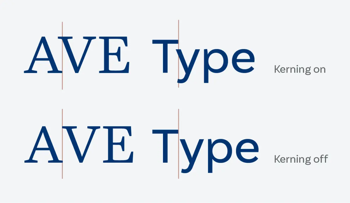
Kerning is the process of adjusting the horizontal space between two individual characters in a font to achieve a visually balanced appearance. Unlike tracking, which adjusts spacing across a range of text, kerning targets specific letter pairs. Proper kerning ensures that words appear uniform, legible, and aesthetically pleasing to the reader.
On this page
Why kerning is important for design
Kerning is essential because digital fonts are mathematical, not optical. When a designer types a word, the software places letters according to their side bearings, which are the invisible buffers on either side of a character. However, these buffers often fail to account for the unique shapes of letters like "A," "V," or "T." Without manual adjustment, these characters can look like they are drifting apart or crashing into one another, creating distracting gaps in the text.
Good kerning creates a consistent rhythm across a line of type. When letters are spaced correctly, the reader’s eye moves smoothly across the word rather than stumbling over uneven white space. This is particularly critical in large-scale applications such as logos, headlines, and signage. In these contexts, even minor spacing errors become magnified, potentially undermining the professional quality of the brand or message. Proper kerning is the hallmark of a polished, high-end design.
How to kern text step by step
Most modern design software, such as Adobe InDesign, Illustrator, or Affinity Designer, includes automated kerning features. While these tools are helpful, they are rarely perfect for custom display work. To achieve professional results, you must take control of the spacing manually. Follow these steps to refine your typography:
- Select the text tool and place your cursor between two letters that appear to have awkward spacing.
- Hold the "Option" (Mac) or "Alt" (Windows) key and use the left or right arrow keys to nudge the characters closer or further apart.
- View the text at various sizes, including very small and very large, to ensure the adjustment holds up across different scales.
- Flip the text upside down; this trick helps you focus on the shapes and negative space between letters rather than the meaning of the words.
Common mistakes when kerning fonts
The most frequent error is over-kerning, which happens when a designer tries to force letters too close together. This can cause characters to touch or overlap, rendering the text unreadable. Another common mistake is ignoring the "optical" weight of letters. For example, a "W" and an "A" have diagonal strokes that create large, triangular pockets of white space. Beginners often treat these pairs the same as two straight-sided letters like "H" and "I," resulting in an uneven, patchy appearance.
Designers should also avoid relying solely on "Metrics" or "Optical" settings provided by software. While these settings are excellent for body copy, they are insufficient for headlines or logos. Relying on automated settings can lead to "loose" or "tight" spots that disrupt the flow of the word. Always perform a final manual check on any text that will be displayed prominently, as the human eye is much better at detecting subtle inconsistencies than a computer algorithm.
Best practices for kerning beginners
When you are starting out, focus on high-impact letter pairs. These are usually combinations involving diagonal or rounded characters. Learning to spot these problematic areas is the first step toward mastering typography. Practice by adjusting common pairs such as "AV," "To," "Wa," and "Ty." By focusing on these, you will quickly develop an eye for how negative space functions in relation to letterforms.
- Start with large, bold fonts to make the spacing issues easier to see.
- Use a consistent reference point, such as the space between two straight letters like "H" and "N," to gauge how other pairs should look.
- Limit your adjustments to small increments to maintain subtle control.
- Print your work on paper, as screen resolution can sometimes hide subtle spacing issues that become obvious in physical print.
- Take frequent breaks to rest your eyes, as staring at the same word for too long can lead to "type blindness" where errors become invisible.
How kerning differs from tracking
It is common for beginners to confuse kerning with tracking, but they serve distinct purposes. Tracking, sometimes called letter-spacing, refers to the uniform adjustment of space across an entire block of text. If you want to make a paragraph look slightly more airy or condense a headline to fit a specific width, you use tracking. It affects every character relationship in the selection equally, whereas kerning is strictly concerned with the relationship between two specific, adjacent letters.
Think of tracking as a global setting and kerning as a local intervention. You should always apply your kerning adjustments first, as these are specific to the character shapes. Once the individual pairs look balanced, you can then apply tracking to the entire word or sentence to achieve the desired overall density. Mastering the distinction between these two tools will give you total control over your typography, allowing you to create layouts that are both highly legible and visually balanced.
Key facts
- Kerning is the process of adjusting the horizontal space between two individual characters to improve visual balance.
- Unlike tracking, which adjusts spacing across a whole word or paragraph, kerning targets specific letter pairs.
- The term originates from the French word "kern," meaning "hinge," referring to a part of a letter that extends beyond its body.
- Poor kerning often occurs in pairs like "AV," "To," or "Wa," where the diagonal shapes create awkward gaps.
- Professional type designers create "kerning tables" embedded in font files to automate spacing for thousands of character combinations.
- To kern manually, squint at your text to identify uneven patches of white space and adjust the values in increments of 10 or 20 units.
The bottom line
Kerning is a fundamental typographic technique that ensures the spacing between letters feels consistent and intentional. By correcting the uneven gaps created by varying letter shapes, designers create professional, readable, and visually harmonious text. While modern software handles much of this automatically, understanding how to manually refine kerning remains a vital skill for anyone working with headlines, branding, or high-quality editorial layouts to achieve a polished look.
People also ask
What is the difference between kerning and tracking?
Kerning adjusts the space between two specific letters, while tracking adjusts the overall spacing between all characters in a block of text. Use tracking to change the density of a paragraph and kerning to fix specific visual inconsistencies.
Why do some letter pairs look further apart than others?
Letters with diagonal or curved edges, such as A, V, T, and O, create natural gaps that rectangular letters do not. Without kerning, these shapes appear to drift apart, creating an uneven rhythm in the text.
Should I manually kern every word in a document?
No, manual kerning is generally reserved for large-scale typography like logos, headlines, or book titles. Body text should rely on the font’s built-in kerning tables to maintain consistent readability.
How can I practice my kerning skills?
Websites like "Kern Type" offer interactive games that allow you to adjust letter spacing and compare your results against professional standards. Regular practice helps train your eye to spot subtle imbalances in typography.
Does every font have kerning information?
Most professional-grade digital fonts include kerning tables, but many free or low-quality fonts lack them entirely. If a font looks "loose" or "gappy," it may be missing these essential spacing instructions.
What is a common mistake when adjusting kerning?
A frequent error is over-tightening letters until they touch or overlap, which ruins legibility. Always view your work at a distance or print it out to ensure the spacing feels natural rather than forced.
This answer was created with the help of AI research tools and reference sources. Spotted an error? Let us know — we correct mistakes quickly. See our editorial policy.