What is typography?
Short answer
Typography is the art and technique of arranging type to make written language legible, readable, and appealing when displayed. It involves selecting typefaces, point sizes, line lengths, line spacing, and letter spacing. By manipulating these visual elements, designers establish hierarchy, convey tone, and ensure that text effectively communicates its intended message.
On this page
What are the basic elements of typography?
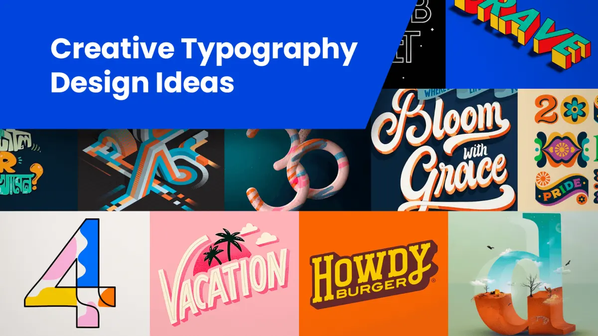
Typography relies on several fundamental components that dictate how text appears on a page or screen. The most prominent element is the typeface, which is a collection of characters sharing a consistent design. These are often categorized into serif, which features small strokes at the ends of characters, and sans-serif, which lacks these decorative flourishes. Other styles include script, display, and monospaced fonts, each serving specific aesthetic or functional purposes.
Beyond the choice of font, designers must manage spatial relationships to ensure clarity. Leading refers to the vertical space between lines of text, while kerning involves adjusting the space between individual letter pairs to achieve visual balance. Tracking, or letter-spacing, applies to the overall density of a word or block of text. Mastering these elements allows a designer to control the "color" or grayness of a paragraph, ensuring that the reader’s eye moves comfortably across the page without fatigue.
How to choose the right font for a project
Selecting a typeface requires balancing the personality of the brand with the practical requirements of the medium. For long-form reading, such as books or lengthy articles, designers often prefer classic serif fonts like Garamond or Times New Roman because their structure helps the eye track lines. Conversely, digital interfaces frequently utilize clean, sans-serif fonts like Helvetica or Inter, which maintain high legibility at smaller sizes on high-resolution screens.
When combining multiple fonts, follow these professional guidelines to maintain visual harmony:
- Limit your project to two or three typefaces to avoid a cluttered appearance.
- Pair a bold, decorative font for headings with a simple, readable font for body copy.
- Ensure there is a strong contrast in weight or style between the chosen fonts.
- Test your pairings at different sizes to ensure they remain distinct and legible.
- Consider the historical context of the font to ensure it matches the tone of the content.
Why typography affects readability and legibility
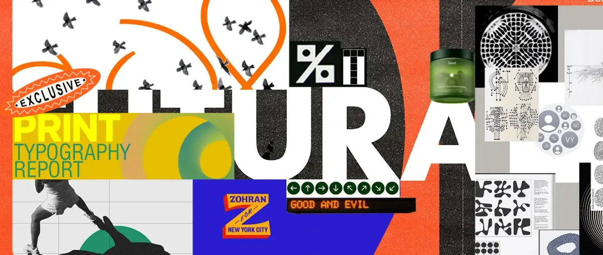
Readability refers to how easy it is to read a large body of text, while legibility describes how easily individual characters can be distinguished from one another. Poor typography can significantly hinder comprehension, causing readers to abandon content prematurely. Factors such as line length are critical; a line that is too long forces the eye to travel too far, while a line that is too short creates a disjointed reading rhythm.
To optimize the reading experience, designers often adhere to the "golden ratio" for line length, typically aiming for 45 to 75 characters per line. Furthermore, the relationship between font size and line height is vital. If the lines are too close together, the text appears cramped; if they are too far apart, the text loses cohesion. Proper hierarchy, achieved through variations in size, weight, and color, guides the reader through the document by highlighting headings and subheadings, effectively creating a map of the information.
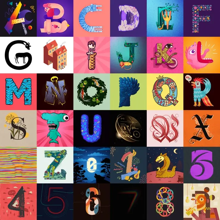
Common mistakes when designing with type
Even experienced designers can fall into traps that compromise the quality of their work. One of the most frequent errors is the overuse of "all caps," which reduces character recognition and makes text appear aggressive or difficult to scan. Another common issue is the failure to use proper typographic symbols, such as smart quotes, en dashes, and em dashes, opting instead for standard typewriter-style punctuation that looks unprofessional in print.
Avoid these common pitfalls to ensure your typography remains polished and effective:
- Never stretch or distort a font to fit a specific space, as this ruins the designer's original proportions.
- Avoid using too many different font sizes, which creates a chaotic and disorganized visual hierarchy.
- Do not ignore the importance of contrast; light gray text on a white background is notoriously difficult to read.
- Refrain from using overly decorative fonts for body copy, as they distract the reader from the content.
- Always check for "widows" and "orphans," which are single words left dangling at the end of a paragraph or column.
How to improve your typographic skills
Improving your typographic eye is a process of observation and practice. Start by analyzing high-quality print media, such as well-designed magazines or classic books, to see how professionals handle margins, grids, and spacing. Pay attention to how different fonts evoke specific emotions, such as the authority associated with a bold serif or the modern efficiency of a geometric sans-serif. Engaging in these analytical exercises will help you develop a more intuitive sense of what works in various contexts.
Practical application is equally important for skill development. Try setting the same paragraph in several different typefaces and adjusting the leading to see how the texture of the block changes. Use software tools to experiment with tracking and kerning, observing how subtle adjustments impact the overall balance. By consistently applying these principles and refining your sensitivity to the nuances of letterforms, you will eventually be able to create layouts that are not only functional but also visually compelling and aesthetically sophisticated.
Key facts
- Typography is the art and technique of arranging type to make written language legible, readable, and appealing when displayed.
- Johannes Gutenberg’s invention of the movable type printing press around 1440 revolutionized typography by allowing for mass production of texts.
- A typeface is a collection of characters sharing a consistent design, while a font refers to the specific weight, width, and style of that typeface.
- Serif typefaces feature small decorative strokes at the ends of letters, whereas sans-serif typefaces lack these strokes and often appear more modern.
- Line spacing, known as leading, should generally be set to 120–145% of the font size to ensure comfortable reading.
- Avoid using more than three different typefaces in a single document to prevent a cluttered and unprofessional appearance.
The bottom line
Typography is an essential discipline that bridges the gap between raw information and effective communication. By mastering the fundamentals of font selection, spacing, and hierarchy, you can significantly enhance the clarity and impact of your message. Whether designing for print or digital platforms, thoughtful typography ensures your text is not only readable but also visually engaging, ultimately helping you connect more effectively with your target audience.
People also ask
What is the difference between a serif and a sans-serif font?
Serif fonts, such as Times New Roman, have small feet or strokes at the ends of characters and are traditionally used for long-form print. Sans-serif fonts, like Arial, lack these strokes and are frequently preferred for digital screens due to their clean, minimalist aesthetic.
How do I choose the right font for a project?
Consider the tone of your content and the intended audience. A formal report benefits from a classic serif font, while a modern brand or mobile application often requires a highly legible sans-serif typeface.
What is kerning and why does it matter?
Kerning is the process of adjusting the space between individual letter pairs to create a visually pleasing result. Proper kerning prevents awkward gaps that can make text look uneven or difficult to read.
What is the ideal line length for readability?
For optimal readability, aim for 45 to 75 characters per line, including spaces. Lines that are too long tire the reader's eyes, while lines that are too short disrupt the natural rhythm of reading.
How can I improve text hierarchy in my designs?
Establish hierarchy by varying font sizes, weights, and colors to guide the reader’s eye. Use bold, large headings for primary titles and smaller, lighter text for body content to create a clear structure.
What are common typography mistakes to avoid?
Avoid using all-caps for long paragraphs, as it slows down reading speed and feels aggressive. Additionally, ensure there is enough contrast between your text color and the background to maintain accessibility.
This answer was created with the help of AI research tools and reference sources. Spotted an error? Let us know — we correct mistakes quickly. See our editorial policy.