What is a serif font?
Short answer
A serif font is a typeface characterized by small decorative strokes, or "feet," attached to the ends of the main letter strokes. These elements, known as serifs, originated from stone carving practices in antiquity. Today, they are widely used in print media to improve readability and convey a sense of tradition and authority.
On this page
What are the characteristics of serif fonts?
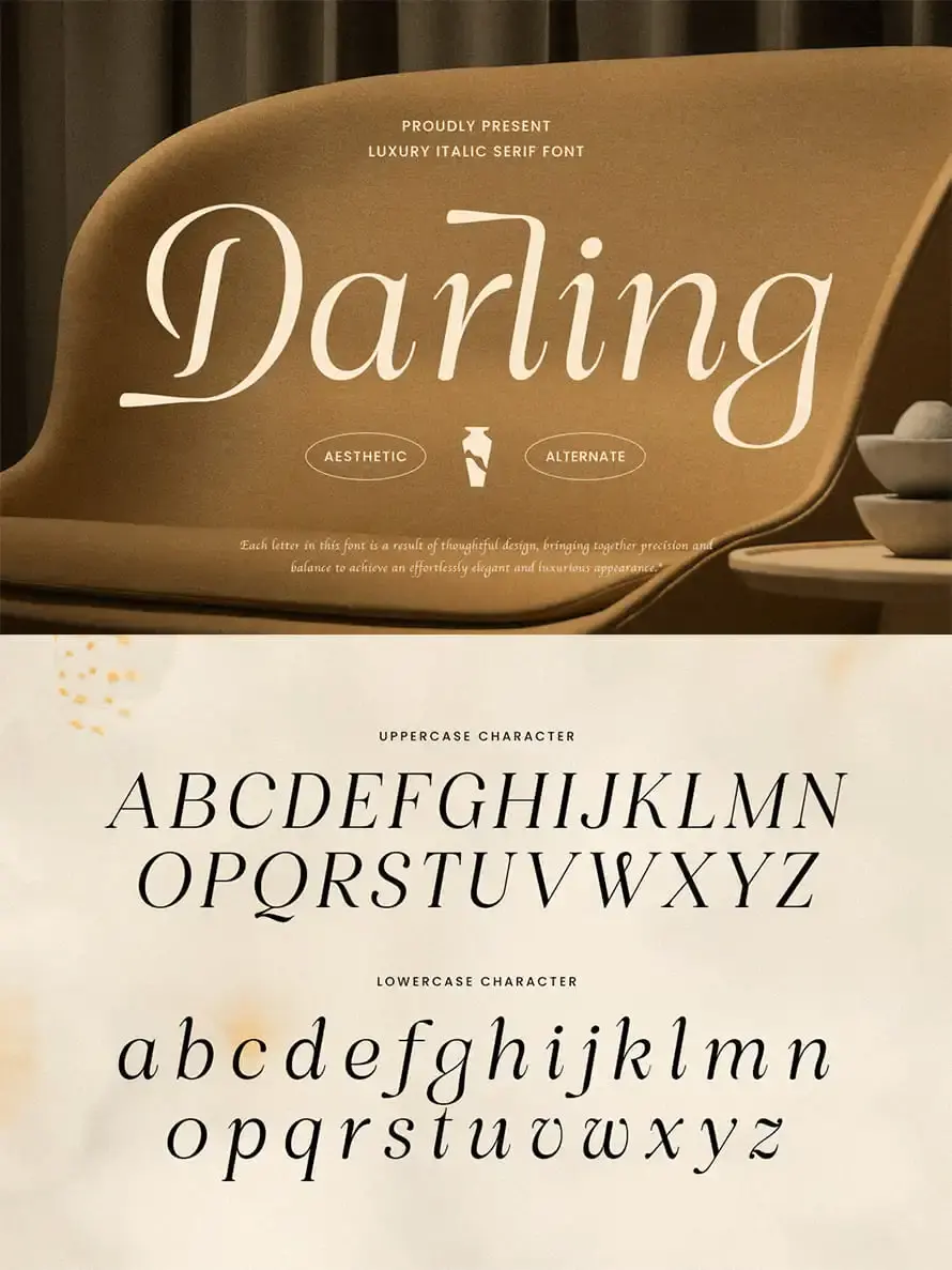
Serif fonts are defined by the presence of small lines or flares at the terminals of letterforms. These features vary significantly in shape, ranging from sharp, pointed edges to rounded, bracketed transitions. The structure of a serif font often mimics the fluid motion of a pen or the precise chisel marks found in classical Roman inscriptions. Because of these distinct details, serif fonts possess a high degree of "character" that differentiates them from the uniform, minimalist appearance of sans-serif typefaces.
Beyond the serifs themselves, these fonts often feature high contrast between the thick and thin parts of the letters. This variation in stroke width helps guide the eye along a line of text, which is why they are frequently chosen for long-form reading. Designers categorize these fonts into several sub-styles based on their historical evolution:
- Old Style: Features low contrast and diagonal stress, such as Garamond.
- Transitional: Offers higher contrast and sharper serifs, exemplified by Baskerville.
- Modern: Characterized by extreme contrast and hairline serifs, like Bodoni.
- Slab Serif: Features thick, block-like serifs, commonly seen in Rockwell.
Why use serif fonts for print?
The primary reason serif fonts remain the standard for books, newspapers, and magazines is their perceived readability in printed formats. The small strokes create a horizontal "flow" that connects letters, helping the reader’s eye move more efficiently across the page. This visual connection reduces the effort required to recognize individual letters, allowing the brain to process words as cohesive units rather than isolated characters. In high-density text, this can significantly reduce eye fatigue during long reading sessions.
Beyond functional readability, serif fonts carry psychological weight. They are often associated with academic rigor, historical heritage, and professional reliability. Because they have been used in publishing for centuries, they evoke a sense of trust and established authority. When a brand or publisher wants to signal that their content is serious, well-researched, or timeless, a serif font is almost always the preferred choice. It transforms a simple block of text into a document that feels permanent and deliberate.
How to choose the right serif font?
Selecting the perfect serif font requires considering the medium and the intended mood of the content. For body text, prioritize fonts with high legibility and moderate contrast, such as Georgia or Times New Roman. These fonts are engineered to remain clear even at smaller point sizes or on lower-quality paper. If you are designing for a digital screen, look for fonts specifically optimized for web display, which often feature larger x-heights and more open letter shapes to prevent blurring.
When selecting a font, follow these steps to ensure compatibility:
- Identify your primary goal: Is the text for long-form reading or for eye-catching headlines?
- Check the character set: Ensure the font includes necessary symbols, numerals, and italics.
- Test the font at your target size: Print a sample page to see how the serifs render on physical paper.
- Compare weights: Ensure the font has a bold weight that maintains its clarity without becoming muddy.
Common mistakes when using serif fonts
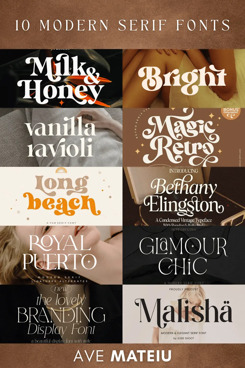
One frequent error is using a highly decorative or "display" serif font for long paragraphs. Display fonts often have exaggerated features or extreme contrast that look beautiful in a large title but become illegible when shrunk down to 10 or 12 points. Avoid fonts with overly intricate serifs if your audience will be reading on mobile devices, as these details can disappear or create visual noise on small, low-resolution screens.
Another mistake is mixing too many different serif styles within a single document. While pairing a bold slab serif for a header with a classic Old Style font for the body can be effective, using three or four different serif typefaces creates visual clutter. This inconsistency confuses the reader and undermines the professional aesthetic you are trying to achieve. Stick to a maximum of two typefaces per project, and ensure they share a common lineage or visual weight to maintain a cohesive and polished look.
Best practices for serif typography
To maximize the impact of your typography, focus on proper spacing and hierarchy. Serif fonts often benefit from slightly more generous line spacing, or "leading," because the serifs themselves occupy vertical space. If the lines are too tight, the serifs can visually collide, creating a cluttered appearance that makes the text difficult to parse. Aim for a line height that is roughly 120% to 145% of your font size to allow the letters to breathe.
Additionally, pay close attention to the alignment and justification of your text. Serif fonts look particularly elegant when justified, as the blocks of text create a clean, architectural shape on the page. However, ensure you are using proper hyphenation settings to avoid large, uneven gaps between words, which can ruin the rhythm of the reading experience. By balancing these technical details with the inherent grace of the typeface, you can create documents that are both visually inviting and exceptionally easy for your audience to navigate.
Key facts
- A serif is a small decorative stroke or "foot" added to the end of the main strokes of a letter.
- Serif fonts are historically associated with traditional printing, such as books, newspapers, and academic journals.
- The term "serif" likely derives from the Dutch word "schreef," meaning a line or pen stroke.
- These fonts are often categorized into styles like Old Style, Transitional, Modern, and Slab Serif.
- Serif fonts are generally considered easier to read in long-form print because the serifs help guide the eye along a line of text.
- Common examples of serif typefaces include Times New Roman, Garamond, Baskerville, and Georgia.
The bottom line
Serif fonts are defined by the small, ornamental strokes at the ends of characters, a design feature rooted in the history of movable type and classical calligraphy. While they excel in printed books and formal documents by improving legibility, they also serve as powerful tools for branding. By understanding the distinction between serif and sans-serif styles, you can effectively choose typography that aligns with your specific communication goals.
People also ask
What is the difference between a serif and a sans-serif font?
A serif font features small decorative strokes at the ends of letters, while a sans-serif font—from the French word "sans" meaning "without"—lacks these additions. Sans-serif fonts typically look cleaner and more modern, making them popular for digital screens and minimalist design.
Are serif fonts better for accessibility?
For many readers, serif fonts are easier to read in printed materials because the strokes create a horizontal flow that connects letters. However, for individuals with certain visual impairments or dyslexia, some sans-serif fonts are often preferred due to their lack of visual clutter.
Why do designers use slab serifs?
Slab serifs feature thick, block-like strokes that provide a bold, industrial appearance. They are frequently used in advertising, headlines, and branding where the goal is to grab attention rather than sustain long-form reading.
Can I use serif fonts for web design?
Yes, serif fonts are widely used on websites to establish authority, elegance, or a classic aesthetic. When using them online, ensure the font size is large enough to maintain legibility, as the fine details of serifs can sometimes blur on low-resolution displays.
What is the most famous serif font?
Times New Roman is arguably the most recognizable serif font, commissioned by the British newspaper The Times in 1931. It became a global standard after being included as a default typeface in early word processing software like Microsoft Word.
How do I choose between serif and sans-serif for a project?
Choose a serif font if you want to convey tradition, reliability, or academic rigor in a printed document. Use a sans-serif font if you are designing for mobile apps, modern digital interfaces, or brands that prioritize a minimalist, contemporary identity.
This answer was created with the help of AI research tools and reference sources. Spotted an error? Let us know — we correct mistakes quickly. See our editorial policy.