What does the color white mean in art?
Short answer
White in art signifies purity, emptiness, light, and infinite potential. It serves as a foundational element for highlighting, creating spatial depth, and establishing neutral backgrounds. Across various cultures and eras, artists have utilized white to convey transcendence, minimalist austerity, or the literal absence of color, shaping the viewer's emotional and intellectual response.
On this page
What does white symbolize in art history?
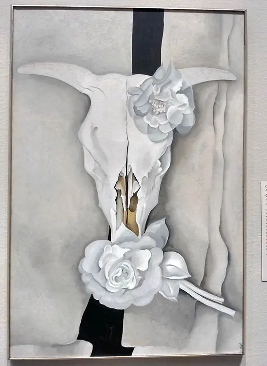
In Western art history, white has long been associated with spiritual purity, divinity, and moral clarity. During the Renaissance, artists used white pigments like lead white to depict the ethereal light of heaven or the innocence of religious figures. This tradition continued through the Neoclassical period, where white marble sculptures were prized for their perceived connection to the rational ideals of ancient Greece and Rome.
Beyond religious contexts, white often represents a "tabula rasa" or a blank slate. In the 20th century, artists like Kazimir Malevich pushed this concept to its extreme with works such as White on White (1918). By stripping away representational imagery, these artists forced viewers to confront the essence of space and the void. White became a symbol of intellectual rigor, silence, and the rejection of traditional decorative art, marking a significant shift toward modern abstraction.
How do artists use white for light and depth?
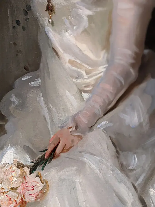
White is the primary tool for artists to simulate the behavior of light on a three-dimensional surface. By applying highlights—the brightest points on an object—artists create the illusion of volume and texture. Without white, a painting often appears flat and muddy, as it lacks the necessary contrast to define form and shadow.
- Apply pure white at the exact point where the light source hits the object.
- Use a slightly tinted white, such as cream or cool blue-white, for reflected light in shadows.
- Gradually blend white into mid-tones to create smooth transitions across curved surfaces.
- Use a dry brush technique to add "sparkle" or specular highlights on reflective surfaces like glass or metal.
Artists must be careful not to overuse white, as it can easily desaturate other colors. When mixed directly into a pigment, white lightens the value but also alters the temperature, often making warm colors appear chalky or cold.
Why is white important in minimalist art?
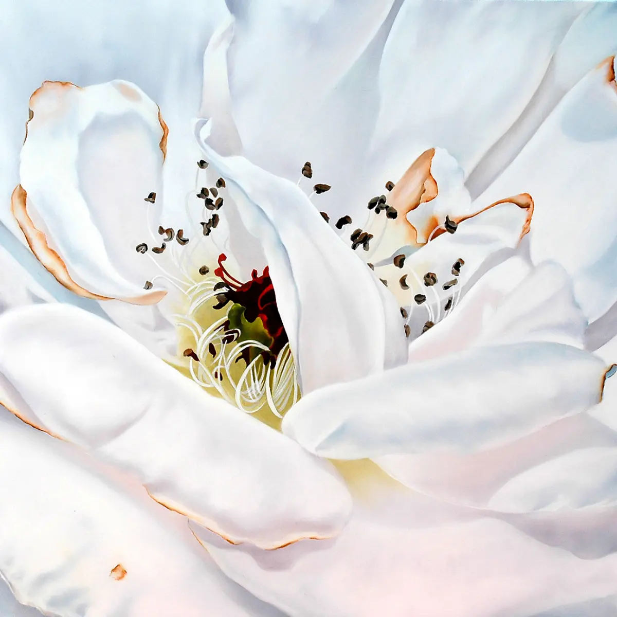
Minimalism, a movement that gained prominence in the 1960s, embraced white as a way to eliminate distractions and focus on the physical presence of an object. Artists like Robert Ryman dedicated their careers to exploring the nuances of white paint, experimenting with different textures, application methods, and surfaces. For these artists, white was not an absence of color but a medium in its own right.
The use of white in minimalism serves several distinct purposes:
- It emphasizes the architecture of the gallery space, making the room itself part of the artwork.
- It forces the viewer to slow down and notice subtle variations in surface relief and brushwork.
- It removes emotional cues, allowing for a more objective and meditative experience.
- It creates a sense of openness, suggesting that the work is infinite and unbound by the frame.
This approach challenges the viewer to look beyond the surface and engage with the material qualities of the paint, canvas, and light.
Common mistakes when using white in painting
One of the most frequent errors beginners make is using white paint to lighten every color. While this increases the value, it frequently results in a "pastel" effect that can make a painting look amateurish or washed out. Instead of relying solely on white, experienced painters often use a combination of lighter-value pigments or thinner glazes to achieve a luminous, natural look.
Another common mistake is applying white highlights too early in the process. Highlights should be the final step, as they define the final form and bring the composition to life. Placing them prematurely can lead to a loss of depth, as the highlights may become muddied by subsequent layers of paint.
- Avoid using "Titanium White" for every task, as its high opacity can easily overpower delicate color mixtures.
- Do not use white to create shadows; instead, use complementary colors to maintain color vibrancy.
- Avoid applying white paint too thickly in areas that are meant to recede, as the physical texture will draw the eye forward.
Best white pigments for various art styles
Choosing the right white pigment is essential for achieving the desired effect in a painting. Each type of white has unique properties regarding drying time, opacity, and tinting strength. Understanding these differences helps artists select the best medium for their specific project needs.
- Titanium White: The most popular choice due to its extreme opacity and brilliant brightness; ideal for covering dark layers.
- Zinc White: A transparent, cool-toned white perfect for glazing and subtle tinting without losing the vibrancy of the base color.
- Lead White: Historically significant and prized for its fast drying time and flexible film, though it requires careful handling due to toxicity.
- Flake White Hue: A modern, non-toxic alternative that mimics the buttery consistency and semi-transparency of traditional lead-based whites.
For beginners, starting with a tube of Titanium White is standard, but keeping a tube of Zinc White or a transparent mixing white is highly recommended for advanced layering techniques. By mastering these different whites, an artist gains greater control over the luminosity and overall atmosphere of their work, ensuring that white serves as a powerful, intentional element of the final composition.
Key facts
- White is technically the presence of all visible wavelengths of light, meaning it reflects the full spectrum rather than absorbing it.
- In color theory, white is considered an achromatic color, serving as a neutral base that influences the perceived intensity of surrounding hues.
- Artists use white to create "tints," which are lighter versions of a color achieved by mixing pigment with white paint.
- In Western art history, white often symbolizes purity, innocence, and divinity, while in many Eastern cultures, it is traditionally associated with mourning and death.
- A common mistake for beginners is using pure white (such as Titanium White) for highlights; instead, use a slightly tinted white to maintain color harmony.
- To create depth in a painting, artists place the brightest white at the focal point to draw the viewer's eye through high-contrast lighting.
The bottom line
White is a versatile tool that functions as both a light source and a structural element in art. By mastering the balance between opaque coverage and transparent tints, artists can manipulate depth, focus, and emotional tone. Whether representing the brilliance of sunlight or the stillness of a minimalist composition, white remains an essential component for defining the values and overall harmony of any visual work.
People also ask
Is white considered a color in painting?
In the context of physics, white is the combination of all colors, but in the practical application of painting, it is treated as a neutral pigment. Artists use it to adjust the value and saturation of other colors on the palette.
How do I choose between different types of white paint?
Titanium White is opaque and strong, making it ideal for covering dark layers, while Zinc White is more transparent and better for subtle glazing. Use Titanium for highlights and Zinc for blending.
Why does white paint sometimes turn yellow over time?
Oil-based white paints often yellow because the linseed oil binder oxidizes as it dries. Using paints with a safflower or poppy oil base can help prevent this discoloration.
How can I use white to create a sense of space?
White creates the illusion of distance by simulating atmospheric haze. By adding a small amount of white to background elements, you push them visually further away from the viewer.
Can white be used to create shadows?
While black is often used for shadows, adding white to a color creates a cooler, chalky appearance that can suggest reflected light within a shadow. Avoid using pure white for shadows, as it can make the area look flat.
What is the difference between warm and cool whites?
Warm whites contain subtle undertones of yellow or red, while cool whites lean toward blue or green. Selecting the right temperature is essential for matching the lighting conditions of your subject.
This answer was created with the help of AI research tools and reference sources. Spotted an error? Let us know — we correct mistakes quickly. See our editorial policy.