What are the principles of design?
Short answer
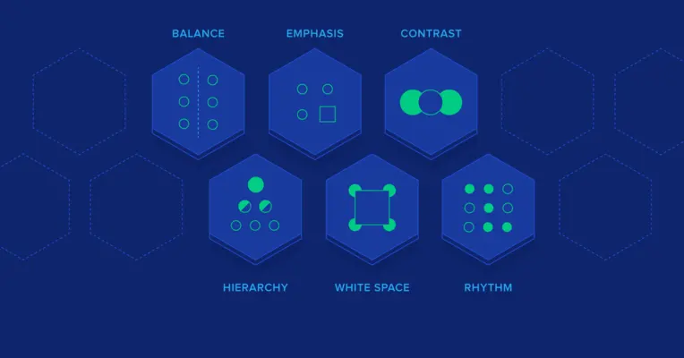
The principles of design are the fundamental rules—including balance, contrast, emphasis, movement, pattern, rhythm, and unity—that guide how visual elements are arranged. By applying these core concepts, designers create compositions that are aesthetically pleasing, functional, and effective at communicating specific messages to an audience across various artistic and professional mediums.
On this page
What are the core principles of design?
The principles of design serve as the organizational framework for visual communication. While elements such as line, shape, color, and texture are the building blocks, the principles dictate how those blocks interact to create a cohesive whole. These rules emerged from the Bauhaus movement in the early 20th century, which sought to bridge the gap between artistic expression and industrial production. By mastering these concepts, creators can manipulate the viewer’s eye and influence how information is processed.
These principles are not rigid laws but rather guidelines that provide structure. When applied correctly, they ensure that a design is not merely decorative but purposeful. Whether you are designing a website, a poster, or a physical product, these concepts remain consistent. They allow for the creation of visual hierarchies, ensuring that the most important information is perceived first. Understanding these relationships is the first step toward moving from basic layout tasks to sophisticated visual problem-solving.
How to apply balance and contrast effectively
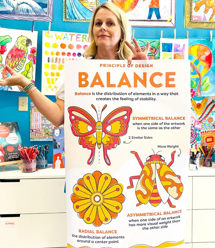
Balance refers to the distribution of visual weight in a composition. It can be symmetrical, where elements are mirrored on either side of an axis, or asymmetrical, where different elements are balanced through size, color, or position. Contrast, conversely, involves placing opposing elements side-by-side to create visual interest. High contrast, such as black text on a white background, ensures readability, while low contrast can create a more subtle, sophisticated mood.
To apply these principles, consider these practical steps:
- Establish a focal point by using a larger size or a bolder color for your primary message.
- Use negative space to prevent the design from feeling cluttered or overwhelming.
- Experiment with asymmetrical balance by placing a small, high-contrast element opposite a larger, neutral shape.
- Use contrasting typefaces to distinguish between headings and body text to guide the reader through your content.
Why movement and rhythm matter in layout
Movement is the path a viewer’s eye takes through a design. Designers use lines, shapes, and color gradients to lead the eye from one element to the next, often toward a call to action. Rhythm is the repetition of these elements, which creates a sense of organized motion. Much like a musical beat, visual rhythm can be regular, flowing, or progressive, helping to create a sense of consistency and predictability within a complex layout.
Creating a successful flow requires careful planning of the visual sequence. If the eye wanders aimlessly, the message is lost. Designers often use a "Z-pattern" or "F-pattern" layout to mimic natural reading habits, ensuring that the most critical information is placed along the path of least resistance. By repeating shapes or colors at intervals, you can establish a visual cadence that keeps the user engaged while they navigate through the information provided in the design.
Best practices for creating unity and emphasis
Unity is the final result of a well-composed design, where all elements feel as though they belong together. It is achieved through proximity, alignment, and the repetition of visual themes. Emphasis, meanwhile, is the art of highlighting specific areas to ensure they stand out from the rest of the composition. Without emphasis, a design lacks a clear objective; without unity, a design feels fragmented and chaotic, making it difficult for the audience to understand the intended message.
- Group related items together to create logical clusters that the brain can process quickly.
- Align elements to a common grid to provide a sense of order and professional structure.
- Limit your color palette to three or four primary tones to maintain visual harmony.
- Use scale to make the most important element the largest or most prominent feature.
- Repeat textures or patterns across the design to tie disparate sections into a single, cohesive experience.
Common mistakes when using design principles
The most frequent error in design is overcrowding, which occurs when a creator tries to include too much information in a limited space. This leads to a loss of emphasis and makes it impossible for the viewer to know where to focus. Another common mistake is ignoring the importance of white space, often called "negative space." Beginners often view empty space as a waste of room, but it is actually a vital tool for providing the eye with a place to rest.
Poor hierarchy is another significant pitfall that renders even the most beautiful designs ineffective. When every element is treated with equal importance, the viewer becomes confused and loses interest. Additionally, failing to maintain consistency—such as using too many different fonts or clashing color schemes—will break the unity of your project. To avoid these issues, always step back from your work and ask if the primary message is immediately clear. If you cannot identify the main point within three seconds, you must simplify your composition and re-establish your visual hierarchy.
Key facts
- Balance creates visual stability by distributing the weight of elements, whether symmetrically or asymmetrically.
- Contrast uses differences in color, size, or shape to highlight important information and guide the viewer's eye.
- Hierarchy organizes elements by importance, often using scale to show the reader what to look at first.
- Repetition of colors, fonts, or shapes builds consistency and helps unify a design across multiple pages.
- Proximity groups related items together to reduce clutter and clarify the relationship between different pieces of content.
- White space, or negative space, prevents overcrowding and allows the design to breathe, improving overall readability.
The bottom line
Design principles provide a foundational framework for organizing visual information effectively. By mastering balance, contrast, hierarchy, repetition, proximity, and white space, you can transform chaotic layouts into clear, professional communications. These rules are not restrictive barriers; rather, they are functional tools that help you guide the viewer’s attention and improve the overall user experience. Consistent application of these concepts ensures your work remains both beautiful and readable.
People also ask
What is the difference between design principles and design elements?
Design elements are the raw materials like lines, shapes, and colors that you use to build a composition. Principles are the rules or guidelines that dictate how you arrange those elements to create a successful, functional, and aesthetically pleasing result.
How can I improve the hierarchy in my design?
Use scale by making your most important headline significantly larger than body text. You can also use bold colors or distinct weights to draw attention to specific sections before others.
Why is white space important in layout design?
White space prevents the viewer from feeling overwhelmed by too much information at once. It creates a visual pause that helps the eye move naturally through the content.
What is the most common mistake beginners make with alignment?
Beginners often place items randomly on a page instead of aligning them to a grid or a common edge. Proper alignment creates a clean, professional look that guides the viewer's eye predictably.
How do I choose a color palette for a project?
Start by selecting a primary color and then use a color wheel to find complementary or analogous shades. Limit your palette to three or four colors to avoid visual chaos.
Can I break these design principles?
Yes, but only after you have mastered them. Experienced designers sometimes break rules to create tension or surprise, but they do so intentionally rather than by accident.
This answer was created with the help of AI research tools and reference sources. Spotted an error? Let us know — we correct mistakes quickly. See our editorial policy.