What makes a good logo?
Short answer
A good logo is a simple, memorable, and versatile visual mark that effectively communicates a brand’s identity. It must remain legible across various scales and mediums, from tiny social media icons to large outdoor billboards. By prioritizing clarity and relevance over complexity, a successful logo builds instant recognition and lasting trust.
On this page
What are the core principles of logo design?
Effective logo design relies on five foundational pillars: simplicity, memorability, timelessness, versatility, and appropriateness. A simple design is easier for the human brain to process and recall, which is why iconic marks like the Nike Swoosh or the Apple silhouette remain effective decades after their creation. These logos avoid unnecessary clutter, focusing instead on a single, strong concept that defines the brand's personality.
Versatility is equally critical in a digital-first world. A logo must function perfectly in black and white, as color can be inconsistent across different printing processes or screen resolutions. Designers often test logos at small sizes, such as 16 by 16 pixels for a browser favicon, to ensure the shape remains distinct. If a logo relies on fine lines or complex gradients, it will likely lose its integrity when scaled down.
- Simplicity: Avoid excessive detail.
- Memorability: Create a unique visual hook.
- Timelessness: Resist fleeting design trends.
- Versatility: Ensure it works in any size or color.
- Appropriateness: Align the style with the industry.
How to create a professional logo design
The design process should begin with research rather than sketching. You must understand the target audience, the competitive landscape, and the brand’s core values before putting pen to paper. Once you have a clear strategy, you can begin brainstorming concepts that translate these abstract values into visual metaphors.
The following steps provide a practical workflow for developing a brand identity:
- Discovery phase: Define the brand’s mission and identify the primary audience.
- Sketching: Generate dozens of rough ideas on paper to explore shapes and layouts.
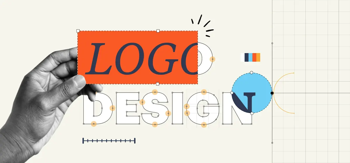
- Vectorizing: Use professional software like Adobe Illustrator to convert the best sketches into scalable vector paths.
- Refinement: Adjust kerning, line weights, and proportions to achieve balance.
- Testing: Apply the logo to mockups like business cards, websites, and apparel to check for real-world utility.
Why color and typography matter
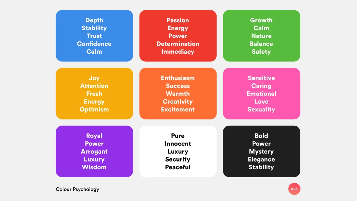
Color psychology plays a significant role in how consumers perceive a brand. For instance, blue is frequently used by financial institutions to convey trust and security, while red is often associated with excitement and urgency in the food and retail sectors. Limiting your palette to one or two primary colors helps maintain brand consistency and makes the logo easier to reproduce across various marketing materials.
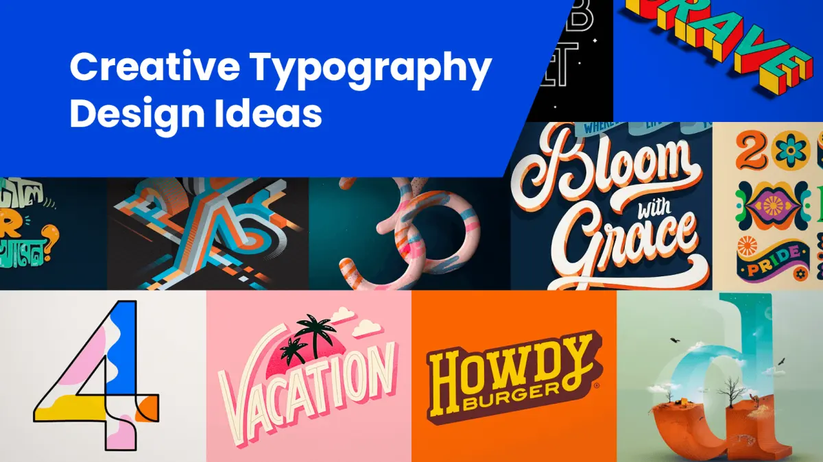
Typography is the silent voice of a logo. The choice between a serif font, which conveys tradition and authority, and a sans-serif font, which suggests modernity and accessibility, can fundamentally change the brand's message. Customizing the spacing, known as kerning, or modifying specific letterforms can transform a generic typeface into a unique, proprietary asset. Always prioritize legibility, as a decorative font that is difficult to read will ultimately alienate potential customers.
Common mistakes when designing a logo
One of the most frequent errors is over-complicating the design. Beginners often try to cram too much information into a small space, resulting in a cluttered mark that fails to communicate a clear message. A logo is not an illustration of everything a company does; it is a symbol that represents the company's identity. If you find yourself adding drop shadows, complex textures, or multiple gradients, stop and remove them to see if the core shape still holds up.
Another common mistake is following design trends too closely. While it is tempting to use current styles, such as neon gradients or ultra-thin line art, these trends often feel dated within a few years. A timeless logo should feel as relevant in twenty years as it does today. Additionally, failing to use vector software is a critical error; raster images like JPEGs cannot be scaled without losing quality, rendering them useless for professional printing or large-scale signage.
How to evaluate a logo design
Evaluating a logo requires objectivity and patience. Once you have a final design, set it aside for a few days before reviewing it with fresh eyes. Ask yourself if the logo stands out from competitors in the same industry. If your logo looks nearly identical to a major player in your field, it will likely cause confusion and undermine your brand’s credibility.
To ensure your logo is successful, perform a final audit against these criteria:
- Does it look clear when printed in black and white?
- Can it be identified from across a room?
- Does it convey the intended emotion or brand personality?
- Is the design distinct enough to be legally trademarked?
- Does it look professional when placed on a website header?
By focusing on these practical benchmarks, you can determine whether your design serves the brand effectively. A good logo is not just a pretty picture; it is a functional tool that supports the long-term growth and recognition of the business it represents.
Key facts
- A logo must be legible at sizes as small as 16 pixels for a website favicon.
- Simple designs, such as the Nike Swoosh created in 1971, remain memorable due to their lack of visual clutter.
- High-quality logos should function effectively in black and white before color is applied.
- Vector files, such as .AI or .EPS, are essential because they allow for infinite scaling without loss of quality.
- A logo should avoid trendy fonts or effects that will look dated within a few years.
- The most effective logos are distinct enough to be recognized in silhouette alone.
The bottom line
A successful logo functions as a timeless, scalable, and versatile anchor for your brand identity. By prioritizing simplicity, legibility, and distinctiveness, you create a visual asset that remains effective across diverse platforms. Avoid the temptation to follow fleeting design trends; instead, focus on creating a mark that is easy to recognize at any size. Ultimately, a great logo communicates your brand's character through minimal visual elements.
People also ask
How many colors should a logo have?
Most experts recommend using no more than two or three primary colors. A limited palette ensures the design remains cohesive and reduces printing costs across various materials.
Should a logo include a tagline?
It is generally best to keep the logo icon and the tagline separate. Including too much text makes the design cluttered and difficult to read when scaled down.
How do I know if my logo is unique?
Conduct a reverse image search and check the United States Patent and Trademark Office database. This helps ensure your concept does not inadvertently mirror an existing brand.
Does a logo need to explain what a company does?
No, a logo serves as a brand identifier rather than a literal description of services. Iconic brands like Apple or Mercedes-Benz do not depict their products in their logos.
What is the difference between a logo and a brand identity?
A logo is a single visual mark, while brand identity encompasses the entire visual system. This includes typography, color palettes, photography styles, and voice used across all media.
How often should a company rebrand?
A brand should only refresh its logo when the current design no longer aligns with the company's mission or market position. Frequent changes can confuse customers and dilute brand recognition.
This answer was created with the help of AI research tools and reference sources. Spotted an error? Let us know — we correct mistakes quickly. See our editorial policy.