What are the elements of art?
Short answer
The elements of art are the fundamental building blocks used by artists to create compositions. These seven essential components include line, shape, form, color, value, texture, and space. By manipulating these tools, creators convey visual messages, establish mood, and organize the physical or digital canvas to effectively communicate their intended artistic vision.
On this page
What are the seven elements of art?
The seven elements of art serve as the universal vocabulary for visual expression. Line is the path of a point moving through space, acting as the foundation for most drawings. Shape is a two-dimensional area defined by lines or color, while form adds the third dimension, giving an object volume and mass. Color, derived from reflected light, introduces hue, intensity, and value, which is the lightness or darkness of a tone. Texture refers to the surface quality, whether implied through visual patterns or physically tactile. Finally, space defines the area around, between, or within objects, creating the illusion of depth in a flat composition.
Understanding these elements allows artists to dismantle complex images into manageable parts. Whether you are analyzing a Renaissance painting or a modern graphic design, these components remain constant. They function as the raw materials that allow for the construction of balance, rhythm, and emphasis within any work. By mastering these basics, you gain the ability to critically evaluate art and improve your own creative output.
How to use elements of art in composition
To effectively use these elements, you must consider how they interact to guide the viewer’s eye. A common technique involves using lines to lead the gaze toward a focal point. You can also utilize value contrasts to create a sense of drama or highlight specific details. When arranging these elements, consider the following principles of design to ensure harmony:
- Balance: Distributing visual weight evenly across the canvas.
- Contrast: Using opposing elements to create interest and tension.
- Emphasis: Making a specific area stand out as the primary focal point.
- Movement: Creating a path for the viewer’s eyes to follow through the work.
- Pattern: Repeating elements to establish rhythm and consistency.
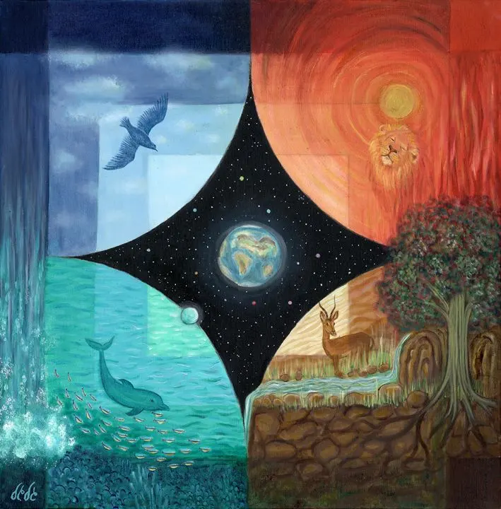
Experimenting with these combinations allows you to control the narrative of your piece. For instance, using warm colors in the foreground and cool, muted colors in the background naturally pushes the viewer’s focus toward the front, enhancing the illusion of three-dimensional space.

Why color and value matter for depth
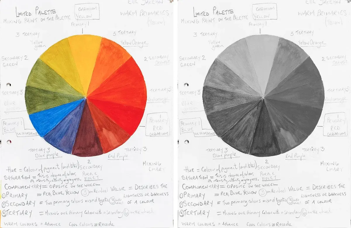
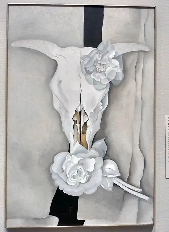
Color and value are arguably the most influential elements for establishing mood and spatial relationships. Value, the relative lightness or darkness of a color, provides the structure for shading and highlights. Without a full range of values, an object may appear flat or cartoonish. By placing dark values against light ones, you create high-contrast areas that demand attention, while subtle gradations create soft, realistic transitions.
Color theory further enhances this by using the color wheel to select harmonious palettes. Complementary colors, which sit opposite each other on the wheel, create the strongest visual vibration and energy. Analogous colors, located next to each other, provide a sense of calm and unity. When you combine these theories with value, you gain full control over the atmosphere of your work. Always remember that light source direction determines where your shadows fall, which is essential for creating believable form and volume in representational art.

Common mistakes when applying art elements
Beginners often struggle with over-complicating their compositions or neglecting the importance of negative space. One frequent error is "cluttering," where too many shapes or textures compete for attention, leaving the viewer confused about where to look. Another common mistake is failing to push the value range; many artists stay within a "mid-tone" gray area, resulting in a dull or muddy appearance. To improve your work, try these steps:
- Simplify your composition by removing unnecessary shapes that do not support the focal point.
- Squint at your reference to see the primary value shapes rather than the distracting details.
- Limit your color palette to three or four colors to achieve better harmony.
- Intentionally leave empty areas to allow the viewer's eyes to rest.
By avoiding these pitfalls, you ensure that your composition remains clear and impactful. Focus on the relationship between elements rather than just the individual objects themselves.
Best practices for practicing art elements
Developing an eye for these elements requires consistent practice and active observation. Start by keeping a sketchbook where you isolate one element at a time. For example, spend a week drawing only lines to explore different weights, lengths, and directions. Next, dedicate time to shading exercises to master value scales from pure white to deep black. This focused approach prevents you from feeling overwhelmed and builds a strong technical foundation.
You should also study masterworks from history, such as the works of Johannes Vermeer for his mastery of light or Henri Matisse for his bold use of shape and color. When you look at these pieces, ask yourself how the artist used specific elements to achieve their goal. By deconstructing professional work, you learn how to apply these tools to your own projects. Consistent practice and critical analysis will eventually make the use of these elements an intuitive part of your creative process, allowing you to focus more on your unique artistic voice.
Key facts
- Line, shape, color, value, form, texture, and space are the seven foundational building blocks used to create visual compositions.
- Use a limited color palette of three to five hues to create harmony and prevent your artwork from appearing chaotic.
- Vary the thickness of your lines to create a sense of depth and movement, rather than using a single uniform stroke.
- Apply the concept of value by using a full range of lights and darks to give two-dimensional shapes a three-dimensional appearance.
- Balance your composition by distributing visual weight through the placement of objects, colors, and textures across the canvas.
- Avoid placing your focal point directly in the center of the frame, as this often results in a static and uninteresting composition.
The bottom line
The elements of art serve as the fundamental vocabulary for visual expression, allowing artists to translate ideas into tangible forms. By mastering line, shape, color, value, form, texture, and space, you gain the ability to manipulate perception and guide the viewer's eye. Practice these elements individually to build your technical skills, then combine them thoughtfully to create balanced, compelling, and professional-grade works of art.
People also ask
What is the difference between shape and form?
A shape is a two-dimensional area defined by an outline, such as a circle on a flat piece of paper. A form is three-dimensional and occupies space, possessing height, width, and depth, like a sphere.
How do artists use texture in their work?
Texture can be physical, meaning the actual surface quality of the material, or visual, which is the illusion of texture created through mark-making. Artists use it to add tactile interest and realism to their subjects.
Why is value important in drawing?
Value refers to the lightness or darkness of a color or tone. It is essential for defining light sources, creating shadows, and establishing the overall mood of a piece.
What is negative space?
Negative space is the area that surrounds the main subject of an artwork. Skilled artists pay as much attention to this space as they do to the subject to ensure a balanced composition.
How does color theory influence art?
Color theory explains how colors interact and how they affect human perception. It helps artists choose combinations that evoke specific emotions or create visual tension.
Can an artwork be successful without using all seven elements?
Yes, many minimalist or abstract works focus on only one or two elements to achieve their effect. The elements are tools to be used intentionally rather than a checklist that must be completed.
This answer was created with the help of AI research tools and reference sources. Spotted an error? Let us know — we correct mistakes quickly. See our editorial policy.