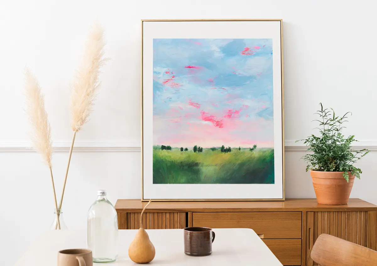
How do you paint from a photograph?
Short answer
Painting from a photograph involves translating a two-dimensional image into a three-dimensional artistic interpretation. You must focus on simplifying complex details, establishing accurate proportions, and adjusting lighting or color to create depth. By treating the photo as a reference rather than a blueprint, you can capture the essence of your subject effectively.
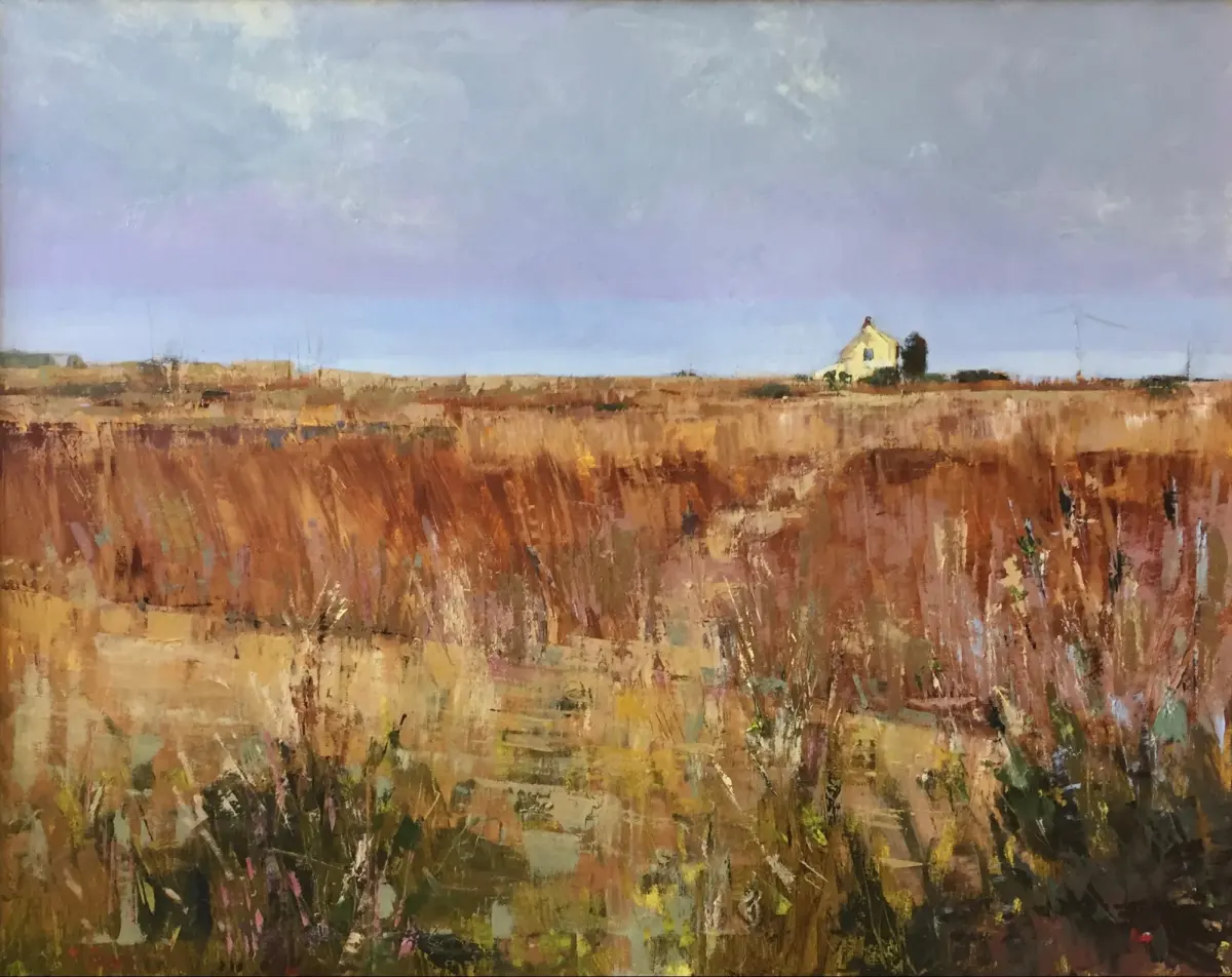
On this page
How to prepare a photo for painting
Before applying paint to canvas, you must ensure your reference photo provides enough information to guide your work. High-contrast images are generally superior because they clearly define the shadows and highlights necessary for modeling form. If your photo is low-quality, consider using photo editing software to increase the contrast or convert the image to black and white. This process helps you focus on values—the lightness or darkness of colors—rather than getting distracted by complex hues.
Once you have a suitable image, consider printing it out at the same size as your intended canvas. This allows you to measure proportions directly from the paper using a ruler or calipers. If you prefer working from a digital screen, ensure the image is zoomed in enough to reveal textures, such as the weave of fabric or the glint in an eye. Taking these preparatory steps prevents guesswork during the initial sketching phase.
How to transfer an image to canvas
Achieving accurate proportions is a common hurdle for artists working from photographs. To ensure your drawing is precise, you can employ several proven techniques that have been used by painters for centuries. These methods help you map out the composition before you commit to permanent paint layers.
- Use the grid method by drawing a light pencil grid over your photo and a corresponding grid on your canvas.
- Utilize a projector to cast the image directly onto your surface, allowing you to trace the primary outlines quickly.
- Apply the sight-size method by placing your reference next to your canvas and measuring distances with a divider tool.
- Use transfer paper to trace the outlines of your photo onto the canvas surface with a stylus or pencil.
Regardless of the method chosen, keep your initial lines light. Heavy graphite or charcoal marks can bleed through thin layers of paint, potentially muddying your colors later in the process.
Why color matching is difficult
Photographs often distort colors due to camera sensors, lighting conditions, and screen calibration. A common mistake is attempting to match the exact color seen on a digital screen, which is backlit and inherently different from pigment on a physical surface. Instead of trying to replicate the exact hue, focus on the relationship between colors. Ask yourself if a color is warmer or cooler than the one next to it, rather than trying to find the perfect match in your paint box.
To improve your color accuracy, create a small test strip on a piece of scrap paper or cardboard. Paint a sample of your mixed color next to the photograph to see how it interacts with the surrounding tones. Remember that a photograph flattens the world, so you may need to exaggerate your color saturation or contrast to compensate for the lack of depth. Adding more intense shadows or brighter highlights can help bring a static image to life.
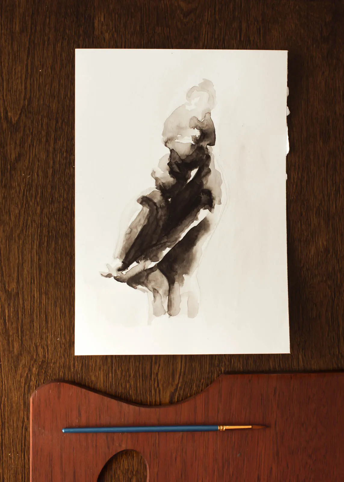
How to avoid common mistakes
Many beginners fall into the trap of painting every single detail visible in the photograph. This approach often results in a stiff, lifeless image that looks more like a copy than a piece of art. Treat the photograph as a suggestion rather than a rigid set of rules. If a detail does not contribute to the overall composition or focal point, feel free to omit it entirely or simplify it into a broader shape.
- Avoid "painting by numbers" by focusing on large masses of light and shadow before moving to fine details.
- Do not rely on the photo for texture; use your brushwork to create tactile interest that a camera cannot capture.
- Be wary of lens distortion, especially in wide-angle shots, which can make objects near the edges of the frame look stretched.
- Check your work frequently by stepping back from the easel to view the painting as a whole rather than focusing on small sections.
Best tools for reference management
Managing your reference material effectively can significantly improve your workflow and final output. If you are working on a complex portrait or landscape, having multiple versions of the same photo can be beneficial. For instance, keep one copy of the image in full color for reference, while keeping a second copy in grayscale to help you evaluate values. This dual-reference approach ensures you maintain both color harmony and structural integrity throughout the painting process.
Modern digital tools also offer significant advantages for painters. Many artists use tablet applications to adjust the crop, brightness, or saturation of their photos in real-time. Additionally, using a dedicated stand to hold your printed reference at eye level prevents neck strain and ensures your perspective remains consistent. By organizing your workspace and reference materials thoughtfully, you create an environment that encourages creativity and allows you to focus entirely on the act of painting. Consistent practice with these methods will eventually allow you to interpret photographs with greater confidence and artistic freedom.
Key facts
- Print your reference photo at the same physical size as your canvas to simplify scaling and proportion transfer.
- Use a grid method by drawing a light pencil grid over both the photo and the canvas to ensure accurate placement of shapes.
- Convert your reference image to black and white to better analyze the values and contrast without the distraction of color.
- Avoid tracing directly from a projection, as it can lead to a stiff, mechanical appearance that lacks artistic interpretation.
- Squint at your reference photo to blur the details, which helps identify the largest areas of light and shadow.
- Limit your color palette to three or four primary pigments to prevent muddy mixtures and maintain color harmony.
The bottom line
Painting from a photograph is a foundational skill that requires balancing technical accuracy with artistic interpretation. By using tools like grids to manage proportions and squinting to simplify complex values, you can transform a flat image into a dynamic work of art. Remember that the photo is merely a starting point; prioritize your own creative choices to ensure the final painting feels alive and intentional.
People also ask
Should I paint exactly what I see in the photograph?
Professional artists often use photos as a guide rather than a literal map. You should feel free to adjust colors, remove distracting background elements, or enhance lighting to improve the overall composition.
How do I deal with the lack of depth in a flat photograph?
Photographs often flatten perspective and lose detail in shadows. Compensate for this by manually increasing the contrast and adding more saturated colors to foreground objects to create a sense of three-dimensional space.
Is it better to work from a digital screen or a physical print?
A physical print is generally superior because it does not emit light, which can distort your perception of color. Prints also allow you to mark directly on the surface for planning purposes.
How can I prevent my painting from looking like a copy of the photo?
Focus on expressive brushwork and varying your paint application. By emphasizing texture and intentional strokes rather than smooth, photographic blending, you inject your personal style into the final piece.
What is the most common mistake when using photo references?
The most frequent error is over-detailing. Beginners often try to paint every individual leaf or hair, which makes the painting look cluttered and static rather than capturing the essence of the subject.
How do I choose the right photo for a painting?
Select images with strong, clear lighting that creates distinct shadow shapes. Avoid photos with flat, diffused light, as these lack the visual structure necessary to create a compelling and readable painting.
This answer was created with the help of AI research tools and reference sources. Spotted an error? Let us know — we correct mistakes quickly. See our editorial policy.