How do you paint a winter scene with watercolor?
Short answer
Painting a winter scene with watercolors requires preserving the white of the paper to represent snow. By using a limited palette of cool blues, grays, and purples, artists create atmospheric depth. Key techniques involve layering washes, utilizing masking fluid for highlights, and carefully managing water-to-pigment ratios to achieve crisp, wintry textures.
On this page
How to prepare your materials for winter landscapes
Selecting the right supplies is the foundation of a successful watercolor painting. For winter scenes, choose cold-press watercolor paper with a weight of at least 300 grams per square meter, as it handles repeated washes without buckling. You will need a limited palette of cool tones, such as Cobalt Blue, Cerulean, Ultramarine, and Payne’s Gray. These colors mimic the icy shadows and overcast skies typical of the season.
Additionally, invest in a few high-quality synthetic or sable brushes. A large round brush is essential for broad sky washes, while a small detail brush is necessary for defining bare tree branches or distant architecture. Keep a roll of masking tape to secure your paper to a board, ensuring clean edges. Having a clean rag or paper towel nearby is vital for lifting excess paint and creating textures that suggest falling snow or frosted surfaces.
Best techniques for painting snow and ice
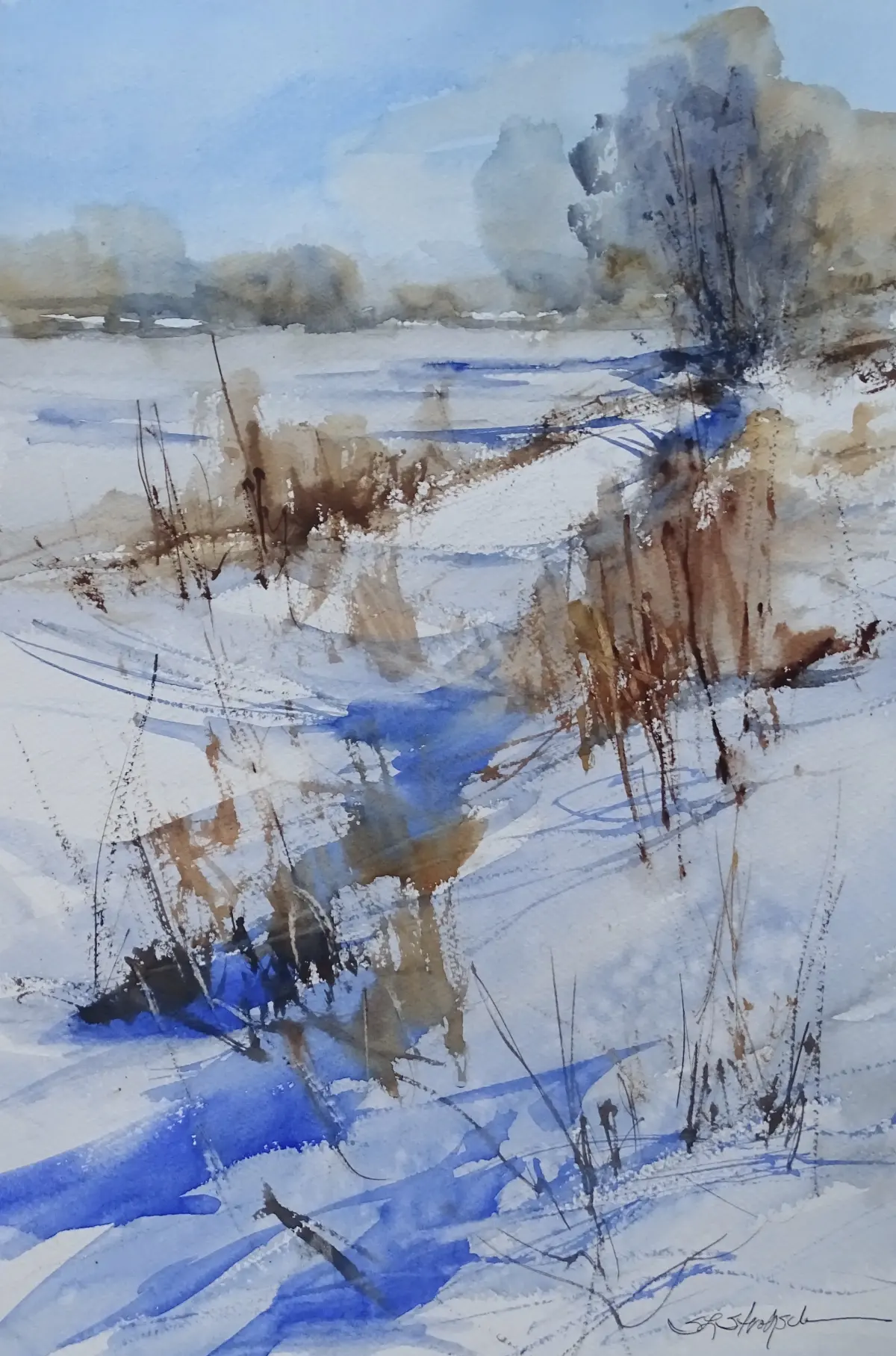
The most critical aspect of a winter scene is the luminosity of the snow. Because watercolor is transparent, you must preserve the white of the paper rather than using white paint. Use masking fluid to protect areas where you want bright, crisp highlights, such as on fence posts or snow-covered rocks. Once the fluid is dry, you can paint over it with confidence.
- Apply a light wash of diluted blue or gray to represent the shadows on the snow.
- Use the wet-on-wet technique for the sky to allow colors to bleed naturally.
- Once the base layers are dry, paint the darker, sharper shadows to provide contrast.
- Remove the masking fluid carefully only after the entire painting is completely dry.
Layering is key to building depth. Start with your lightest values and gradually add darker, more saturated colors to the foreground to create a sense of distance and perspective.
How to create atmospheric winter skies
Winter skies are often characterized by soft gradients and muted tones. To achieve this, dampen the sky area of your paper with clean water before applying your pigment. Drop in a mixture of Cobalt Blue and a touch of Burnt Umber to create a sophisticated, desaturated gray. Tilt your board slightly to allow the colors to blend and flow downward, mimicking the hazy appearance of a cold, overcast day.
Avoid overworking the sky, as this leads to muddy colors and loses the freshness of the medium. If you want to depict a blizzard or light snowfall, consider using a dry brush technique. Load your brush with a thick, opaque white gouache or a very concentrated watercolor mixture and lightly tap it against another brush to create fine, irregular splatters across the paper. This adds a dynamic, textured element that suggests movement and wind within the composition.
Common mistakes when painting winter scenes
Many beginners struggle with the tendency to make shadows too dark or too warm. Winter light is typically cool, so avoid using brown or warm yellow tones in your shadows, as these will clash with the icy atmosphere. Another common error is failing to consider the direction of the light source. If your light is coming from the left, ensure that all shadows on snowdrifts and trees fall consistently to the right.
- Using too much water, which causes colors to lose their pigment intensity.
- Painting shadows with pure black, which looks flat and unnatural compared to mixed darks.
- Forgetting to leave white gaps between objects, causing the composition to look cluttered.
- Rushing the drying process, leading to unwanted blooms or "cauliflower" effects in the paint.
Patience is essential; wait for each layer to dry completely before adding detail to prevent colors from bleeding into one another unintentionally.
Why contrast is essential for winter compositions
Without proper contrast, a winter landscape can appear washed out and uninteresting. Because the subject matter is naturally monochromatic, you must rely on tonal value to guide the viewer’s eye. Use deep, dark tones for the foreground elements, such as tree trunks or shadows near the viewer, and keep the background colors pale and soft. This atmospheric perspective is the primary tool for creating a sense of scale.
When painting trees, remember that they are often silhouettes against a bright sky. Use a dark, cool mixture of Payne’s Gray and Ultramarine to paint the branches, varying the pressure of your brush to make the lines thinner toward the tips. By balancing these dark, sharp details against the expansive, soft white of the snow, you create a compelling focal point. Through careful observation of light and shadow, you can transform a simple piece of paper into a vivid, chilly winter day.
Key facts
- Use masking fluid to preserve white highlights on snow and tree branches before applying color washes.
- Choose cold-press watercolor paper, which has a textured surface that helps capture the granular look of snow.
- Mix cool blues, violets, and grays to create shadows, as snow reflects the color of the sky rather than being pure white.
- Apply a "wet-on-wet" technique for soft, misty backgrounds and "wet-on-dry" for sharp, detailed foreground elements.
- Use a limited palette of three or four colors, such as Ultramarine Blue, Burnt Umber, and Alizarin Crimson, to maintain color harmony.
- Lift paint with a clean, damp brush or a paper towel while the pigment is still wet to create soft, glowing light effects.
The bottom line
Painting a winter scene requires restraint and a focus on light. By preserving the white of your paper and using cool, transparent shadows, you can effectively capture the crisp atmosphere of the season. Focus on layering washes from light to dark, and do not be afraid to leave large areas of the paper untouched to represent the brilliant, reflective quality of fresh, fallen snow.
People also ask
How do I make snow look realistic in watercolor?
Focus on the shadows rather than the white of the paper. Use thin, watery washes of blue or violet to define the contours of snowdrifts, leaving the brightest areas untouched.
What is the best brush for painting winter trees?
A round brush with a fine point, such as a size 4 or 6, is ideal for delicate branches. Hold the brush loosely and use quick, flicking motions to mimic the organic growth of twigs.
Can I use salt to create texture in a winter scene?
Yes, sprinkling table salt onto a damp wash creates crystalline patterns that resemble falling snow or frost. Wait for the paint to be slightly damp, not soaking wet, for the best results.
How do I avoid muddy colors in my painting?
Avoid over-mixing your pigments on the palette or the paper. Apply clean, transparent layers and allow each one to dry completely before adding the next to keep colors vibrant.
What colors work best for a winter sky?
Use diluted washes of Cerulean Blue or Payne’s Gray. For a sunset effect, introduce faint touches of yellow ochre or rose near the horizon to contrast with the cool landscape.
How do I fix a mistake if I paint too dark?
While the paint is still wet, you can blot it with a paper towel to lift pigment. If the paint is dry, try gently scrubbing with a clean, damp brush to lighten the area.
This answer was created with the help of AI research tools and reference sources. Spotted an error? Let us know — we correct mistakes quickly. See our editorial policy.