How do you paint a storm in watercolor?
Short answer
Painting a storm in watercolor requires managing moisture levels to create atmospheric depth. Use a wet-on-wet technique for turbulent clouds, layering dark, cool pigments like Payne’s Gray or Indigo. By lifting color while damp and adding sharp, dry-brush details for rain, you can capture the raw energy and dramatic movement of a tempest.
On this page
How to prepare the paper for storm paintings
Watercolor paper is the foundation of any storm scene, and choosing the right weight is critical for handling heavy water application. Use 300-pound cold-press paper to ensure the surface does not buckle when you saturate it with multiple washes. Before you begin, stretch your paper by soaking it in clean water for several minutes and taping it down to a board with gummed tape. This prevents the paper from warping as you build up the dark, moody layers necessary for a convincing storm.
Once the paper is prepped, consider your color palette. Storms are rarely just black and white; they contain subtle shifts of violet, deep blue, and earthy ochre. Prepare your pigments in advance so you can work quickly while the paper remains damp.
- Select high-quality tube paints for intense saturation.
- Mix a large quantity of your primary storm color to avoid stopping mid-stroke.
- Keep a clean spray bottle nearby to re-wet areas that dry too quickly.
How to create turbulent cloud textures
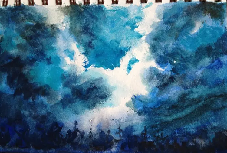
The hallmark of a storm is the movement within the clouds. To achieve this, use the wet-on-wet technique by wetting the entire sky area with clean water before introducing pigment. Drop in your darkest colors at the top of the clouds and allow them to bleed downward into lighter, grayer tones. Use a large, soft mop brush to move the paint gently, avoiding over-blending, which can turn the sky into a flat, muddy mess.
As the paper begins to lose its shine, use a stiff, damp brush to "lift" or scrub out highlights where lightning or breaks in the clouds might appear. This subtractive process creates the illusion of light struggling to pierce through the heavy atmosphere. If you want to add more structure to the cloud edges, wait until the paper is barely damp and use a round brush to lay in sharper, darker shapes. This contrast between soft, diffused edges and crisp, hard lines creates a sense of depth and impending intensity.
How to paint rain and atmospheric depth
Rain is best represented through varying degrees of transparency and directional strokes. To simulate a downpour, use a clean, damp brush to pull vertical streaks of color down from the base of your clouds. This technique, often called "pulling," softens the transition between the sky and the landscape below. By layering these vertical marks, you create a veil of rain that obscures the horizon, which is a classic hallmark of a natural storm.
For more intense rain, use a dry-brush technique. Take a brush with very little water and thick paint, then lightly drag it across the paper’s texture to create broken, jagged lines.
- Focus the darkest rain streaks in the foreground to create a sense of perspective.
- Use a splatter technique by tapping a loaded brush over the paper to suggest wind-blown droplets.
- Ensure your rain strokes follow the same angle to mimic the direction of the wind.

Common mistakes when painting storms
The most frequent error beginners make is overworking the paper, which destroys the transparency of the watercolor medium. Once you have laid down a wash, resist the urge to keep brushing over it, as this lifts the previous layers and creates unwanted texture. If the painting looks too light, wait until it is completely dry before adding another glaze. Adding wet paint to a partially dry surface often results in "blooms" or "cauliflowers," which can ruin the intended atmosphere of the storm.
Another common mistake is using colors that are too vibrant. Storms are characterized by desaturated, cool tones. If your sky looks like a bright blue summer day, add a touch of burnt sienna or raw umber to your blue mix to neutralize it. Keeping your palette restricted to three or four colors will help maintain unity throughout the piece. Remember that a storm is about mood and contrast, not about using every color in your paint box.
How to finish and preserve your work
Finalizing a storm painting requires a delicate touch, especially when adding the last bits of contrast. Once the main body of the storm is dry, you may choose to add a few final, dark accent marks to anchor the composition. These could be silhouettes of trees or buildings that provide a sense of scale against the massive, looming clouds. Use a small, pointed round brush for these details to ensure they remain sharp and provide a clear focal point amidst the chaos.
After the painting is fully cured, which typically takes 24 hours, evaluate the work for balance. If the painting feels too dark, you can use a kneaded eraser to gently lift small areas, though this should be done sparingly. Finally, protect your watercolor by framing it behind glass with a mat to prevent the surface from touching the glazing. This ensures that your storm scene remains protected from humidity and dust, preserving the delicate washes and the dramatic intensity you worked so hard to capture on the page.
Key facts
- Use the "wet-on-wet" technique by pre-wetting your paper with clean water to allow pigments to bleed and create soft, atmospheric edges.
- Incorporate dark, granulating pigments like French Ultramarine or Burnt Umber to simulate the heavy, textured appearance of storm clouds.
- Reserve the brightest whites of the paper for lightning bolts or highlights on waves, as watercolor relies on the paper's luminosity.
- Lift paint while it is still damp using a clean, thirsty brush or a paper towel to create "holes" for light to break through the clouds.
- Vary the consistency of your paint; use a creamy, concentrated mix for foreground shadows and a thin, watery wash for distant rain veils.
- Apply salt to damp washes to create crystalline, chaotic textures that mimic the unpredictable nature of falling rain or turbulent spray.
The bottom line
Painting a storm requires balancing controlled chaos with deliberate pigment placement. By utilizing the wet-on-wet technique and reserving the paper’s white surface for light, you can capture the intensity of a tempest. Focus on maintaining moisture levels to ensure soft transitions, and use granulating pigments to build texture. Ultimately, the key is to embrace the unpredictable nature of the medium to convey the raw energy of nature.
People also ask
How do you prevent your storm painting from looking muddy?
Avoid over-mixing your colors on the palette and limit the number of pigments used in a single wash. Apply your darkest values in one or two decisive strokes rather than layering repeatedly, which can dull the vibrancy of the paper.
What is the best paper weight for heavy watercolor washes?
Use 300-pound (640 gsm) cold-press watercolor paper to prevent buckling when applying large amounts of water. If using lighter 140-pound paper, ensure it is fully stretched and taped down to a board before you begin painting.
How can I create the effect of rain falling in the distance?
Use a flat, damp brush to gently pull vertical streaks of color downward from the bottom of your dark cloud shapes. Keep these strokes very faint and soft to suggest depth and atmospheric perspective.
Should I use masking fluid for lightning?
Masking fluid effectively preserves sharp, bright white lines for lightning bolts against a dark sky. Apply it with a ruling pen or a silicone-tipped brush, let it dry completely, and remove it only after the surrounding washes are bone-dry.
Why are my edges turning into hard lines instead of soft clouds?
Hard lines occur when the paper begins to dry before you add the next pigment. Keep your paper consistently damp by re-wetting the back or working quickly in sections to maintain a fluid, seamless transition.
How do I achieve deep, dramatic blacks without using tube black?
Mix complementary colors like Burnt Sienna and Ultramarine Blue to create a rich, chromatic black. This mixture provides more depth and visual interest than a flat, manufactured black paint, which can look chalky or artificial.
This answer was created with the help of AI research tools and reference sources. Spotted an error? Let us know — we correct mistakes quickly. See our editorial policy.