How do you draw a realistic waterfall?
Short answer
Drawing a realistic waterfall requires capturing the fluid motion of falling water through vertical lines, soft highlights, and contrasting textures. By layering translucent white strokes over darker background tones, you create the illusion of transparency and speed. Focus on the transition from the calm river edge to the chaotic, misty base.
On this page
How to structure a waterfall drawing
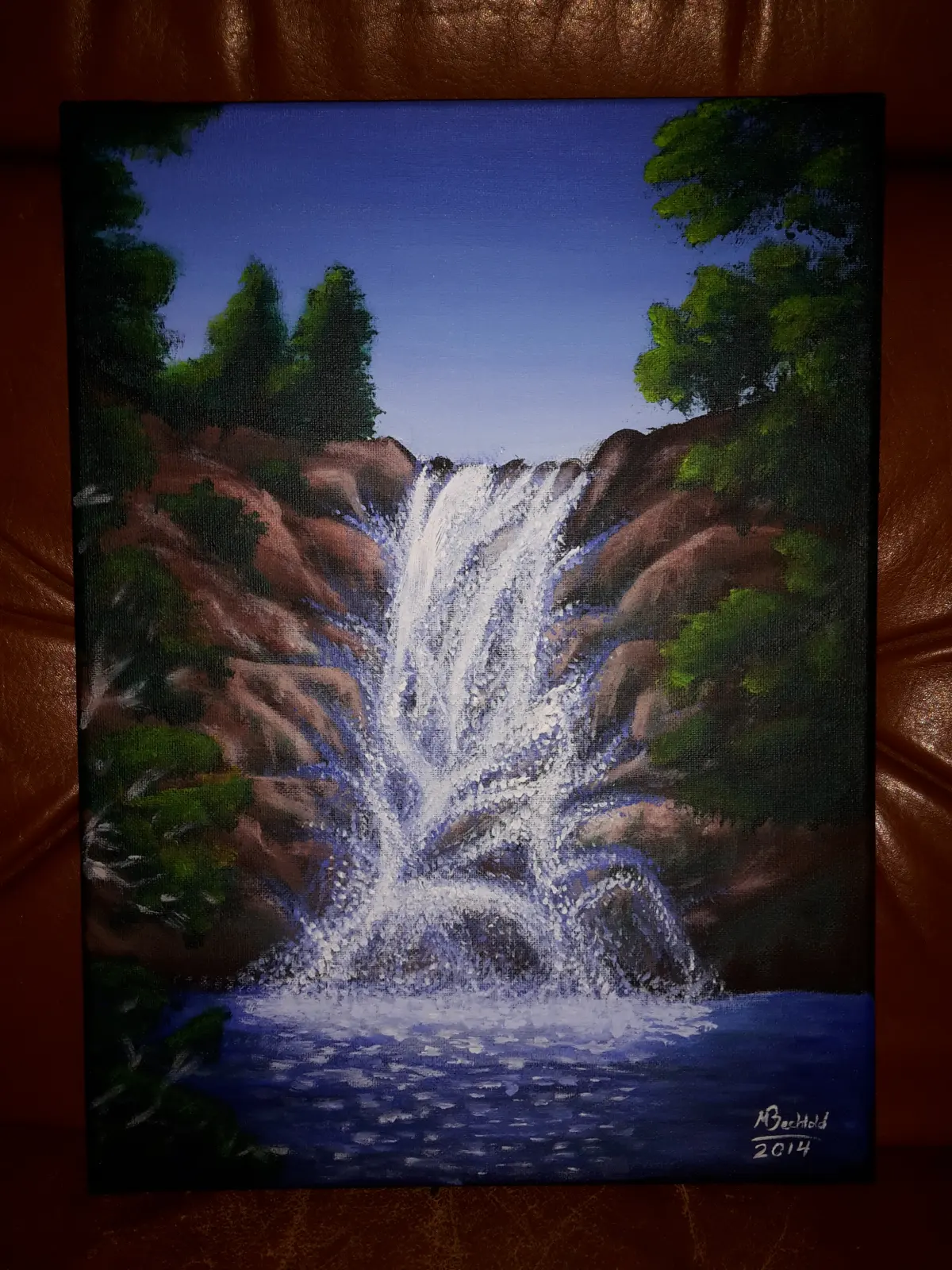
To achieve a realistic look, you must first establish the composition by identifying the three distinct zones of a waterfall: the crest, the veil, and the pool. The crest is where the water transitions from the riverbed to the drop, often marked by a slight curve or ripple. The veil represents the main body of falling water, which should be drawn with long, vertical strokes that suggest gravity and speed. Finally, the pool at the base is where the water hits the rocks, creating turbulence and mist.
Begin by sketching the surrounding rock formations, as these provide the necessary scale and context for the water. Use light, gestural lines to map out the flow of the water, ensuring that the path follows the contours of the terrain. Avoid drawing a perfectly straight line, as natural waterfalls often fan out or break into multiple streams as they descend. By establishing these structural boundaries early, you provide a roadmap for adding the finer details of water texture and light reflection later in the process.
How to create the texture of falling water
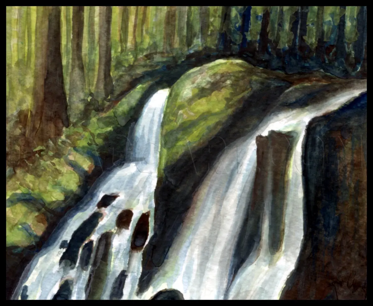
Water is not a solid object, so you must use varying line weights to represent its fluid nature. Start by applying a base layer of graphite or charcoal to represent the darker tones behind the water, such as wet rocks or shadows. Once the background is established, use a sharp eraser or a white gel pen to pull out the highlights of the water. This subtractive method mimics the way light catches the surface of the stream, creating a sense of depth and transparency that is essential for a convincing image.
- Use long, vertical strokes to define the main flow of the waterfall.
- Leave thin gaps between your strokes to suggest the air and mist trapped within the water.
- Vary the pressure of your pencil to create darker, denser areas where the water is thick and lighter areas where it is thin or misty.
- Add small, horizontal dashes at the base of the fall to represent the splash and foam created upon impact.
Best drawing tools for beginners
For those new to landscape drawing, a set of graphite pencils ranging from 2H to 6B is ideal. The harder 2H pencils are perfect for creating light, preliminary outlines that can be easily erased, while the softer 6B pencils allow you to build deep, rich shadows in the surrounding rock faces. A kneaded eraser is an indispensable tool because it can be molded into a fine point to lift highlights out of the graphite, allowing you to create the delicate, wispy appearance of cascading water.
Blending stumps or tortillons can help soften the transitions between the water and the surrounding environment. However, avoid over-blending the water itself, as this can make it look like smooth glass rather than moving liquid. If you prefer working with ink or markers, focus on layering thin, translucent lines to build up the volume of the water. Start with the lightest tones and gradually add darker strokes to define the shadows within the folds of the waterfall, ensuring that the white of the paper remains visible for the brightest reflections.
Why waterfalls look misty and soft
The mist at the bottom of a waterfall occurs because the energy of the falling water is dispersed upon hitting the rocks, turning liquid into fine droplets. To capture this effect, you should avoid using sharp, defined lines at the base of your drawing. Instead, use a soft blending tool or a light hatching technique to create a hazy, ethereal transition. This mist should obscure the bottom of the waterfall, suggesting that the water is disappearing into a cloud of spray rather than simply stopping at a hard edge.
- Use a soft, circular motion with your blending tool to create the appearance of swirling mist.
- Keep the edges of the mist blurred to differentiate it from the sharp, focused lines of the falling water.
- Add small, scattered dots around the base to represent individual droplets catching the light.
- Ensure the mist is lighter than the surrounding shadows to make it appear luminous and airy.
Common mistakes when drawing waterfalls
A frequent error is drawing the water as a solid, static shape without any sense of movement. Beginners often outline the entire waterfall, which makes it look like a rigid structure rather than a fluid substance. To avoid this, focus on the direction of the flow rather than the edges. Let the water overlap the rocks in some places and disappear behind them in others, which creates a dynamic interaction between the landscape and the stream. This layering effect is key to making the water feel like it belongs in the environment.
Another common mistake is failing to account for the light source. Water is highly reflective, so the highlights should be consistent with the direction of the sun or ambient light in your scene. If the light comes from the side, one side of the waterfall may appear brighter than the other. Ignoring this will make the waterfall look flat and disconnected from the rest of your drawing. Always check your values to ensure that the brightest parts of the water are truly the lightest areas on the page, which provides the necessary contrast to bring the entire composition to life.
Key facts
- Waterfalls are defined by gravity; always draw the flow lines vertically to indicate a downward pull.
- Use a sharp, hard-edged eraser to carve out "negative space" highlights within the falling water for a realistic effect.
- Horizontal lines at the base of the falls represent the impact zone where water crashes and creates turbulent foam.
- Mist is best rendered by using a soft blending stump or a kneaded eraser to smudge graphite into a hazy, translucent layer.
- Vary the thickness of your water streams; grouping lines together creates the illusion of volume and power.
- Reflect the surrounding environment in the pool at the bottom to ground the waterfall within the landscape.
The bottom line
Drawing a realistic waterfall requires balancing the rigid pull of gravity with the fluid, chaotic nature of moving water. By focusing on vertical flow lines, layering transparent highlights over dark rock structures, and meticulously rendering the turbulent spray at the base, you can create a dynamic sense of motion. Always prioritize contrast to ensure the water appears bright, powerful, and distinct from the surrounding landscape.
People also ask
How do I make water look like it is moving rather than frozen?
Use long, slightly curved vertical strokes that taper at the bottom to suggest velocity. Avoid perfectly straight lines, as natural water flow is organic and slightly irregular.
Should I use white ink or a pencil for highlights?
White gel pens or opaque gouache are superior for adding crisp, bright highlights on top of dark pencil work. Pencils often struggle to achieve the necessary brightness against shaded areas.
How do I draw the rocks behind the water?
Draw the rock formations first, then layer the water over them using light, transparent strokes. This ensures the structure of the cliff remains visible through the veil of the falls.
What is the best way to show the spray at the base?
Use a stippling technique with a sharp pencil or a fine-point pen to create a cluster of dots. This mimics the chaotic, airy nature of water droplets splashing against the rocks.
Why does my waterfall look like a flat sheet of paper?
You likely lack sufficient contrast between the shadows and highlights. Add deeper shadows on the sides of the waterfall to create a sense of depth and cylindrical volume.
How do I draw the top edge where the water falls?
Draw a soft, rounded lip rather than a sharp corner to show the water bending over the ledge. This transition point is crucial for establishing the scale and weight of the flow.
This answer was created with the help of AI research tools and reference sources. Spotted an error? Let us know — we correct mistakes quickly. See our editorial policy.