How do you draw a market stall step by step?
Short answer
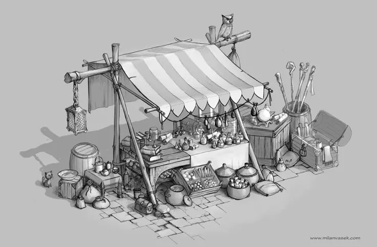
Drawing a market stall involves establishing a sturdy rectangular frame using perspective lines, then adding a sloped awning and display surfaces. By layering simple geometric shapes—cubes for crates and cylinders for produce—you create depth. Focus on consistent vanishing points to ensure the structure looks grounded and realistic within your scene.
On this page
How to draw the basic structure of a market stall
Begin by drawing a horizon line to determine your eye level, which dictates how much of the stall’s interior is visible. Use two-point perspective to sketch the main rectangular box that forms the base of the stall. By drawing two vanishing points on your horizon line, you ensure that all horizontal edges converge correctly, preventing the structure from looking distorted or lopsided.
Once the base is established, draw vertical lines upward from the four corners to define the height. Connect the tops of these lines to create the roof frame, typically a slanted rectangular plane. This overhead canopy is essential for providing shade and defining the stall's silhouette. Keep your initial lines light so they can be easily erased or adjusted as you refine the proportions of the counter and support posts.
How to add details to a market stall drawing
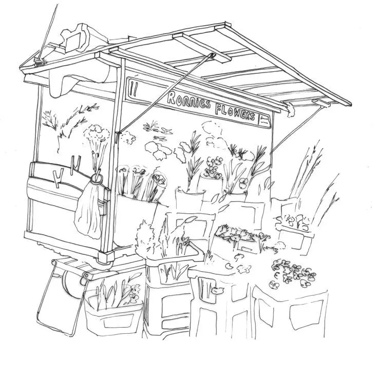
After the structural frame is set, focus on the functional elements that make the stall look authentic. Add a thick horizontal board across the front to serve as the main counter, then draw vertical support beams connecting the counter to the ground. You can enhance the realism by adding wooden textures, such as vertical slats or cross-bracing, to the base of the stall.
To make the stall look like a busy marketplace, populate the counter with various goods. Use simple shapes to represent different items, such as spheres for fruit, cylinders for jars, or rectangular boxes for crates. By varying the sizes and heights of these objects, you create visual interest and a sense of depth.
- Sketch crates as small cubes stacked at different angles.
- Draw produce using circles of varying sizes to suggest volume.
- Add a hanging sign or chalkboard to the front for character.
- Include a small stool or chair behind the counter for the vendor.
How to use perspective for a professional look
Perspective is the most critical element in making a market stall appear three-dimensional. If your lines do not converge toward the vanishing points, the stall will look flat or "broken." Always ensure that the lines representing the top and bottom of the stall are parallel to each other and directed toward their respective vanishing points on the horizon.
When drawing the awning, consider its angle relative to the sun. If the awning is slanted, the lines defining its edges must also converge toward a vanishing point, even if that point is different from the one used for the base. This attention to geometric accuracy separates a professional-looking drawing from a casual sketch. If you are struggling with the angles, use a ruler to lightly trace lines back to the vanishing points until you feel comfortable drawing them freehand.
Common mistakes when drawing market stalls
One of the most frequent errors is ignoring the scale of the objects placed on the counter. Beginners often draw fruit or boxes that are far too large relative to the stall, which makes the entire structure look like a miniature toy rather than a full-sized booth. Always compare the size of your items to the height of the counter to ensure they look functional and proportional.
Another common mistake is failing to account for overlapping shapes. When items are placed on a counter, they should partially obscure the items behind them. If you draw every object in its entirety without overlapping, the counter will look cluttered and lack depth. Remember that the human eye naturally simplifies complex scenes; you do not need to draw every single piece of produce, but rather suggest their presence through grouping and silhouettes.
- Drawing the stall base perfectly square instead of using perspective.
- Forgetting to add the thickness of the counter boards.
- Making the roof canopy too thin or flimsy.
- Leaving the background blank, which isolates the stall unnaturally.
- Using overly dark outlines that flatten the overall image.
Best shading techniques for market stalls
Shading is the final step that brings your market stall to life by defining its volume and lighting. Identify a single light source, such as the sun, and apply shadows consistently on the opposite side of every object. Use cross-hatching or smooth gradients to show the underside of the awning, which should be the darkest area of the stall.
Cast shadows are equally important for grounding the stall in its environment. Draw a soft, elongated shadow stretching away from the base of the stall and the items on the counter. This shadow acts as an anchor, preventing the stall from appearing as if it is floating in mid-air. By building up layers of graphite or ink, you can create a sense of texture, such as the rough grain of wooden crates or the smooth, reflective surface of glass jars, adding a final layer of polish to your work.
Key facts
- Use a vanishing point to establish linear perspective, ensuring the stall’s roof and counter align toward a single horizon line.
- Start with a simple rectangular box to define the stall's volume before adding architectural details like posts or fabric awnings.
- Incorporate a striped pattern on the awning to create a classic market aesthetic, using parallel diagonal lines to follow the roof's slope.
- Draw the counter at waist height, approximately three to four feet from the ground, to maintain realistic human scale.
- Group items on the counter in clusters of three or five to create visual interest without cluttering the composition.
- Add shadows beneath the counter and behind the stall to ground the structure firmly in the environment.
The bottom line
Drawing a market stall requires a balance between structural accuracy and creative detail. By establishing a strong foundation with linear perspective and maintaining consistent proportions, you create a believable space. Focus on the interplay between the geometric frame and the organic shapes of the merchandise. With careful attention to lighting and shadows, you can transform a simple box into a vibrant, inviting scene for any viewer.
People also ask
How do you make a market stall look busy?
Add varied shapes for produce, such as spheres for fruit and cylinders for jars, and include small figures interacting with the counter. Overlapping these items creates depth and suggests a high volume of goods.
What is the best way to draw fabric textures on an awning?
Use long, soft vertical strokes to suggest the weight of the canvas and add subtle folds near the support poles. Avoid perfectly straight lines, as fabric naturally sags and ripples under its own weight.
Should I draw the stall from a low or high angle?
A low angle makes the stall look grand and inviting, while a high angle provides a clear view of the goods on display. Choose your perspective based on whether you want to emphasize the structure or the merchandise.
How do I draw the support poles correctly?
Ensure the vertical lines are perfectly perpendicular to the ground to prevent the stall from appearing to lean. Use a ruler for the initial sketch to maintain structural integrity before adding texture like wood grain.
How can I show that the stall is outdoors?
Include environmental cues like cobblestone patterns on the ground, a few stray leaves, or distant trees in the background. These elements provide context and help the viewer understand the setting.
What common mistake ruins the perspective of a stall?
The most frequent error is failing to align the roof and counter edges to the same vanishing point. If these lines diverge, the stall will appear distorted or collapsed rather than three-dimensional.
This answer was created with the help of AI research tools and reference sources. Spotted an error? Let us know — we correct mistakes quickly. See our editorial policy.