How do you draw a cartoon tree?
Short answer
Drawing a cartoon tree involves establishing a simple structural framework before adding organic details. You begin by sketching a trunk and a cloud-like canopy shape, then refine the textures and shadows to create depth. By varying the silhouette and adding character-driven elements, you can easily transform basic geometric forms into stylized trees.
On this page
How to structure a cartoon tree
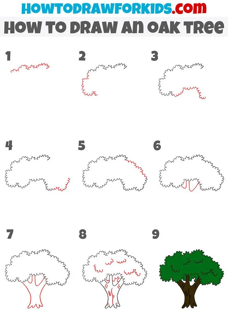
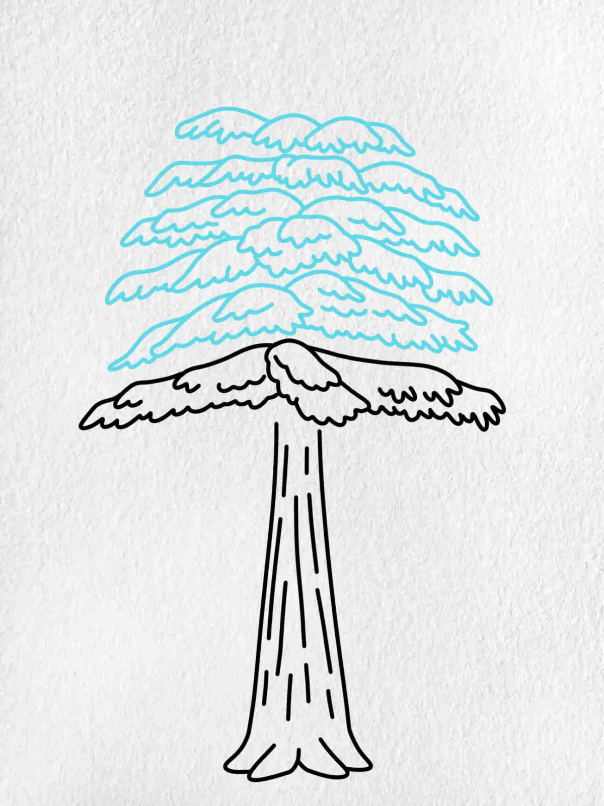
To begin drawing a cartoon tree, you must first define the basic proportions of the trunk and the canopy. Start by drawing a vertical rectangle or a slightly tapered cylinder for the trunk, ensuring it is wide enough to support the weight of the branches. Above this, sketch a large, loose circle or oval to represent the foliage area. Keeping these shapes simple allows you to visualize the overall volume before you commit to permanent ink or detailed shading.
Once the primary shapes are in place, you can refine the silhouette to make it look more natural. Instead of a perfect circle for the leaves, use a series of connected, overlapping scallops or "bumpy" lines to suggest the texture of foliage. This technique creates a playful, stylized look that is essential for cartooning. Remember that trees in nature are rarely perfectly symmetrical, so tilting the trunk slightly or offsetting the canopy can add a dynamic, professional feel to your illustration.
Best tools for drawing trees
For beginners, the best tools are simple graphite pencils and a soft eraser, which allow for experimentation without the fear of making permanent errors. A 2B pencil is ideal for sketching the initial structure because it is dark enough to see but light enough to erase easily. Once you are satisfied with your rough sketch, use a fine-liner pen or a felt-tip marker to solidify the outlines. These tools provide the bold, clean edges that define the cartoon aesthetic.
If you are working with digital tools, utilize layers to separate your sketch from your final line art. This allows you to adjust the shape of the branches without affecting the foliage. Regardless of your medium, keep the following items ready to ensure a clean process:
- A kneaded eraser for lifting graphite without damaging the paper surface.
- A variety of pen nib sizes to create line weight variation, which adds visual interest.
- A blending stump or soft brush if you plan to add grayscale shading to your tree.
How to add texture and detail
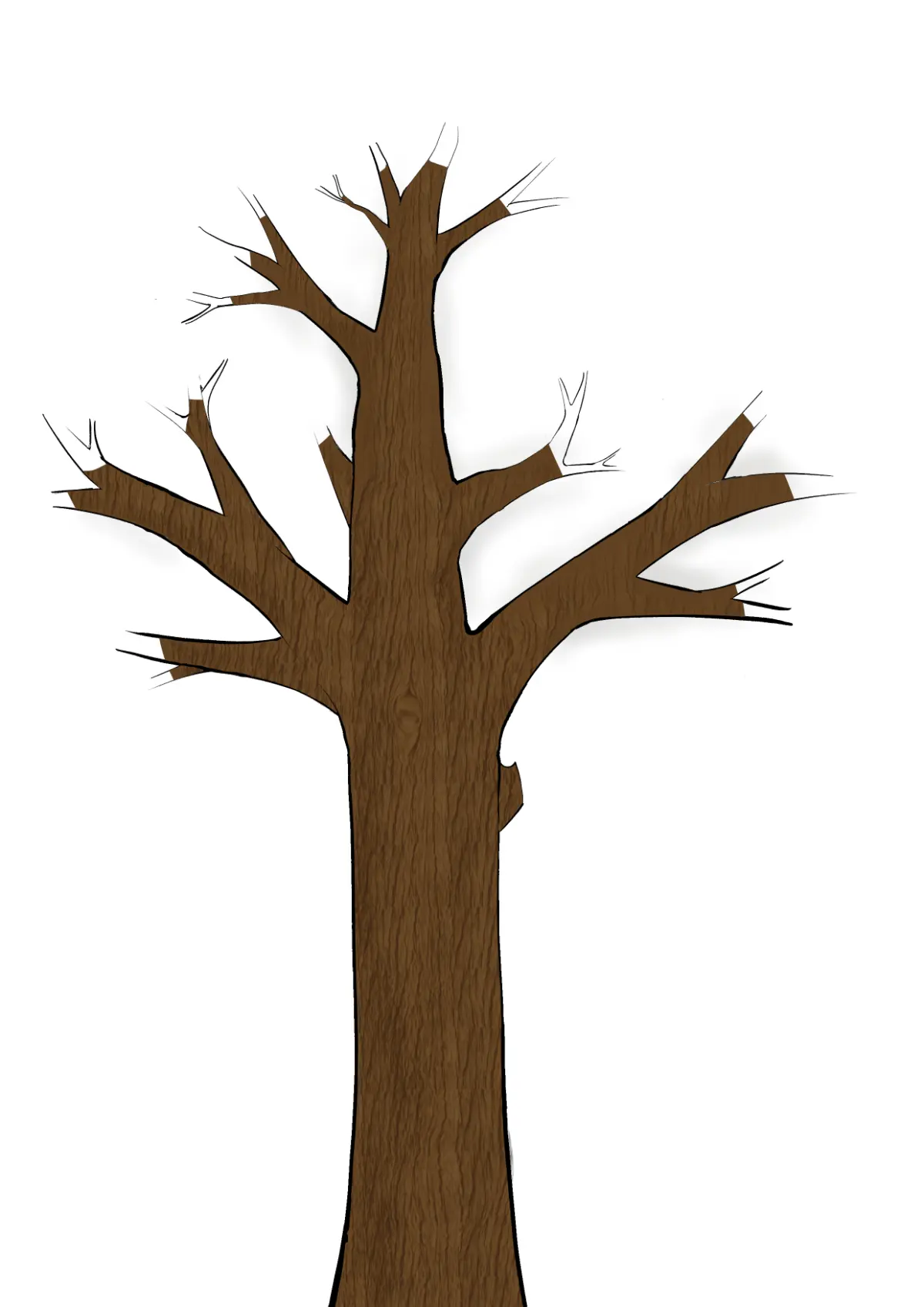
Adding texture is what separates a flat shape from a recognizable tree. For the trunk, avoid drawing straight, vertical lines, as these can make the wood look like a plastic pipe. Instead, draw short, jagged, or curved lines along the sides of the trunk to suggest bark. You can also add a few "knots" or circular markings to give the tree a sense of age and history. These small details provide visual cues that inform the viewer about the tree's character.
For the foliage, you can either keep it as a solid mass or break it up into smaller clusters. If you choose the latter, follow these steps to create a sense of depth:
- Draw the outer perimeter of the canopy using large, scalloped curves.
- Add smaller, internal clusters of leaves near the edges to suggest layers.
- Leave some white space within the canopy to represent light filtering through the branches.
- Use a darker ink or cross-hatching in the areas where the branches meet the trunk to create a natural shadow.
Why cartoon trees look better with shadows
Shadows provide the necessary contrast to make your cartoon tree pop off the page. Without shading, even the most detailed drawing can look flat and uninteresting. To add effective shadows, first decide where your light source is coming from. If the sun is in the top right corner, the left side of the trunk and the bottom-left area of the foliage should be shaded. This consistency is the secret to making your drawing feel grounded in a three-dimensional space.
When applying shadow, use a simple hatching or stippling technique to avoid overcomplicating the cartoon style. You do not need to render every single leaf; instead, focus on shading the larger masses. A single, solid shadow shape on the ground beneath the tree also helps anchor the object, preventing it from appearing as if it is floating in mid-air. By keeping your shading bold and simplified, you maintain the iconic, readable quality that makes cartoon art so effective and visually appealing.
Common mistakes when drawing trees
One of the most frequent mistakes is making the trunk too thin, which makes the tree look fragile or cartoonishly unstable. Always ensure the trunk is proportionate to the size of the canopy; a large, heavy canopy requires a sturdy, thick base to look balanced. Another common error is drawing too many individual leaves. In cartooning, less is often more; focusing on the overall shape of the foliage mass is far more effective than trying to draw every single leaf, which can quickly clutter the drawing and lose the viewer's focus.
Finally, avoid perfectly repeating your patterns. If every single branch looks identical, the tree will appear mechanical rather than organic. To avoid this, vary the size and spacing of your leaf clusters and the curvature of your branches. If you find your tree looking stiff, try these adjustments:
- Vary the length of your lines to break up repetitive patterns.
- Add a small limb or an extra branch poking out from an unexpected angle.
- Use thicker lines for the base of the trunk and thinner lines for the outer twigs to create a sense of scale.
Key facts
- Start by drawing a simple "Y" shape to establish the primary structure of the trunk and main branches.
- Use a series of overlapping, rounded "cloud" shapes to represent the foliage rather than drawing individual leaves.
- Vary the thickness of your lines; thicker lines at the base of the trunk provide a sense of weight and stability.
- Add a few jagged, V-shaped marks on the trunk to simulate the texture of bark without overcomplicating the drawing.
- Keep the foliage asymmetrical to make the tree appear more natural and less like a rigid geometric shape.
- Use a lighter touch for the inner branches to ensure they do not distract from the overall silhouette of the tree.
The bottom line
Drawing a cartoon tree is an exercise in simplification, focusing on basic shapes rather than realistic detail. By establishing a sturdy trunk, using rounded forms for foliage, and maintaining an asymmetrical balance, you can create a clear and expressive illustration. Remember that the goal is to capture the essence of a tree through clean lines and intentional composition, which provides a solid foundation for any artistic project.
People also ask
Should I use a pencil or a pen to draw a cartoon tree?
Start with a light graphite pencil to sketch your initial structure and shapes. Once you are satisfied with the proportions, use a felt-tip pen or ink liner to finalize the outlines and erase the pencil marks.
How do I make the tree look like it is in a specific season?
For autumn, draw smaller, scattered shapes within the foliage to represent falling leaves. For winter, omit the leaves entirely and focus on drawing intricate, bare branches extending from the trunk.
How many branches should a cartoon tree have?
Three to five main branches are usually sufficient to create a recognizable tree. Adding too many branches can make the drawing look cluttered and difficult to read at a glance.
Can I add a face to my cartoon tree?
Yes, placing two oval eyes and a curved line for a mouth on the trunk is a classic cartoon trope. Keep the features simple to maintain the tree's overall shape.
How do I add depth to the foliage?
Add a few darker, shaded "cloud" shapes on the underside of the foliage mass. This creates a sense of volume and suggests that light is hitting the top of the tree.
What is the best way to draw roots?
Extend two curved lines from the base of the trunk into the ground. Keep them wide at the top and tapering to a point as they disappear into the soil.
This answer was created with the help of AI research tools and reference sources. Spotted an error? Let us know — we correct mistakes quickly. See our editorial policy.