Why are maps distorted?
Short answer
Maps are distorted because it is mathematically impossible to flatten a sphere onto a two-dimensional plane without stretching or tearing its surface. To represent the Earth’s curved geography on a flat map, cartographers must sacrifice either accurate shapes, sizes, distances, or directions, leading to inherent trade-offs in every projection.
On this page
Why map distortion happens
The Earth is an oblate spheroid, a shape that cannot be perfectly unfolded like a piece of paper. When cartographers attempt to project this three-dimensional globe onto a flat surface, they must perform a mathematical transformation. This process inevitably introduces errors known as "projection distortion." Depending on the intended use of the map, the creator decides which geographic properties to preserve and which to sacrifice.
The most common types of distortion involve shape, area, distance, and direction. For instance, if a map preserves the correct shape of a landmass, its relative size is often blown out of proportion. Conversely, if a map maintains accurate area, the shapes of continents may appear squashed or elongated. Because no single map can be perfect, every flat representation of the world is a compromise designed for a specific purpose.
How map projections work
Cartographers use various geometric models to "wrap" the globe onto a flat plane. These models are categorized by the surface they use for projection: the cylinder, the cone, or the flat plane. Each method interacts with the Earth's surface differently, creating unique patterns of distortion that radiate from the points of contact.
- Cylindrical projections: These wrap a cylinder around the globe, often touching at the equator. They are excellent for navigation but distort the size of regions near the poles.
- Conic projections: These place a cone over a portion of the Earth. They are highly accurate for mid-latitude regions but fail to represent the entire globe.
- Azimuthal projections: These project the globe onto a flat plane touching a single point, such as a pole. These are ideal for showing polar routes but suffer from extreme distortion toward the edges.
Why the Mercator projection is misleading
Created by Gerardus Mercator in 1569, this cylindrical projection remains the most recognizable map in the world. It was designed specifically for marine navigation because it represents lines of constant compass bearing as straight lines. This feature allowed sailors to plot courses easily, but it came at a massive cost to geographic accuracy.
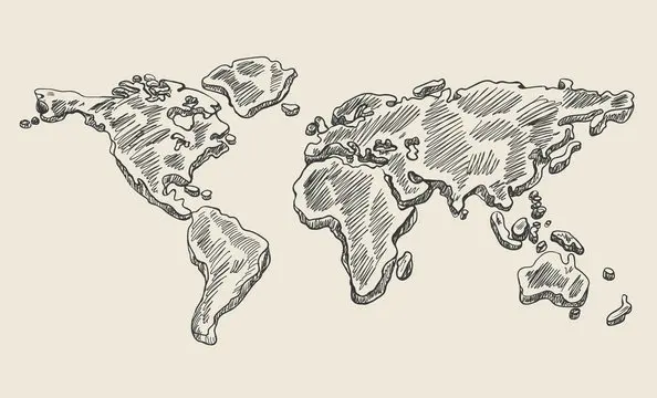
The Mercator projection inflates the size of objects as they move away from the equator. This is why Greenland appears roughly the same size as Africa, even though Africa is actually 14 times larger. Because of this, many people grow up with a distorted perception of global geography. While useful for local navigation, it is widely considered a poor choice for educational or statistical purposes due to its extreme size bias.
How to choose the right map
Choosing the correct map depends entirely on the information you need to convey. If you are analyzing global population density, you should use an equal-area projection, such as the Gall-Peters or Mollweide, to ensure that landmasses are represented by their true relative sizes. If you are planning a flight path, a gnomonic projection is superior because it shows the shortest distance between two points as a straight line.
When selecting a map, consider these factors to avoid common pitfalls:
- Identify the map's purpose: Is it for navigation, education, or data visualization?
- Check the projection type: Look for labels like "Equal-Area," "Conformal," or "Equidistant."
- Verify the scale: Remember that scale is rarely constant across a flat map.
- Avoid comparing sizes on Mercator maps: Never use a standard web map to compare the land area of countries at different latitudes.
Common mistakes when reading maps
A frequent error is assuming that a map is a literal, unedited photograph of the world. Users often mistake the "up" direction on a map for a universal orientation, forgetting that north is an arbitrary convention rather than a physical requirement. Another mistake is relying on a single map projection for all tasks, which can lead to significant errors in distance calculations or spatial reasoning.
To improve your map literacy, always look for the projection name in the map's metadata or legend. If you are measuring distances, ensure the map is "equidistant" for your specific region. By understanding that every map is a subjective interpretation of reality, you can better navigate the complexities of global geography and avoid the traps set by historical cartographic conventions. Always remember that the map is a tool, not the territory itself, and its utility is limited by the mathematical constraints of its design.
Key facts
- The Earth is an oblate spheroid, meaning it is a sphere slightly flattened at the poles and bulging at the equator.
- Flattening a curved surface onto a flat plane inevitably causes distortion in either shape, area, distance, or direction.
- The Mercator projection, created by Gerardus Mercator in 1569, preserves angles for navigation but drastically inflates the size of landmasses near the poles.
- No single map projection can simultaneously maintain perfect scale, area, and shape across the entire globe.
- The Gall-Peters projection is an equal-area map that preserves the relative size of continents, though it significantly distorts their shapes.
- To minimize errors, mapmakers choose projections based on the specific purpose, such as using an equidistant projection for measuring flight paths.
The bottom line
Maps are essential tools for navigation and analysis, yet they are inherently limited by the geometry of our planet. Because the Earth is a sphere, translating its surface onto a flat sheet of paper requires compromises that distort size, shape, or distance. Understanding these trade-offs allows you to select the right map for your needs, ensuring that you interpret geographic data with necessary critical awareness.
People also ask
Why does Greenland look as large as Africa on many maps?
This occurs because of the Mercator projection, which stretches landmasses as they move away from the equator to maintain constant compass bearings. In reality, Africa is approximately 14 times larger than Greenland.
What is the most accurate map projection?
No projection is perfectly accurate, as accuracy depends on the map's intended use. The Winkel Tripel projection is often considered a good compromise because it minimizes the distortion of area, direction, and distance simultaneously.
How can I tell if a map is distorted?
Look at the size of familiar landmasses like Antarctica or Greenland compared to the equator. If they appear disproportionately massive, the map is likely using a projection that prioritizes navigation or shape over scale.
Why are maps often centered on Europe?
This is largely a historical legacy of European cartographers who created the most widely used projections during the Age of Discovery. Modern digital maps allow users to center their view anywhere, reflecting a more global perspective.
Can a globe be distorted?
A physical globe is the most accurate representation of the Earth because it maintains the planet's spherical shape. However, globes are impractical for detailed navigation or close-up analysis of small geographic areas.
What is the Tissot’s Indicatrix?
This is a mathematical tool used by cartographers to visualize the distortion of a projection. It consists of circles placed across a map; if the map is distorted, the circles appear as ellipses of varying sizes and shapes.
This answer was created with the help of AI research tools and reference sources. Spotted an error? Let us know — we correct mistakes quickly. See our editorial policy.