What is symmetry in art?
Short answer
Symmetry in art is a compositional principle where elements are balanced around a central axis, point, or line. It creates a sense of harmony, stability, and order by mirroring visual weight. Artists utilize various forms of symmetry, such as reflectional, rotational, or translational, to guide the viewer’s eye and establish formal structure.
On this page
What are the different types of symmetry in art?
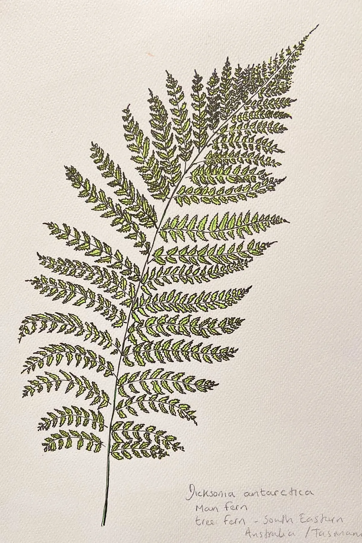
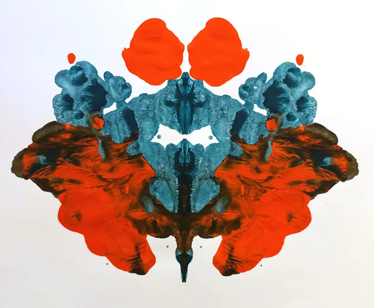
Symmetry is categorized based on how visual elements are distributed across a composition. The most common form is bilateral or reflectional symmetry, where an image is mirrored across a central vertical or horizontal axis. This creates the illusion that one side of the artwork is a reflection of the other, often used in religious icons or classical architecture to signify perfection and divine order.
Beyond simple reflection, artists employ more complex geometric arrangements to create movement and rhythm. These include:
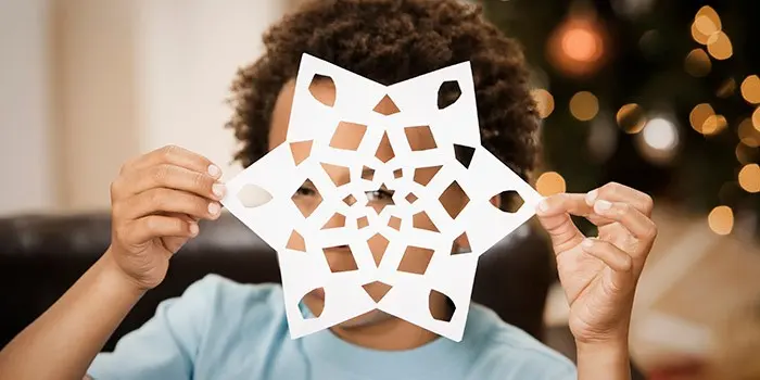
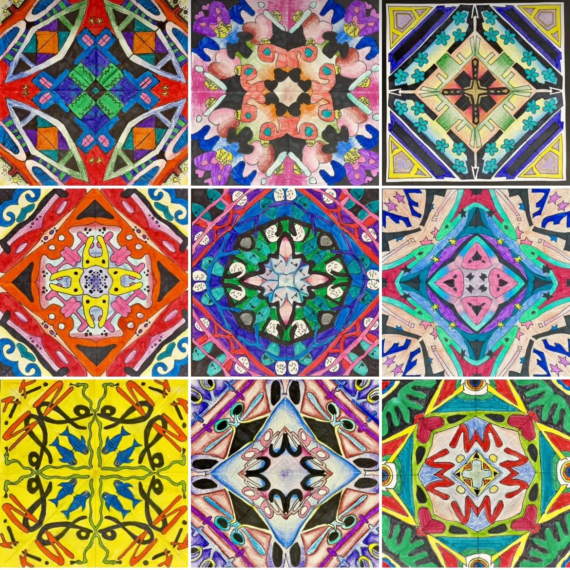
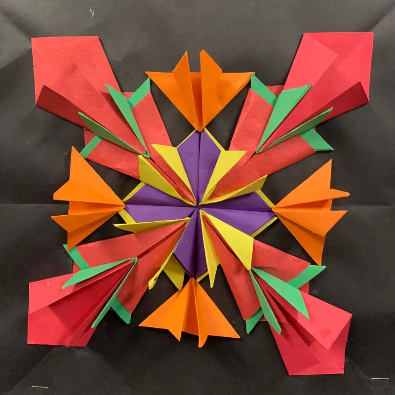
- Rotational symmetry: Elements are rotated around a central point, common in mandalas and circular patterns.
- Translational symmetry: A motif is repeated at regular intervals, often seen in textile designs and architectural friezes.
- Glide reflection: A combination of reflection and translation, where a mirrored shape is shifted along an axis.
These variations allow artists to move beyond static balance, introducing dynamism while maintaining a cohesive visual structure. By choosing specific types of symmetry, creators can manipulate the viewer’s perception of space and time within a two-dimensional plane.
Why do artists use symmetry in their work?
The primary purpose of symmetry is to evoke a sense of stability and permanence. Human psychology is naturally drawn to balanced forms, which the brain perceives as organized and safe. In historical contexts, such as the construction of the Parthenon in Athens or the design of Renaissance altarpieces, symmetry was used to convey authority, logic, and the idealization of nature.
Symmetry also serves as a powerful tool for visual hierarchy. By centering a subject, an artist immediately signals to the viewer that this element is the focal point of the narrative. This technique is frequently observed in:
- Formal portraiture, where the subject is placed dead-center to command attention.
- Architectural photography, which uses symmetry to emphasize the grand scale of man-made structures.
- Graphic design, where balanced layouts ensure readability and brand reliability.
While symmetry can feel rigid, it remains an essential foundation for establishing clarity. It provides a reliable framework that allows an artist to introduce subtle variations without losing the overall sense of unity.
How to create symmetrical art for beginners
Creating symmetrical art requires careful planning and the use of guide lines to ensure accuracy. If you are working on paper, start by lightly drawing a central axis line with a ruler. This line acts as the spine of your composition, ensuring that the visual weight remains evenly distributed on both sides.
Follow these steps to develop a symmetrical drawing:
- Sketch your central axis line lightly with a graphite pencil.
- Draft the primary shapes on one side of the axis, focusing on proportions.
- Use a measuring tool, such as a compass or ruler, to map the corresponding points on the opposite side.
- Refine the details, checking frequently to ensure the distance from the axis is identical for both halves.
Once the structure is set, you can add shading or color. Remember that light source placement is critical; if the light comes from the left, the shadows must be mirrored correctly to maintain the illusion of symmetry.
Common mistakes when using symmetry
A frequent error is assuming that symmetry must be perfectly mathematical, which can lead to a sterile or "robotic" appearance. While the underlying structure should be balanced, minor variations in texture or brushwork can prevent the final piece from feeling too mechanical. Over-reliance on exact mirroring often strips an artwork of its human touch and emotional depth.
Another common pitfall is ignoring the "negative space" surrounding the symmetrical subject. If the space on one side of the axis is cluttered while the other is empty, the symmetry will feel lopsided regardless of how well the central subject is drawn. To avoid this, consider these points:
- Ensure the background elements are balanced in size and tone.
- Avoid placing high-contrast colors on only one side of the composition.
- Use a mirror to check your work; looking at a reversed version of your drawing often reveals hidden imbalances.
By monitoring the negative space, you maintain the equilibrium that makes symmetrical compositions so effective and visually satisfying.
When should you avoid symmetry?
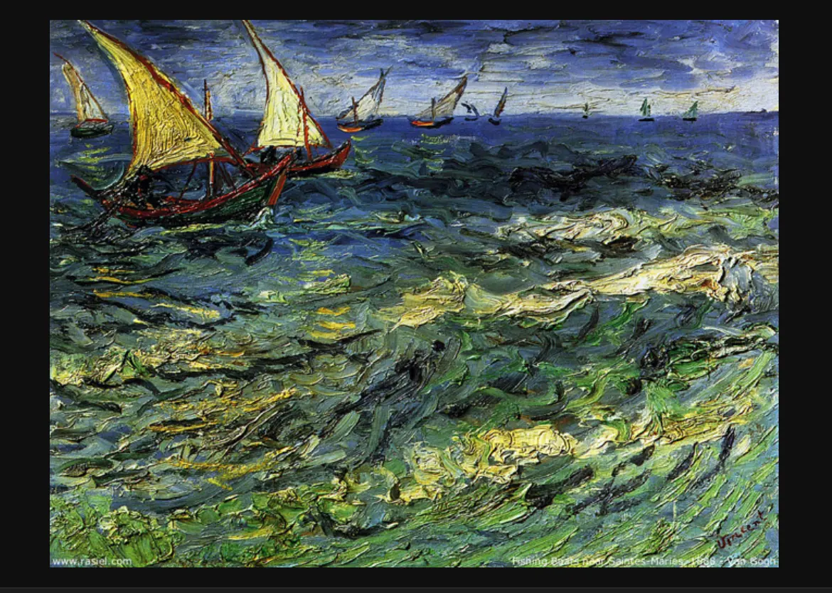
While symmetry provides order, it can also become predictable or monotonous if used in every project. If your goal is to convey chaos, movement, or emotional tension, asymmetrical balance is often a superior choice. Asymmetry uses different elements to achieve a sense of equilibrium, such as balancing a large, dark shape with several smaller, lighter ones.
Modern and contemporary art movements, particularly Expressionism and Surrealism, often reject symmetry to reflect the unpredictability of the human experience. If your composition feels stagnant or lacks energy, try breaking the symmetry by:
- Shifting the central axis slightly off-center to create tension.
- Introducing an unexpected color or texture on one side to disrupt the pattern.
- Using irregular shapes that suggest movement rather than static perfection.
Ultimately, symmetry is a tool rather than a rule. Understanding when to adhere to it and when to abandon it is the hallmark of a skilled artist who knows how to control the viewer's emotional response.
Key facts
- Symmetry occurs when parts of an image are organized so that they mirror each other across a central axis.
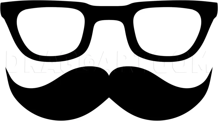
- Bilateral symmetry, the most common form, divides a composition into two identical halves like a human face.
- Radial symmetry involves elements radiating outward from a central point, frequently seen in mandalas or flower petals.
- Asymmetry creates balance by using different elements of equal visual weight rather than identical shapes.
- The Golden Ratio, approximately 1.618, is often used alongside symmetry to create aesthetically pleasing, natural proportions.
- To test for symmetry, fold a printed image in half; if the sides align perfectly, the composition is symmetrical.
The bottom line
Symmetry is a fundamental design principle that brings order and balance to visual art through mirrored or radial arrangements. While bilateral symmetry offers a sense of classic stability, mastering its application requires careful attention to visual weight and focal points. By understanding when to utilize perfect alignment and when to introduce subtle variations, artists can create compositions that feel both harmonious and engaging to the viewer.
People also ask
Why do artists use symmetry in their work?
Artists use symmetry to convey a sense of stability, order, and formality. It is frequently employed in religious icons, classical architecture, and portraiture to project harmony and permanence.
Is symmetry always better than asymmetry?
No, symmetry is not inherently superior to asymmetry. While symmetry provides calm and structure, asymmetry creates dynamic energy, tension, and a more modern, unpredictable visual experience.
How can I identify the focal point in a symmetrical piece?
In perfectly symmetrical works, the focal point is almost always located exactly on the central axis. Because the sides mirror each other, the eye is naturally drawn to the center of the composition.
What is the difference between reflectional and rotational symmetry?
Reflectional symmetry mirrors an image across a line, whereas rotational symmetry occurs when an object maintains its appearance after being rotated around a central point by a specific degree.
Can symmetry make art look boring?
Over-reliance on strict symmetry can sometimes make a piece feel static or predictable. Many artists break symmetry intentionally to add character or to prevent the viewer's eye from becoming stagnant.
What is a common mistake when creating symmetrical art?
A common error is neglecting "visual weight," where one side feels heavier due to color intensity or texture despite having the same shape as the other side. Balance requires considering the perceived weight of elements, not just their geometry.
This answer was created with the help of AI research tools and reference sources. Spotted an error? Let us know — we correct mistakes quickly. See our editorial policy.