What is screentone?
Short answer
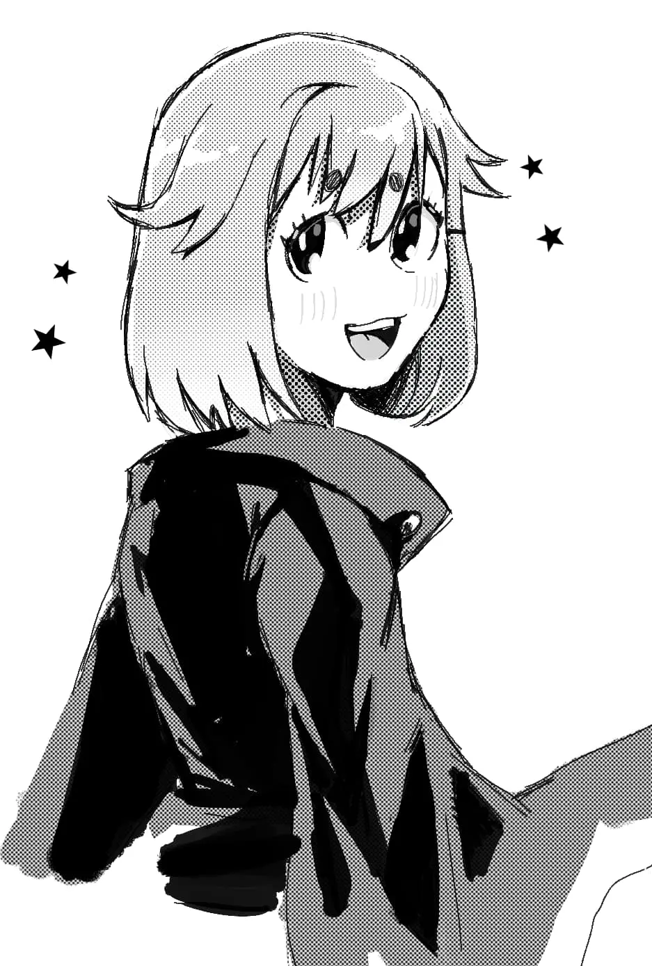
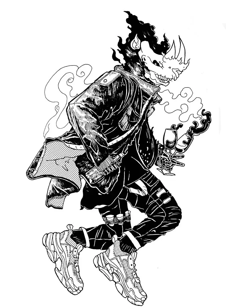
Screentone is a technique used in illustration and comics to add shading, textures, and patterns to black-and-white artwork. It consists of adhesive-backed transparent sheets printed with dots or designs. By cutting and applying these sheets, artists create depth and grayscale effects without needing to draw individual lines or use ink washes.
On this page
What is screentone used for?
Screentone serves as an essential tool for manga artists and graphic novelists to establish tone, lighting, and atmosphere in monochrome pages. Because traditional comic printing relies on black ink, artists cannot use gray paint or color to indicate shadows. Instead, they use patterns of varying dot densities to simulate different shades of gray. This technique allows an artist to distinguish between a character’s hair, the texture of clothing, or the dim lighting of a room.
Beyond simple shading, screentones provide visual variety through specialized patterns. Artists utilize these sheets to represent complex textures like wood grain, brick walls, clouds, or speed lines that convey motion. By layering different tones or scratching away parts of the film, creators can achieve sophisticated gradients and highlight effects. This versatility makes it a staple in professional comic production, ensuring that black-and-white panels remain visually engaging and easy to read.
How to apply screentone sheets
Applying traditional physical screentone requires precision, patience, and a steady hand. The process involves selecting the desired pattern, cutting it to fit the specific area of the drawing, and burnishing it onto the paper. Once the sheet is placed, the artist removes the excess material to ensure the tone only covers the intended shapes.
- Measure the area on your drawing where the tone will be placed.
- Place the screentone sheet over your artwork and lightly trace the outline of the area with a hobby knife.
- Carefully cut along the traced lines, ensuring you do not press hard enough to cut through the underlying drawing paper.
- Peel the excess screentone away from the shape.
- Use a burnisher or the back of a spoon to press the remaining tone firmly onto the paper, removing any air bubbles.
- Use an eraser or a specialized scratching tool to remove tone from areas that require highlights.
What are the different types of screentones?
Screentones are categorized primarily by their dot density and pattern style. Density is measured in lines per inch (LPI), which indicates how many dots are contained within a single inch. A lower LPI, such as 30 or 40, produces larger, more visible dots, while a higher LPI, such as 60 or 70, creates a finer, smoother appearance. Choosing the right LPI is crucial because patterns that are too fine can cause a moiré effect, a distracting visual interference pattern, when the artwork is scanned or printed.
In addition to standard dot patterns, there are several other varieties available to artists:
- Gradation tones: These sheets transition from light to dark, perfect for dramatic lighting.
- Texture tones: These include patterns like fabric weaves, floral designs, or metallic finishes.
- Effect tones: These are used for stylized backgrounds, such as radiating lines or explosive shapes.
- Transparent film: Often used to protect artwork or create specific overlays.
Common mistakes when using screentone
A frequent error for beginners is applying too much pressure when cutting out the shapes. If the blade cuts too deeply, it can damage the original illustration, making it difficult to correct or scan properly. Another common mistake is failing to burnish the edges of the tone thoroughly. If the edges are not pressed down, they can peel up over time or collect dust, which ruins the professional look of the page.
Artists also often struggle with the moiré effect by layering multiple patterns incorrectly. When two different dot patterns are placed on top of each other at the wrong angles, they create a jagged, shimmering visual artifact that is unpleasant to the eye. To avoid this, artists should ensure that the patterns are aligned correctly or use specialized "seamless" tones designed for layering. Finally, storing sheets in humid environments can cause the adhesive to degrade, making the tones difficult to apply or remove.
How to transition to digital screentone
Modern digital illustration software has largely replaced physical sheets with digital screentone brushes and textures. Digital tools offer significant advantages, including the ability to undo mistakes, adjust dot density instantly, and apply tones to complex shapes with a single click. Most professional programs feature a dedicated "tone" or "halftone" function that automatically applies the correct LPI, preventing the dreaded moiré effect during the printing process.
Despite the shift to digital, the fundamental principles of screentone remain the same. Artists must still consider the balance of light and dark, the appropriate density for the print size, and the aesthetic impact of the chosen pattern. Learning to use digital screentones involves mastering layer masks and opacity settings, which allow for the same scratching and highlighting techniques used in traditional methods. Whether working on paper or a tablet, understanding how these patterns interact with the viewer's eye is the key to creating professional, high-quality black-and-white artwork that effectively communicates depth and mood.
Key facts
- Screentone is a technique used in comics and technical drawing to add shading, texture, and patterns to black-and-white artwork.
- The most famous brand, Letratone, was introduced by Letraset in the mid-20th century, revolutionizing professional illustration.
- Traditional screentones are adhesive-backed transparent sheets printed with fine black dots, lines, or cross-hatching.
- Artists apply the sheet over their ink drawing, cut away the excess with a hobby knife, and burnish it to adhere firmly.
- The visual effect of shading is created by optical mixing, where the eye perceives the density of dots as varying shades of gray.
- Modern digital software now replicates these physical sheets using "halftone" brushes and pattern overlays to mimic the classic aesthetic.
The bottom line
Screentone remains a vital tool for achieving professional depth and texture in monochromatic illustration. Whether using traditional adhesive sheets or digital emulation, the technique relies on the precise arrangement of patterns to simulate grayscale values. By mastering the application of these textures, artists can elevate flat line art into dynamic, dimensional compositions, capturing the classic aesthetic that has defined the medium of comics for decades.
People also ask
How do you prevent screentone from peeling off the paper?
Ensure the drawing surface is clean and free of eraser dust before application. Use a burnishing tool or a smooth object to apply firm, even pressure across the entire surface of the tone.
Can you layer multiple screentones on top of each other?
Yes, layering is a common technique to create complex textures or darker gradients. However, be aware that stacking too many layers can create a "moiré" pattern, which is an unwanted visual interference effect.
What is the difference between a dot pattern and a line pattern?
Dot patterns are typically used for smooth gradients and skin tones, while line patterns are often used to suggest movement or metallic surfaces. The choice depends on the desired texture and the artistic style of the piece.
Do I need special tools to apply physical screentone?
You primarily need a sharp hobby knife, such as an X-Acto blade, and a burnisher. A light touch is essential when cutting to ensure you slice through the adhesive film without damaging the underlying paper.
How do I choose the right density for my artwork?
Density is usually measured in lines per inch (LPI) or percentage of black coverage. A lower percentage, such as 10% or 20%, is best for highlights, while 60% or higher is suitable for deep shadows.
Is it possible to remove screentone once it is applied?
You can often peel it off if done carefully, but it may leave adhesive residue or tear the paper fibers. Using a small amount of adhesive remover or rubber cement thinner can help, but it risks damaging the ink underneath.
This answer was created with the help of AI research tools and reference sources. Spotted an error? Let us know — we correct mistakes quickly. See our editorial policy.